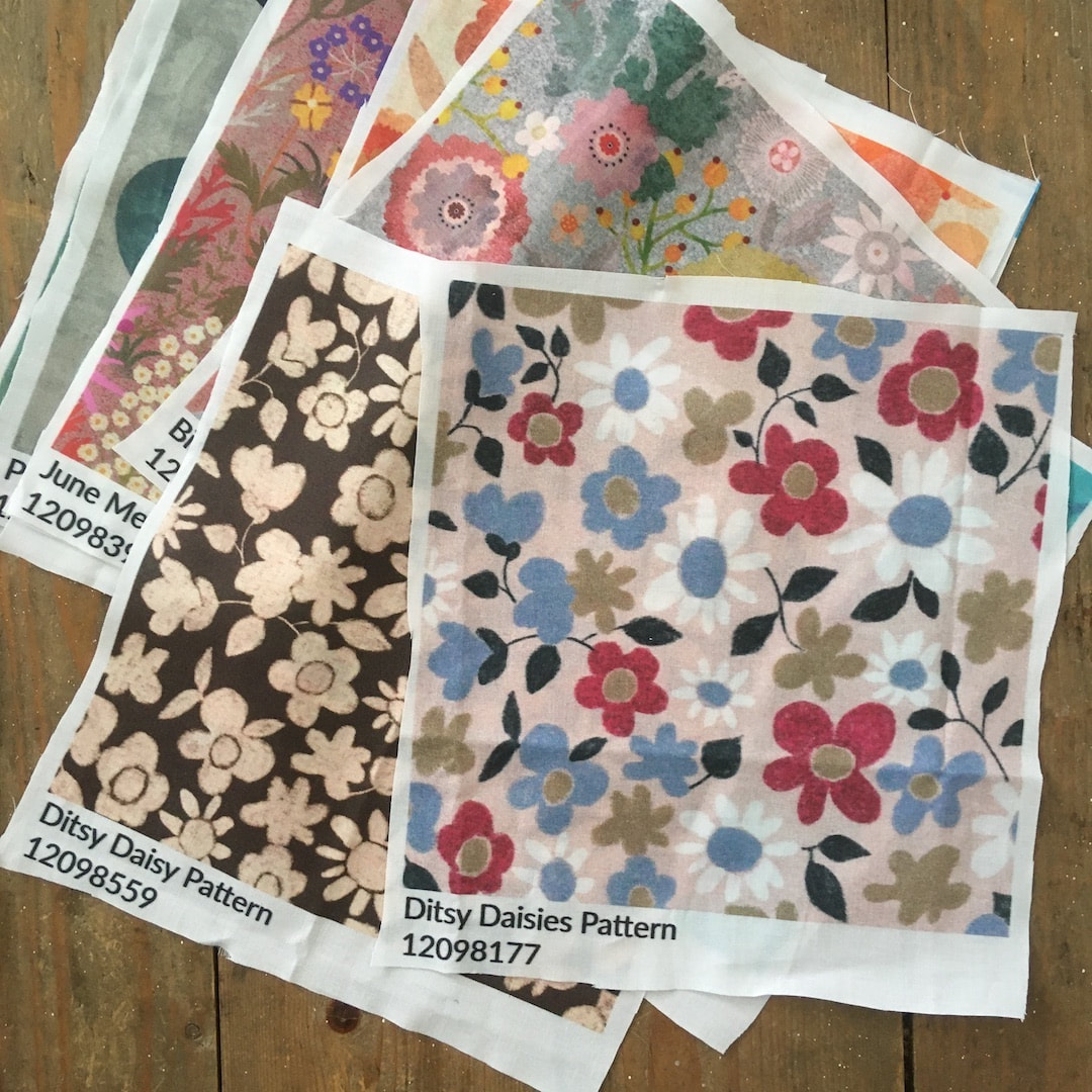
 An exciting start to the week when my first ever sampler from Spoonflower arrived on Monday morning for proofing. I worked in the print industry for a number of years, so I am no stranger to proofing, or finding unexpected results and learning from them. I ordered proofs for a variety of different patterns to see what works and what doesn't. The printing itself is very good and close to the original, but I could see that I need to buck up my design ideas! The one that worked best of all was the 'vintage tie' design. Patterns which look the strongest on screen printed the least successfully; Yay! Flowers for example, because the close tones and colour harmonies don't show up so well. After close critical scrutiny I made a check-list for designs for Spoonflower ... 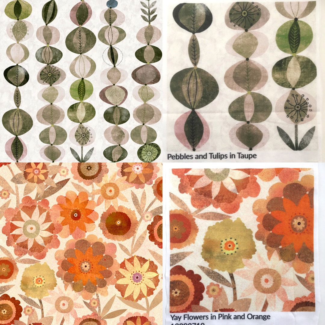 Comparison between riginal artwork (left) and Spoonflower sampler (right). It was impossible to photograph or scan the sampler fabric accurately, the samples are not so contrasty and appear softer and more faded, but these images show how big the images printed. The sampler square dimensions are 204mm, whereas the physical dimensions for a 2048 x 2048px provided in Procreate's canvas information is 173 x 173mm, so I was expecting the whole pattern tile to fit with just enough space to check the pattern repeat. I suppose the print size is due to the 300dpi resolution I use. The biggest surprise was the print size - it's enormous compared to what I was expecting, and doesn't do the work any favours (compare the samples on the right with the lower left corner of the artworks). I found a blog post here which explains Spoonflower's default resolution is 150dpi, and files not set at 150dpi 'can cause some unexpected changes in scale'. My bad for not reading the handbook before uploading - I just assumed because 300dpi is print industry standard that Spoonflower would print at that. I always work at 300dpi, I wouldn't work at 150dpi because I use the same artworks for different print services which do require 300dpi. Spoonflower's advice is to adjust the resolution once the work has been uploaded to Spoonflower (I wondered what that little box and the rulers were for - what a newby!) However, the sampler yielded so much other information I was able to see from the variety of designs I had printed what works and what doesn't. Check List:
I am now reworking the vintage tie daisy pattern colour separations using plain colour and hard outline instead of chalky. It's possible I can rework other designs, too. It means a change in my work habits, using crayon work and collage not as the finished design, but as prep sketches to be worked into final patterns; there is a nice feel about that which suits my traditional background). So, bright and clear is my motto moving forward! Redbubble I'm not sure how worried I should be about works on Redbubble. I have seen a couple of my designs on Redbubble's physical products, and the reproduction is excellent right down to the finest detail, even on products where the design is scaled down to fit. The difference is that Redbubble print on 100% polyester which gives premium print quality for the sublimation process, but the process prints differently on Spoonflower's cotton and natural fibres. I disabled a few designs on Redbubble which I knew may look scruffy or dirty, but they are ones I would rework anyway for Spoonflower so they will be back all shiny and new in time - it won't do my Redbubble any harm to smarten up my technique! Comments are closed.
|

~~~~~~~~~~~~~~~~~~~~~~
Welcome to my illustration and patterns blog.
I illustrate under the pen-name of Binky McKee, McKee being my mother's maiden name. Binky was the name of every single cat my great-grandmother kept - allegedly about 40 of them during her 94 years of life. I changed the website address a few months ago, so some older links on previous posts are broken. If you click one of those and it takes you to a strange page, simply replace the .co.uk after the binkymckee. with weebly.com and it will work again. I hope you enjoy your visit! ~~~~~~~~~~~~~~~~~~~~~~
~~~~~~~~~~~~~~~~~~~~~~
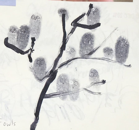
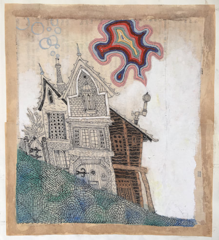
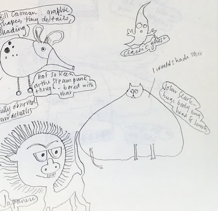
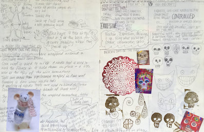
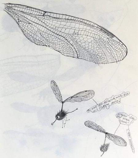
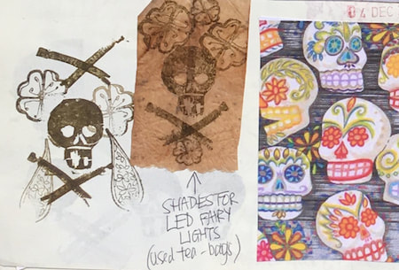
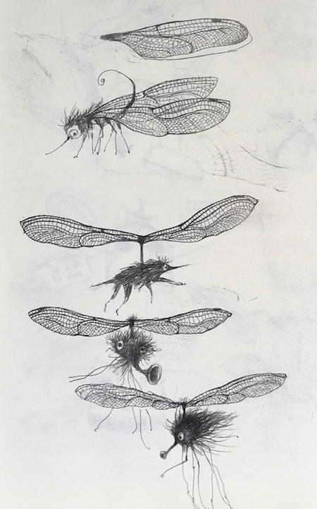
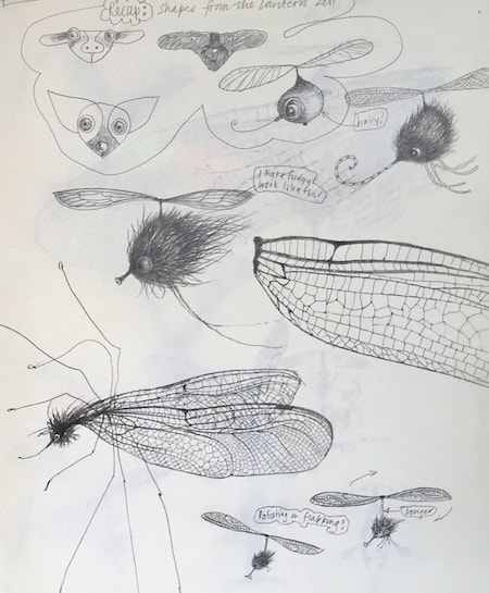
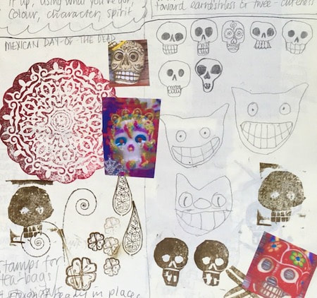
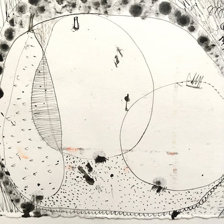
I keep lots of scrapbooks and sketchbooks where I develop ideas and design little creatures. Here's a peek inside one ...

~~~~~~~~~~~~~~~~~~~~~~
~~~~~~~~~~~~~~~~~~~~~~
As you may know, I am also known as Heather Eliza Walker.
Click the image if you would like to find out more and visit my other website. ~~~~~~~~~~~~~~~~~~~~~~ ~~~~~~~~~~~~~~~~~~~~~
~~~~~~~~~~~~~~~~~~~~
April 2024
~~~~~~~~~~~~~~~~~~~~~~
~~~~~~~~~~~~~~~~~~
All
~~~~~~~~~~~~~~~~~~~~~~
~~~~~~~~~~~~~~~~~~~~~~
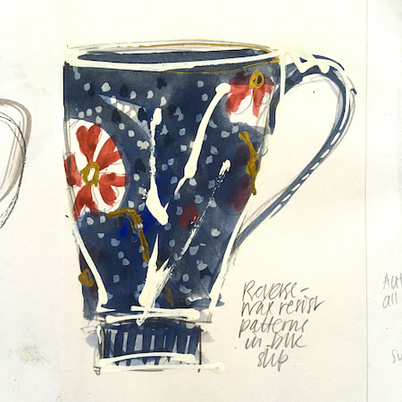
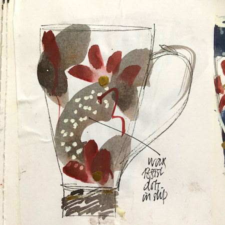
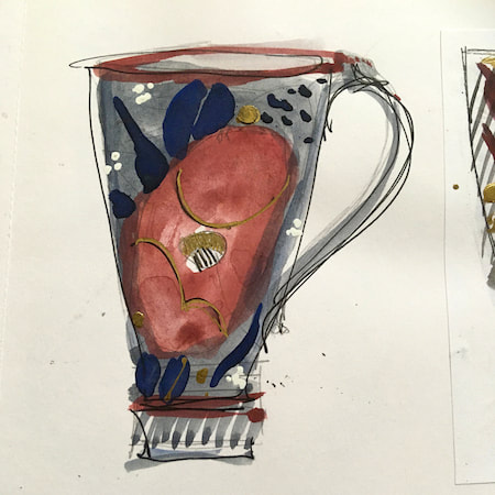
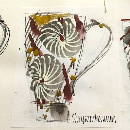
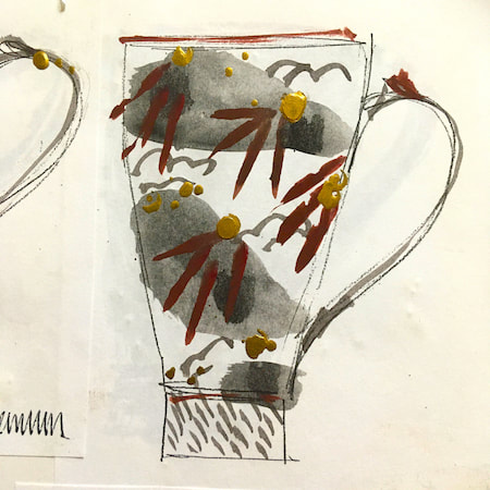
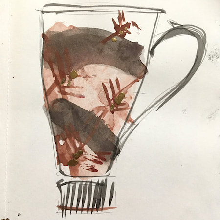
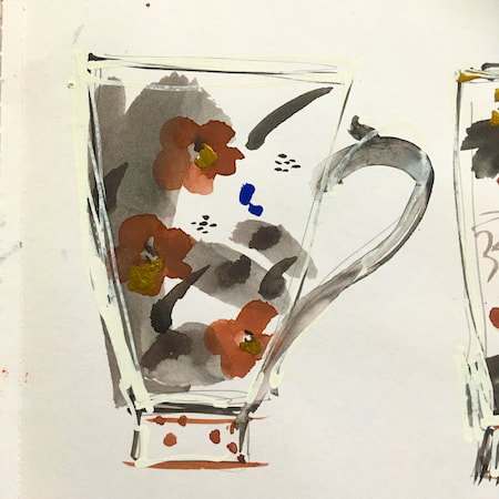
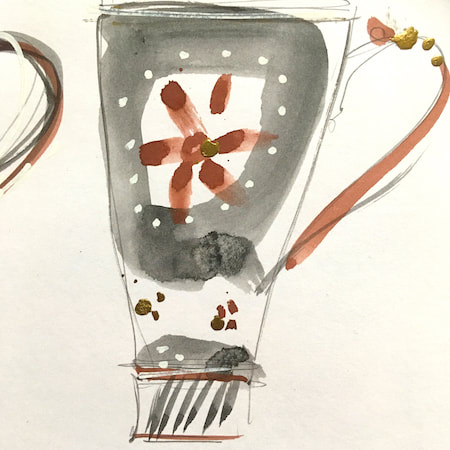
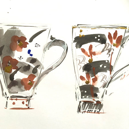
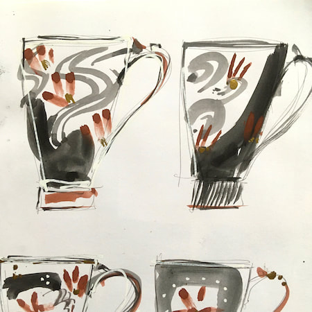
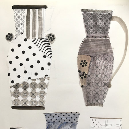
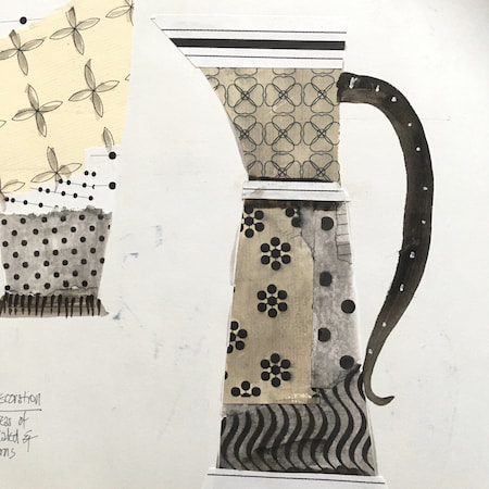
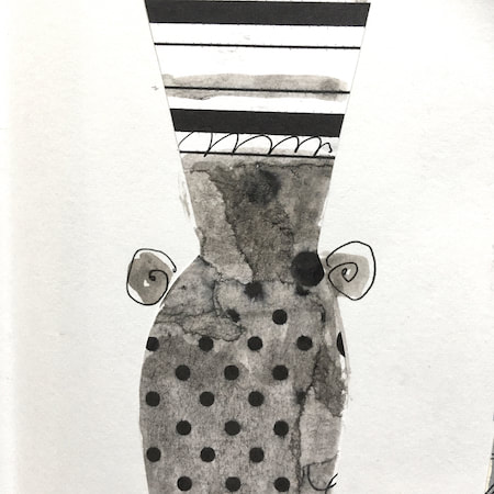
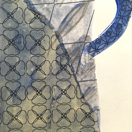
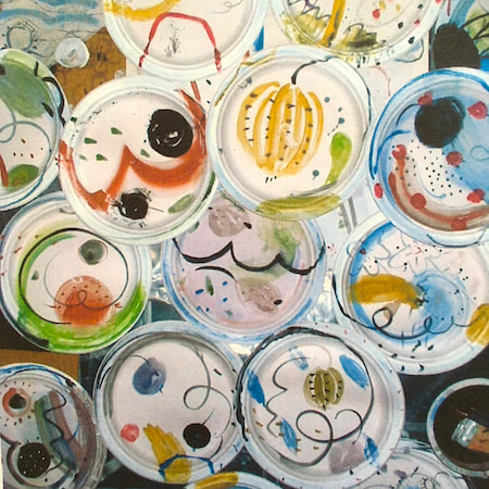
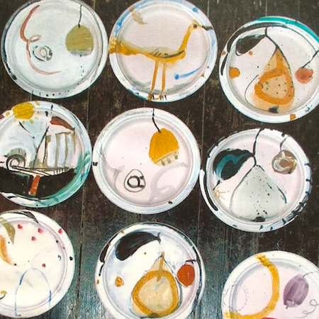
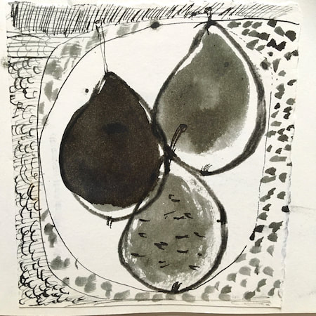
This time, take a peek into my ceramic design sketchbook. I actually made some of the mugs, but I kind of prefer the drawings! The plate designs are painted on paper plates, a most liberating process.
~~~~~~~~~~~~~~~~~~~~~~
~~~~~~~~~~~~~~~~~~~~~~
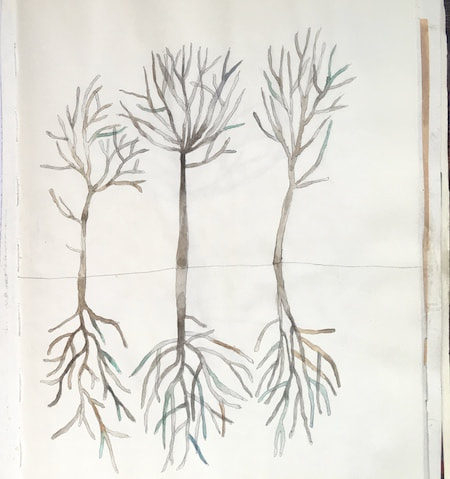
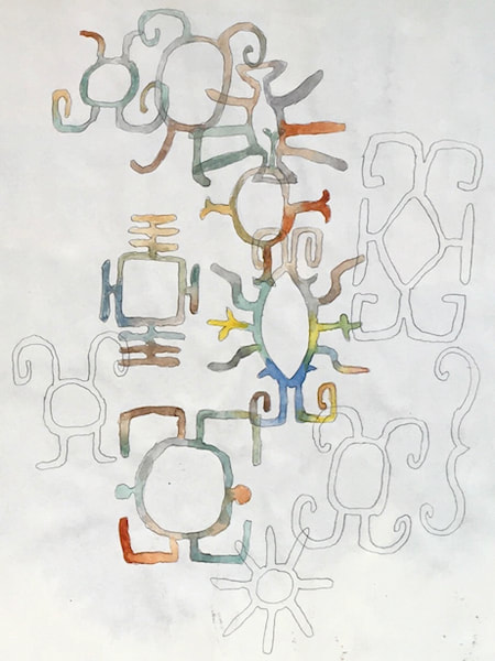
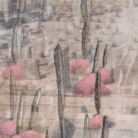
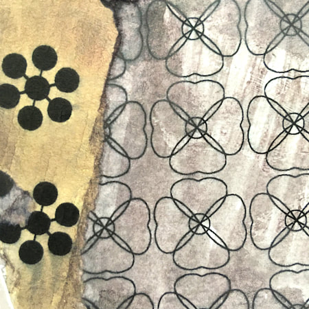
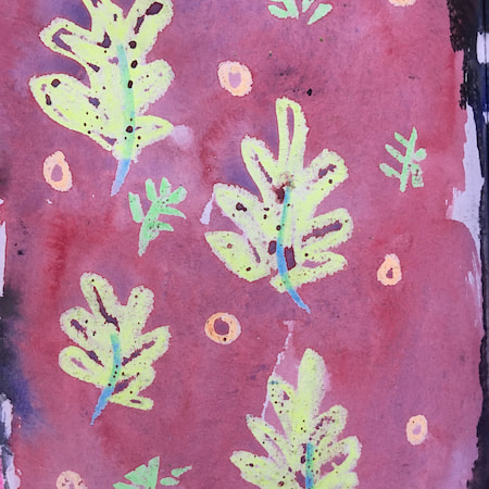
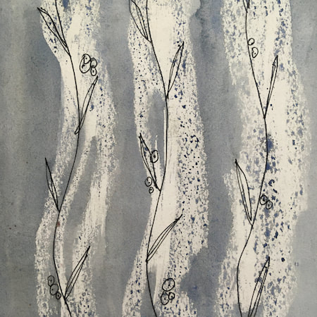
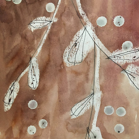
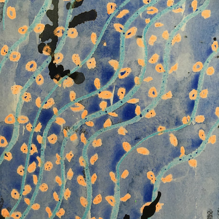
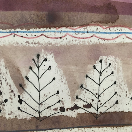
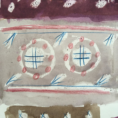
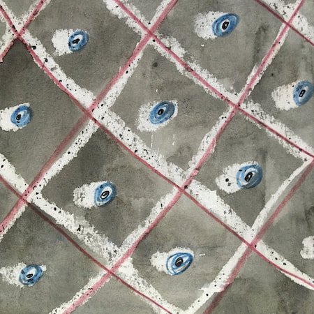
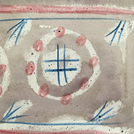
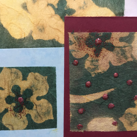
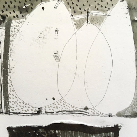
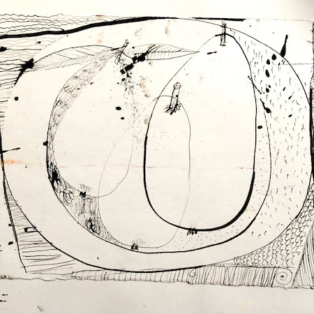
These watercolours are from my pattern sketchbook. I used coloured wax crayons to resist the washes of watercolour, also home-made rubber stamps dipped in bleach then printed on crêpe paper - the bleach takes out the paper dyes.
~~~~~~~~~~~~~~~~~~~~~~
~~~~~~~~~~~~~~~~~~~~~~
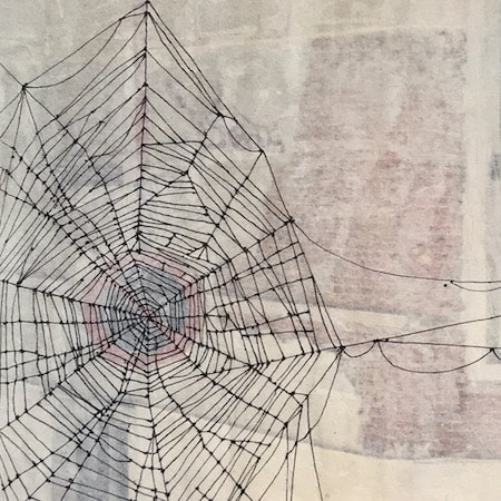
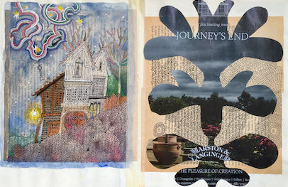
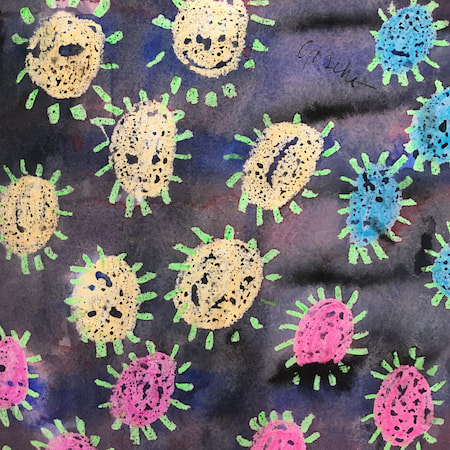
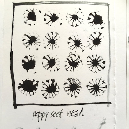
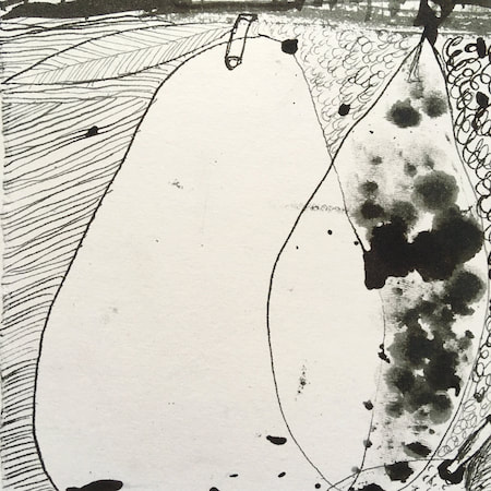
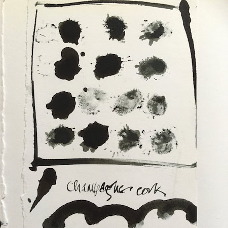
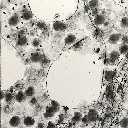
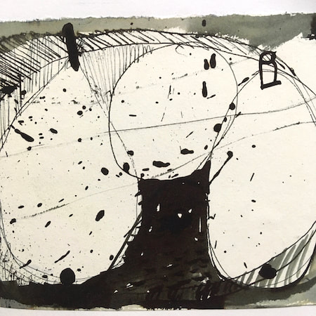
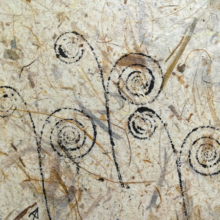
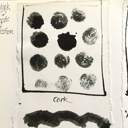
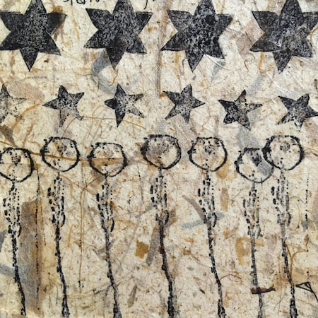
A sketchbook I used for mark-making with unusual objects - corks, seed-heads, feathers, home-made rubber stamps, my fingers and lots of flicky things ...
|
 RSS Feed
