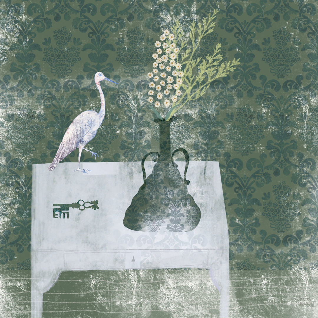
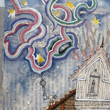
 I was quite thrilled with the glassy nature of a new texture I had created almost by accident, and made another wall art piece with it and a stork and a key. No, I don't know what it means, but it has a nice tranquil feel. I mostly designed them as framed artworks, but they work well on a few other homeware products such as coasters and acrylic blocks, so I made separate templates for spiral notebooks and hard cover journals, complete with parchment textured labels to write the journal title, your name, etc for Redbubble. I can't resist stationery goods. 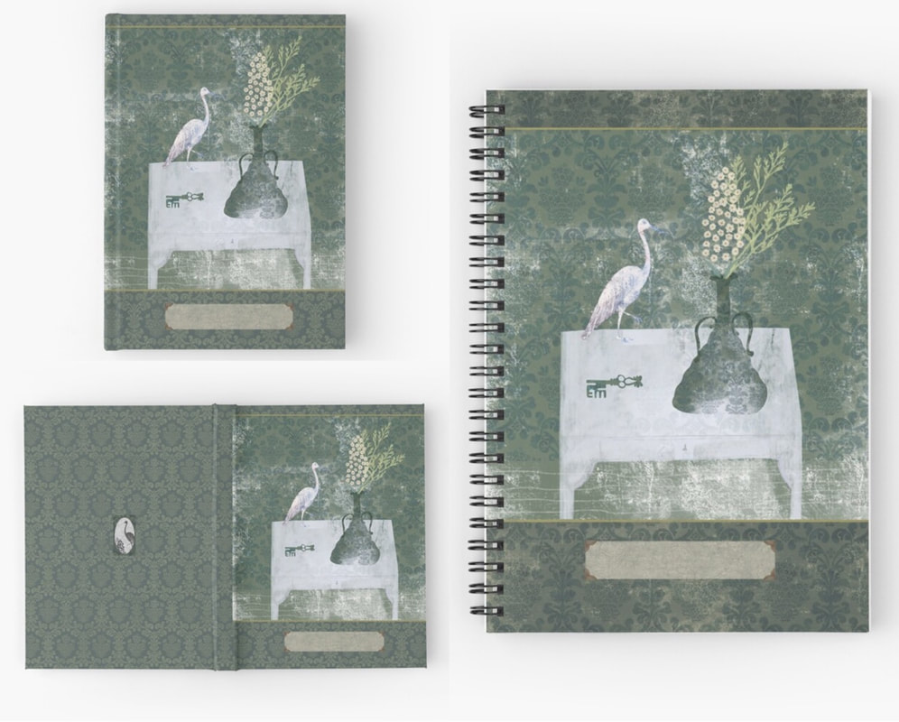 Thanks for visiting, see you next week!
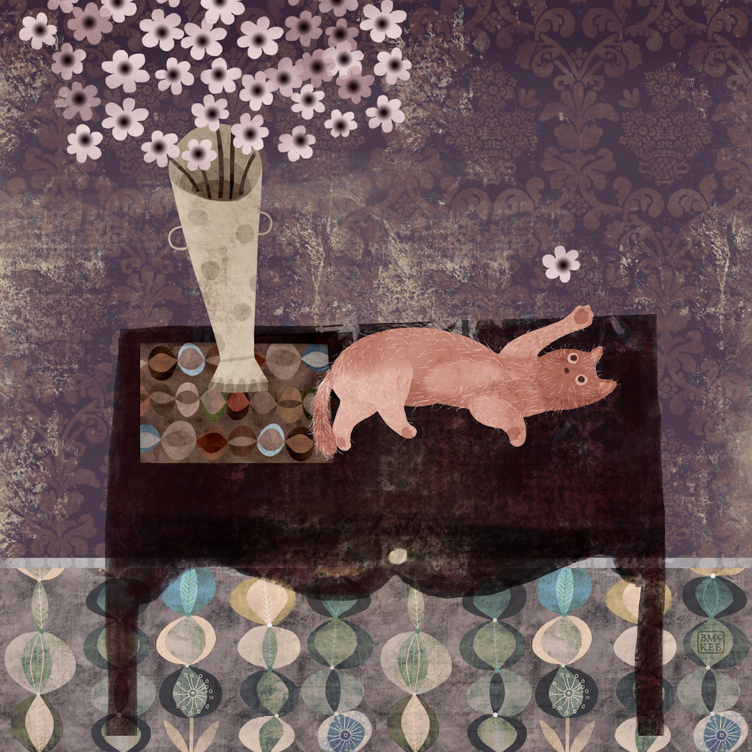 Still on the wall art theme, I made this composition of a naughty moggy on a table for the caturday hashtag on Instagram. I haven't posted a caturday for ages, it's so much fun!
 Instead of just uploading patterns to my Redbubble store, I have been turning my attention to wall art. Below is a rework of one of last year's pieces, and I was so encouraged by how charming it looks framed in my shop I went on to make the new composition above. 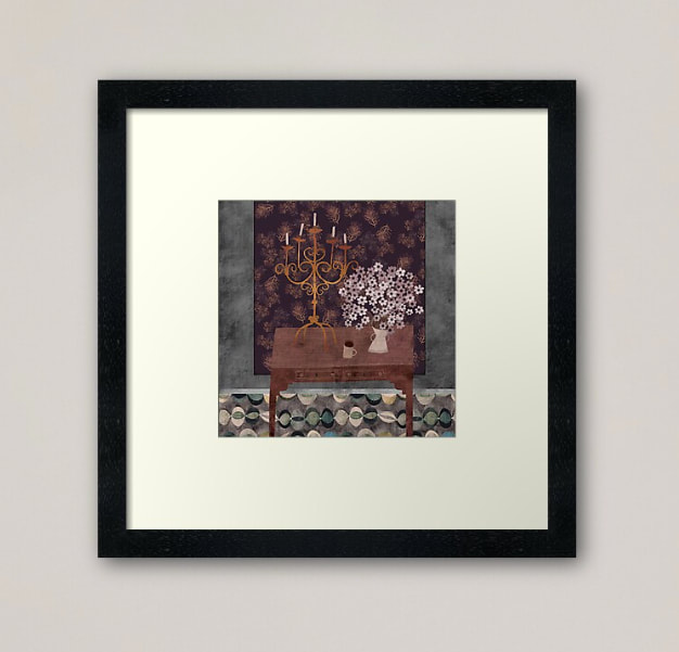 The variety of work and different dimensions certainly makes my Explore Designs page more exciting, taking it away from the strict grid into a naturally staggered flow which is easier on the eye. I have also begun to mix up the designs; I had been uploading patterns in different colourways one after the other so they were grouped together, but I think that looks a bit boring so now I am alternating patterns to work the colours. I discovered that's actually a fresher and enjoyable way to work anyway. 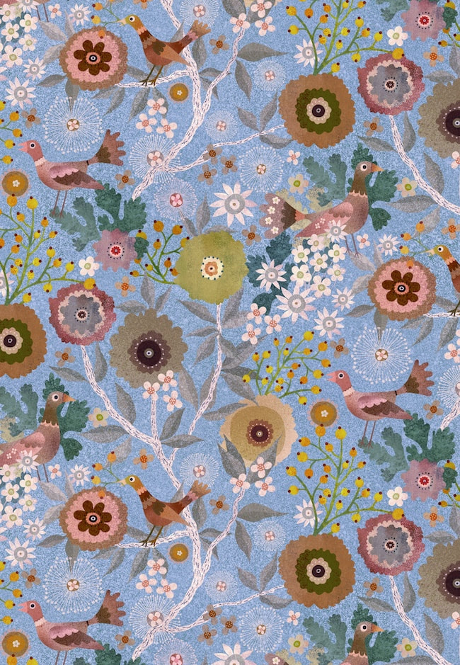 Here's a version from this week, a blue colourway of the birds and berries pattern I have been working on lately, but I also got out the vintage tie daisies pattern plus a few others to put into new colourways. Mixing it all up seems to be really improving the look of my page.
Thanks for visiting, see you next week! 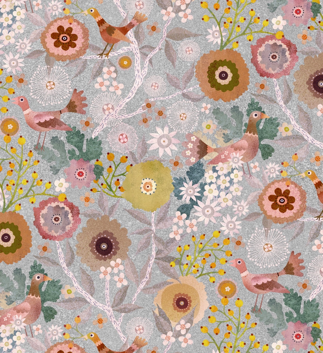 Last week's success reworking Yay Flowers! from 2020 inspired me to rework the Birds and Berries garden pattern I also made last year, but never used. I gave it a quick try on Redbubble at the time, but had concerns about it so I never launched it. Back then I was working by bouncing designs back and forth between iPad and Photoshop and it raised a few issues, such a line of just one pixel going missing etc - a minuscule difference, but enough to fault a good pattern, and although I tested the repeat thoroughly and it seemed fine in the end, I just didn't trust it. I lost Photoshop when my very, very old MacBook finally died, but already had Procreate on iPad and was using that more and more. I won't subscribe to Adobe any more (don't approve, and can't afford it anyway) so nowadays no more Photoshop and I am working exclusively on my iPad Air. No, I don't have the wondrous Procreate 5 because it's only available for iPad Pro (which I also can't afford) but over the last few months I have worked out an idiosyncratic but completely practical way of making good patterns 'by hand', which I really enjoy; I can work in comfort at massively enlarged pixel scale for total accuracy. It's a kind of hybrid of the physical paper method and modern (well, sort of in my case) technology, and it certainly satisfies my inner jigsaw puzzler! So, this week I had the confidence to get out my favourite pattern and rework it. I could only get it to work last year in merged form, solid state with background, so colour variations didn't really work. I rebuilt the pattern tile from scratch with elements I had filed away, and hey presto - colour separations! I love this silvery version (above), the original colourway is shown below. And yes, the pattern is going back onto my Redbubble store to play in all its colourways. 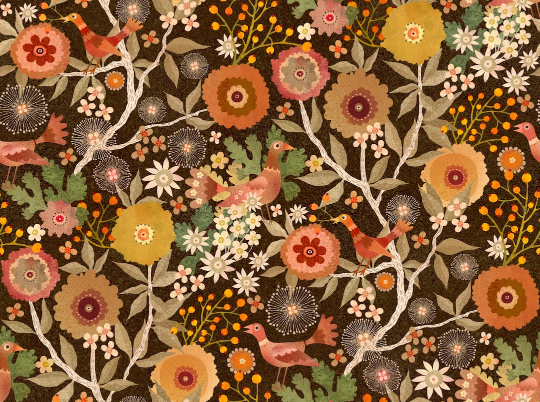 Thanks for visiting, see you next week!
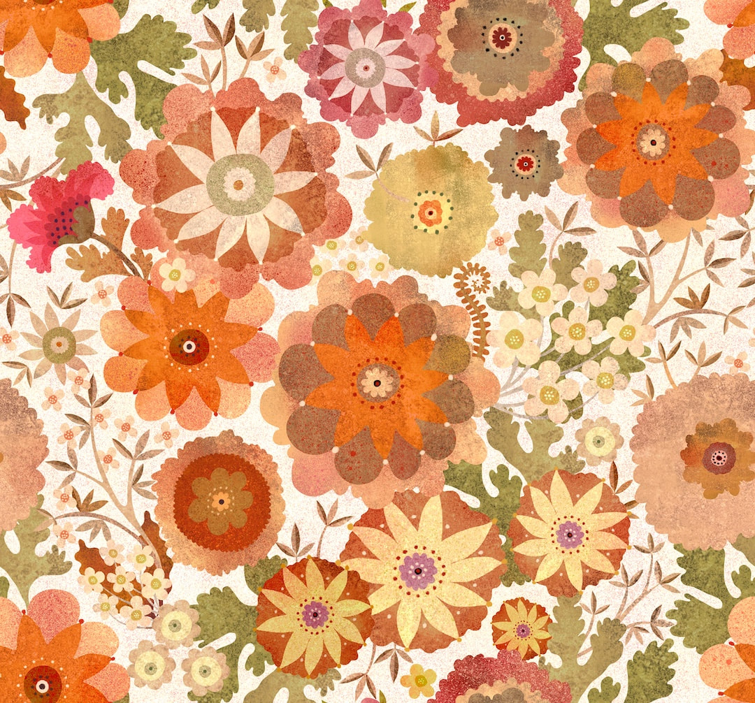 In May last year I made the above pattern which I called Yay Flowers! I only every produced it in one colourway as I was going through a process at the time of making patterns as a whole entity, with everything merged together. I made a new speckled repeating background for the original pattern, pictured above. When I was drafting the idea for the pattern last year, I had produced an initial little composition which I liked a lot, but couldn't figure out how to use it at the time. I thought I would give it a go while I had the various artwork pieces out. I keep the elements of patterns I really like so I can use them again, so I fetched the flower workings, rearranged them, created new stems, leaves, and a couple of new flowers, and colour separated at the same time. Below is a lovely, sombre version of the new pattern in velvety browns. 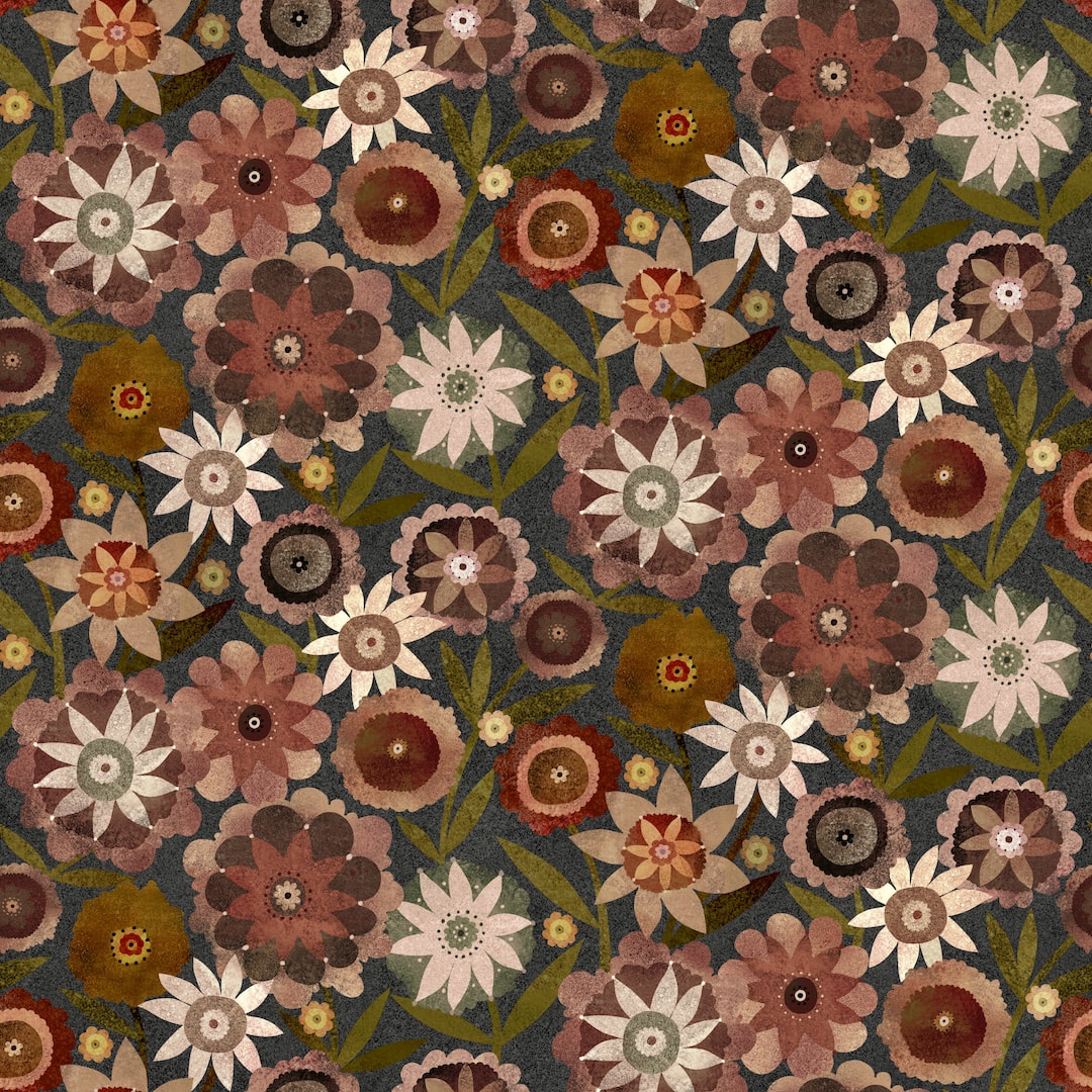 It has been a week of colourways, I also worked a few for last week's British Meadows pattern . I particularly liked this soft blue and lilac version, quite dreamy. 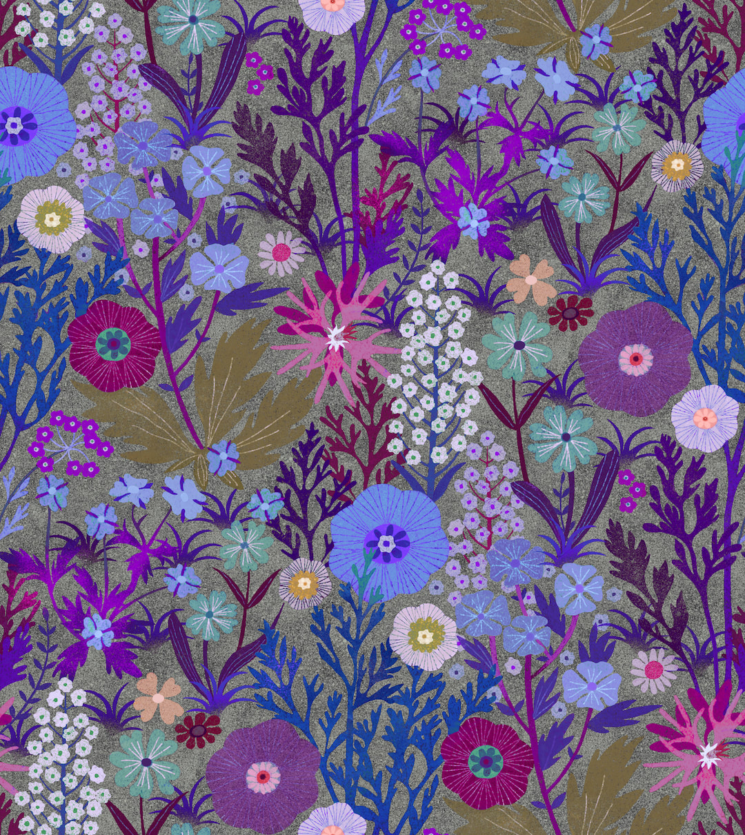 Thanks for visiting, see you next week!
|

~~~~~~~~~~~~~~~~~~~~~~
Welcome to my illustration and patterns blog.
I illustrate under the pen-name of Binky McKee, McKee being my mother's maiden name. Binky was the name of every single cat my great-grandmother kept - allegedly about 40 of them during her 94 years of life. I changed the website address a few months ago, so some older links on previous posts are broken. If you click one of those and it takes you to a strange page, simply replace the .co.uk after the binkymckee. with weebly.com and it will work again. I hope you enjoy your visit! ~~~~~~~~~~~~~~~~~~~~~~
~~~~~~~~~~~~~~~~~~~~~~
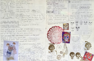
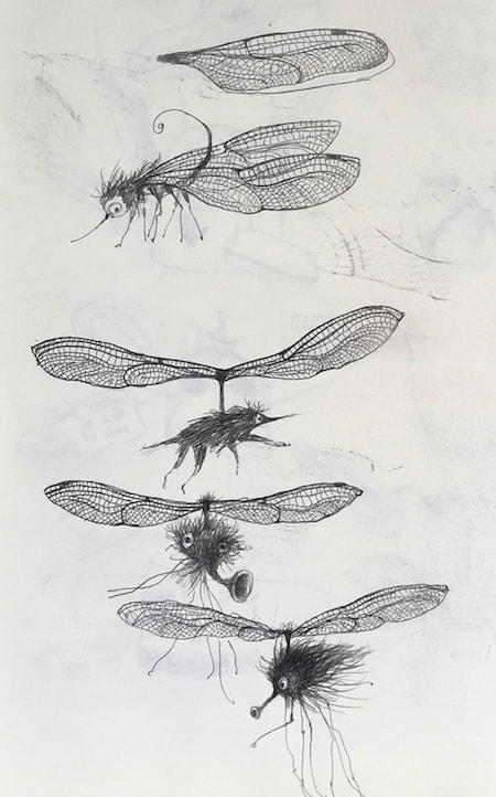
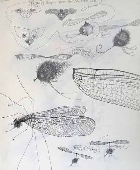
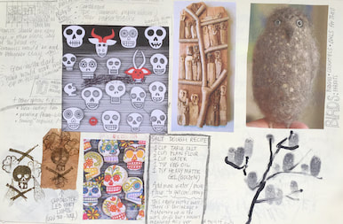
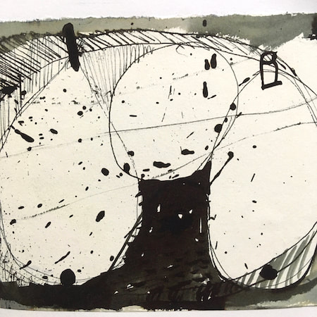
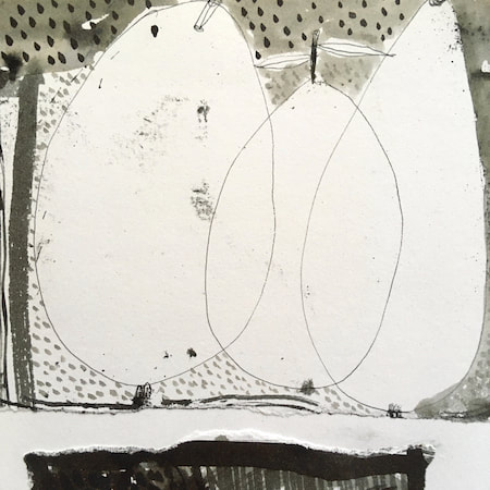
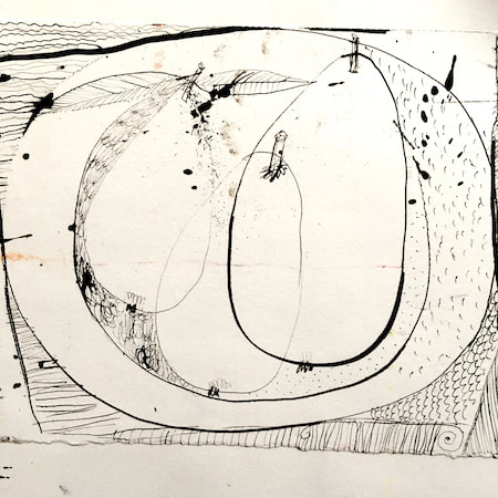
I keep lots of scrapbooks and sketchbooks where I develop ideas and design little creatures. Here's a peek inside one ...

~~~~~~~~~~~~~~~~~~~~~~
~~~~~~~~~~~~~~~~~~~~~~
As you may know, I am also known as Heather Eliza Walker.
Click the image if you would like to find out more and visit my other website. ~~~~~~~~~~~~~~~~~~~~~~ ~~~~~~~~~~~~~~~~~~~~~
~~~~~~~~~~~~~~~~~~~~
April 2024
~~~~~~~~~~~~~~~~~~~~~~
~~~~~~~~~~~~~~~~~~
All
~~~~~~~~~~~~~~~~~~~~~~
~~~~~~~~~~~~~~~~~~~~~~
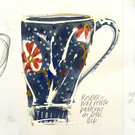
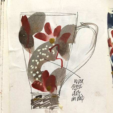
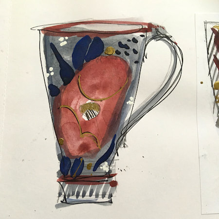
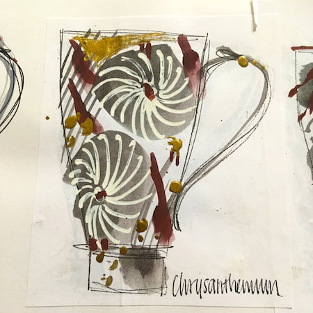
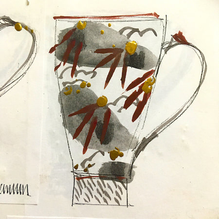
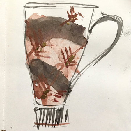
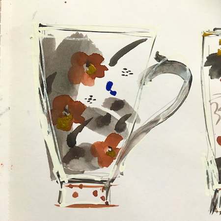
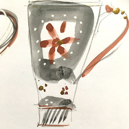
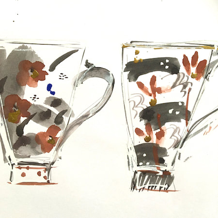
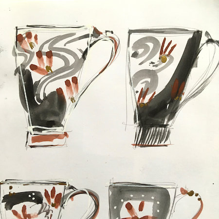
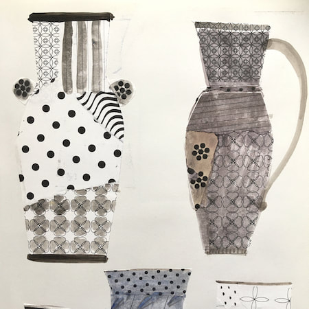
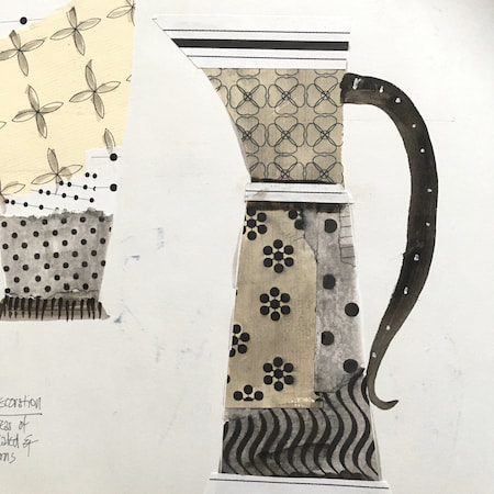
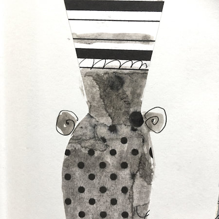
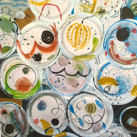
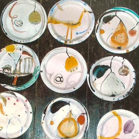
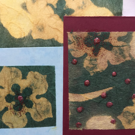
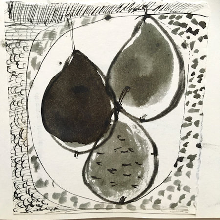
This time, take a peek into my ceramic design sketchbook. I actually made some of the mugs, but I kind of prefer the drawings! The plate designs are painted on paper plates, a most liberating process.
~~~~~~~~~~~~~~~~~~~~~~
~~~~~~~~~~~~~~~~~~~~~~
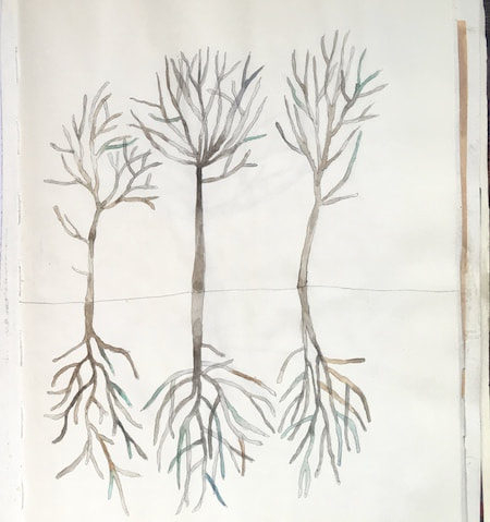
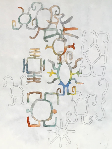
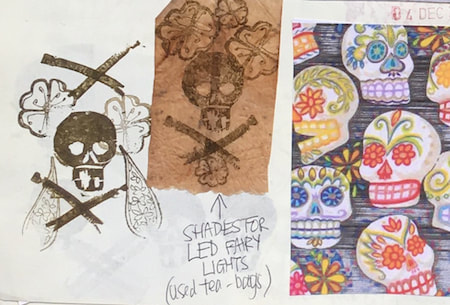
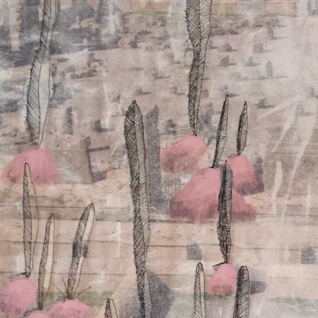
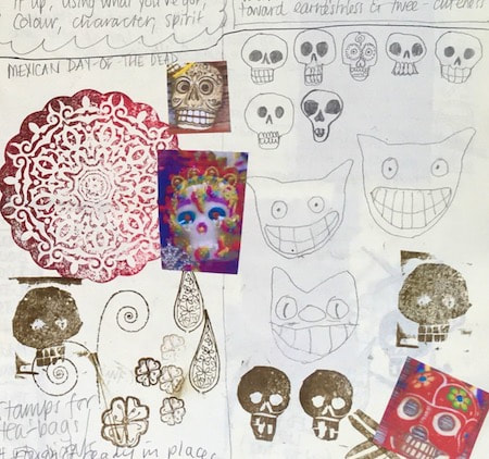
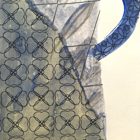
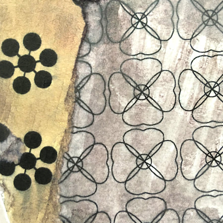
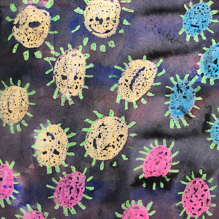
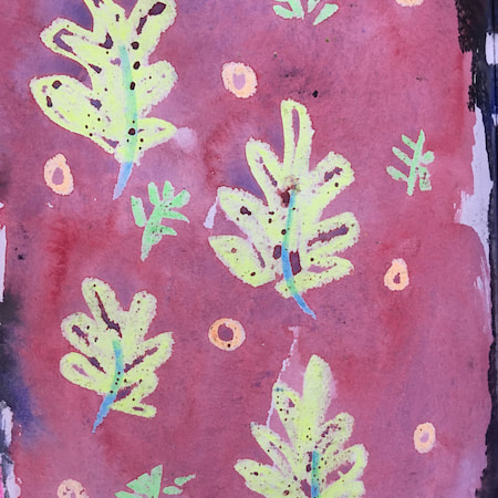
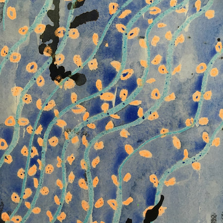
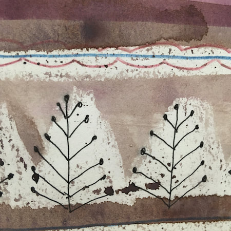
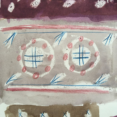
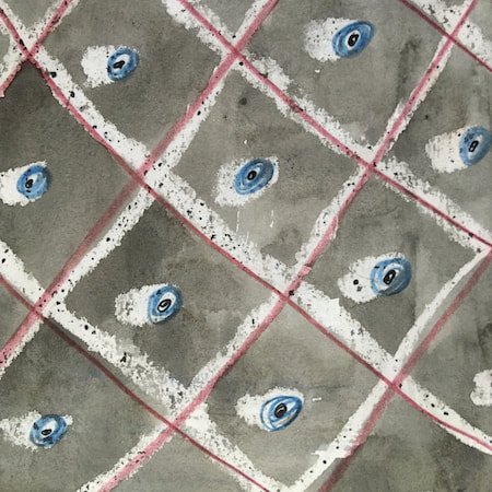
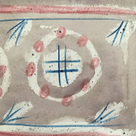
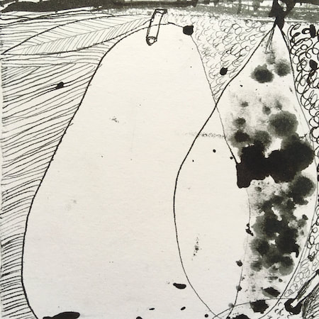
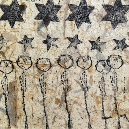
These watercolours are from my pattern sketchbook. I used coloured wax crayons to resist the washes of watercolour, also home-made rubber stamps dipped in bleach then printed on crêpe paper - the bleach takes out the paper dyes.
~~~~~~~~~~~~~~~~~~~~~~
~~~~~~~~~~~~~~~~~~~~~~
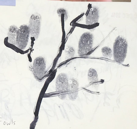
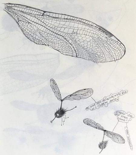
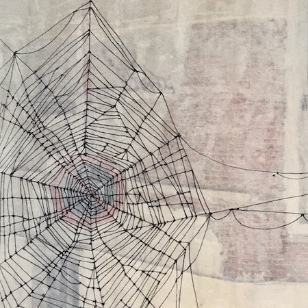
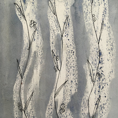
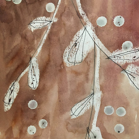
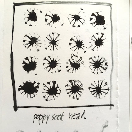
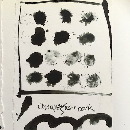
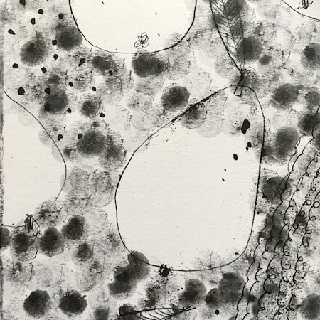
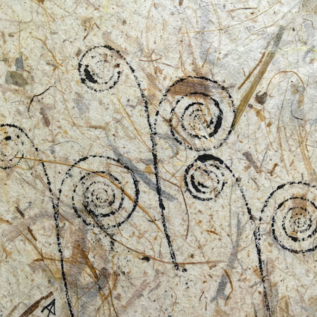
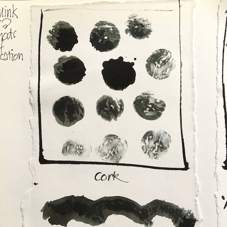
A sketchbook I used for mark-making with unusual objects - corks, seed-heads, feathers, home-made rubber stamps, my fingers and lots of flicky things ...
|
 RSS Feed
