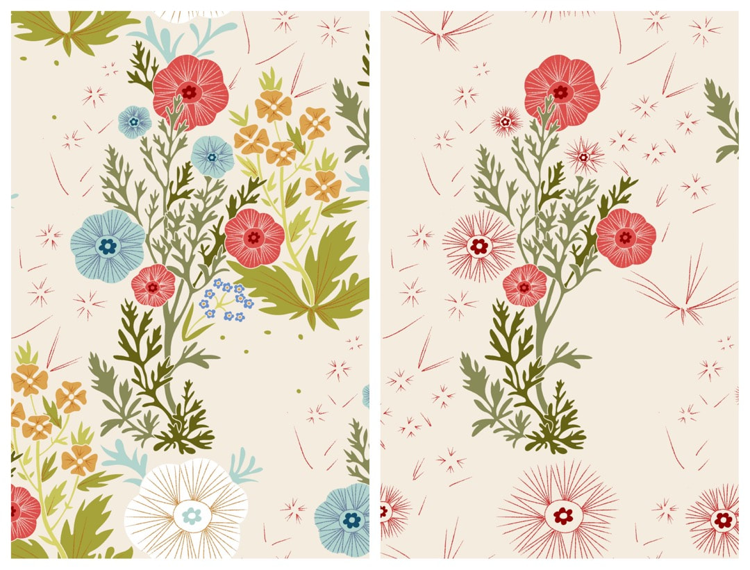
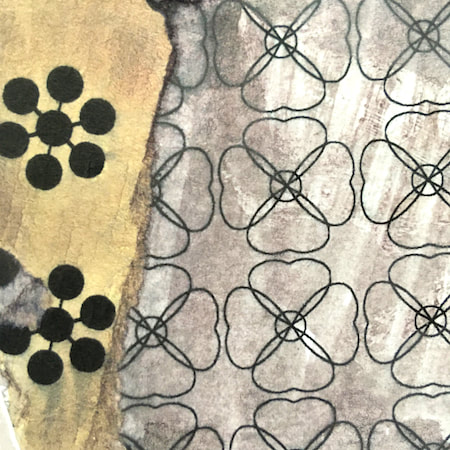
 The outline tile for this floral pattern is now finished, so I began working on colour experiments. These progress shots with lots of surrounding space are very pleasing to the eye. As well as trying out different colour fills, I experimented with using coloured outlines, giving a different cast to the hues of the pattern. I also made the outline disappear altogether by colouring it the same as the background, as can be seen in the image above. As always at this stage lots of new ideas popped up along the way, alongside quite a bit of troubleshooting - I found missing parts of line, things overlapping where they shouldn't and a few other of the usual suspects to amend. 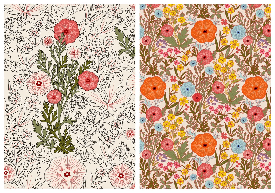 For example, as I started colouring in the outline drawing above, I noticed the leaf to the right of the coloured section was overlapping the large poppy just visible on the right edge, which made no spacial sense; the big poppy shouldn't be behind the plant next to it, which is already behind the coloured group. It halted the graceful upwards direction of the pattern, so I amended the drawing by neatly tucking the leaf in. The change can be seen to the left of the big orange poppy - now it's in a happy space and flowing nicely. 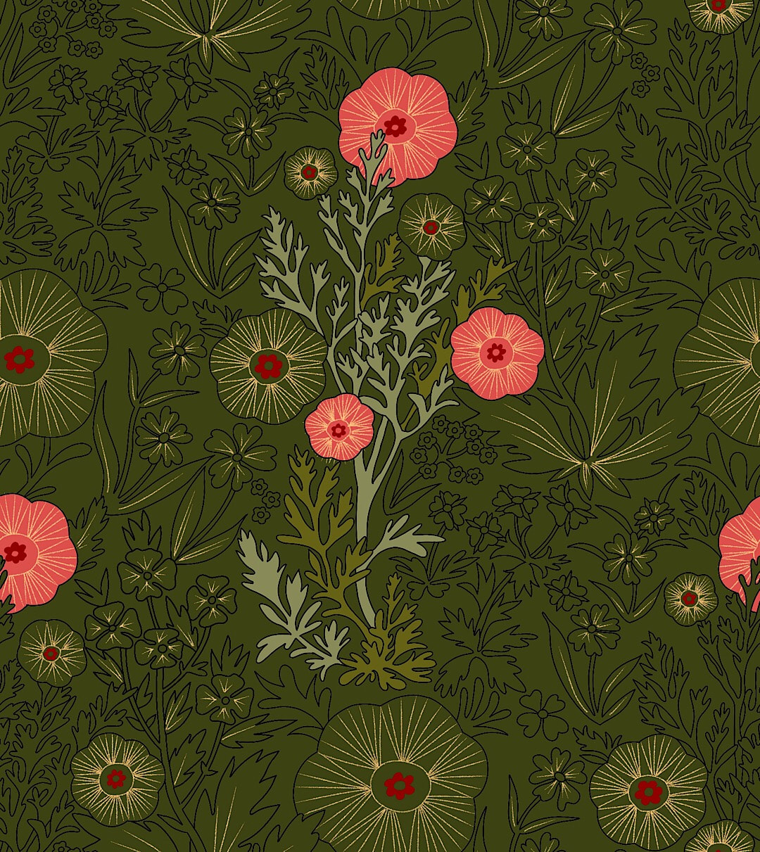 I loved this quiet William Morris-type colour scheme against the dark green background. I saved this progress shot while playing around and will keep the idea for later. 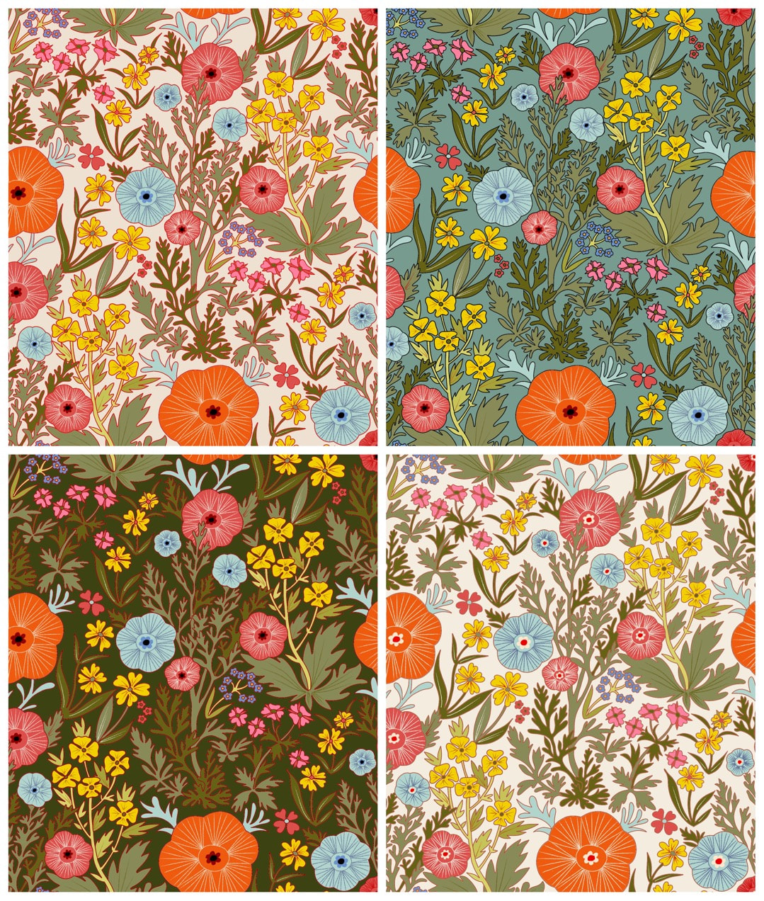 It probably doesn't look like it here, but these versions are very rough and ready and are definitely just sketches. I changed my mind about the colours so many times I exhausted the outlines with too many colour drops, and there are accidental ticks and smudges all over from too much handling, but after a few more colour tweaks I will have the references to make some lovely clean patterns.
Thanks for visiting, see you next week! 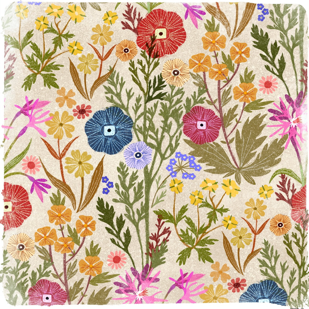 Collage sketch for pattern design in Procreate, 2021 I began work tracing this favourite pattern sketch in March. I put it to one side for a while and picked it up again this week, got a bit obsessed with it, and have probably spent way too much time on it by now! It looks really pretty as a sketch, but presented a few unexpected problems when I put my new outline drawing into repeat. First, there was a pronounced vertical caused by the pink ragged-robin flower directly underneath the main poppies element running into each other; also, the leaf and bud section belonging to it was clumsy. The pattern was overcrowded and needed more flow and space, so the ragged-robin, much as I loved it, was the first to go. 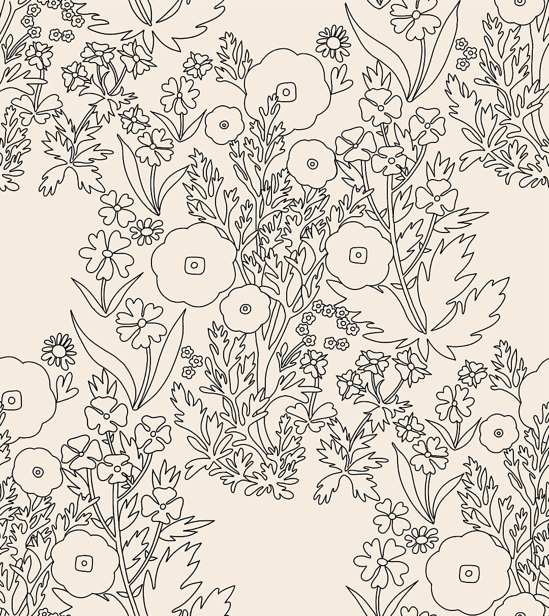 Introducing a curve in the main poppy stem and removal of element to correct rigid vertical Now there was that awkward extra space to be filled with another element. I came up with these two ideas:  New dock and poppy elements - I went for the poppy in the end 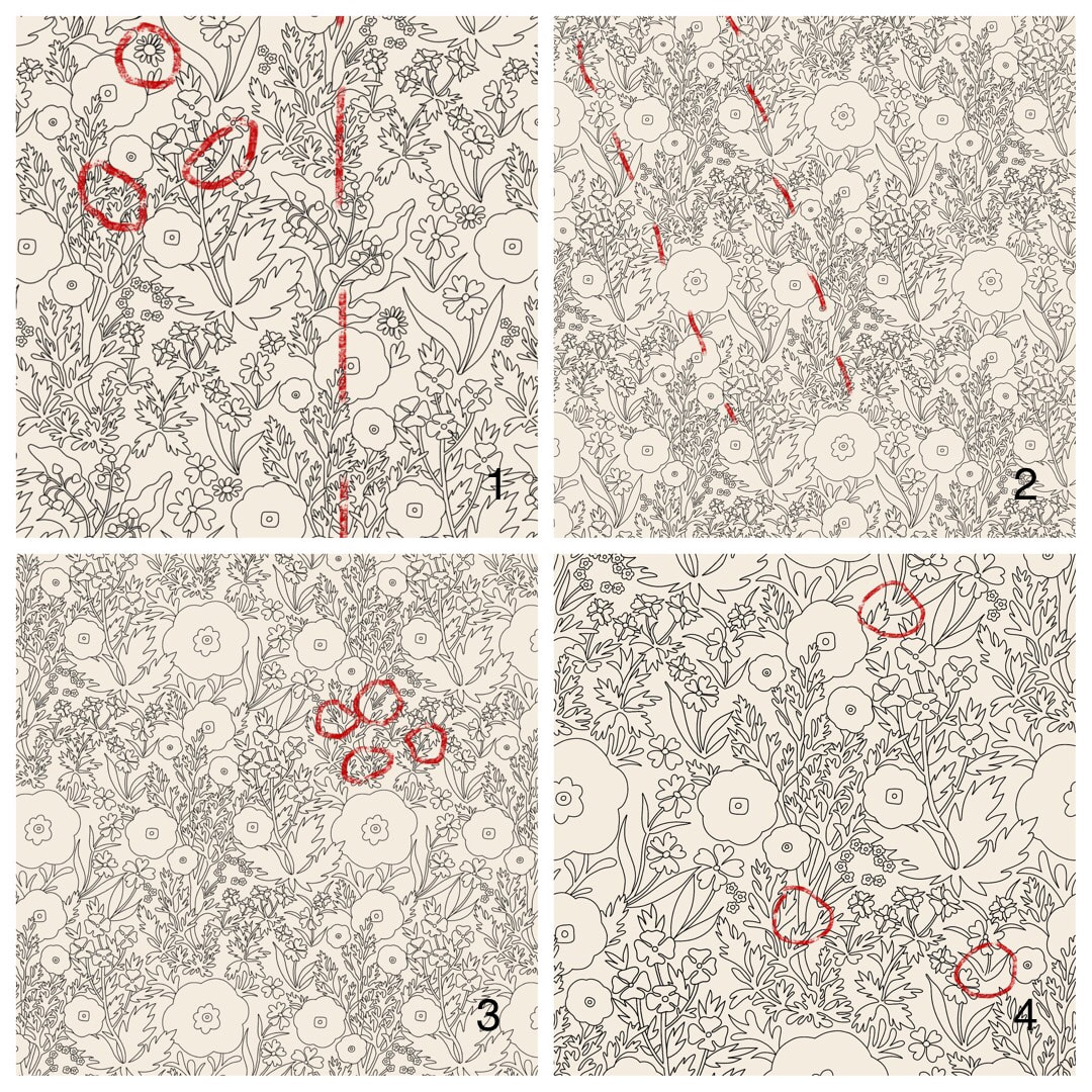 More challenges presented themselves on the way, the kind I enjoy digging away at to get a pattern to work. These are the four last stages before reaching the final design:
1. The dock plant element, as well as not being as simple as I wanted for the fill, presented another unwanted vertical; also marked here for amendment are daisy elements whose style didn't match the overall look, and some line clustering like ink blots to be cleaned up. 2. Switched to the simpler poppy element, but eek! Now I have an unwanted strong diagonal from one of the other elements. 3. I flipped and refitted the offending element to disrupt the diagonal and improve the overall flow; I wanted to suggest a relaxed meadow ruffled by gentle breezes rather than a countryside march! In addition I found three more 'ink-fill' areas to simplify. 4. The final stage, indicating areas for further decluttering to clarify the line. So, there we have it; the outline pattern now fits well and is flowing nicely. The next step is to try colouring it, and see how it looks after that. Thanks for visiting, see you next week! 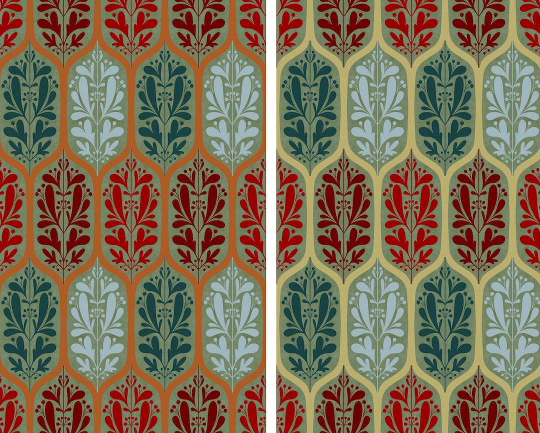 Because I don't have any automated tools to produce the geometry for a true ogee repeat, I had to devise all sorts of tricks to make templates and guides for these patterns. I managed to get the spacing perfectly even between the long ogees above by making a 'pixel counter': Procreate's crayon brush has a good texture, so a boldly-coloured block of that exposes the pixels clearly when zoomed up close. I moved the block around the initial pattern tile to measure the distance between components. I also made good use of Procreate's built in accurate click-to facility, and the canvas crop function. The image below shows the assisted quadrant rotational drawing function at work over a home-made guide which looks like a windmill. 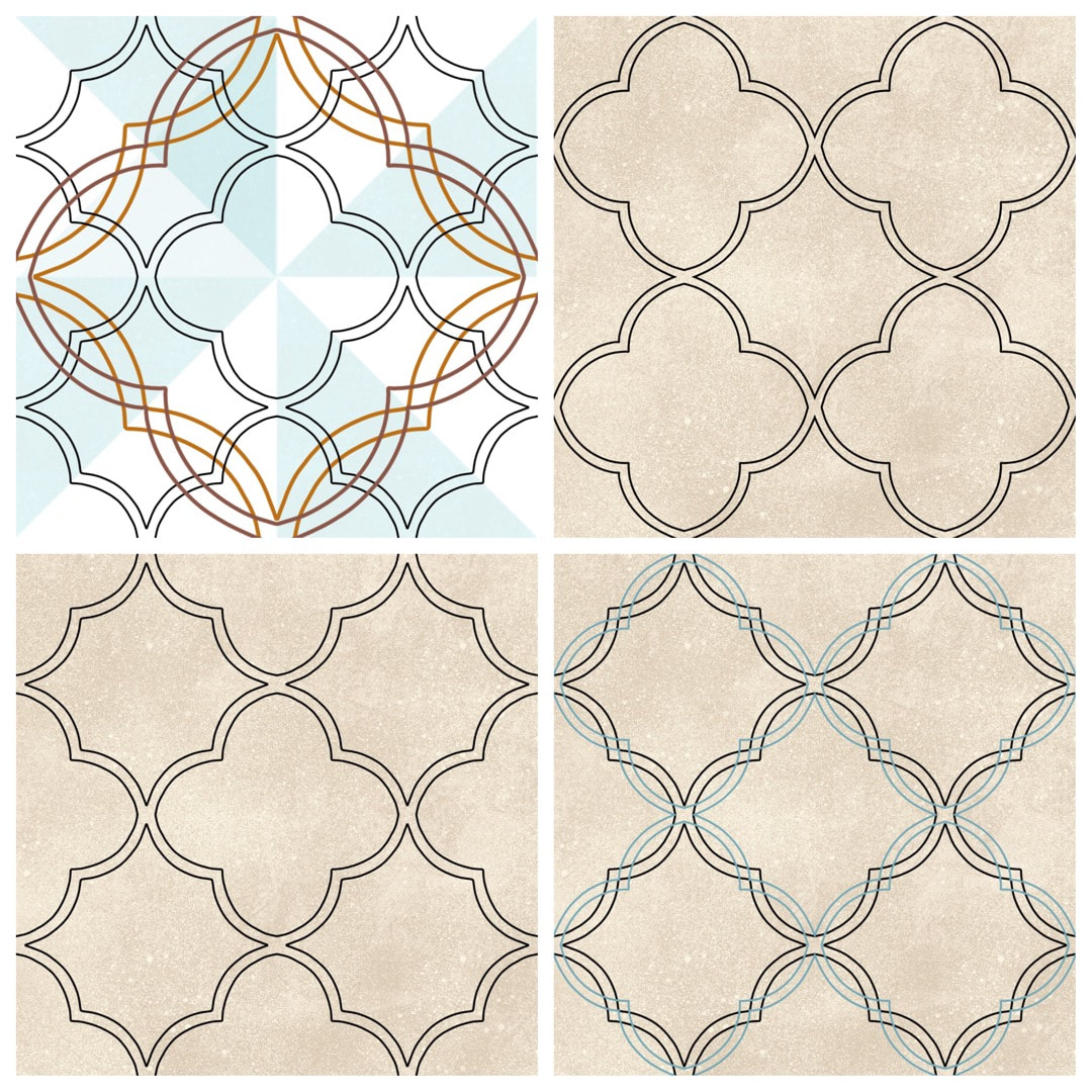 In addition, the ellipse tool is a bit too random to create perfect circles to use as guides for drawing S shapes, but I got around that by using the vignette frame tool in AfterLight on a plain square canvas. I did 'cut out' the circle very carefully so I could manipulate it, but just the plain flat image AfterLight provided is a good guide tool. Below is the result: an elegant, flowing line which creates a true ogee pattern, very pleasing to the eye. 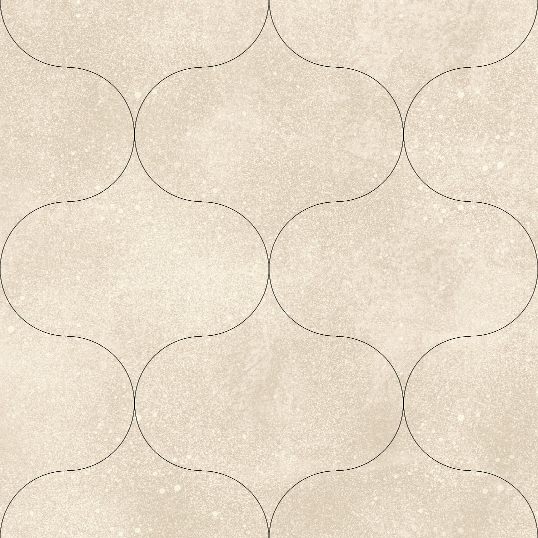 I actually love this kind of problem-solving and inventing new methods, all based on how these patterns would be made by hand using curved templates, compasses, rulers and tracing paper. I have shared more images of these 'tools' here on my Heather Eliza journal.
Thanks for visiting, see you next week! 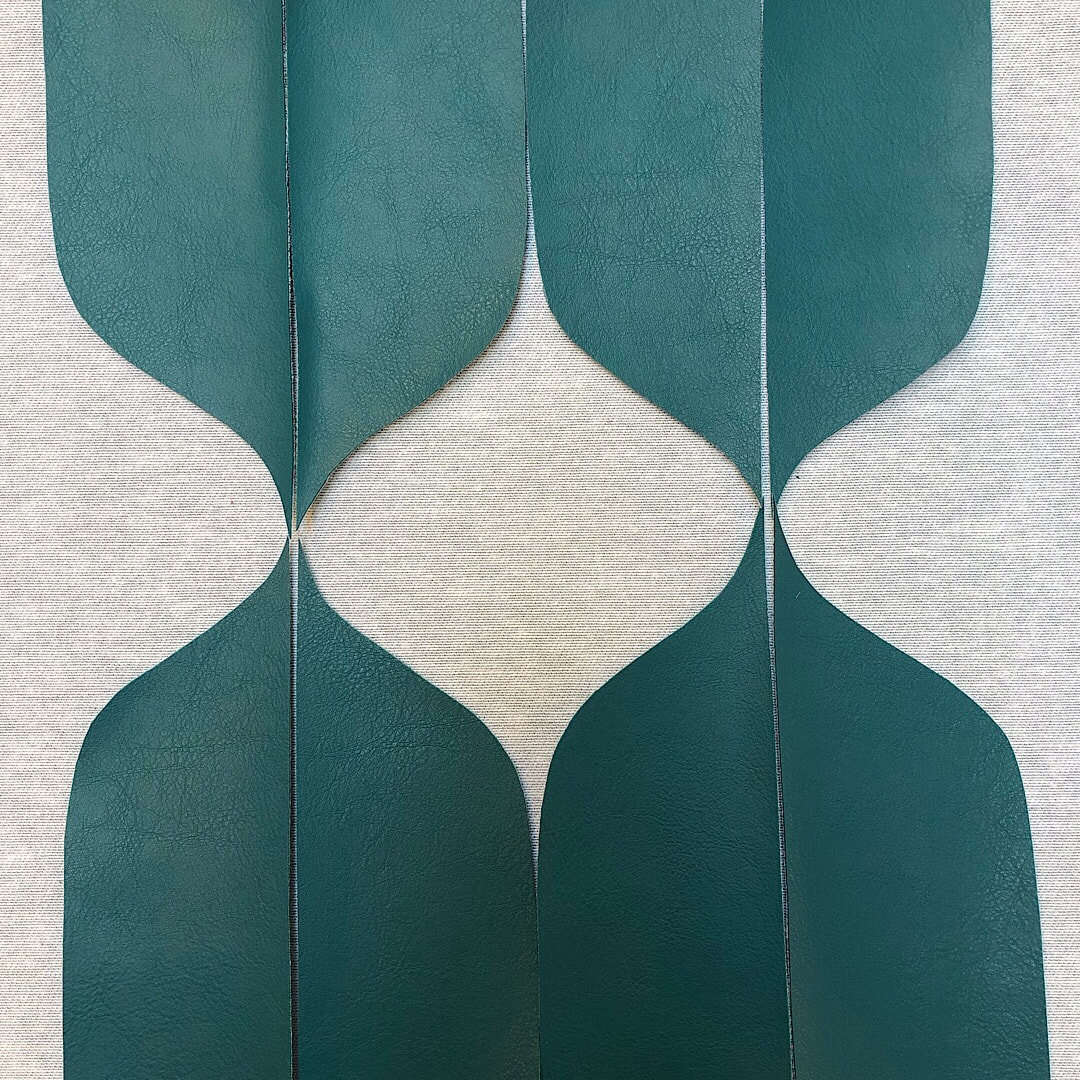 Inspiration comes from unexpected places: the lovely curves pictured above are pieces of vinyl fabric left over after cutting out panels to recover a set of chairs at work. They were tossed to one side to be discarded, but not before I spotted the potential for an ogee style pattern! I quickly laid them out and snapped a quick pic for reference before they were swept away. 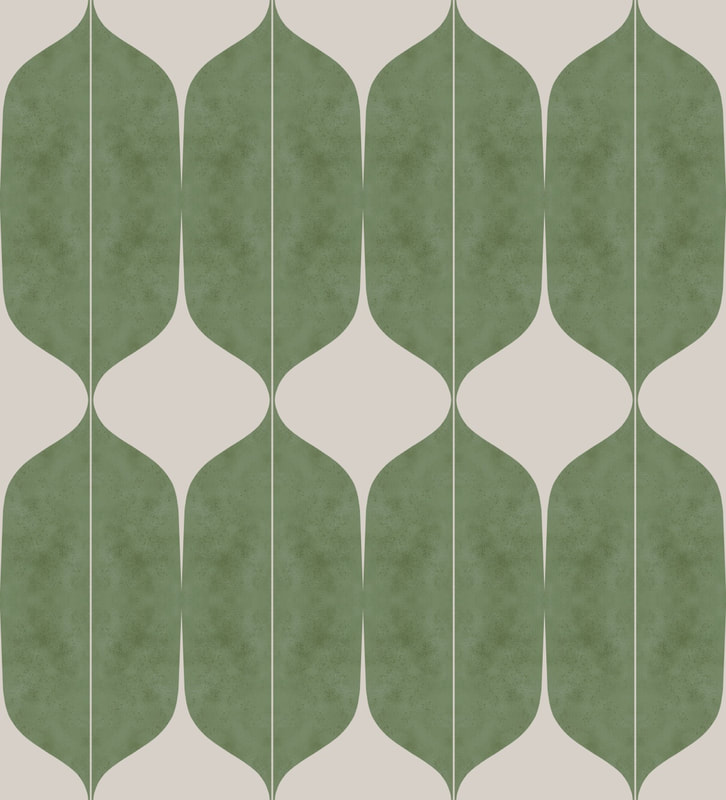 A few days later I started playing about with a few ideas for making patterns. I cut one curved motif in Procreate based on the vinyl scraps; above is an initial blocking together to see how it flows. I began assembling elements for a repeat tile, and as always I was fascinated by the forms produced at each step of the process. They make a srtiking collage when collected together. 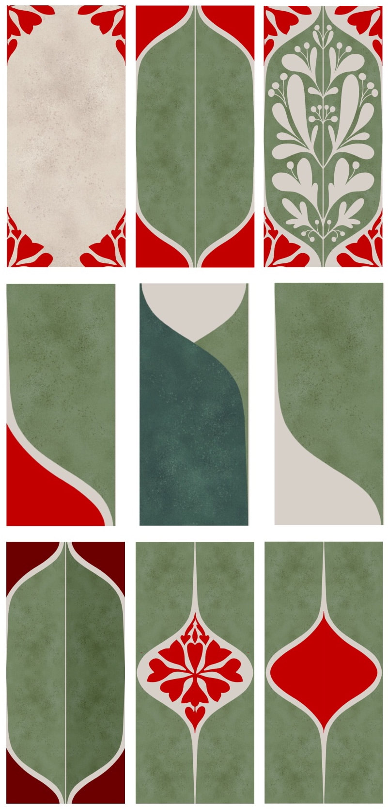 There are a few different ideas here for a variety of elongated ogee-style patterns. I also began working on a true ogee pattern of flowing identical elements, as yet unfinished.
This all started me wondering where the word ogee comes from; an exquisite old Persian term, perhaps? Or is it a spelling of the initials 'OG', standing for something? Maybe a French Moroccan word? and so my musings went on. After a little research I found this completely unexpected answer, which could even be Scottish, and local to me! "While the origins of the word ogee are uncertain, it was first used in the whisky distilling industry. It refers to a bulbous chamber which makes up part of a traditional pot still. The ogee sits on top of the distilling pot and, as the liquid heats up, it creates a larger surface area for the vapours to land on." - www.handmadekitchens.co.uk Well I never! Maybe 'OG' really does stands for something like 'Old Gertie' and just became a word after all. I know the vats are often given affectionate names in the distilleries ... Thanks for visiting, see you next week! |

~~~~~~~~~~~~~~~~~~~~~~
Welcome to my illustration and patterns blog.
I illustrate under the pen-name of Binky McKee, McKee being my mother's maiden name. Binky was the name of every single cat my great-grandmother kept - allegedly about 40 of them during her 94 years of life. I changed the website address a few months ago, so some older links on previous posts are broken. If you click one of those and it takes you to a strange page, simply replace the .co.uk after the binkymckee. with weebly.com and it will work again. I hope you enjoy your visit! ~~~~~~~~~~~~~~~~~~~~~~
~~~~~~~~~~~~~~~~~~~~~~
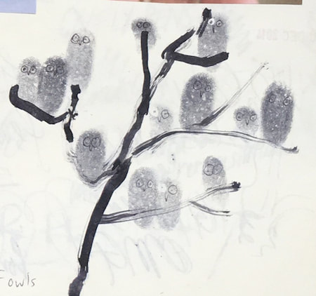
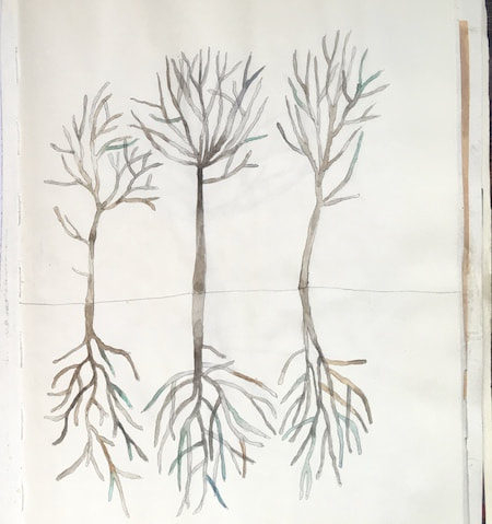
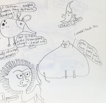
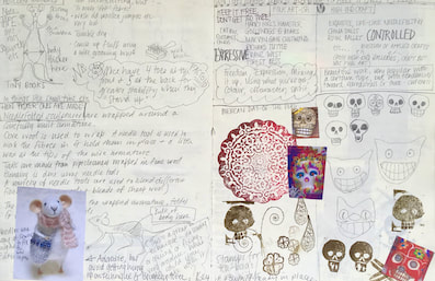
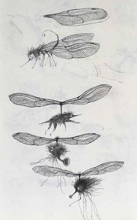
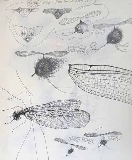
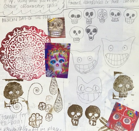
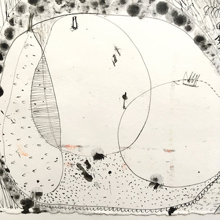
I keep lots of scrapbooks and sketchbooks where I develop ideas and design little creatures. Here's a peek inside one ...

~~~~~~~~~~~~~~~~~~~~~~
~~~~~~~~~~~~~~~~~~~~~~
As you may know, I am also known as Heather Eliza Walker.
Click the image if you would like to find out more and visit my other website. ~~~~~~~~~~~~~~~~~~~~~~ ~~~~~~~~~~~~~~~~~~~~~
~~~~~~~~~~~~~~~~~~~~
April 2024
~~~~~~~~~~~~~~~~~~~~~~
~~~~~~~~~~~~~~~~~~
All
~~~~~~~~~~~~~~~~~~~~~~
~~~~~~~~~~~~~~~~~~~~~~
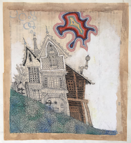
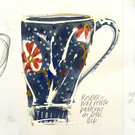
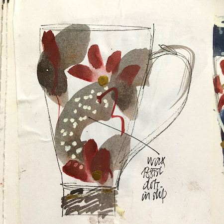
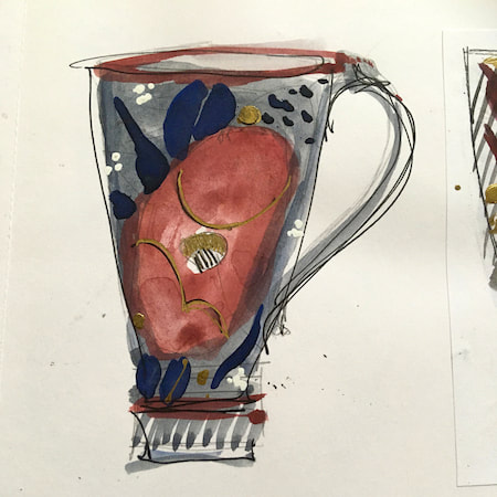
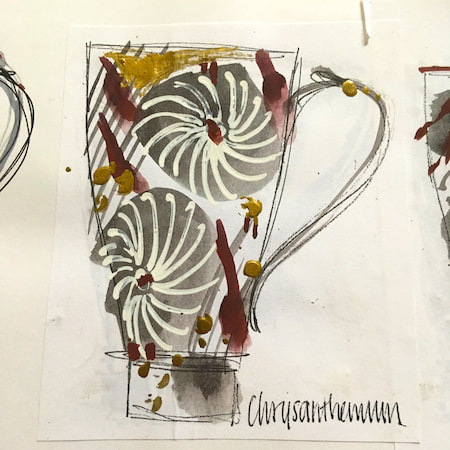
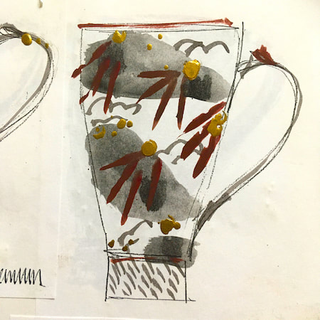
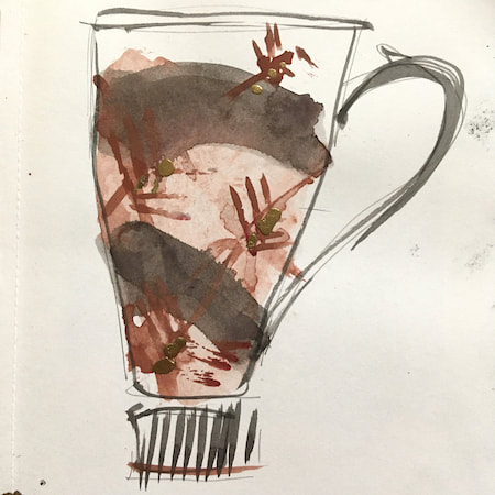
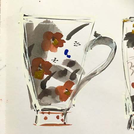
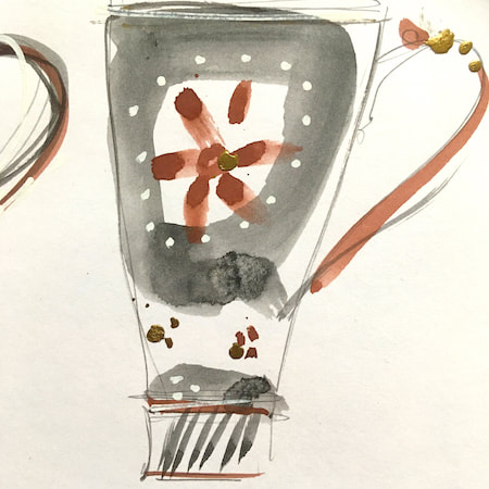
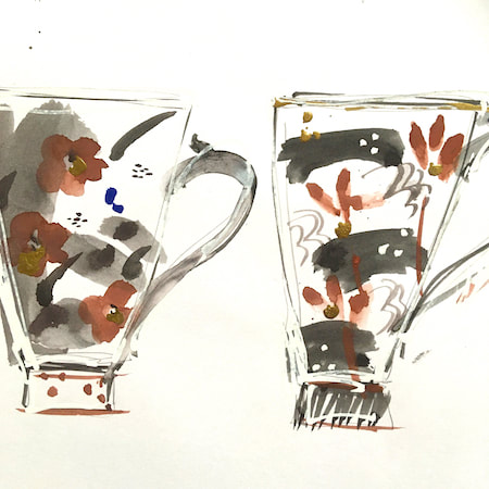
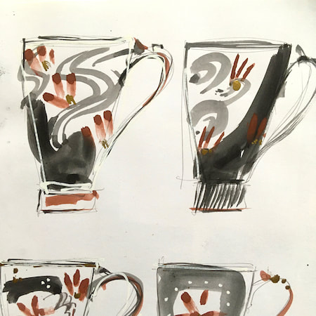
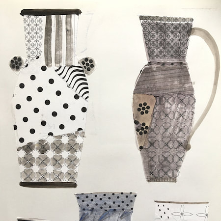
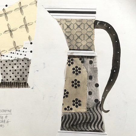
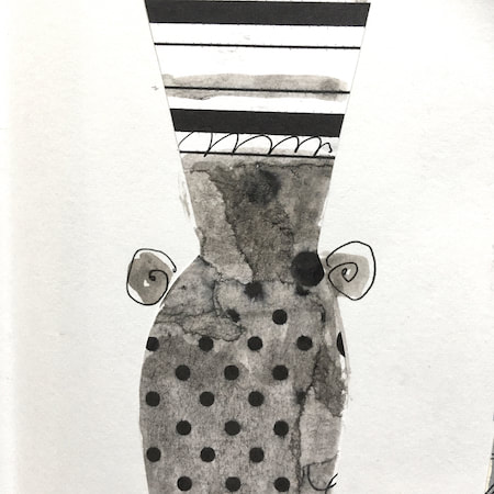
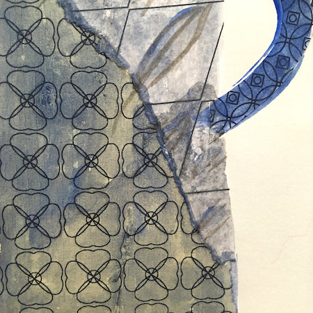
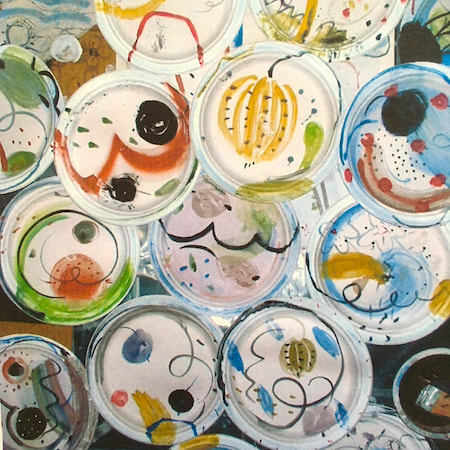
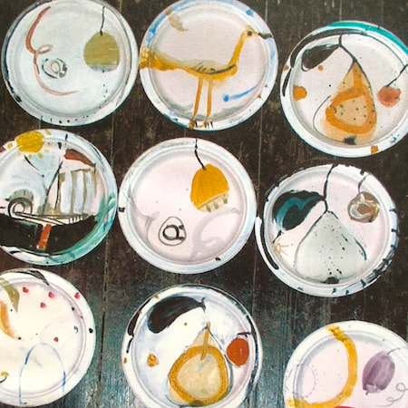
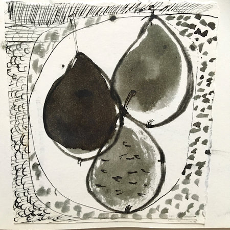
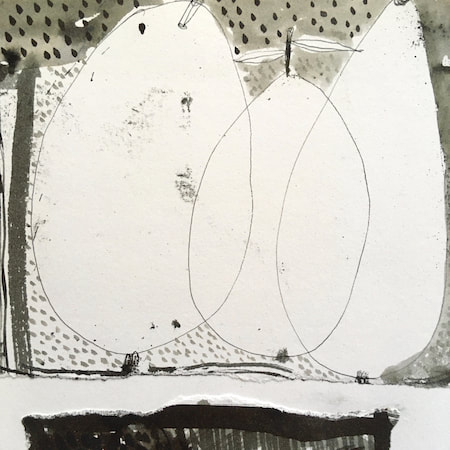
This time, take a peek into my ceramic design sketchbook. I actually made some of the mugs, but I kind of prefer the drawings! The plate designs are painted on paper plates, a most liberating process.
~~~~~~~~~~~~~~~~~~~~~~
~~~~~~~~~~~~~~~~~~~~~~
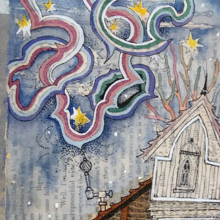
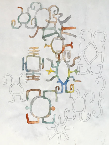
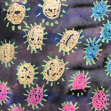
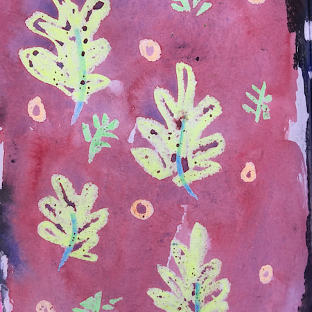
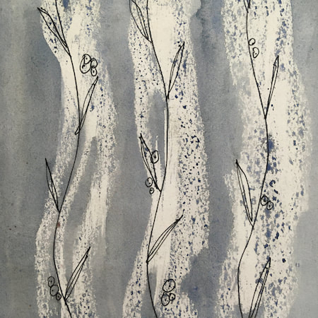
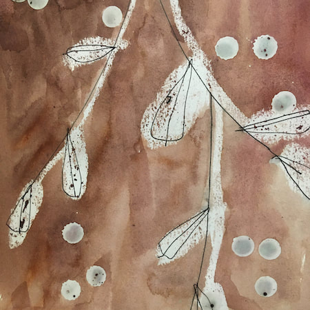
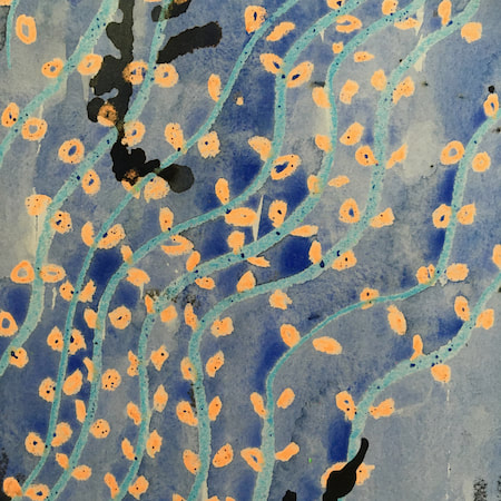
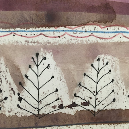
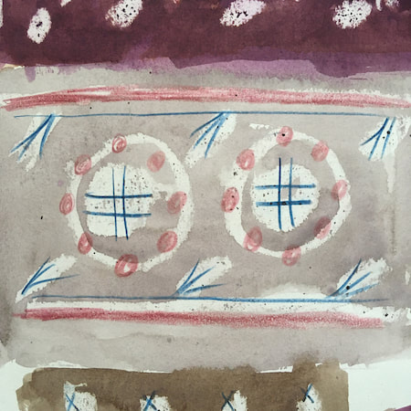
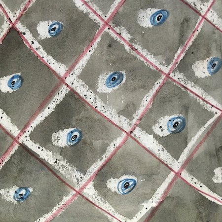
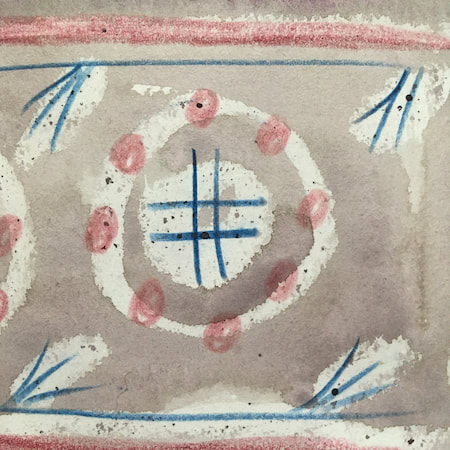
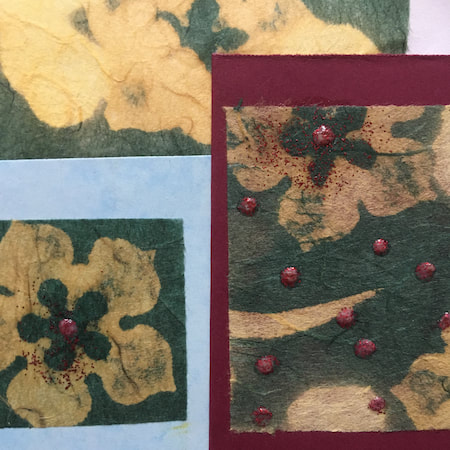
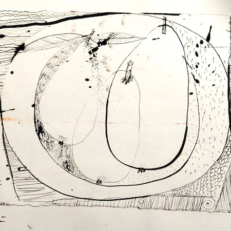
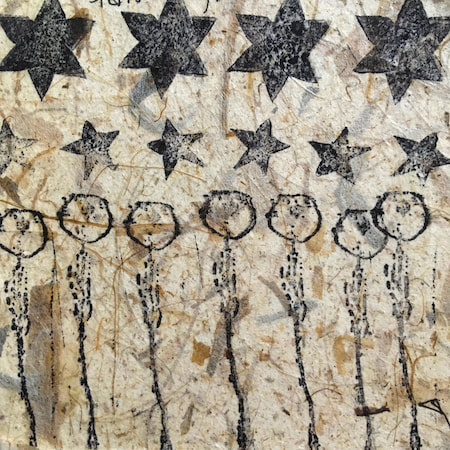
These watercolours are from my pattern sketchbook. I used coloured wax crayons to resist the washes of watercolour, also home-made rubber stamps dipped in bleach then printed on crêpe paper - the bleach takes out the paper dyes.
~~~~~~~~~~~~~~~~~~~~~~
~~~~~~~~~~~~~~~~~~~~~~
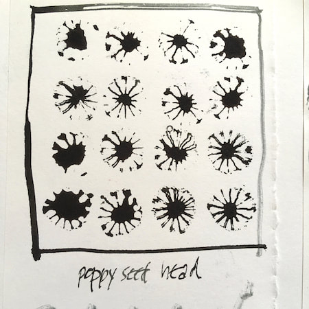
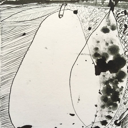
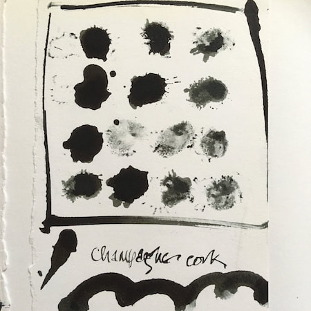
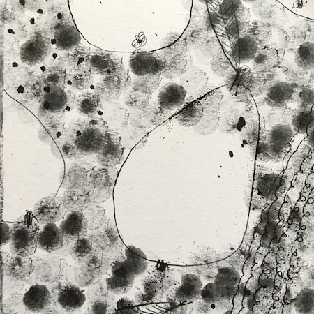
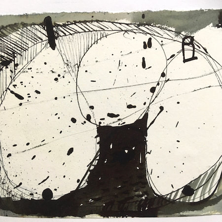
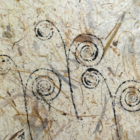
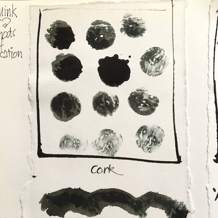
A sketchbook I used for mark-making with unusual objects - corks, seed-heads, feathers, home-made rubber stamps, my fingers and lots of flicky things ...
|
 RSS Feed
