 Replacing the flower circled in white (pictured below) improved the dynamics of this pattern. The first version works well, but I feel the new version above is more lively. I am aware of the fact that I always tend to default to a full-frontal view of flowers - all you have to do is click the floral tab for evidence of this habit. 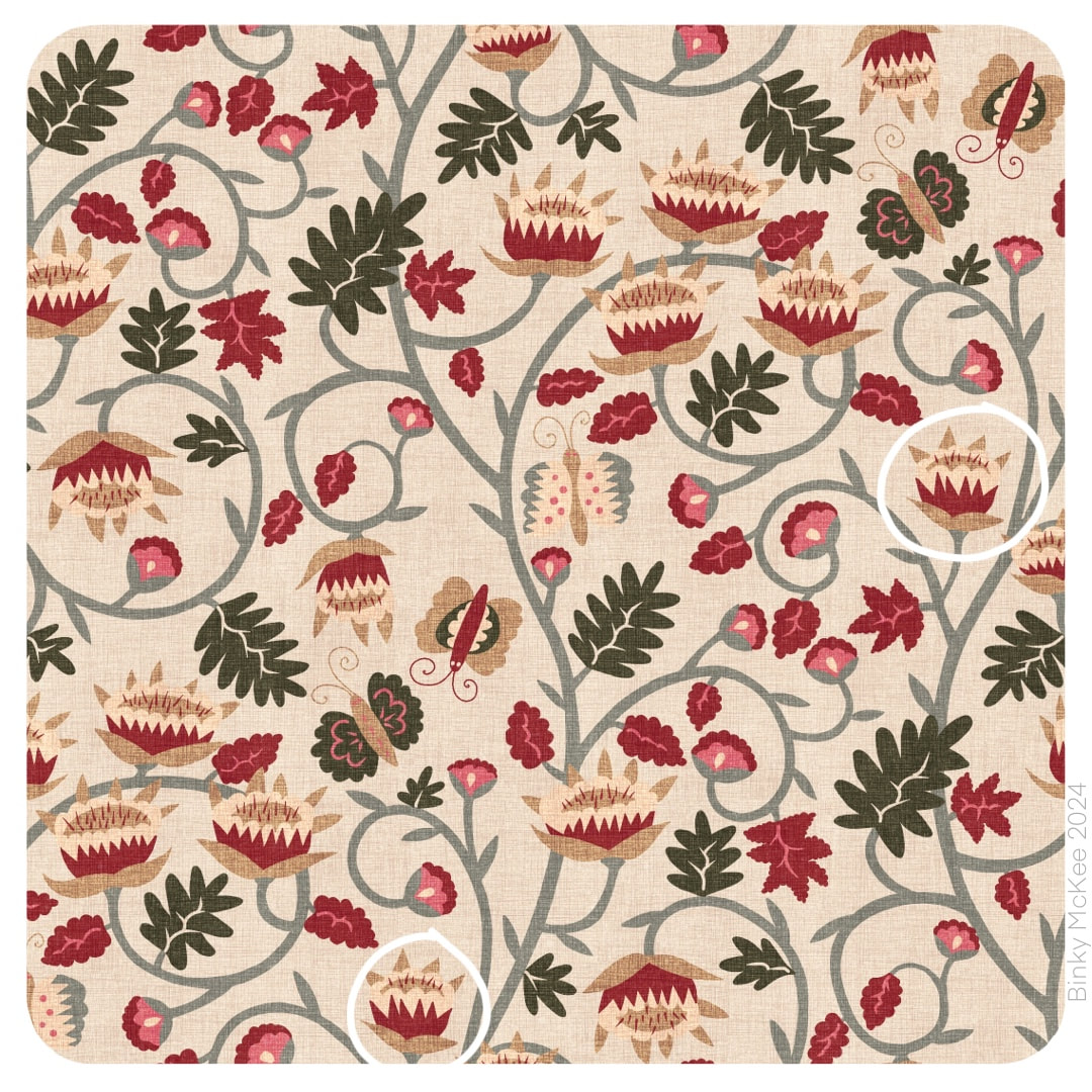 My absolute firm favourites of the patterns I have designed so far contain the simple, full frontal approach (see blossoms here for example). I love the honest cheer it brings, but working on this pattern makes me feel I should try to investigate some different aspects of flowers and maybe mix things up a little more.
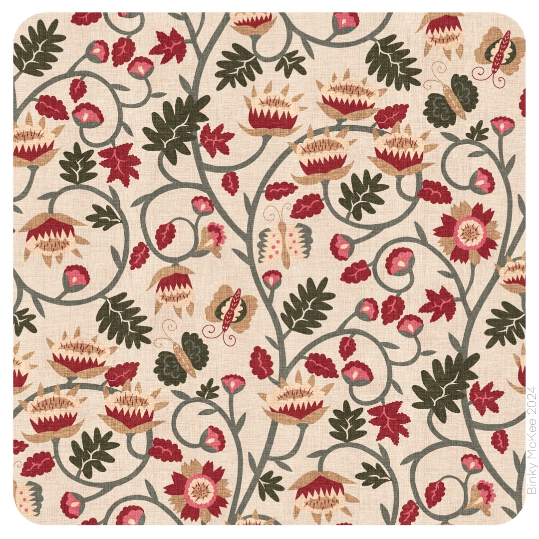
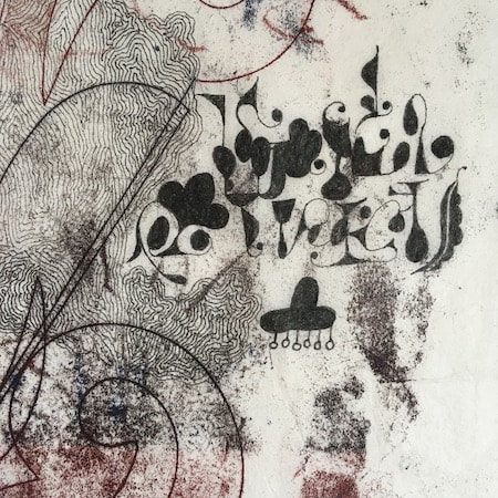
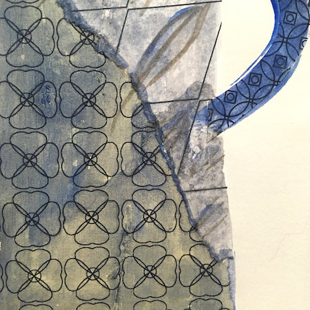
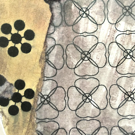
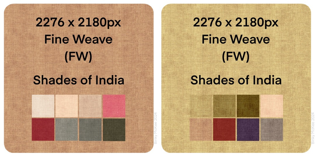 I spent some time this week on making some linen textures for the new Voynich/Jacobean inspired pattern. It's coming along pretty well, the two images below show progress following on from the work in last week's post. Because the pattern suggests Indian block-print patterns to my mind (and I adore Indian textiles) I went for a natural dye feel in the palettes. 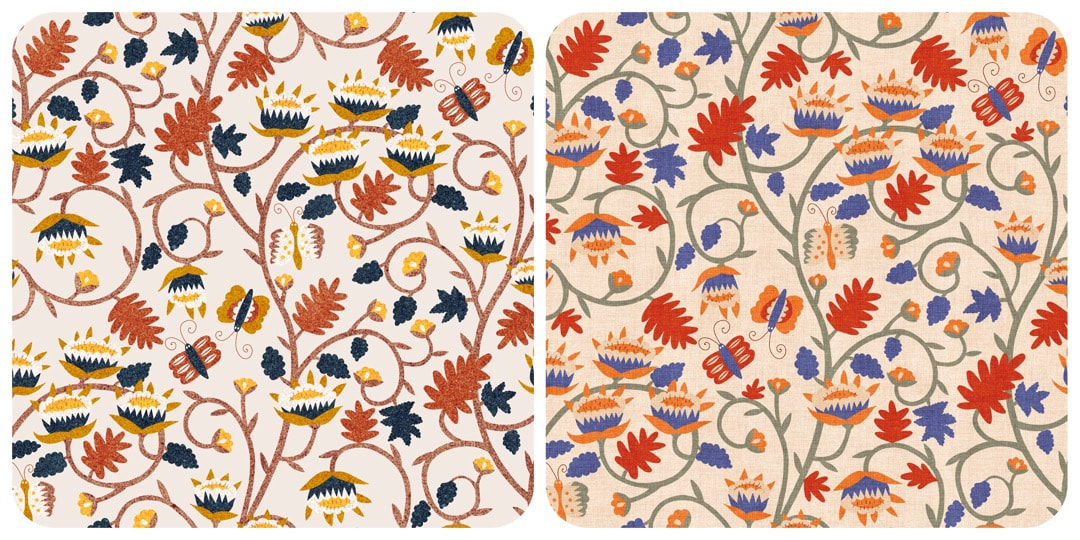 Work in Progress 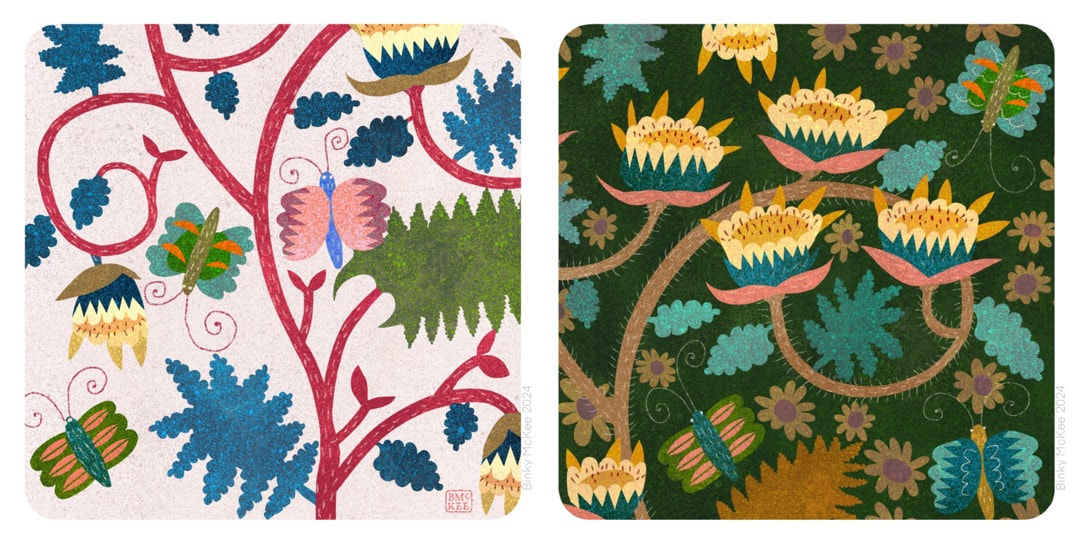 Harking back to May 2022 and a few drawings I made inspired by the Voynich manuscript, this week I began another pattern I have always wanted to design but never plucked up the courage to get on with dealing with the complexities of turning a drawing into a pattern. 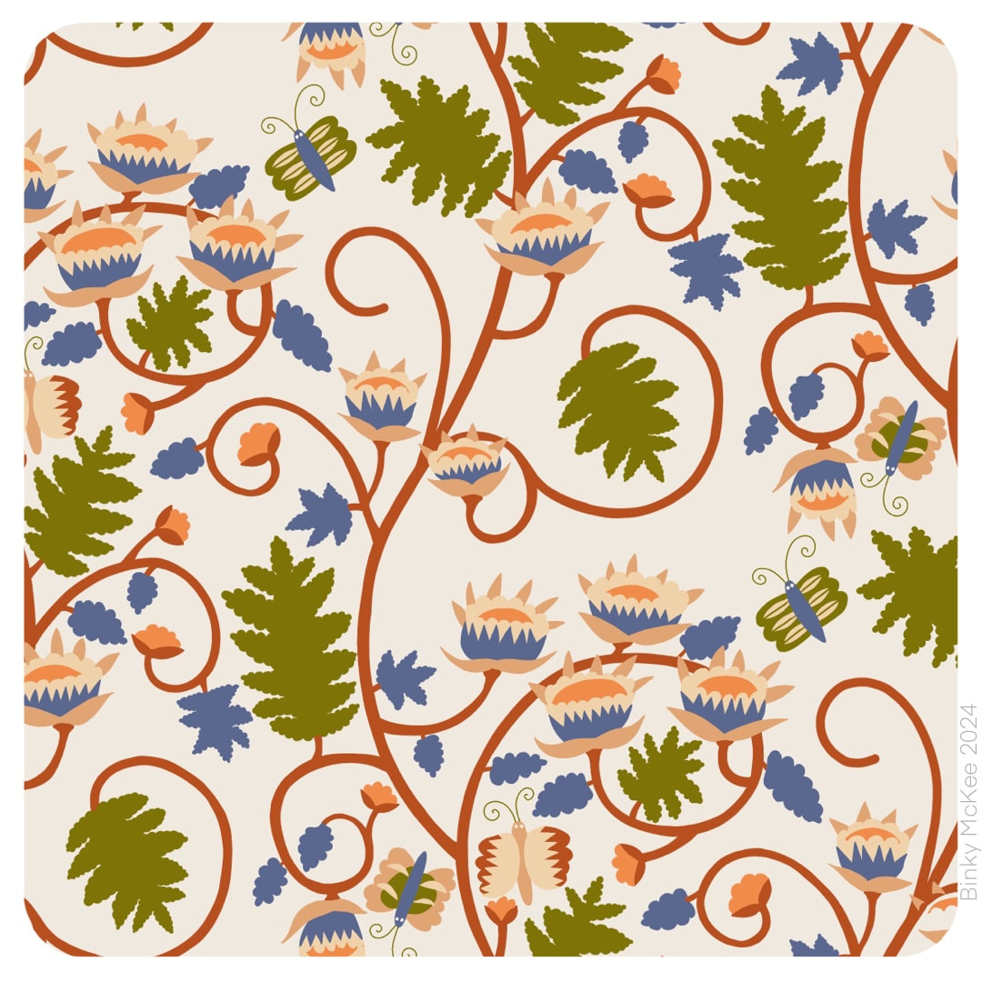 I met many pitfalls along the way: I traced the original in Procreate, which was a good start, but by the time I got this far with it I realised I was working from tiny originals at 72 dpi. I forgot they were low resolution, and I prefer to work with 300 dpi as industry standard, or at least Procreate's default 264 dpi; so, resizing and redrawing was necessary. 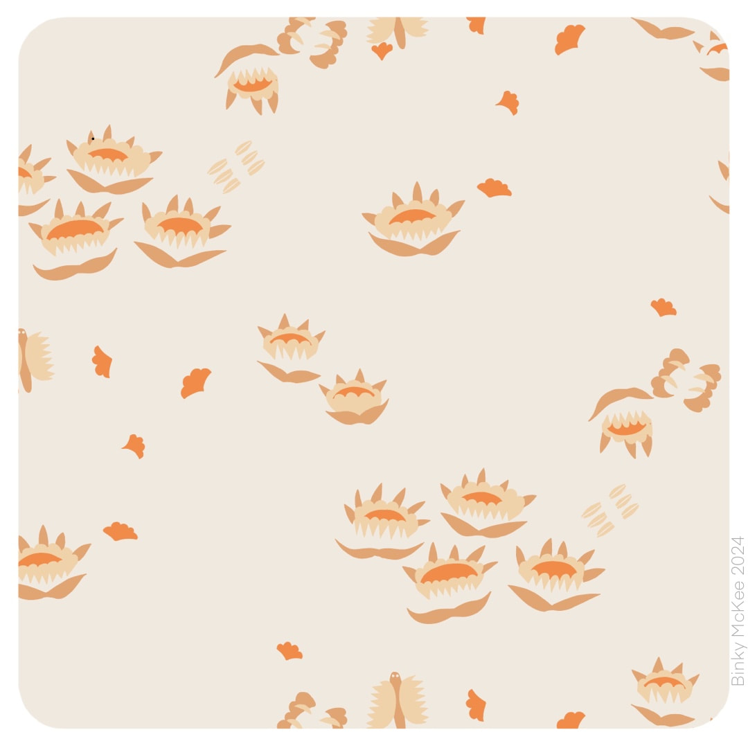 So, once I had sorted the resolution and nice crisp elements I was up and running. At the same time I tweaked the dimension of the pattern tile which not only tightened the design, but as an added bonus it also fitted the texture tiles I have been collecting. Here are three colour separations which on their own have a delightful floating and spacious quality which may well become another pattern.
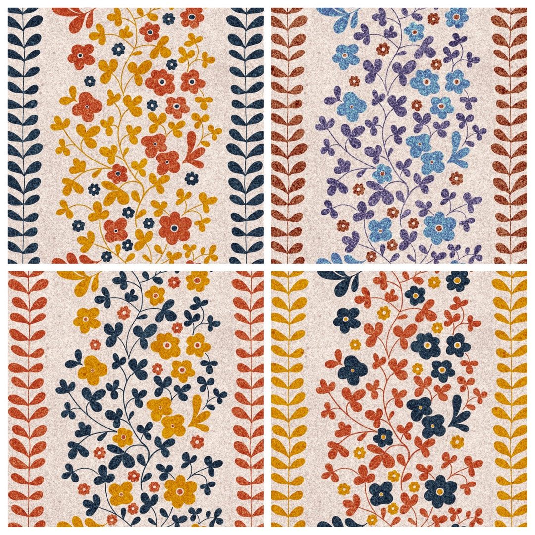 Four fun colourways in the pattern I worked a couple of weeks ago to accompany the Moth Garden designs. These are the inky speckle textures I made last year - I think the cobalt one (flowers top right) needs a bit of work, it's just a little bit too speckled for these little flowers. I now have 2 Moth Garden designs, plus the clouds pattern as well as this in the collection. I'm looking forward to putting them all together to see how they look!
|

~~~~~~~~~~~~~~~~~~~~~~
Welcome to my illustration and patterns blog.
I illustrate under the pen-name of Binky McKee, McKee being my mother's maiden name. Binky was the name of every single cat my great-grandmother kept - allegedly about 40 of them during her 94 years of life. I changed the website address a few months ago, so some older links on previous posts are broken. If you click one of those and it takes you to a strange page, simply replace the .co.uk after the binkymckee. with weebly.com and it will work again. I hope you enjoy your visit! ~~~~~~~~~~~~~~~~~~~~~~
~~~~~~~~~~~~~~~~~~~~~~
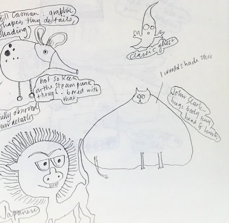
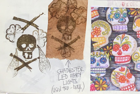
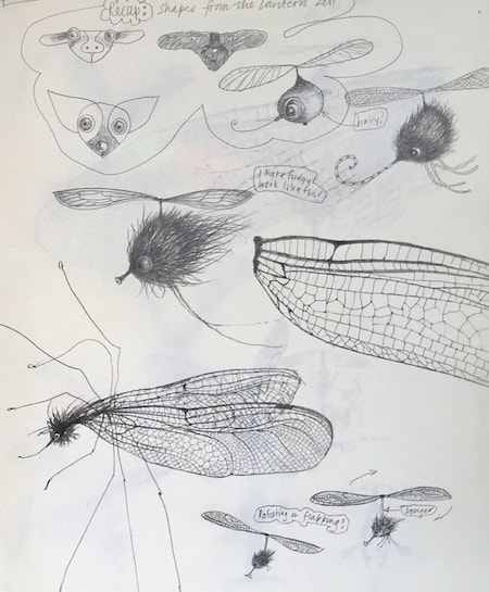
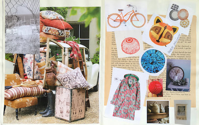
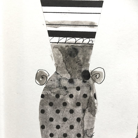
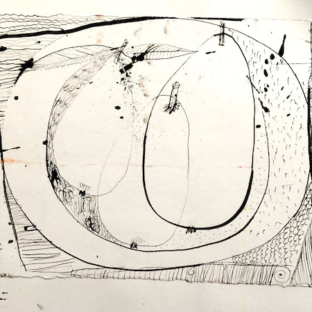
I keep lots of scrapbooks and sketchbooks where I develop ideas and design little creatures. Here's a peek inside one ...

~~~~~~~~~~~~~~~~~~~~~~
~~~~~~~~~~~~~~~~~~~~~~
As you may know, I am also known as Heather Eliza Walker.
Click the image if you would like to find out more and visit my other website. ~~~~~~~~~~~~~~~~~~~~~~ ~~~~~~~~~~~~~~~~~~~~~
~~~~~~~~~~~~~~~~~~~~
April 2024
~~~~~~~~~~~~~~~~~~~~~~
~~~~~~~~~~~~~~~~~~
All
~~~~~~~~~~~~~~~~~~~~~~
~~~~~~~~~~~~~~~~~~~~~~
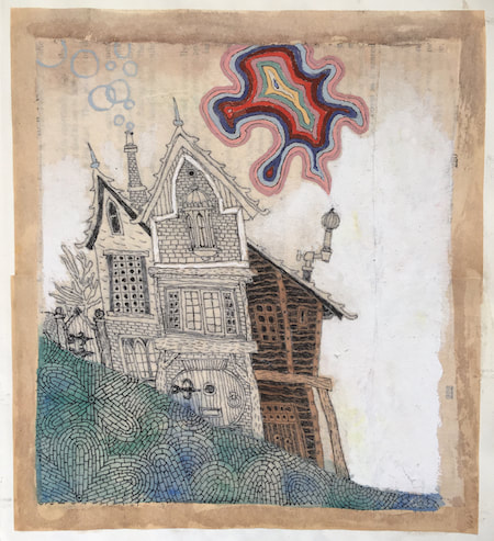
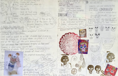
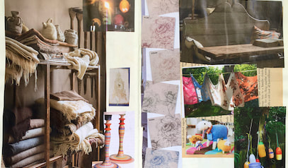
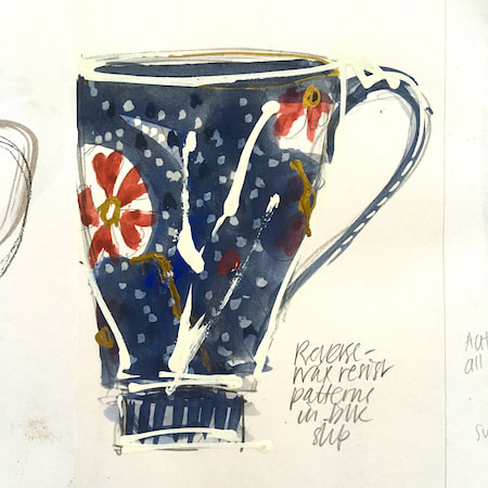
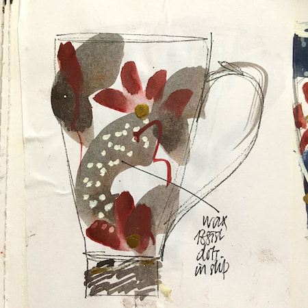
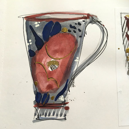
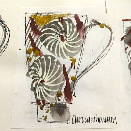
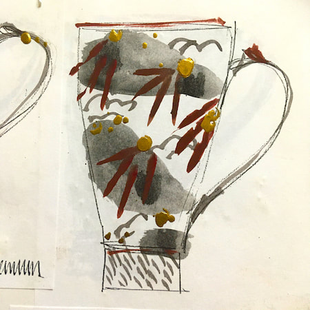
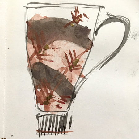
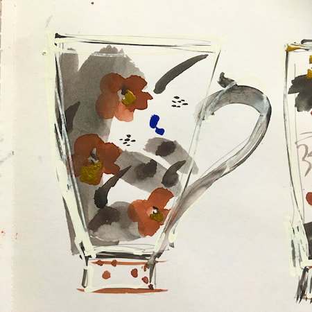
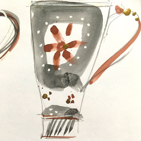
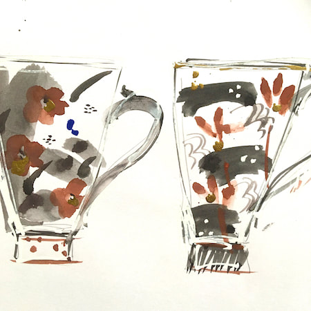
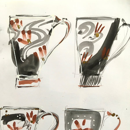
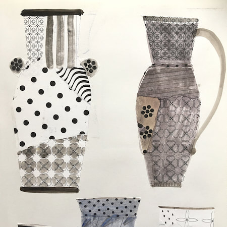
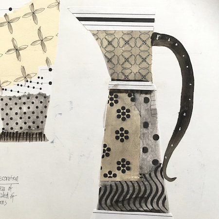
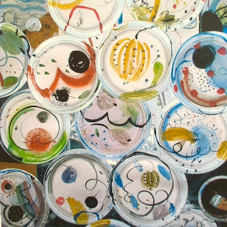
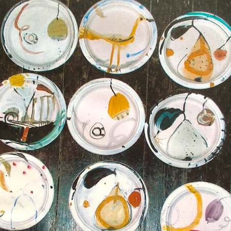
This time, take a peek into my ceramic design sketchbook. I actually made some of the mugs, but I kind of prefer the drawings! The plate designs are painted on paper plates, a most liberating process.
~~~~~~~~~~~~~~~~~~~~~~
~~~~~~~~~~~~~~~~~~~~~~
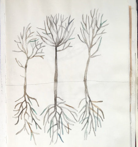
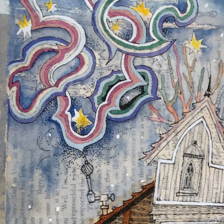
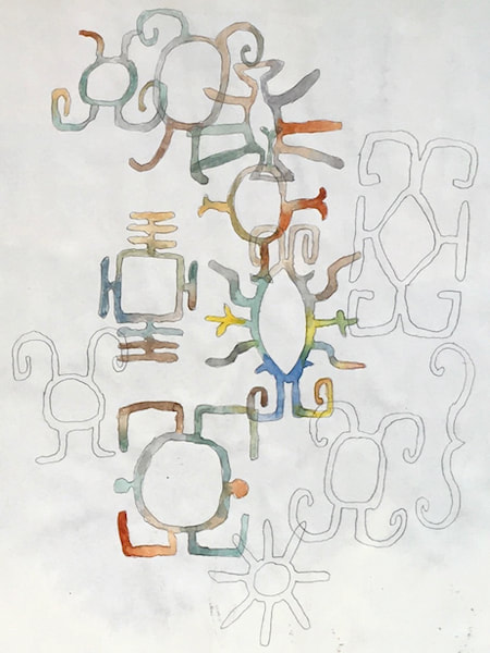
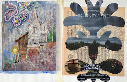
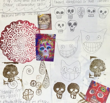
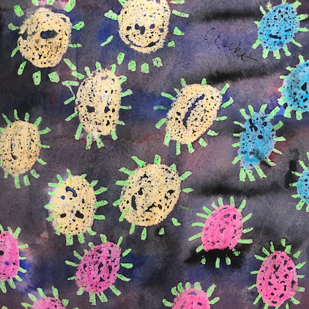
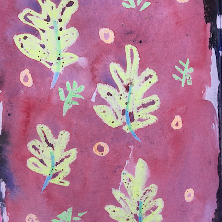
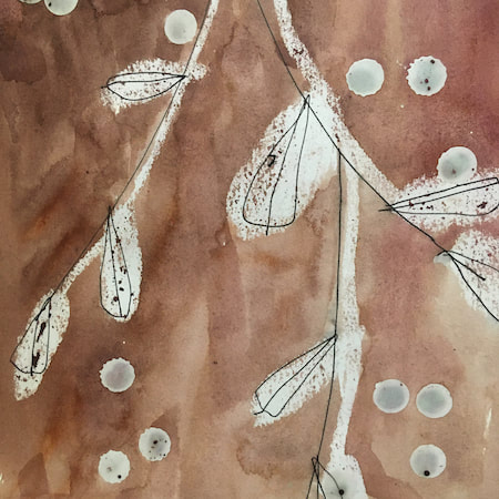
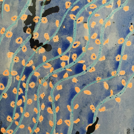
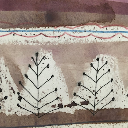
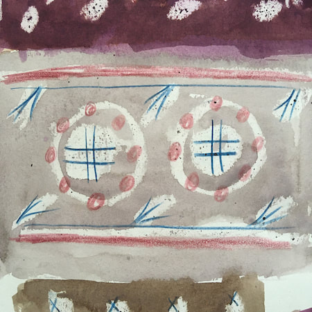
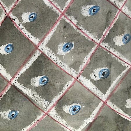
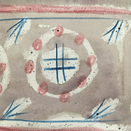
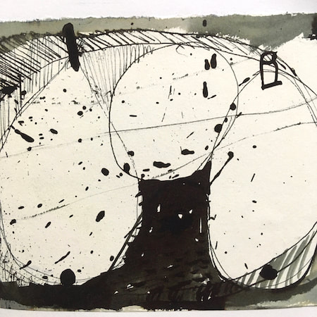
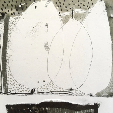
These watercolours are from my pattern sketchbook. I used coloured wax crayons to resist the washes of watercolour, also home-made rubber stamps dipped in bleach then printed on crêpe paper - the bleach takes out the paper dyes.
~~~~~~~~~~~~~~~~~~~~~~
~~~~~~~~~~~~~~~~~~~~~~
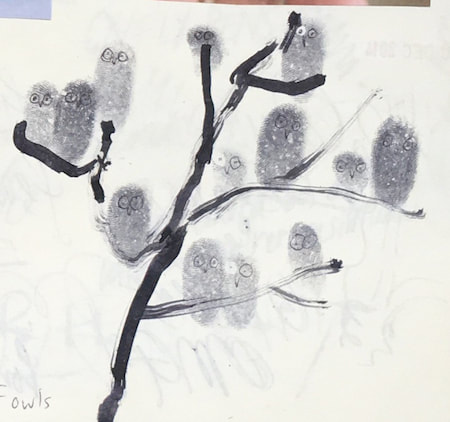
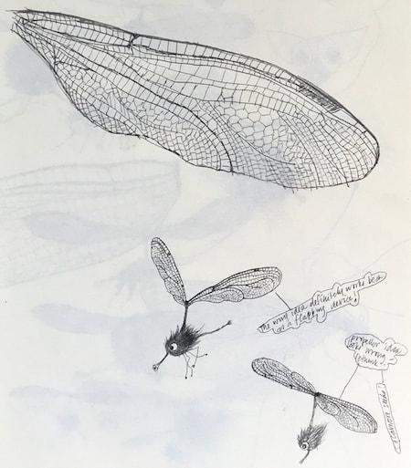
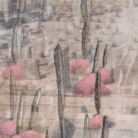
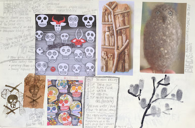
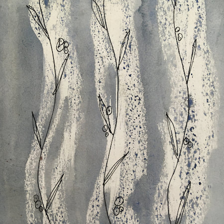
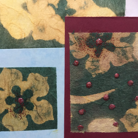
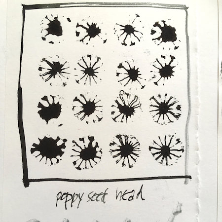
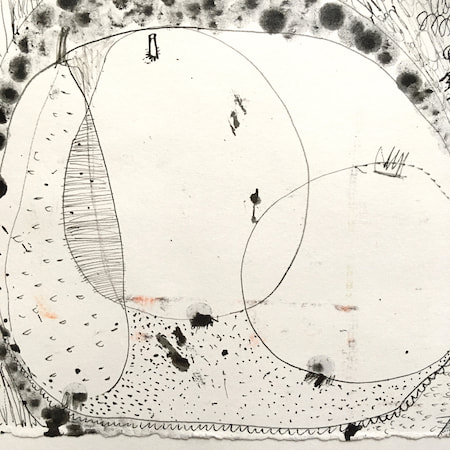
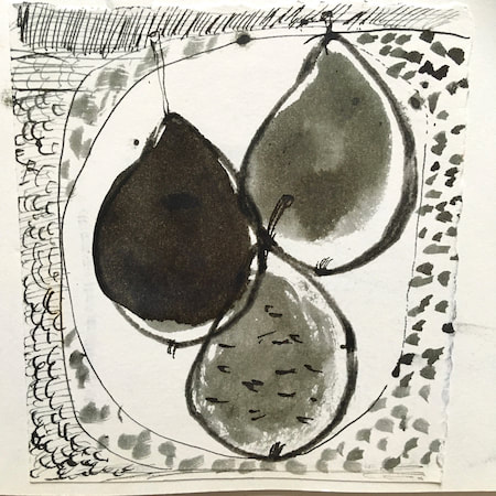
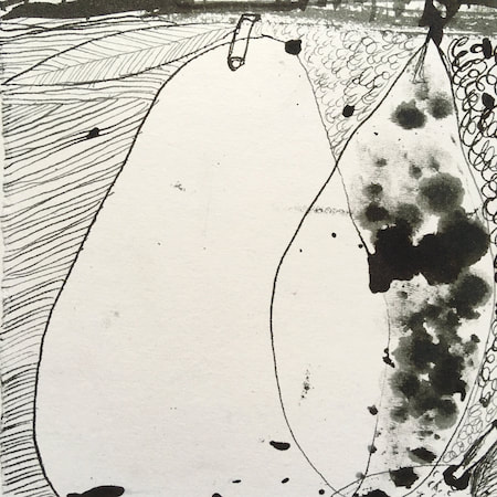
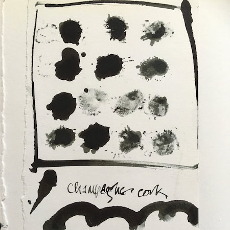
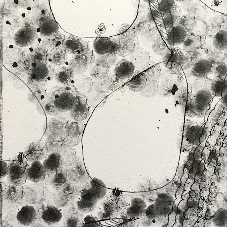
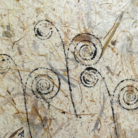
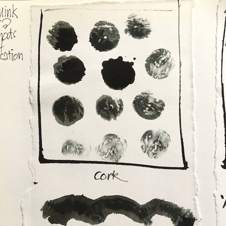
A sketchbook I used for mark-making with unusual objects - corks, seed-heads, feathers, home-made rubber stamps, my fingers and lots of flicky things ...
|
 RSS Feed
