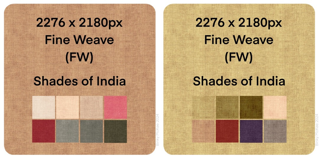
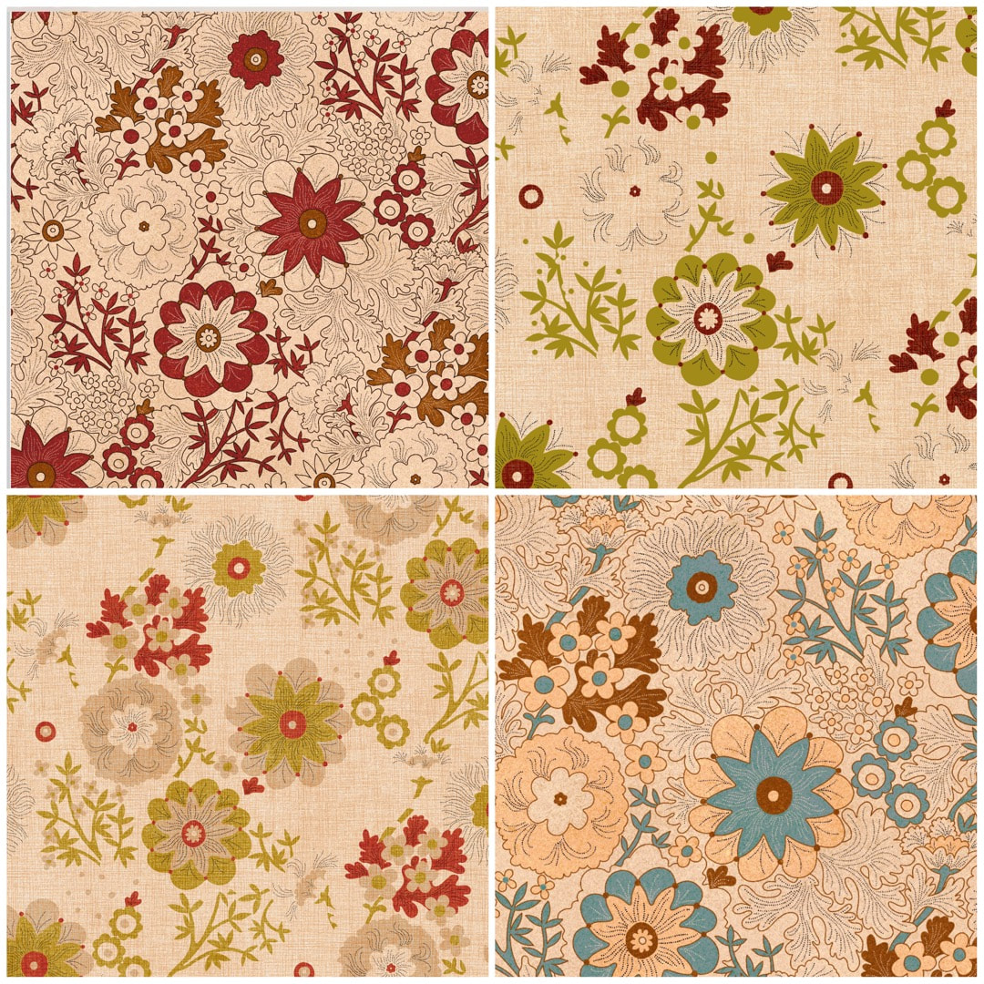
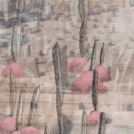
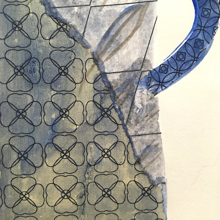
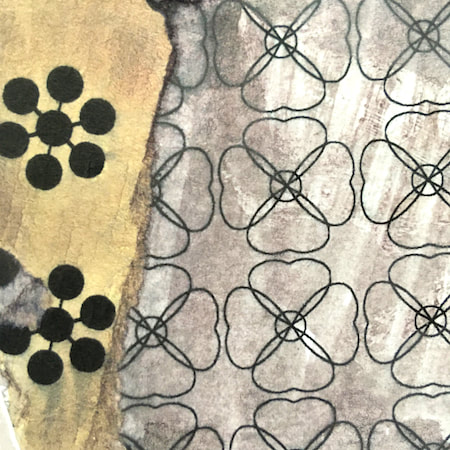
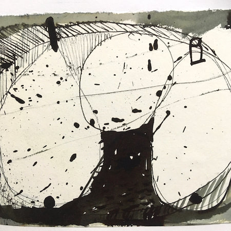
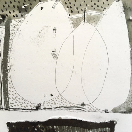
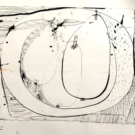
 I spent some time this week on making some linen textures for the new Voynich/Jacobean inspired pattern. It's coming along pretty well, the two images below show progress following on from the work in last week's post. Because the pattern suggests Indian block-print patterns to my mind (and I adore Indian textiles) I went for a natural dye feel in the palettes. 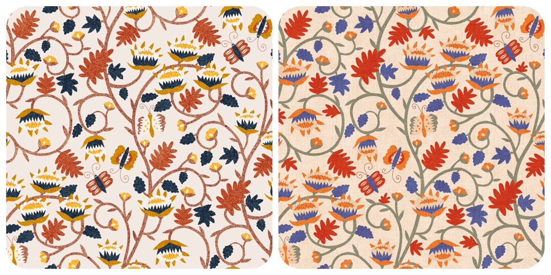 Work in Progress 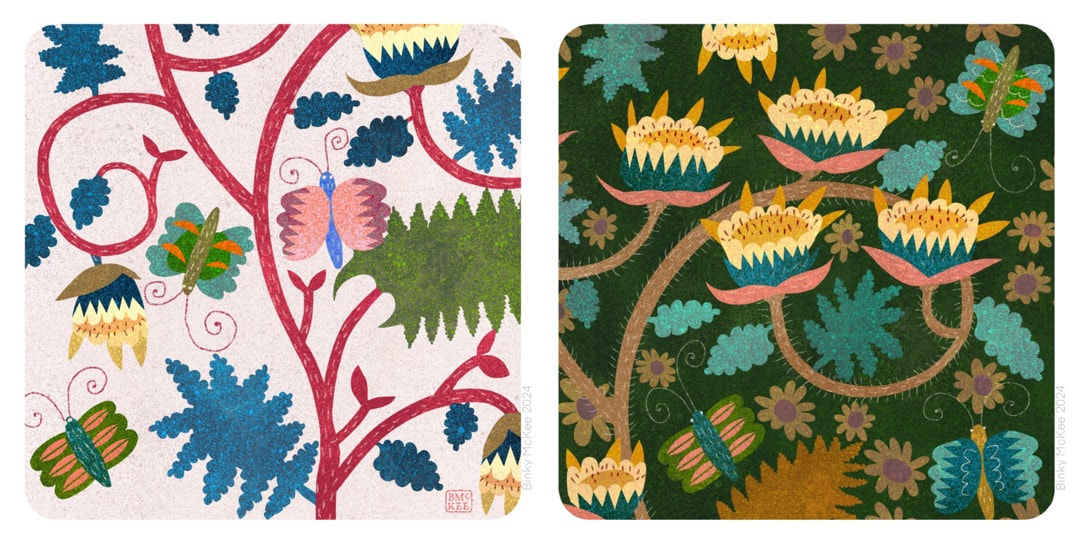 Harking back to May 2022 and a few drawings I made inspired by the Voynich manuscript, this week I began another pattern I have always wanted to design but never plucked up the courage to get on with dealing with the complexities of turning a drawing into a pattern. 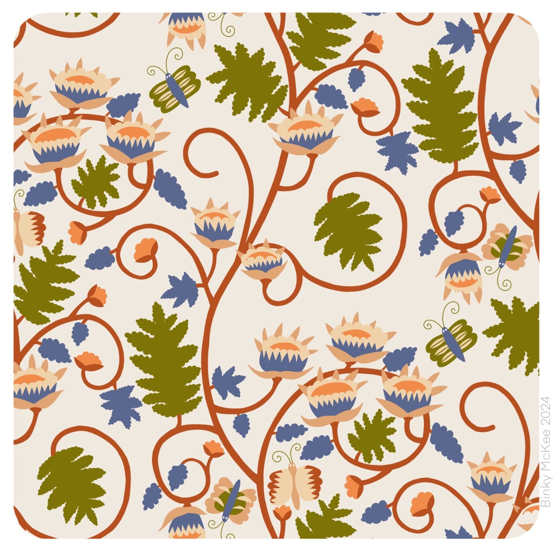 I met many pitfalls along the way: I traced the original in Procreate, which was a good start, but by the time I got this far with it I realised I was working from tiny originals at 72 dpi. I forgot they were low resolution, and I prefer to work with 300 dpi as industry standard, or at least Procreate's default 264 dpi; so, resizing and redrawing was necessary. 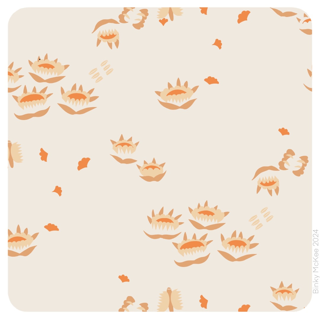 So, once I had sorted the resolution and nice crisp elements I was up and running. At the same time I tweaked the dimension of the pattern tile which not only tightened the design, but as an added bonus it also fitted the texture tiles I have been collecting. Here are three colour separations which on their own have a delightful floating and spacious quality which may well become another pattern.
  I made monochrome versions of these designs last December as a quick aside, but only just got around to working on colour separations last month (and no, I still haven't found a better title than the mondegreen "Rivermoth Tonight"). Here they are now in beautiful speckly ink colours. Of course, I wanted to see how they would look applied to products. 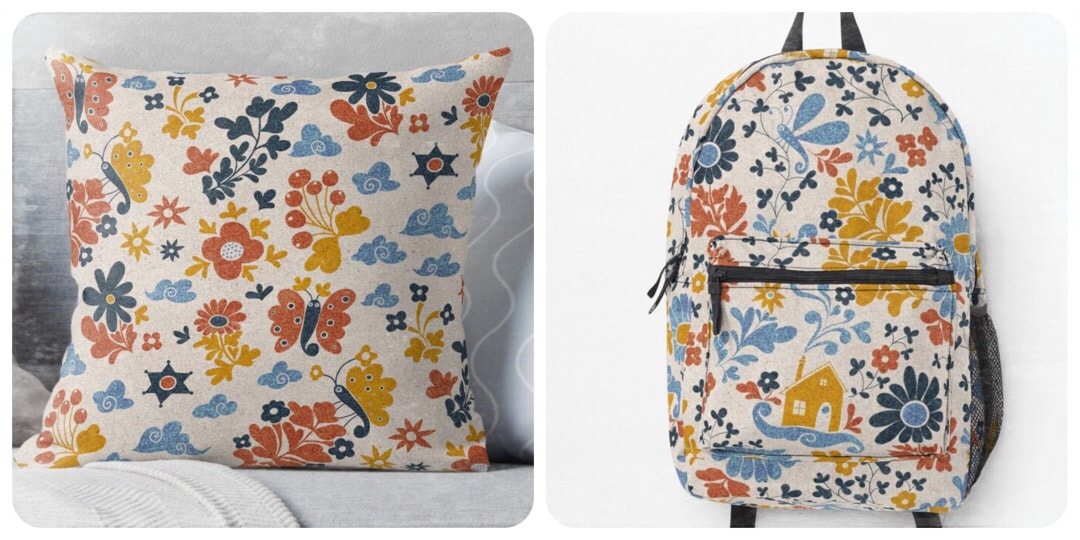 It has been an absolute age since I had a go on Redbubble and it was very nearly another age until I got logged in, thanks to forgetting my password and user name, and then had the wrong password written down for the email address to receive account recovery directions. But I sorted it out in the end, so I could try these two out on a couple of my favourites. It's marvellous really how the tech works to let you see how a pattern sits on an object, such a fun thing - and who knows, I may even buy something one day. For the time being I have my designs set to private until I decide what I want to share there, as I have a sneaking suspicion that ideas get pinched left right and centre from the platform.
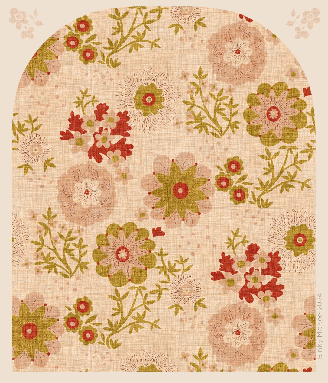 A more spacious pattern using elements from Yay Flowers, based on the lower left image in last week's collage. I thought this would be an easy thing to do because the pattern setup was already in place, but moving things around, redrawing and balancing various parts naturally led to problem-solving, and took more time than I anticipated. It's an activity I really enjoy, though, and now this quiet, relaxed pattern might be nice for curtains and cushions, or even as an upholstery fabric for a lovely old chintzy sofa. I like the way some colours are stronger than others, suggesting dyes of differing fugitivity on a vintage material - a satisfyingly vintage cottage mood.
 Daylight began its return this week with the sun's angle bouncing up 10 degrees higher than it was at the winter solstice, and a sudden marked increase in daylight both in the mornings and evenings. It is a joy to see, and to hear the birds waking up with tootling and whootling precursors to the dawn chorus. When the sun comes out, it really feels as though spring is just around the corner.
With this is mind, take a look at these screenshots of recent Yay Flowers work in progress: some pretty details come along while making colour separations, and these looked just like spring to me. I'll be taking a closer look at these, and maybe making some new patterns based on them soon. 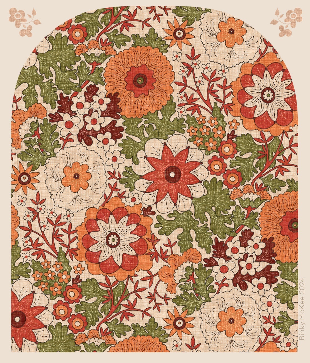 I finally got a linen texture to work with the new Yay Flowers half-drop pattern by resizing the Peru linen colourway tiles I made last September, making the 'weave' tighter to better suit complex designs like this. Above you see the outline version, which enables the background colour to be used within the pattern itself, providing a fresh and spacious appearance. Here I am using the vibrant colours based on a Peruvian hand-knitted cardigan I bought in London's Camden Lock, when I was living close-by in Belsize Park during the late 1980's and early '90's. (The cardigan is still going strong, in spite of its age!) I used the coloured textures in October for my fruits and blossoms design. 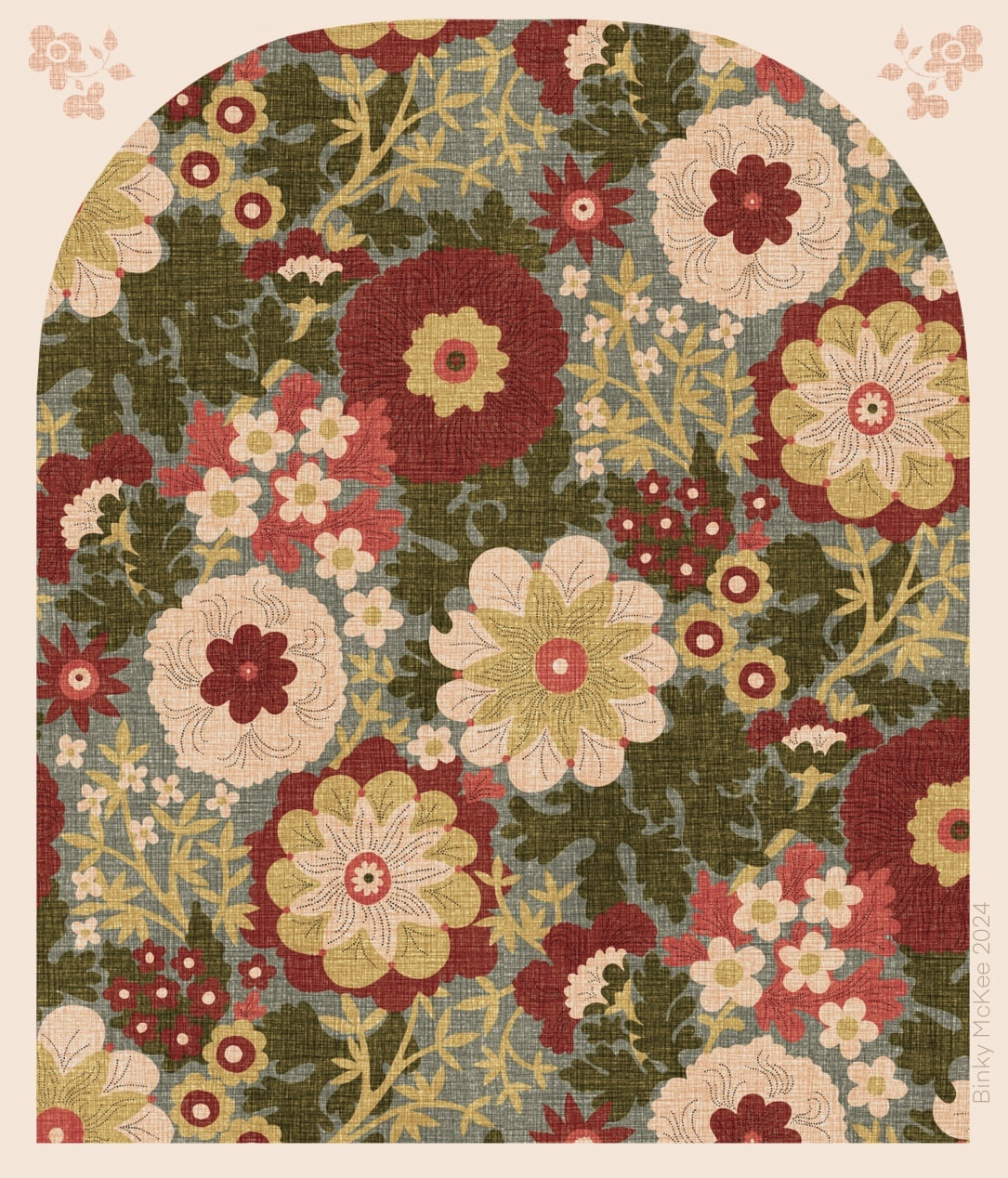 Loving the faded chintz look on this version! Also using the resized Peru linen texture, the colours have been toned down slightly in this one for a softer, more antique look. This is the version without outline, using only a few of the stipple details on the main flowers.
See also this pattern I made in October using the original Peru linen texture. The permutations of a five or six colourway are apparently endless. 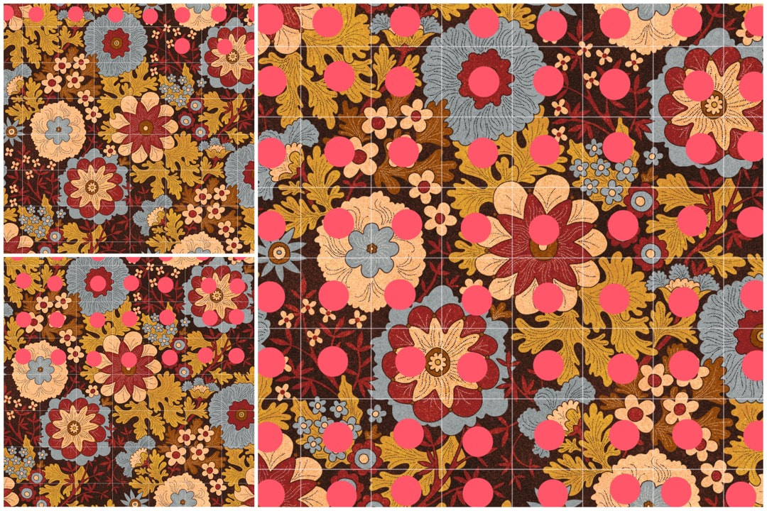 Checking for flaws in the pattern Lots of fun and fails this week while experimenting with texture overlays and colourways. I discovered big textures didn't work with this pattern because there's already a lot going on in it, so I made a completely new autumn palette based on a favourite Crazy Daisies colourway with a more even, close speckle which looked fine. In the process I involved the original outline drawing, with the result I now have two versions: one using outline, and the other without, each with 5 colour separations.
The screenshots above show the progress of final checks on the outline version after I played around with the colours. When I make these checks I save a jpeg to iPad's camera roll, and open it in Procreate next to the original psd artwork. Using the drawing guide grid (seen above in white) I check one square at a time, blown up to fill the iPad screen, looking for any imperfections or mistakes which I then correct in the pattern artwork layers. I put a large pink dot in each square of the jpeg image once it has been checked, so I know where I am. I'm sure most of the corrections I make wouldn't even show in print, but the weird thing about printing is that it can either hide or emphasise even the teeny-weeniest halo or shadow - so it's better to be safe than sorry when it comes to paying for proofs. During the process I noticed a couple of the speckle texture colour layers didn't tile as well as I thought, so amending those is next on the list. 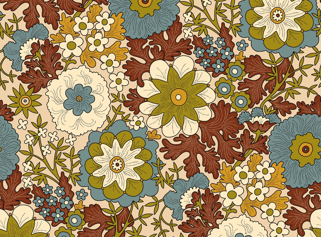 I moved my blogging day from Sunday to Friday, so there is a bit of catching up to do here. Continuing with the Yay Flowers half-drop rework, I altered the outline drawing to the brown colour shown above so that leaves crossed the skinny stems of the two cupped flowers, eliminating an irritating whippy movement in the pattern. At the same time I changed the direction of the green stem in the top left flower. Next, I filled the outlines with colours. It was a nice, clean finish, but took a long time, and the potential of filling the repeat details in the wrong colours was high. I realised that in the long run it would be better to create colour separation layers for consistency in the balance of the design, not only for making speedy colourway changes but also providing the option of adding texture with clip masks. 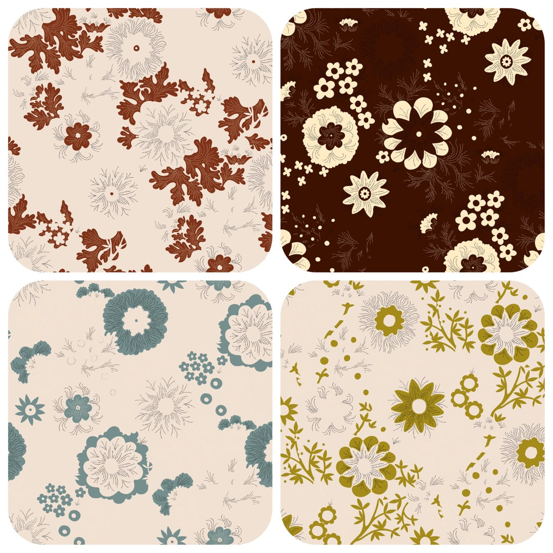 Having achieved this nice balance using colour-drop, I separated the design each colour onto its own Procreate layer. It was necessary to remove the outlines between the elements for use with clip-masks to avoid 'furring' of the lines, which would print with a fuzzy appearance; above shows how four of the five separations now look. 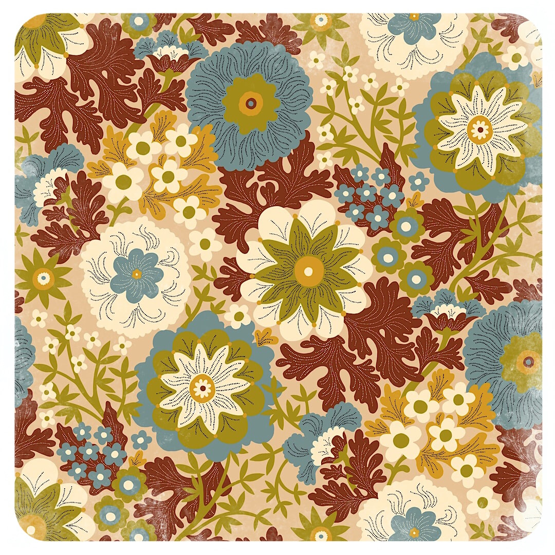 Here is the final result - a nice, fresh pattern. I like the cartoon effect of the outline version, but feel the pattern is now a lot more open with improved flow, and I look forward to playing with different colours and textures.
As a note, until now I have just kept textured finishes for interest in blog posts or Instagram. However, recently I have been working with fire-retardant and blackout fabrics which have a plain, bland surface, and noticed patterns with added texture do work well on these materials. So, moving forward: flat and clean versions for weaves and nap, and texture for smooth cloths and papers as well as blog posts - it's good to know! 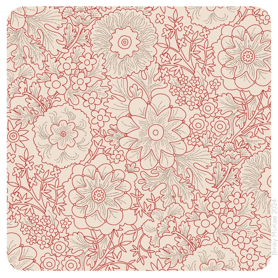 Finally, a half-drop version of Yay! Flowers ! Years on from its very beginning, I finished the outline drawing for colour-drop with any palette this week. I put the trail of links in last week's post, which can be followed right back to experiments with a watercolour sketch in March 2019. 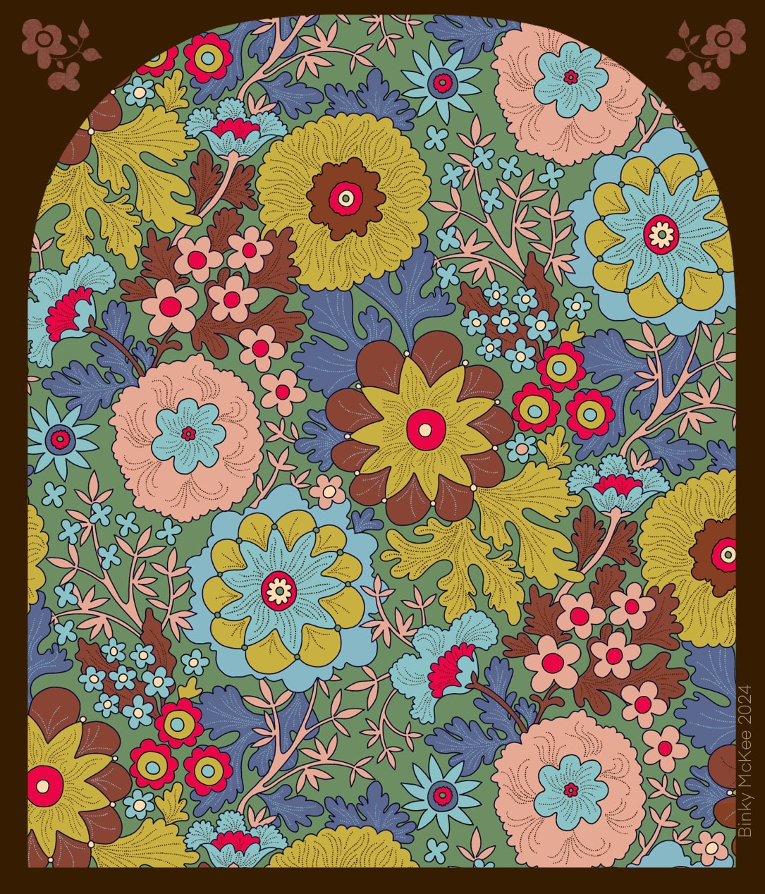 Here's a version I made for testing the pattern, filled with the glorious technicolour of my 'Naturals' palette, spiced up with a vivid red (and, yes, I'm still very much into the arch presentation!)
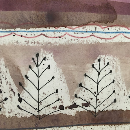
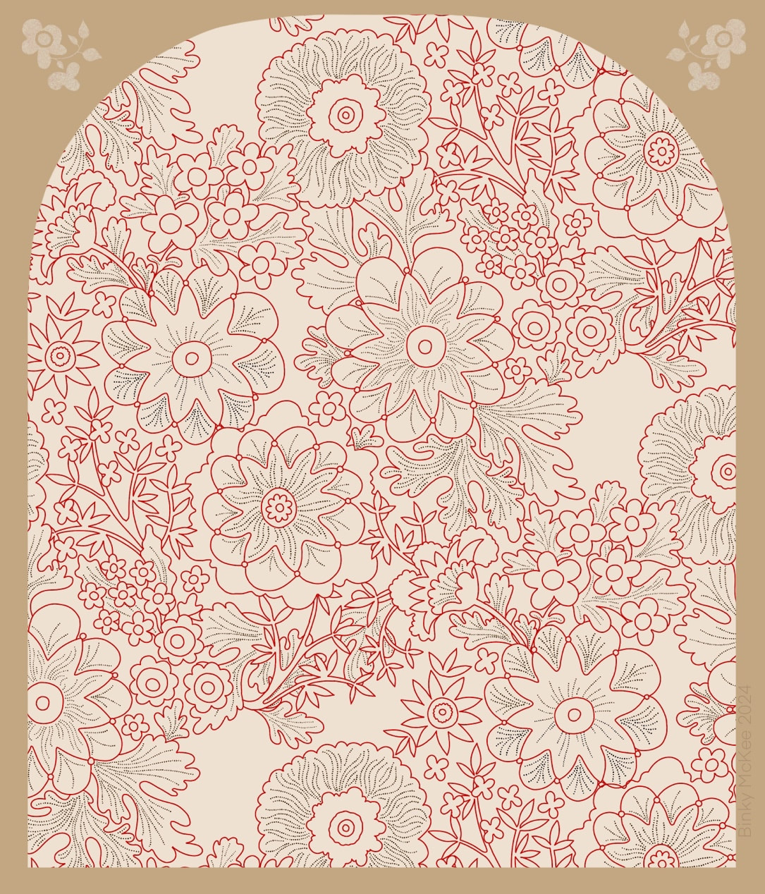 WIP half-drop version begun this week This pattern goes back quite some way, this link will take you to the previous 2021 version where you can follow links right back to its very beginning. It is a favourite of mine, so I'm happy to invest time on it. In 2021 I made the clean version (below) but it didn't occur to me to keep an outline version to make new colourways. It was early days in 'clean' work for reproduction, and I thought I could just keep colour-dropping over previous colours, but I soon discovered the outlines get degraded that way; so the only way I could change the colours was by using curves or HSB adjustments. Both methods are fine, but limited in tonal values by the original. 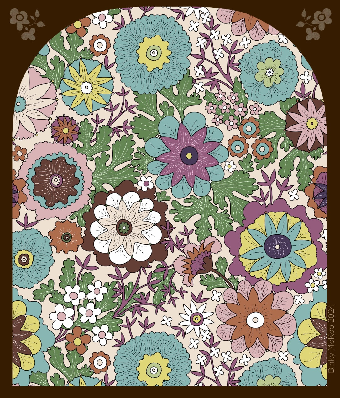 2021 version Finally, I remembered this was something I wanted to do, and it was the perfect thing for the January lull before the end of the holidays. Also, the previous pattern was a block repeat and I had always wanted to make a half-drop from it; so, at the same time as redrawing the original outlines I began work on that too. 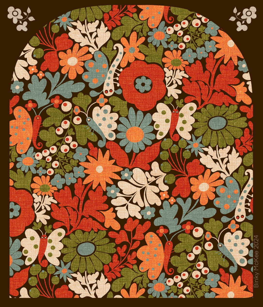 River Moth Tonight - I know, it doesn't have very much to do with rivers at all! I also made an arch-shaped clipping mask for blogs and Instagram posts to make patterns look more interesting (otherwise the feed just looks like a pattern-book) which I liked so much I have probably over-used it here, but above is my 'River Moth Tonight' pattern (still haven't thought of a better name) looking very bonny in its archway!
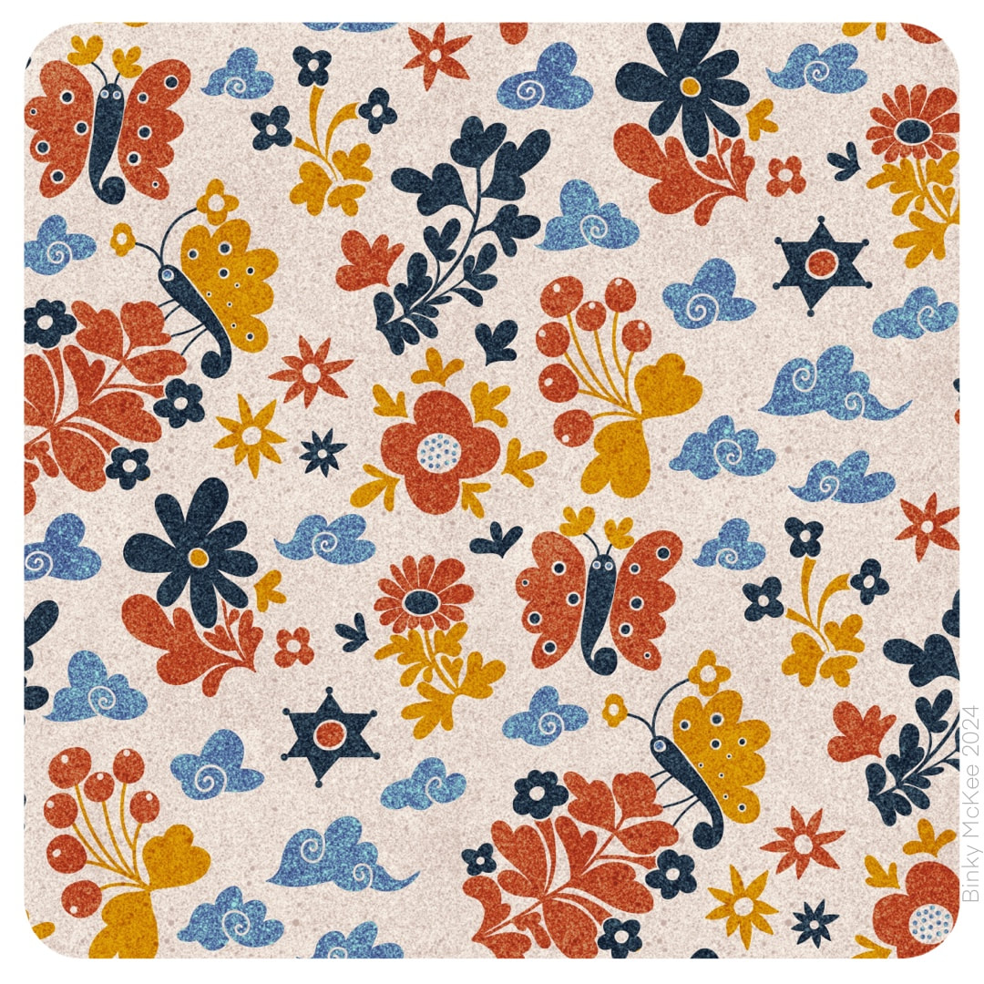
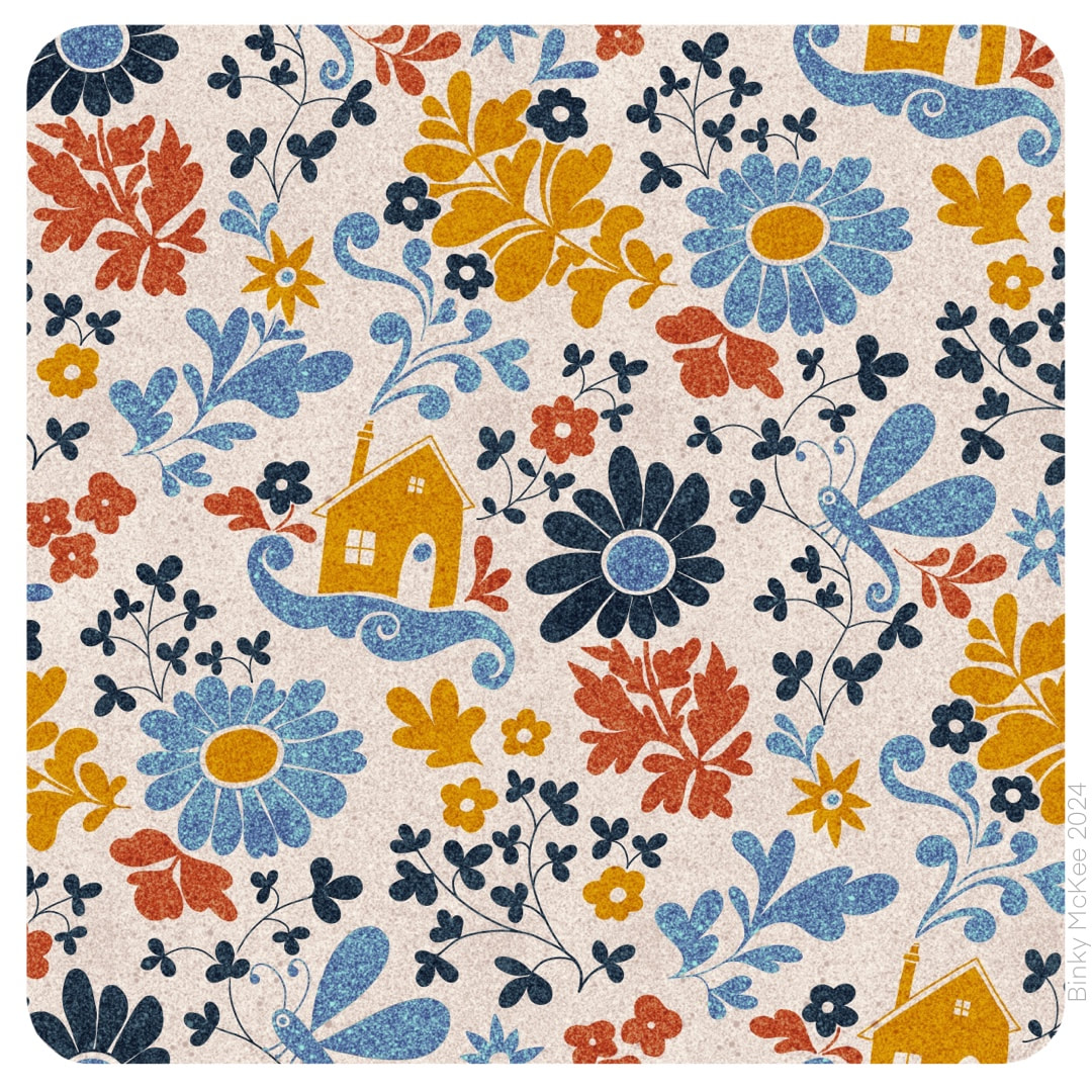
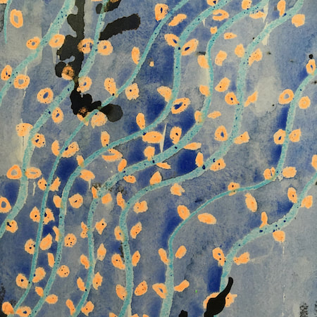
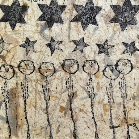
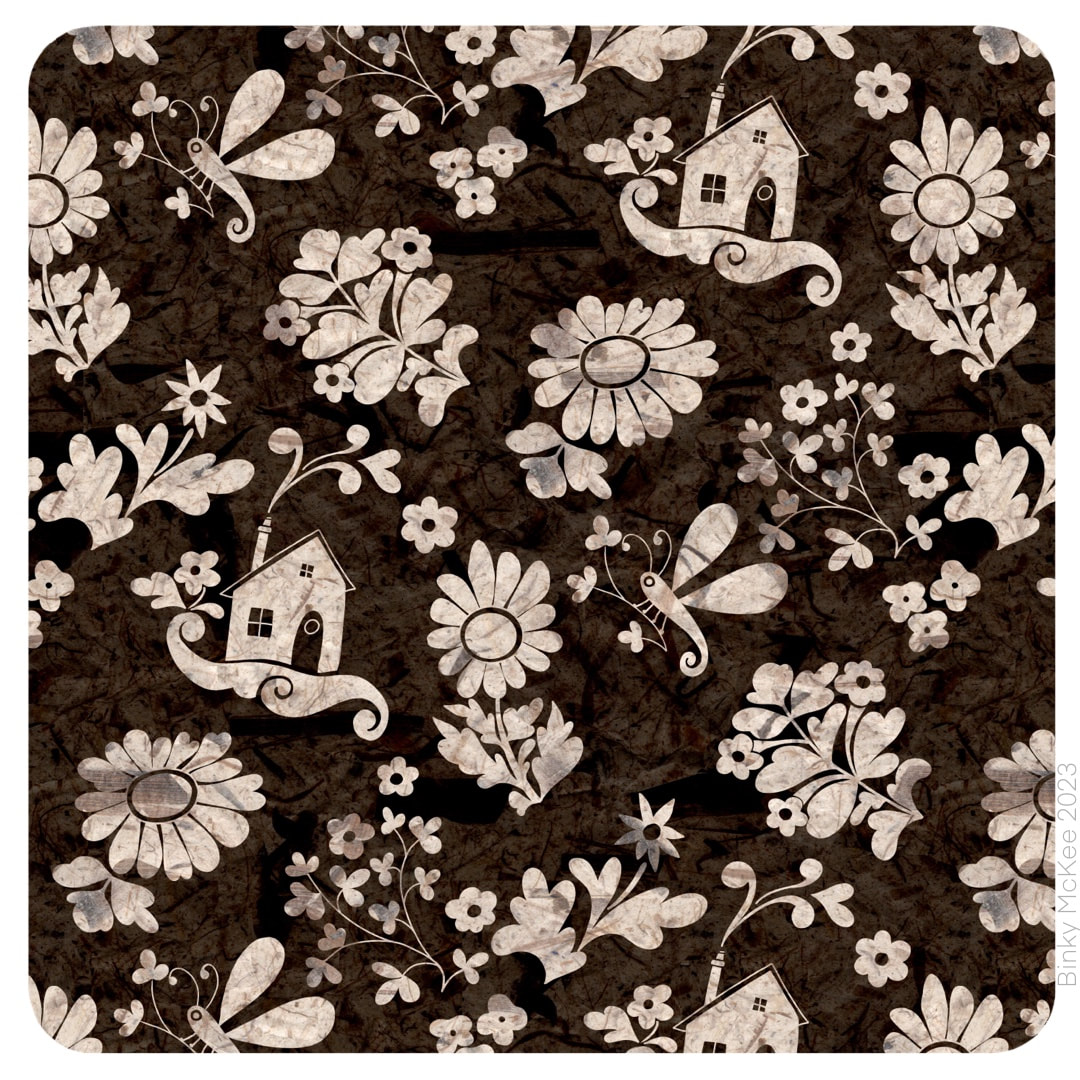 Still on the papery mono theme, I separated out some of the main motifs from the 'rivermoth' pattern (last week's post), tweaked them to suit, and designed a couple of extra motifs to accompany them to create two new patterns. I had noticed when I was working on the 5-colour version that each layer looked good when visibility on the other layers was toggled off; the space around each element was nice and I wanted to use it. I activated the spaces with surrounding elements, adding little houses with puffing smoke and some delicate sprigs in the brown version, and curly clouds and some new flowers in the blue one. 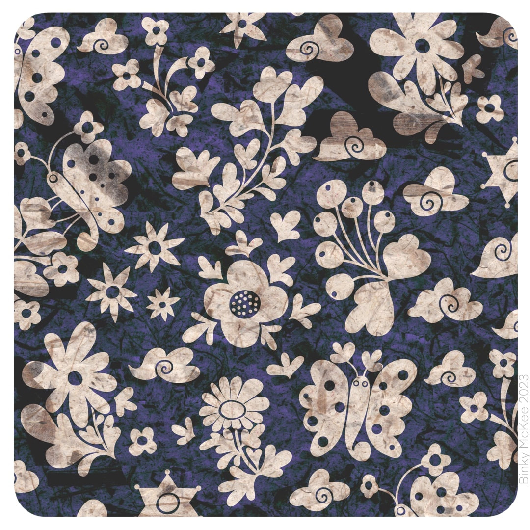 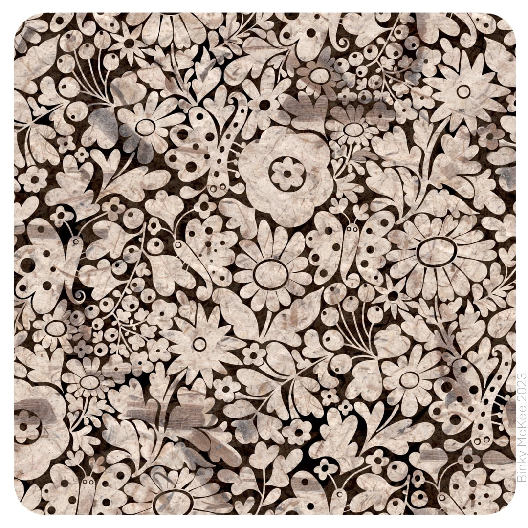 Mono versions of 'River Moth Tonight' (I haven't thought of a better way to name this pattern yet) designed for single colour. The top one has papery texture, the two are below speckled. It's always interesting to see how the graphic nature of a design works in single colours. 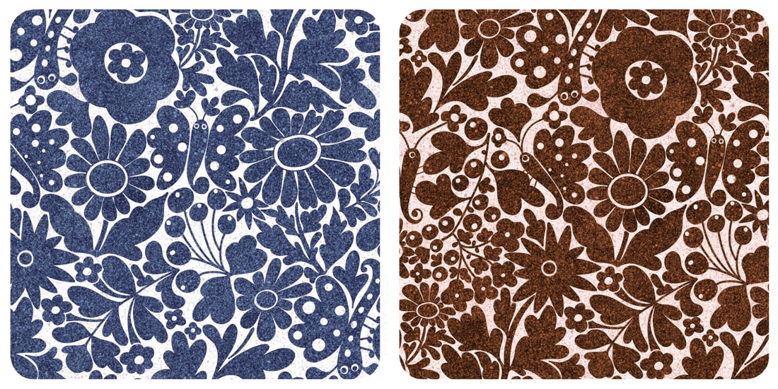 I started making this night moth garden design on October 1, following along from ideas in Crazy Daisies with elements expanding into surrounding spaces until they are almost touching. I visited it on and off for about 3 weeks, during which time I swore I heard music on the radio a few times singing "this is the river-moth tonight" which I thought was lovely (it turned out to be "this is the rhythm of the night", just another of my hilarious misheard lyrics). The image of moths in gardens on a summer night was as stuck in my head as the song. The pattern lay around on my iPad without any further experiments until this week, when I gave it the bark paper texture overlays I was using for my folksy patterns. Tonal variations from the bark fibres embedded in the paper give the colours a rich, velvety feel in this design. 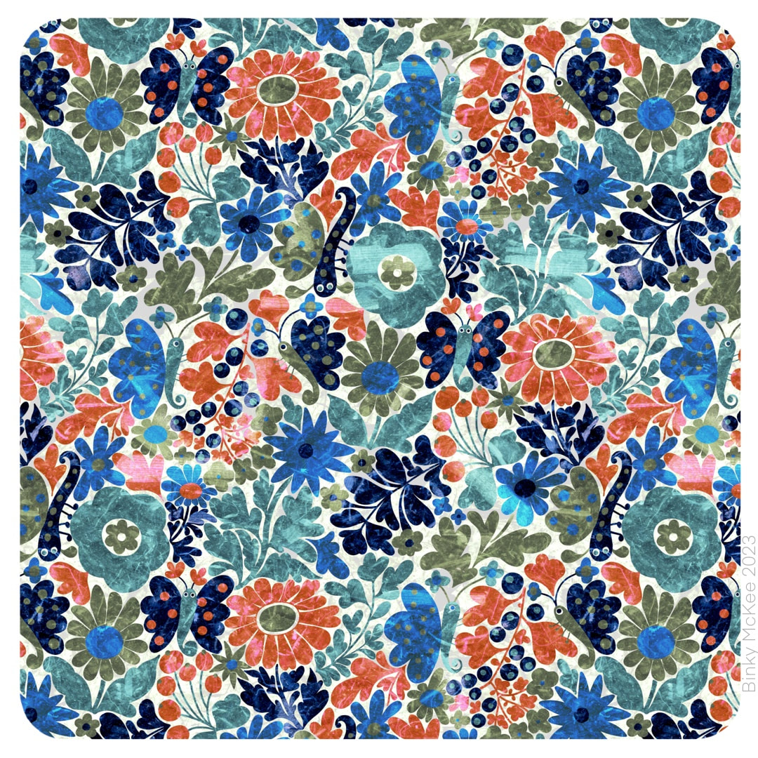 It's unlikely I would print a something like this onto fabric as there is already enough texture in the material, but it could work well on smooth paper, so I always make my textures repeat just in case. Here is how the 'bigger picture' works. I manipulated inverted colours in this version, and now it looks like marble inlays.
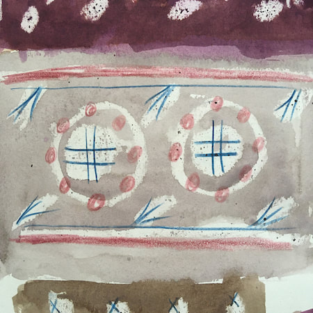
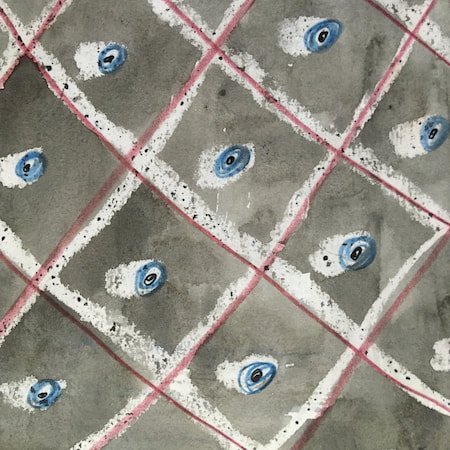
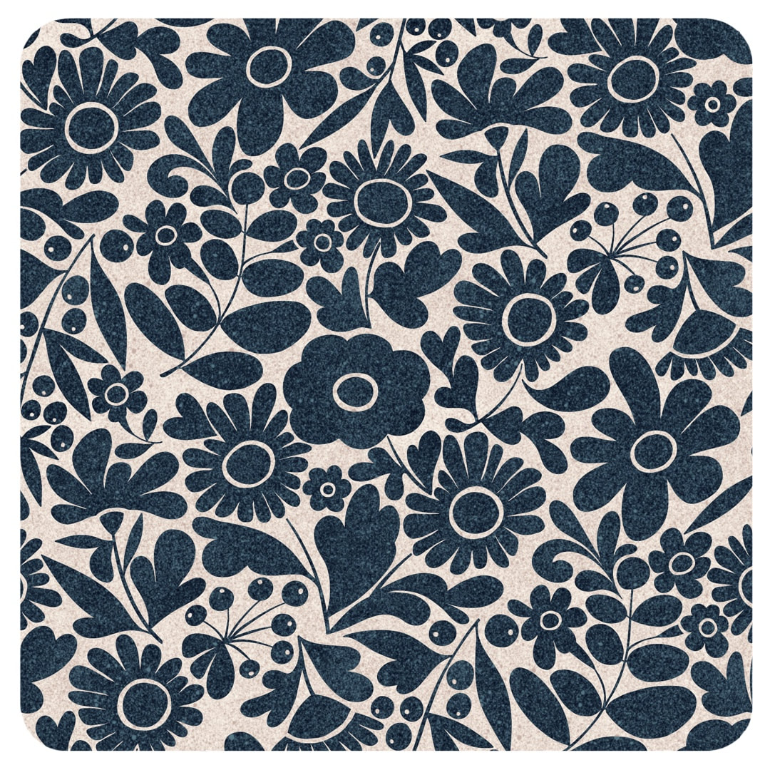 A redesign of my Crazy Daisies pattern for single colours. Shown here are versions in indigo on stone, and cream on chocolate which is based on a mono version of my vintage tie daisy pattern which I made in 2021. 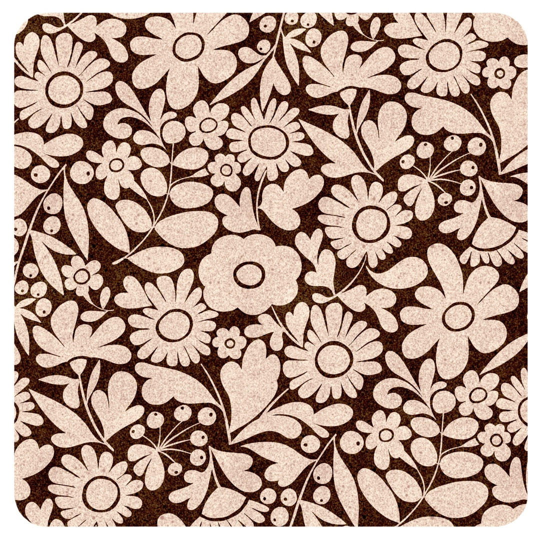 I thought I had posted an entry with the monochrome version of the vintage tie pattern when I made it, but when I went back through the archives to link to it I found I hadn't, so I have put it below. I made it in Procreate using the charm of a crayon brush, but later I made pristine versions of both the coloured and monochrome versions for printing on fabric. 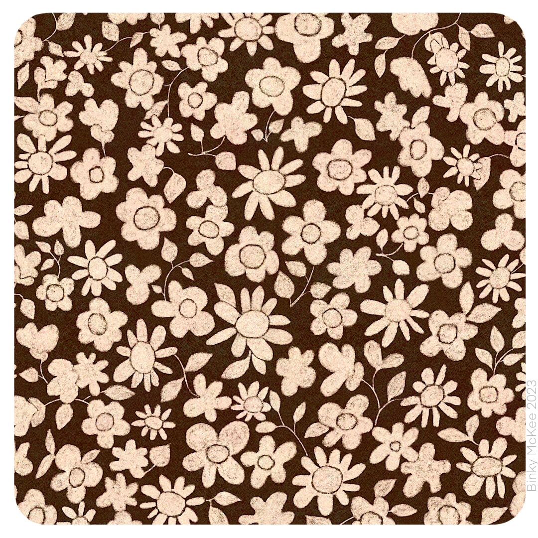 Vintage Tie Daisies, 2021 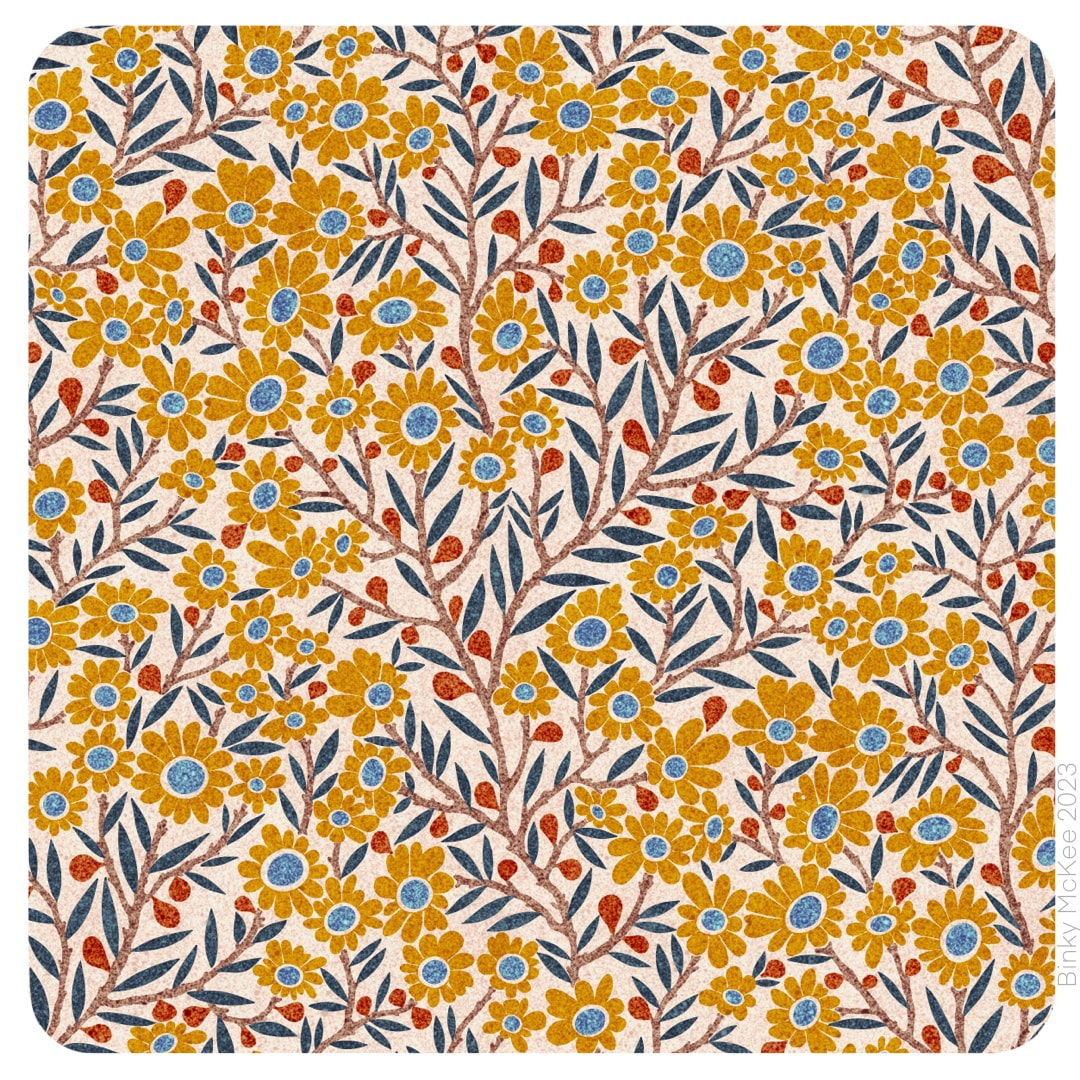 I settled on the version which uses all the flower centres in the same colour for these two colourways, liking the inky effect speckle texture I made for the catkins pattern a couple of weeks ago so much that I added new colours to the palette. All based on earthy ink pigments, here are ochre and sienna beside the original indigo and blue. 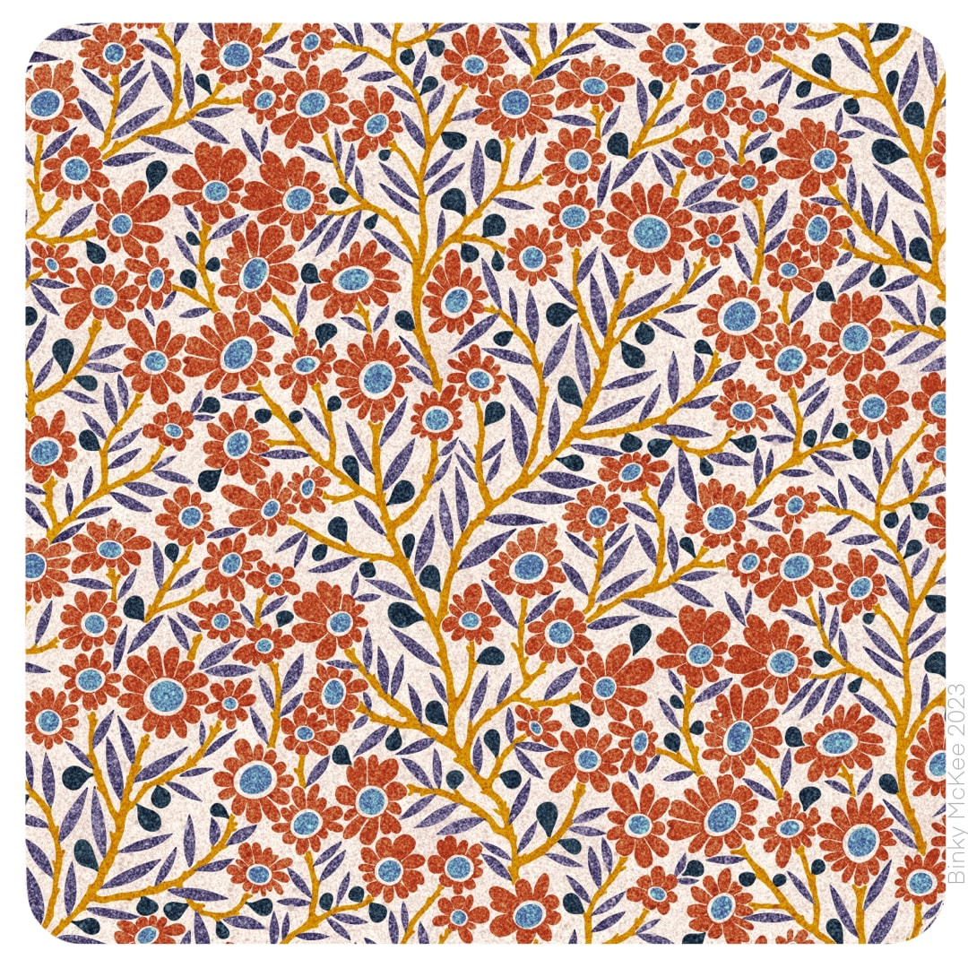 I think the speckle texture suits these patterns, it's not ideal for everything but sits well on smaller elements like these; I imagine them printed on soft cotton.
|

~~~~~~~~~~~~~~~~~~~~~~
Welcome to my illustration and patterns blog.
I illustrate under the pen-name of Binky McKee, McKee being my mother's maiden name. Binky was the name of every single cat my great-grandmother kept - allegedly about 40 of them during her 94 years of life. I changed the website address a few months ago, so some older links on previous posts are broken. If you click one of those and it takes you to a strange page, simply replace the .co.uk after the binkymckee. with weebly.com and it will work again. I hope you enjoy your visit! ~~~~~~~~~~~~~~~~~~~~~~
~~~~~~~~~~~~~~~~~~~~~~
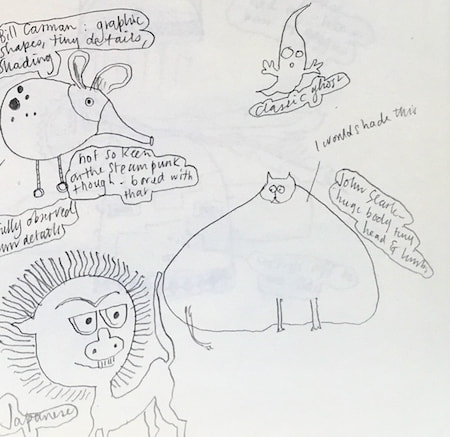
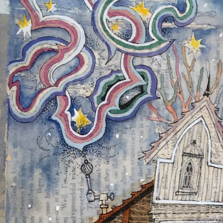
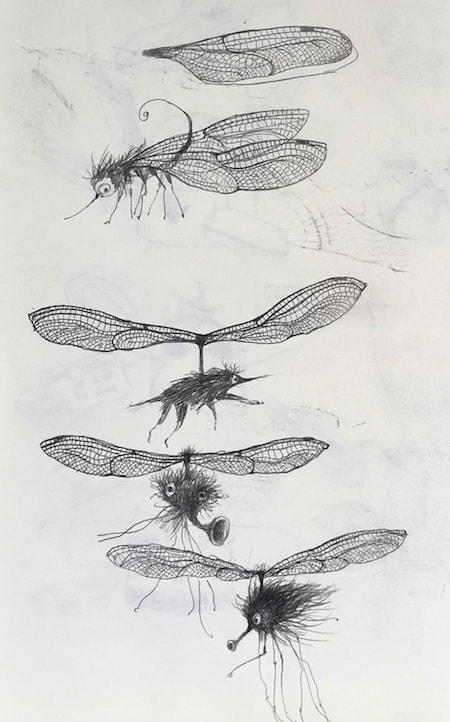
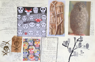
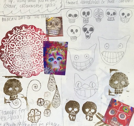
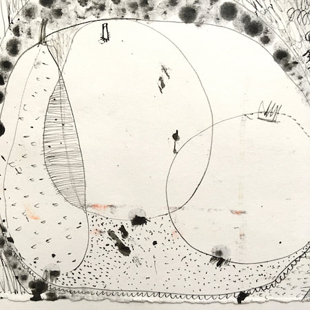
I keep lots of scrapbooks and sketchbooks where I develop ideas and design little creatures. Here's a peek inside one ...

~~~~~~~~~~~~~~~~~~~~~~
~~~~~~~~~~~~~~~~~~~~~~
As you may know, I am also known as Heather Eliza Walker.
Click the image if you would like to find out more and visit my other website. ~~~~~~~~~~~~~~~~~~~~~~ ~~~~~~~~~~~~~~~~~~~~~
~~~~~~~~~~~~~~~~~~~~
April 2024
~~~~~~~~~~~~~~~~~~~~~~
~~~~~~~~~~~~~~~~~~
All
~~~~~~~~~~~~~~~~~~~~~~
~~~~~~~~~~~~~~~~~~~~~~
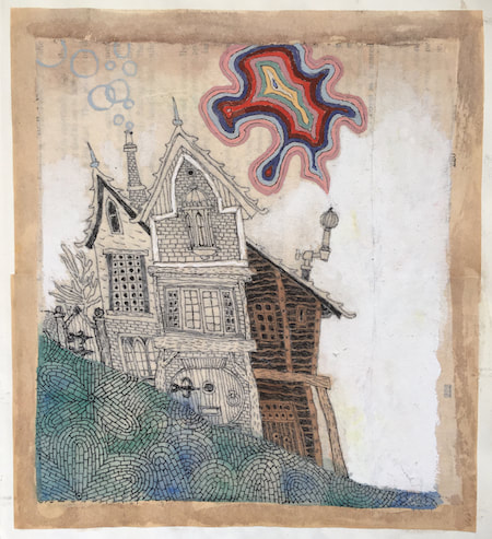
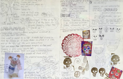
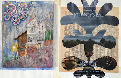
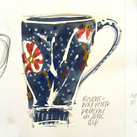
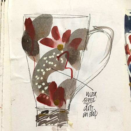
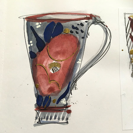
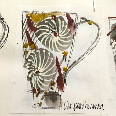
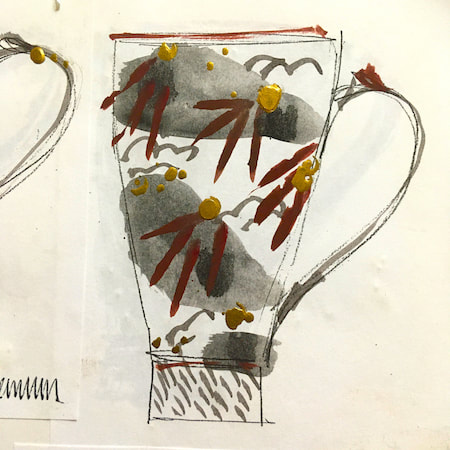
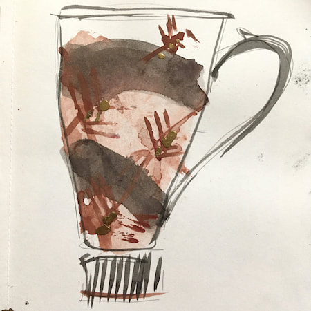
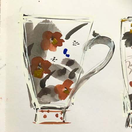
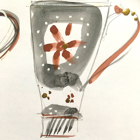
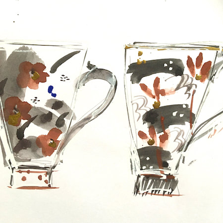
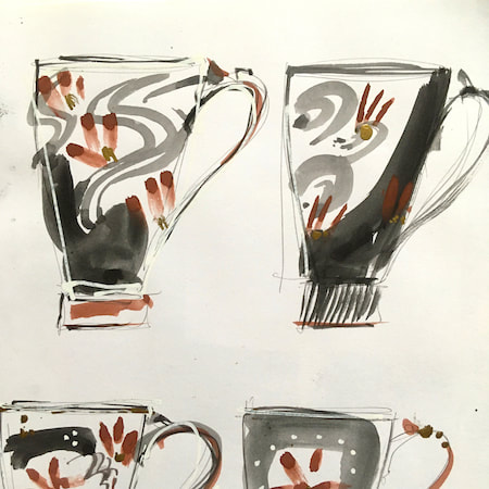
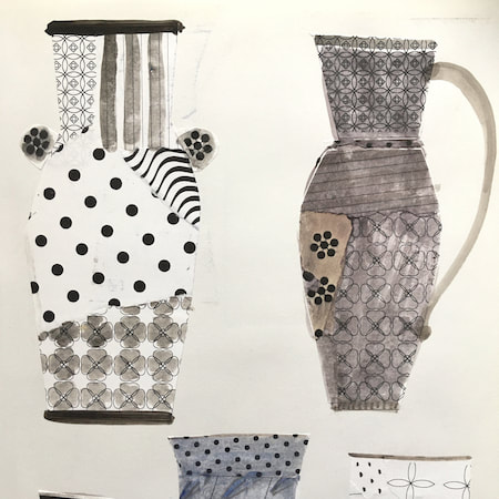
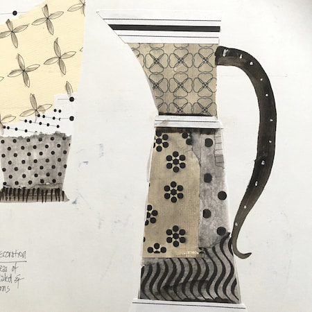
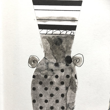
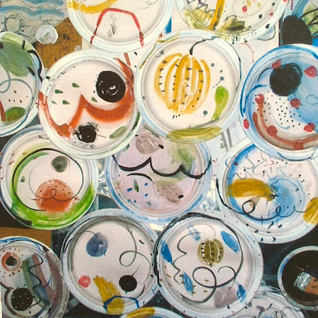
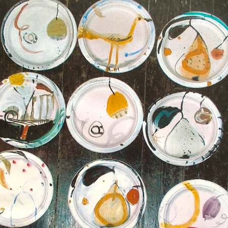
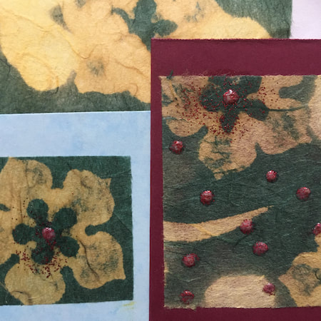
This time, take a peek into my ceramic design sketchbook. I actually made some of the mugs, but I kind of prefer the drawings! The plate designs are painted on paper plates, a most liberating process.
~~~~~~~~~~~~~~~~~~~~~~
~~~~~~~~~~~~~~~~~~~~~~
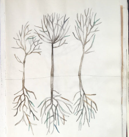
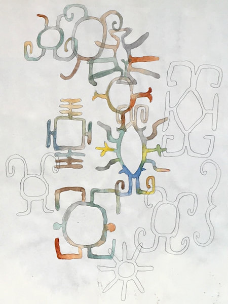
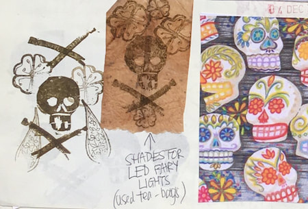
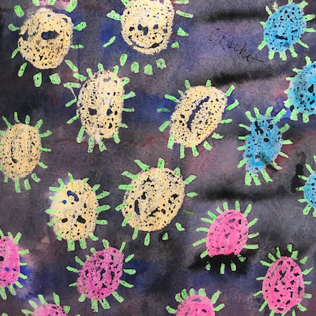
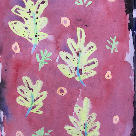
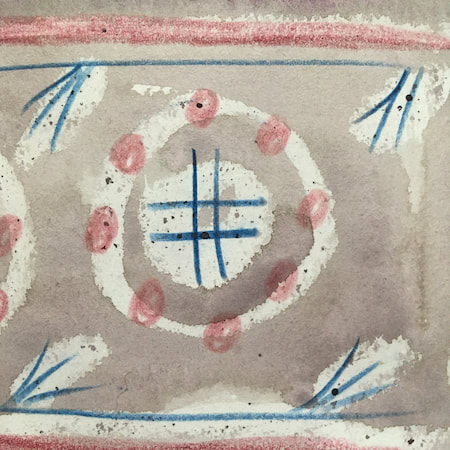
These watercolours are from my pattern sketchbook. I used coloured wax crayons to resist the washes of watercolour, also home-made rubber stamps dipped in bleach then printed on crêpe paper - the bleach takes out the paper dyes.
~~~~~~~~~~~~~~~~~~~~~~
~~~~~~~~~~~~~~~~~~~~~~
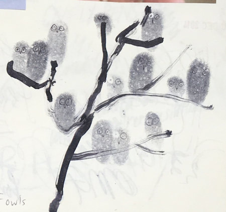
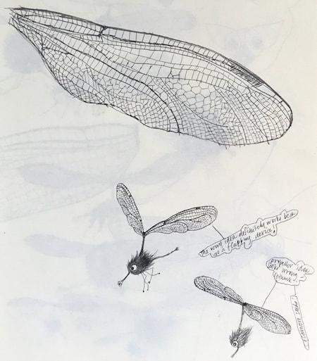
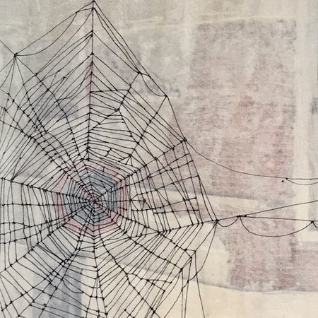
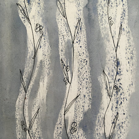
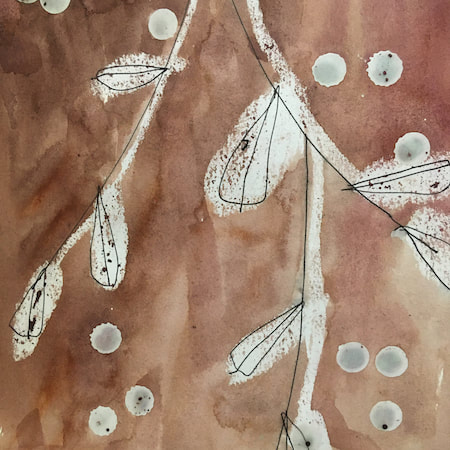
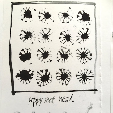
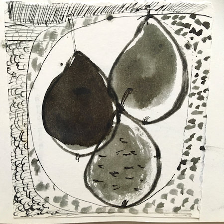
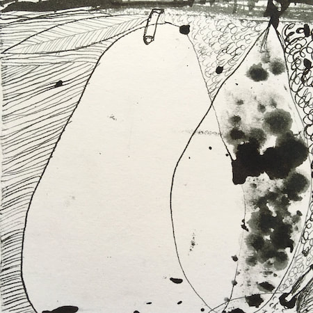
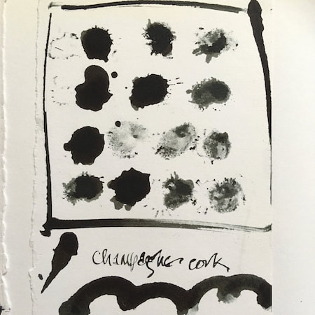
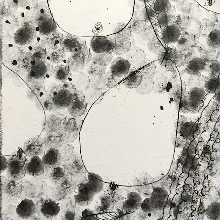
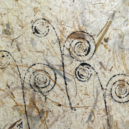
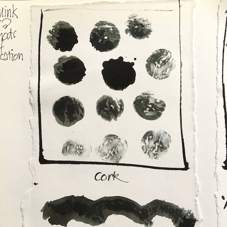
A sketchbook I used for mark-making with unusual objects - corks, seed-heads, feathers, home-made rubber stamps, my fingers and lots of flicky things ...
|
 RSS Feed
