 Mono versions of 'River Moth Tonight' (I haven't thought of a better way to name this pattern yet) designed for single colour. The top one has papery texture, the two are below speckled. It's always interesting to see how the graphic nature of a design works in single colours. 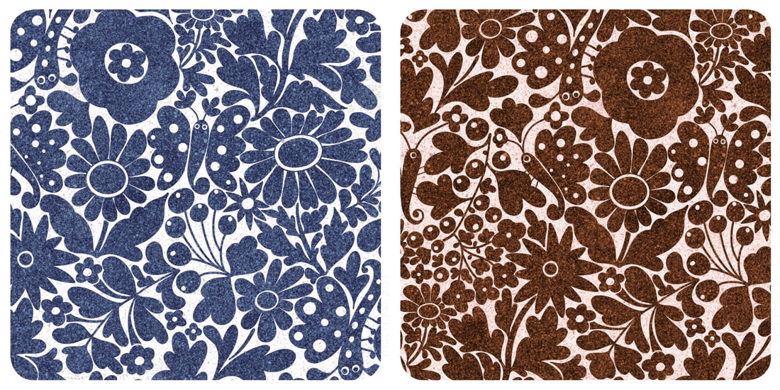 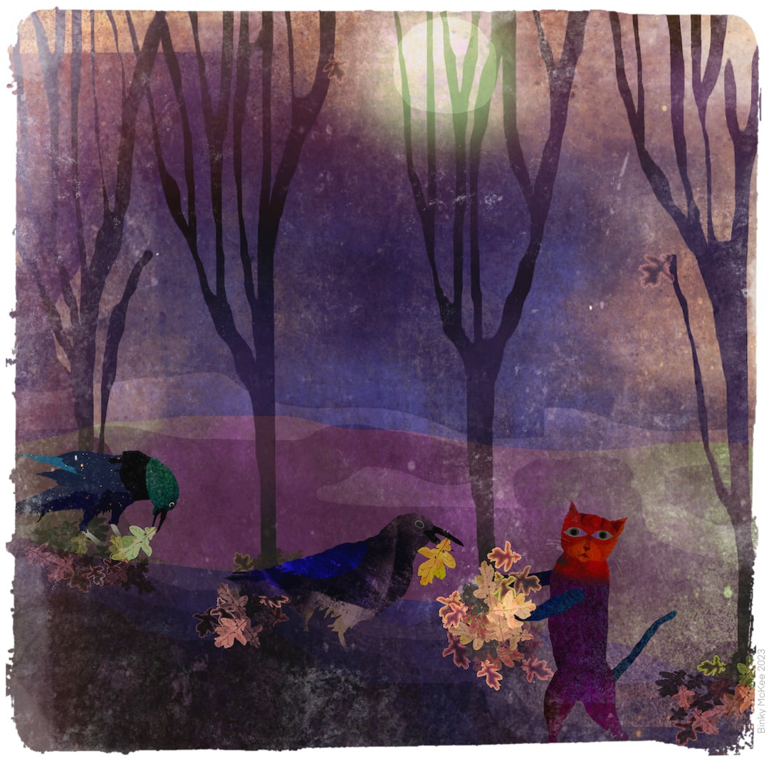 Cat and Crows Clearing Leaves, Procreate illustration 2019 It was time to clear away all the fallen leaves today in our neighbourhood annual 'leafathon', a sociable and fun tradition which dates back goodness knows how many years (we moved in as a young family in 1971). Even after 1984 when I lived outside of Scotland I would make it a date to come home and lend a hand before I moved back in 2006, and in fact B's daughter now does the same, travelling up from Englandshire to bag a few leaves when she can make the date. Eventually, B and I kept the house for our own following my parents' passing, so hardly a year has gone by when I have missed it - but this year I was unable to make it. I had some horrid bug (not covid, according to my nearly out-of-date home tests), felt ghastly, and judged it wise not to risk passing it on to some of the older residents. So I sadly stayed in the house and watched everyone having a great time from the window with a strong sense of FOMO. Ironically, the illustration above was made in 2019, just as Covid19 was sneaking into the country through the back door.
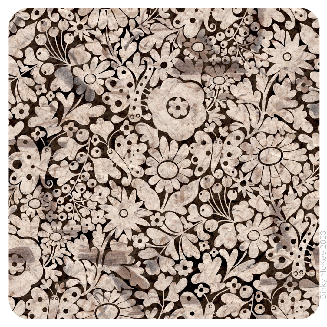
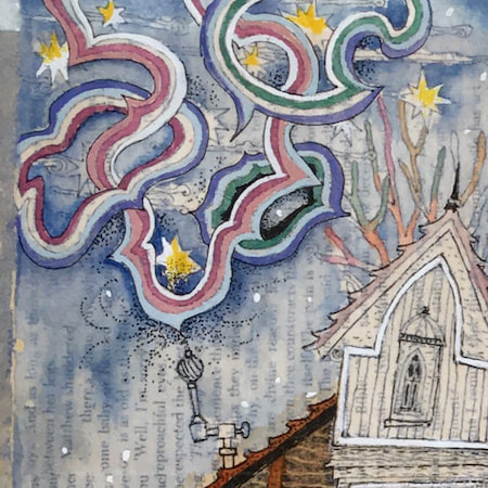
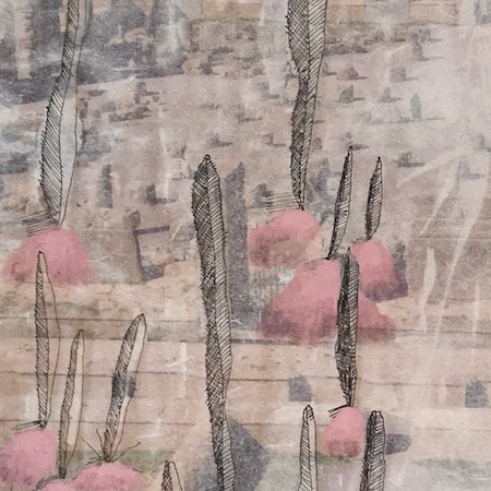
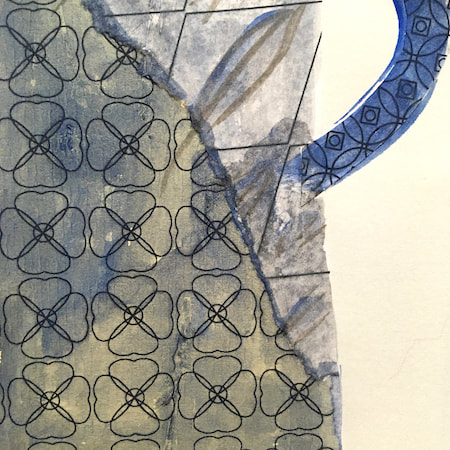
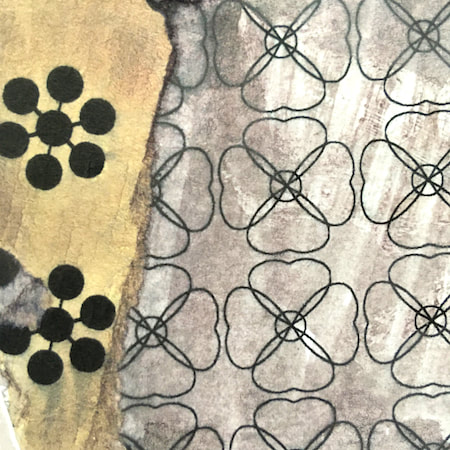
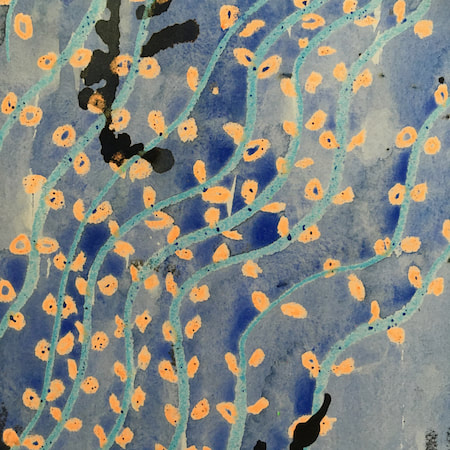
 I started making this night moth garden design on October 1, following along from ideas in Crazy Daisies with elements expanding into surrounding spaces until they are almost touching. I visited it on and off for about 3 weeks, during which time I swore I heard music on the radio a few times singing "this is the river-moth tonight" which I thought was lovely (it turned out to be "this is the rhythm of the night", just another of my hilarious misheard lyrics). The image of moths in gardens on a summer night was as stuck in my head as the song. 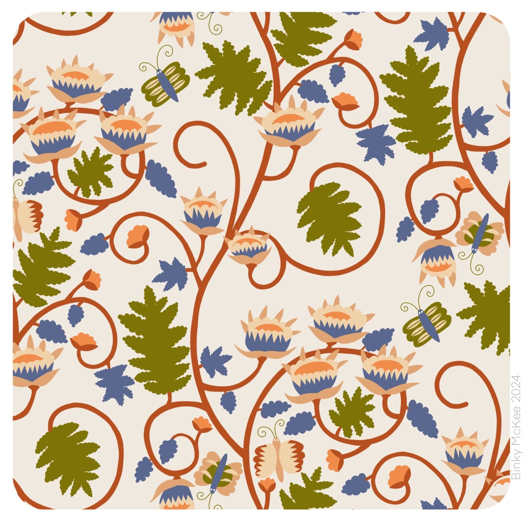 The pattern lay around on my iPad without any further experiments until this week, when I gave it the bark paper texture overlays I was using for my folksy patterns. Tonal variations from the bark fibres embedded in the paper give the colours a rich, velvety feel in this design.  It's unlikely I would print a something like this onto fabric as there is already enough texture in the material, but it could work well on smooth paper, so I always make my textures repeat just in case. Here is how the 'bigger picture' works. I manipulated inverted colours in this version, and now it looks like marble inlays.
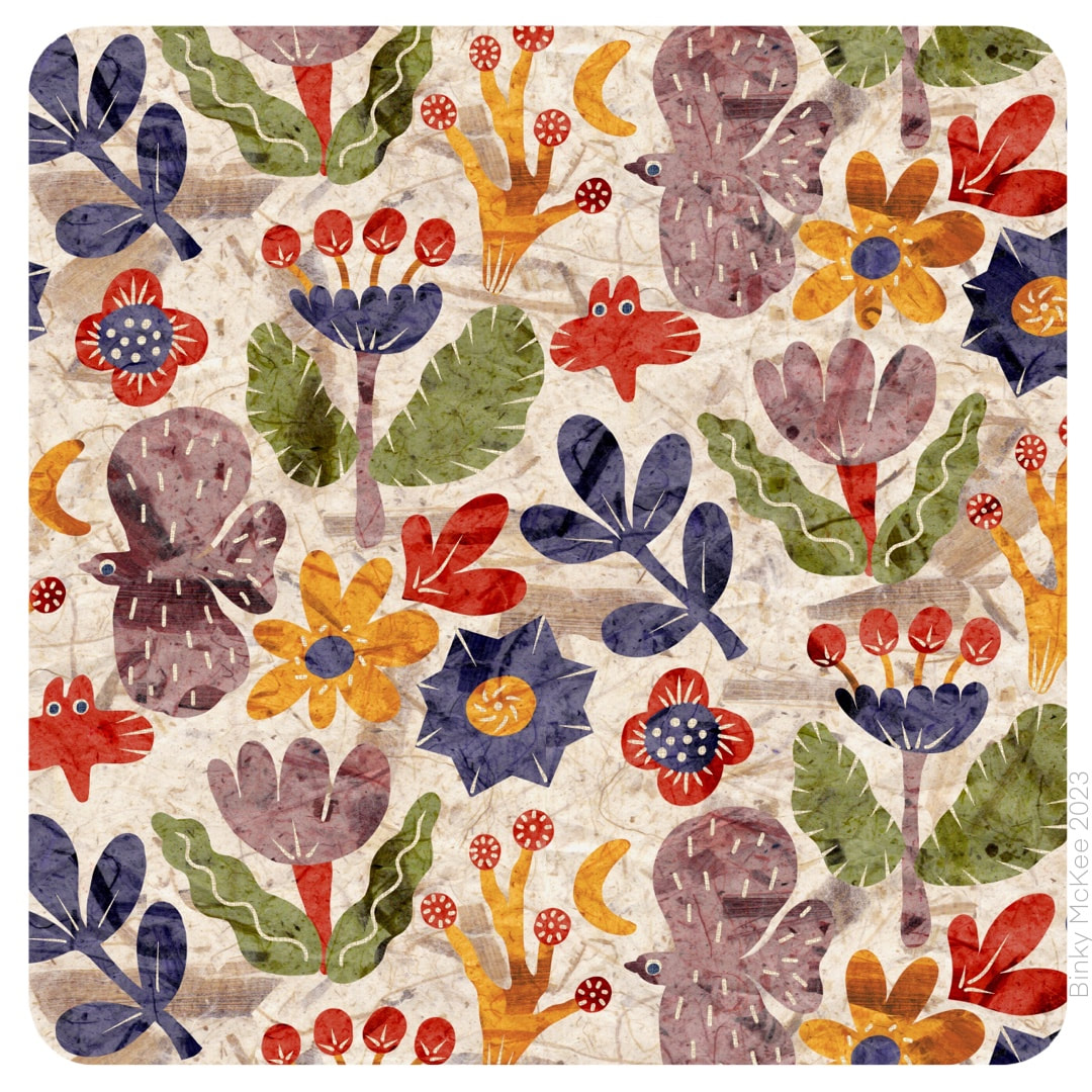 I've been experimenting with a bark paper texture, which brought this folksy pattern I made last year to life together with a slight adjustment to the colour separations. I converted it to make the Hallowe'en version in the previous post, also given the papery treatment - I like the scrap-book feel which has revived and refreshed the pattern.
I know it's bonfire night but I'm not feeling it this year, too much stress for dogs and other pets, so no fireworks pictures today. I have noticed much less activity on the Guy Fawkes front this year locally. I hate to sound preachy, being one who prefer a more laisser-faire approach, but loud explosions and waste of resources seem inappropriate and anachronistic on all levels of our present political climate, so best to let it lie for now I think; perhaps it's time for some quiet reflection and reframing how we interact with our world instead of celebrating huge fires and spectacular expensive rockets for the sake of a few minutes' entertainment. |

~~~~~~~~~~~~~~~~~~~~~~
Welcome to my illustration and patterns blog.
I illustrate under the pen-name of Binky McKee, McKee being my mother's maiden name. Binky was the name of every single cat my great-grandmother kept - allegedly about 40 of them during her 94 years of life. I changed the website address a few months ago, so some older links on previous posts are broken. If you click one of those and it takes you to a strange page, simply replace the .co.uk after the binkymckee. with weebly.com and it will work again. I hope you enjoy your visit! ~~~~~~~~~~~~~~~~~~~~~~
~~~~~~~~~~~~~~~~~~~~~~
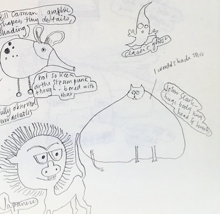
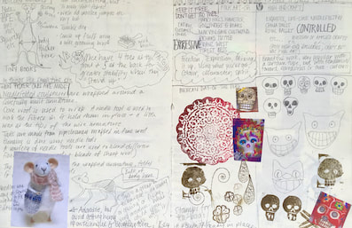
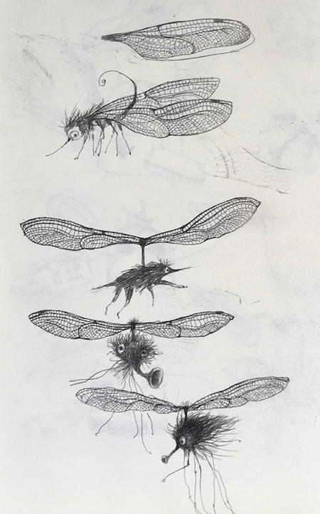
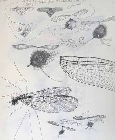
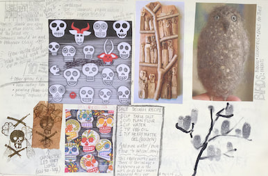
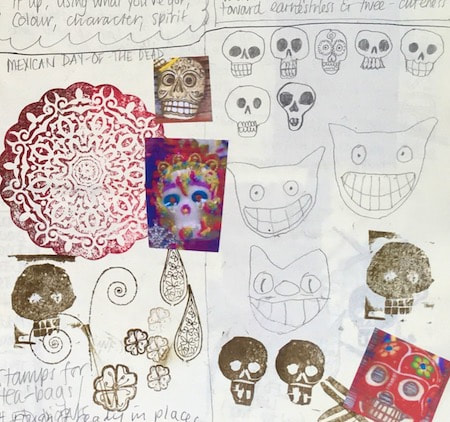
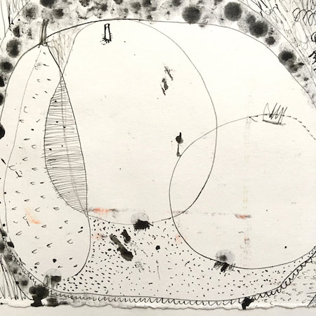
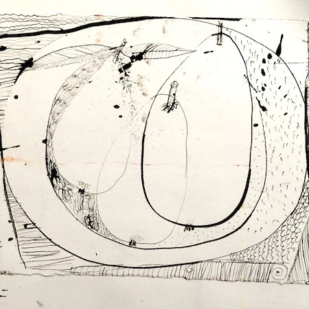
I keep lots of scrapbooks and sketchbooks where I develop ideas and design little creatures. Here's a peek inside one ...

~~~~~~~~~~~~~~~~~~~~~~
~~~~~~~~~~~~~~~~~~~~~~
As you may know, I am also known as Heather Eliza Walker.
Click the image if you would like to find out more and visit my other website. ~~~~~~~~~~~~~~~~~~~~~~ ~~~~~~~~~~~~~~~~~~~~~
~~~~~~~~~~~~~~~~~~~~
April 2024
~~~~~~~~~~~~~~~~~~~~~~
~~~~~~~~~~~~~~~~~~
All
~~~~~~~~~~~~~~~~~~~~~~
~~~~~~~~~~~~~~~~~~~~~~
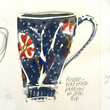
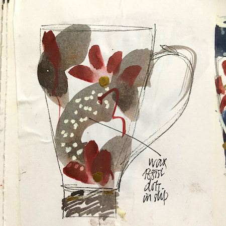
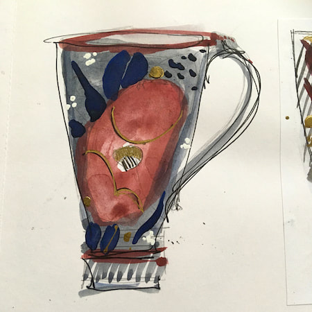
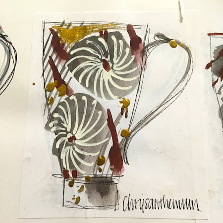
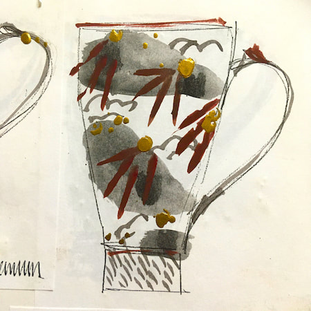
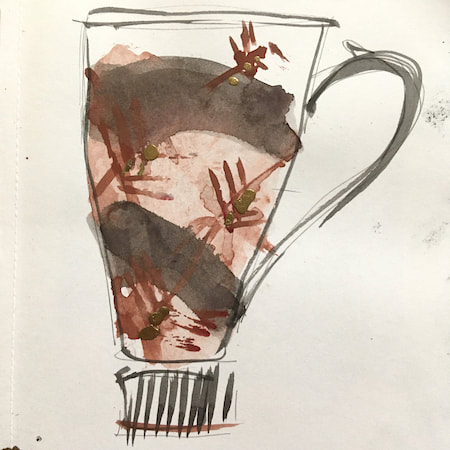
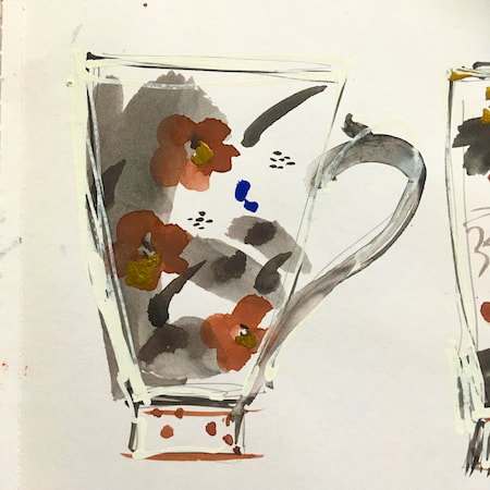
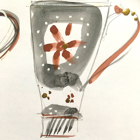
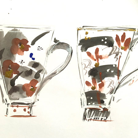
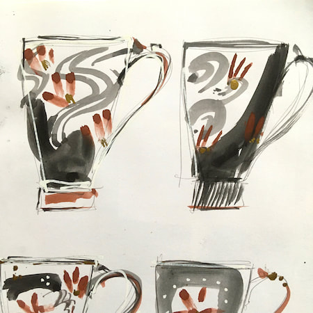
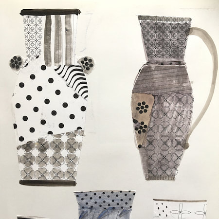
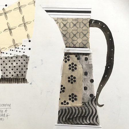
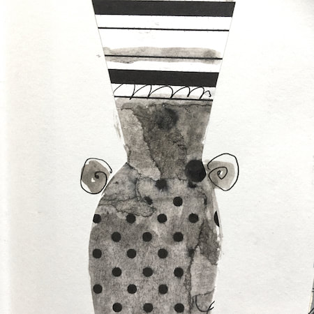
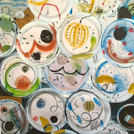
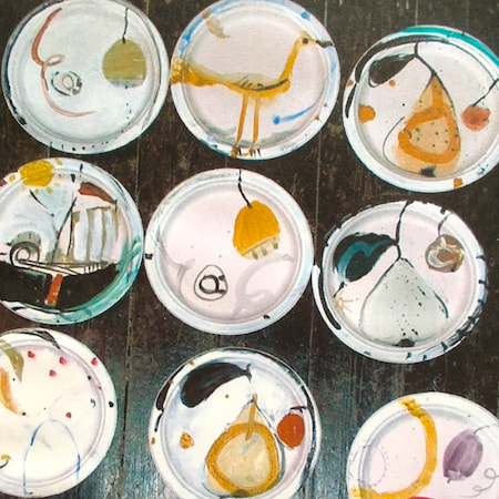
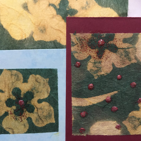
This time, take a peek into my ceramic design sketchbook. I actually made some of the mugs, but I kind of prefer the drawings! The plate designs are painted on paper plates, a most liberating process.
~~~~~~~~~~~~~~~~~~~~~~
~~~~~~~~~~~~~~~~~~~~~~
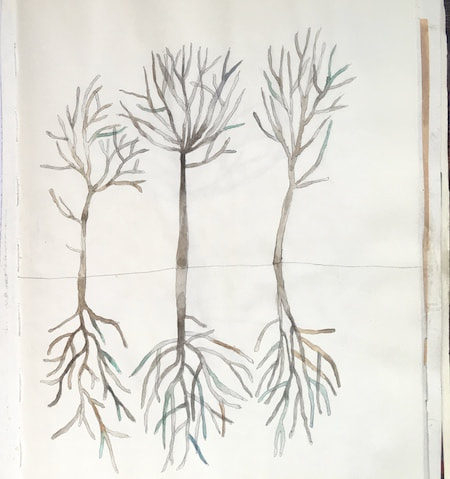
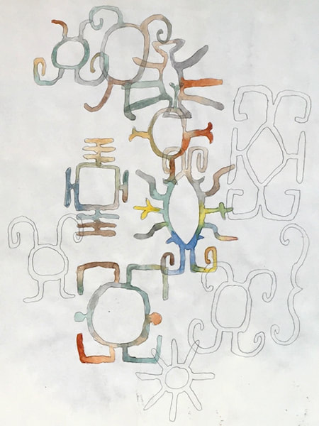
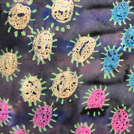
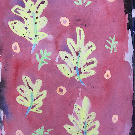
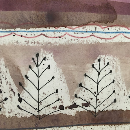
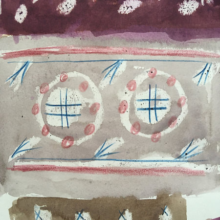
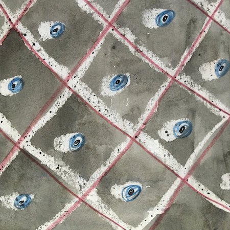
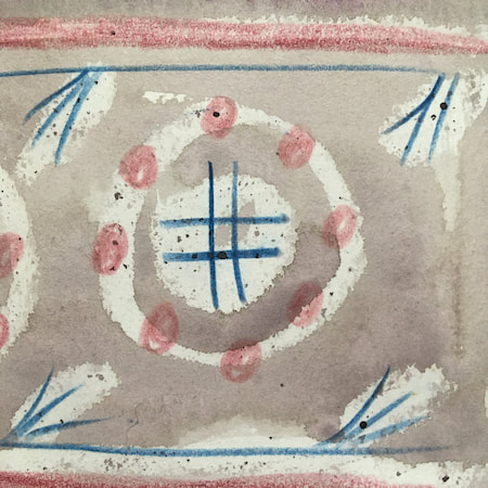
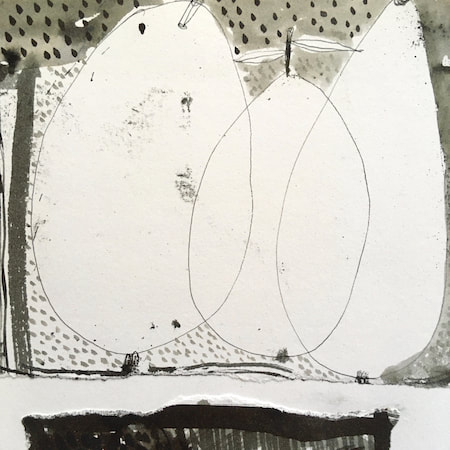
These watercolours are from my pattern sketchbook. I used coloured wax crayons to resist the washes of watercolour, also home-made rubber stamps dipped in bleach then printed on crêpe paper - the bleach takes out the paper dyes.
~~~~~~~~~~~~~~~~~~~~~~
~~~~~~~~~~~~~~~~~~~~~~
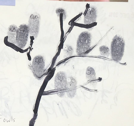
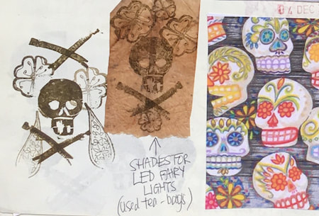
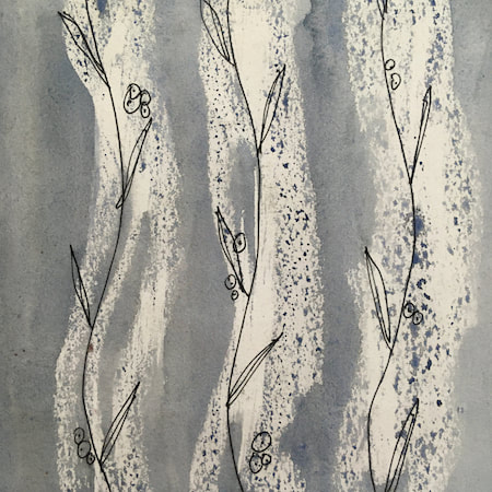
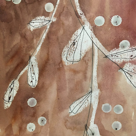
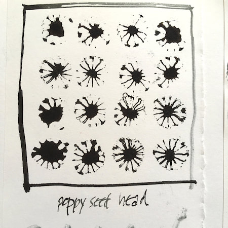
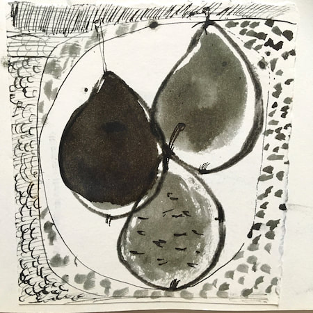
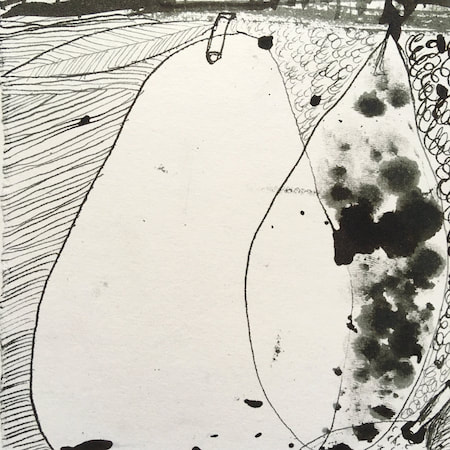
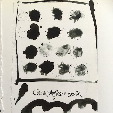
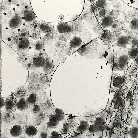
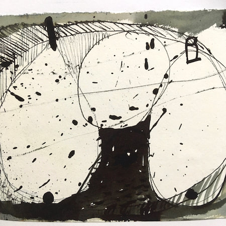
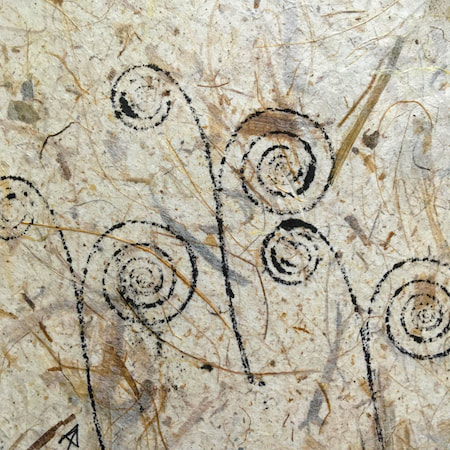
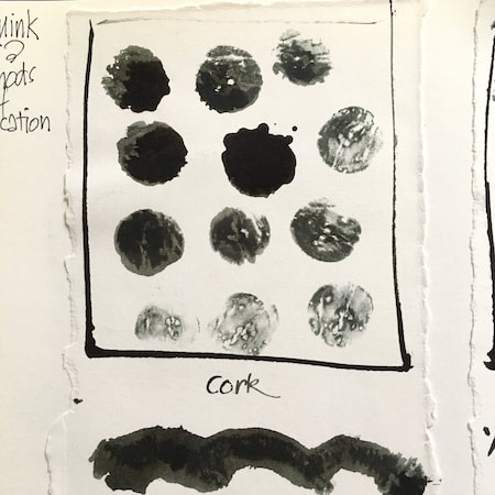
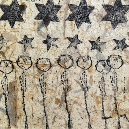
A sketchbook I used for mark-making with unusual objects - corks, seed-heads, feathers, home-made rubber stamps, my fingers and lots of flicky things ...
|
 RSS Feed
