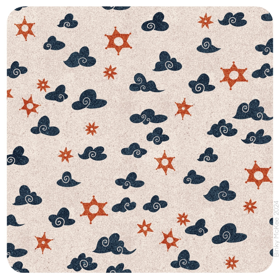
 Two fun, simple patterns to accompany the busier moth garden designs of 3 March. I picture a set of cushions on a sofa in my mind and imagine how they would all look together when I do this. I played with so many different colourways for the stars and clouds design above that I couldn't decide on a favourite, so I made a new pattern shown below just with clouds, but in all the inky speckle colours I made last October! 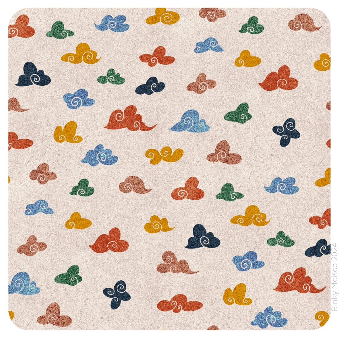 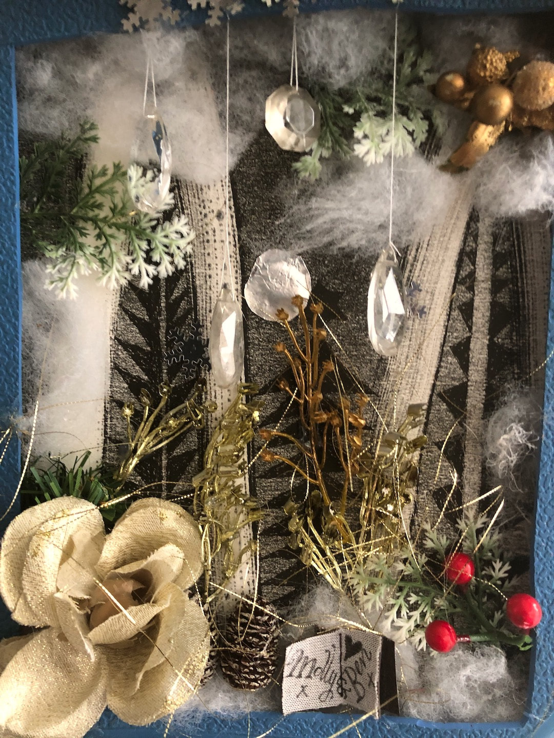 I kicked off my Christmas crafting this year with this 'card' for Molly and Ben. We had all agreed no presents this year, but to hand-make cards instead. I had absolutely no idea what I was going to do as a special card for them until B turned up with a broken hot water bottle. The stopper had failed, unsurprisingly as the bottle is really quite old now. He was about to throw it in the bin when I stopped him and cut out the textured section for printmaking - then the idea came to me to make it into a sort of picture frame. 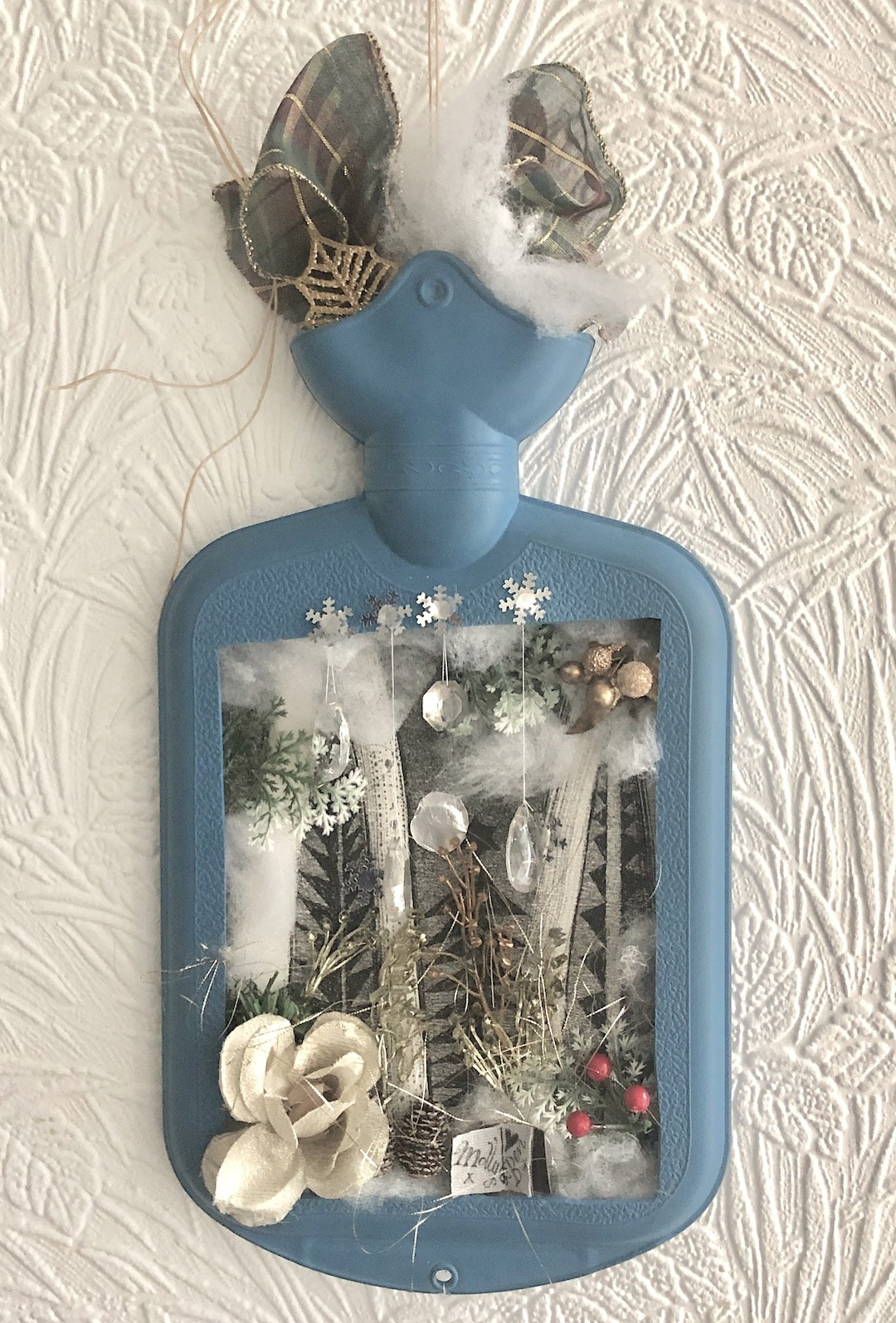 Much fun with a hot glue gun later, here is Molly and Ben's Christmas card! I have written about the one I made for our Mr. T with a description of the materials used on my Heather Eliza blog, more or less the same as used here, except for the addition of a butchered Christmas decoration on this one.
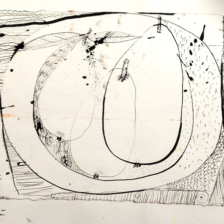
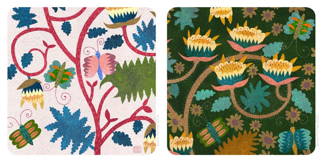 I started making this night moth garden design on October 1, following along from ideas in Crazy Daisies with elements expanding into surrounding spaces until they are almost touching. I visited it on and off for about 3 weeks, during which time I swore I heard music on the radio a few times singing "this is the river-moth tonight" which I thought was lovely (it turned out to be "this is the rhythm of the night", just another of my hilarious misheard lyrics). The image of moths in gardens on a summer night was as stuck in my head as the song. 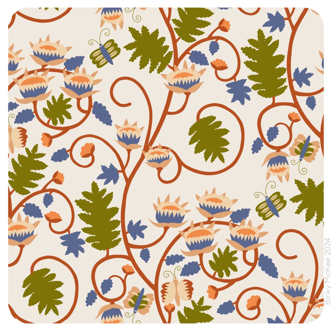 The pattern lay around on my iPad without any further experiments until this week, when I gave it the bark paper texture overlays I was using for my folksy patterns. Tonal variations from the bark fibres embedded in the paper give the colours a rich, velvety feel in this design.  It's unlikely I would print a something like this onto fabric as there is already enough texture in the material, but it could work well on smooth paper, so I always make my textures repeat just in case. Here is how the 'bigger picture' works. I manipulated inverted colours in this version, and now it looks like marble inlays.
This is the first weekend I have had to myself since mid-July. We have been incredibly busy since then: as an indirect result of the Edinburgh Festivals the day-job went crazy with 650 chairs to recover for the Scottish Assembly Rooms while they weren't in use in addition to all our regular work. Throw into the equation 3 lots of house guests, dog-sitting and cat-sitting to cover various owners' holidays, and different commitments in the evenings and weekends - you get the picture. I did manage to get some pattern-making done simply by stealing 5 minutes here and there, working in the car during lunch-breaks. I had set aside images for my blog but didn't get around to posting them so I back-dated those then made these two catch-up collages. 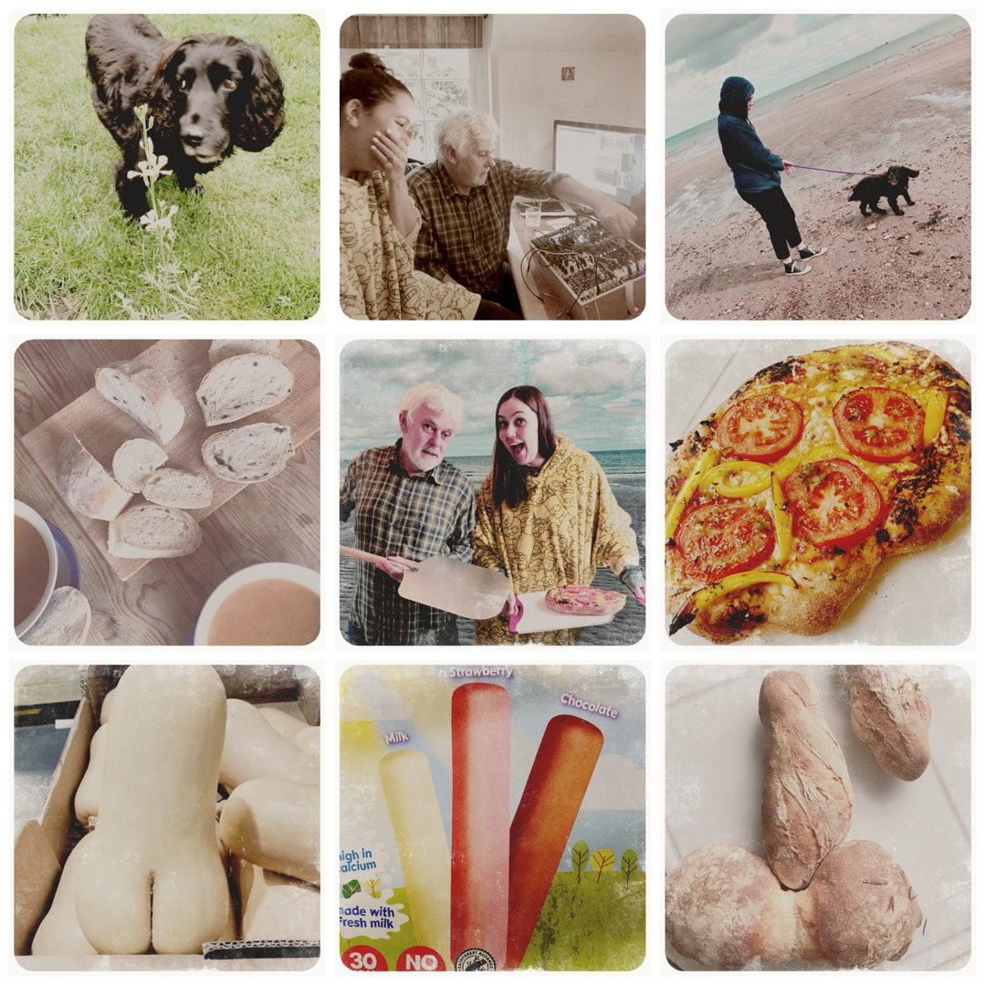 Top row: Zico in the garden with a bolted rocket plant, hurrah! Molly arrived: modular fun with B, and Kirkcaldy beach with Zico Middle row: B's beautiful olive bread and squash soup; pizza making day (hilarious photo which Molly superimposed onto a Kirkcaldy beach pic; pizza looking like a 1970s cookery book photo which I love, Bottom row (pun intended): Rude food - Molly and I had fits of hysteria discovering a pair of buttocks in a butternut squash in Aldi, followed by spotting suggesive lollies (I thought we were going to get thrown out) - and somehow we managed to make some of B's rustic breads into more rude food. 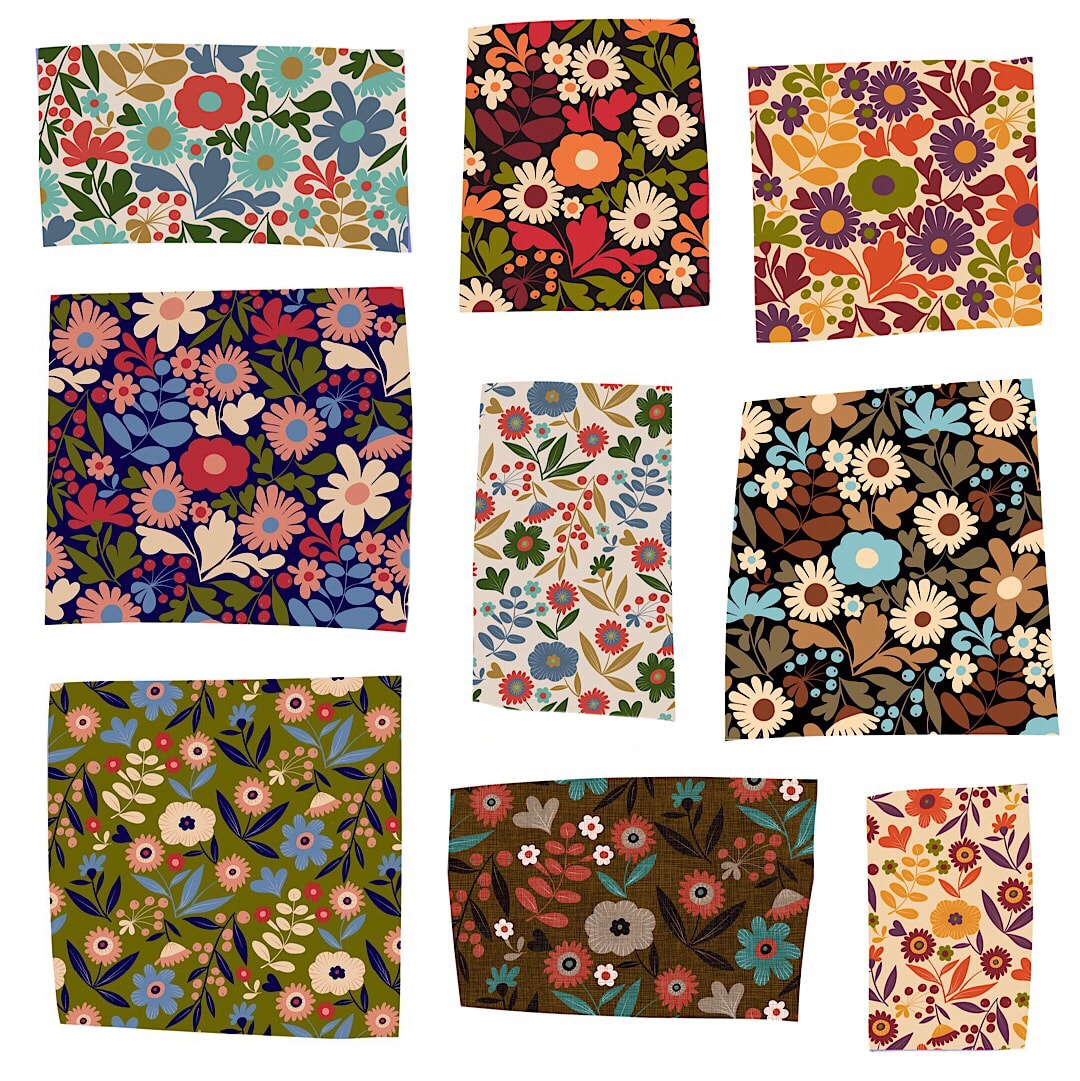 So, Wildflower Garden had a makeover with a rearrangement of the colour separations, and together with Crazy Daisies both were given new colourways based on old velvet shades and my favourite Peruvian cardi.
New work is underway, too ... Thanks for visiting, see you next week! 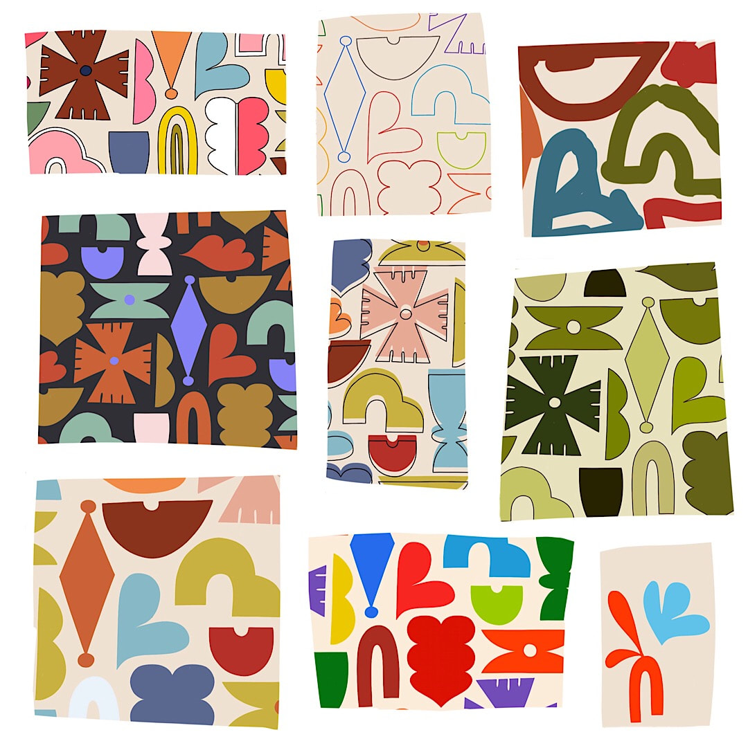 Lots of fun with retro colours this week!
Starting from top left and going round in a clockwise spiral to the centre: 1. The first version of last week's pattern tile. I decided it was too fussy for what I wanted, so a simplified version replaced it. 2. Colourful lines created using a clipping mask, and 3. The delightful chaos of the layer unclipped! It looks like mad kiddy drawing. 4. A classic 70's green scheme. 5. A couple of motifs I introduced to the pattern but didn't use - will keep for a completely different pattern, I think 6. I spent a lot of time during the week collecting colours based on retro children's toys, as well as traditional sweets like midget gems and jelly babies. Disturbingly, I discovered the plastic toy colours were virtually the same as the food colours. 7. My favourite renditions in a natural palette, and 8. Another favourite colour scheme, from a vintage floral based on a men's neck tie in my collection. 9. A 'missed register' to make your eyes shudder! Made by nudging the outline away from the fill. I like it. Thanks for visiting, see you next week! 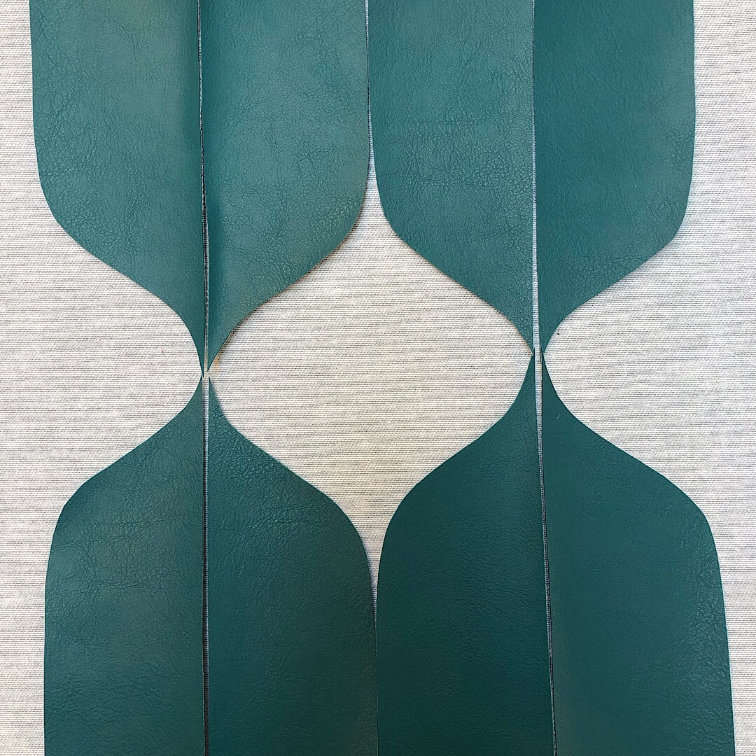 Inspiration comes from unexpected places: the lovely curves pictured above are pieces of vinyl fabric left over after cutting out panels to recover a set of chairs at work. They were tossed to one side to be discarded, but not before I spotted the potential for an ogee style pattern! I quickly laid them out and snapped a quick pic for reference before they were swept away. 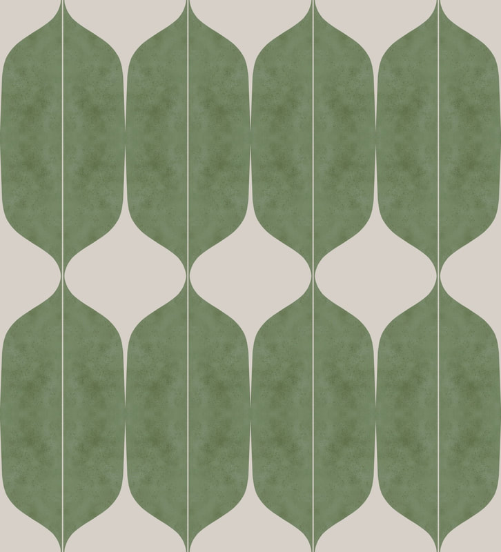 A few days later I started playing about with a few ideas for making patterns. I cut one curved motif in Procreate based on the vinyl scraps; above is an initial blocking together to see how it flows. I began assembling elements for a repeat tile, and as always I was fascinated by the forms produced at each step of the process. They make a srtiking collage when collected together. 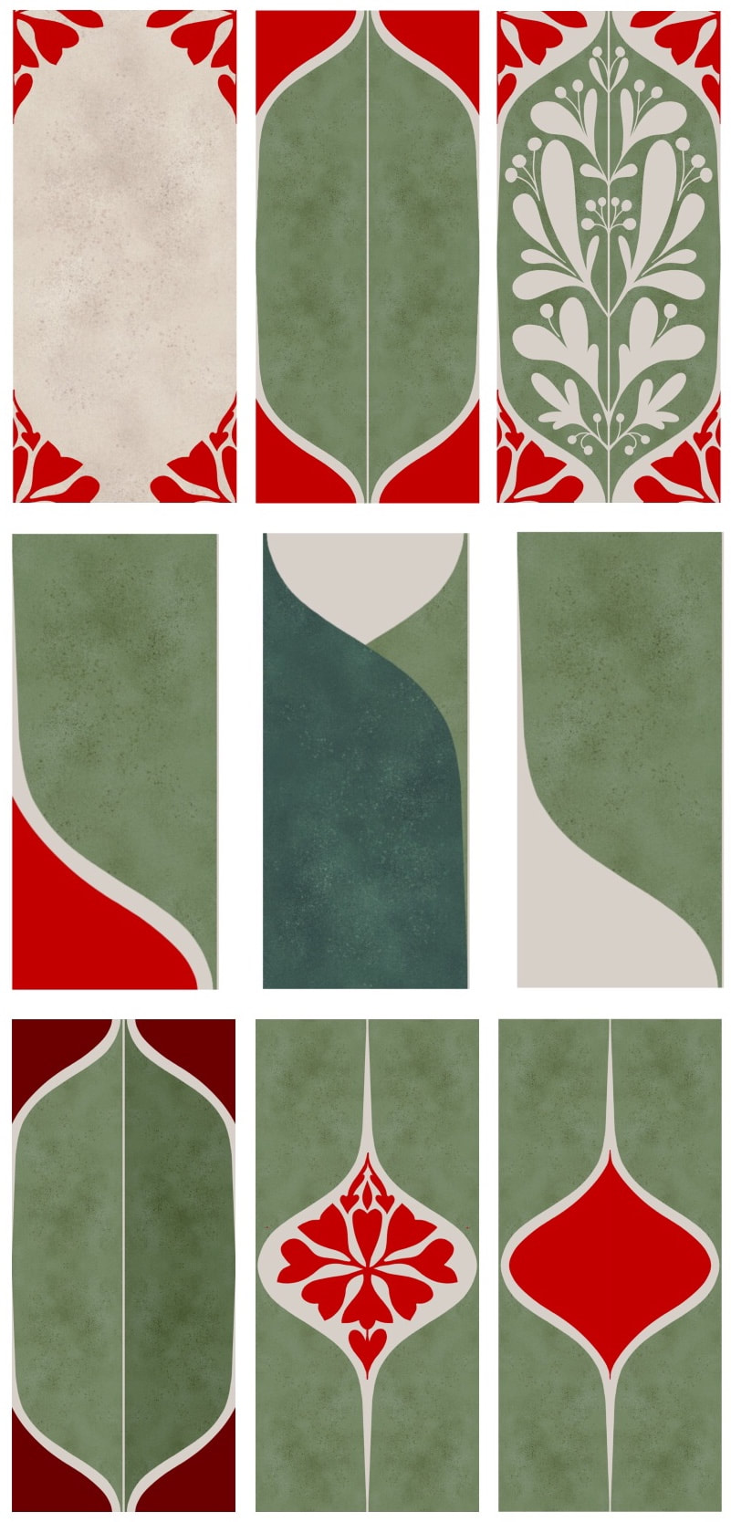 There are a few different ideas here for a variety of elongated ogee-style patterns. I also began working on a true ogee pattern of flowing identical elements, as yet unfinished.
This all started me wondering where the word ogee comes from; an exquisite old Persian term, perhaps? Or is it a spelling of the initials 'OG', standing for something? Maybe a French Moroccan word? and so my musings went on. After a little research I found this completely unexpected answer, which could even be Scottish, and local to me! "While the origins of the word ogee are uncertain, it was first used in the whisky distilling industry. It refers to a bulbous chamber which makes up part of a traditional pot still. The ogee sits on top of the distilling pot and, as the liquid heats up, it creates a larger surface area for the vapours to land on." - www.handmadekitchens.co.uk Well I never! Maybe 'OG' really does stands for something like 'Old Gertie' and just became a word after all. I know the vats are often given affectionate names in the distilleries ... Thanks for visiting, see you next week!  In an audacious piece of art theft, I took these roundels from one of my Heather Eliza drawings made on my iPad, and made a pattern from them. Well, I am the same person, after all. For now I have been enjoying the sketchy look of them which would look good printed on smooth paper, but I may at some point make clean, bright versions for textiles in different colourways. The two versions above are exactly as the original, whereas these pictured below have had layers removed and colours and direction changed.  Thanks for visiting, see you next week!
 I have started some pareidolia drawings from the recent photos I took of crushed up leaves on the pavements, but first of all here is a design tweak which lifted this pattern of shapes. I rounded the top edge of the green shape in the middle of the two images above - left is the first draft with a flat top, right is the rounded version which did so much for the pattern, making it less rigid and giving it some bounce. 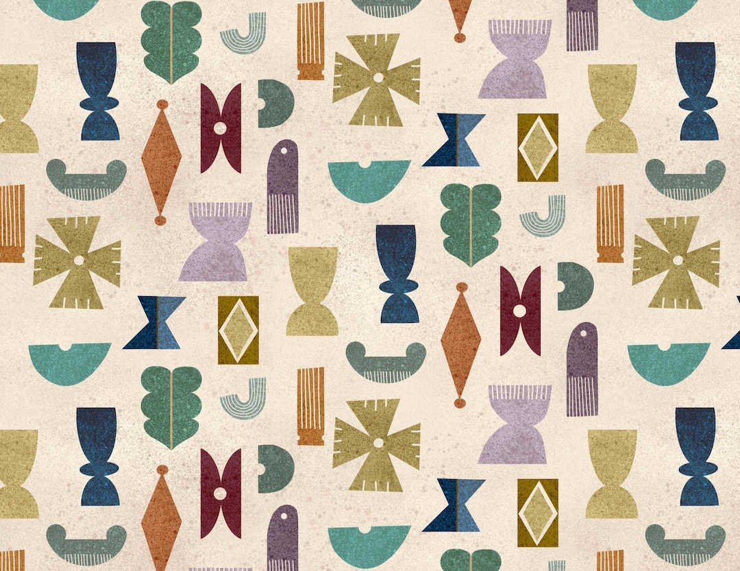 Compare the look of the pattern now with the older version in previous posts. The image below is all the layers of patterns in a Procreate document made visible all at the same time - I find the intense collage effect exciting. The shapes take on a thin tissue appearance, and the whole effect is like confetti in a heap. 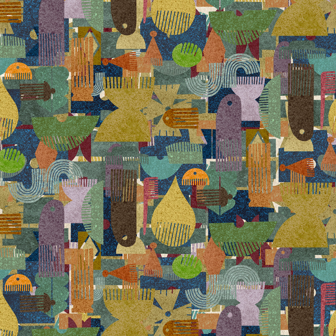 Thanks for visiting, see you next week!
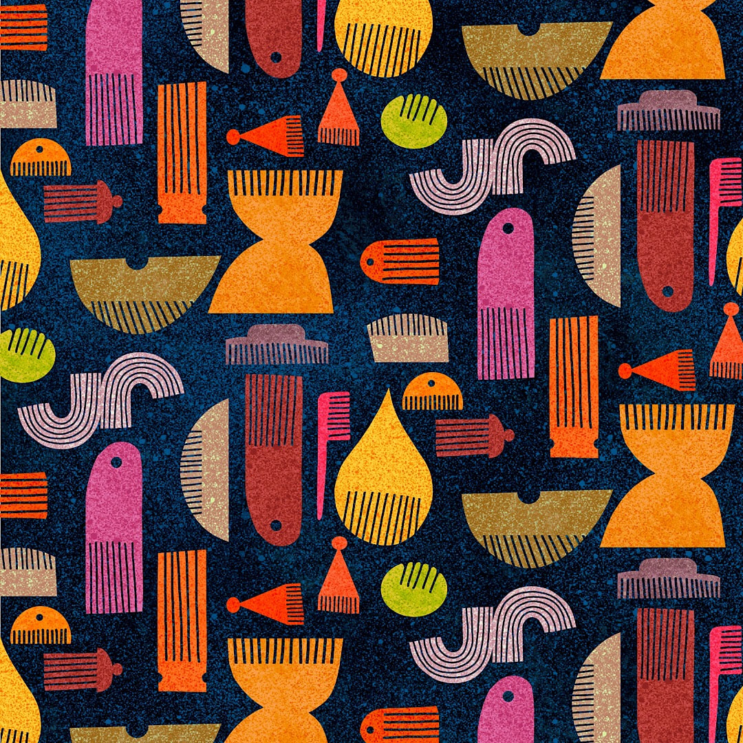 Playing with different colourways for the original combs pattern I posted two weeks ago, this vibrant one against a dark background was a big favourite. Then, almost unconsciously as a form of doodling I began to play around making birds from the combs. They quickly became a pattern as I listened to Beatrix, a wonderful dramatisation of the life of Beatrix Potter on BBC Radio 4 Extra. Two ways to relax in the evenings when I'm too tired to take on anything that requires big thoughts! 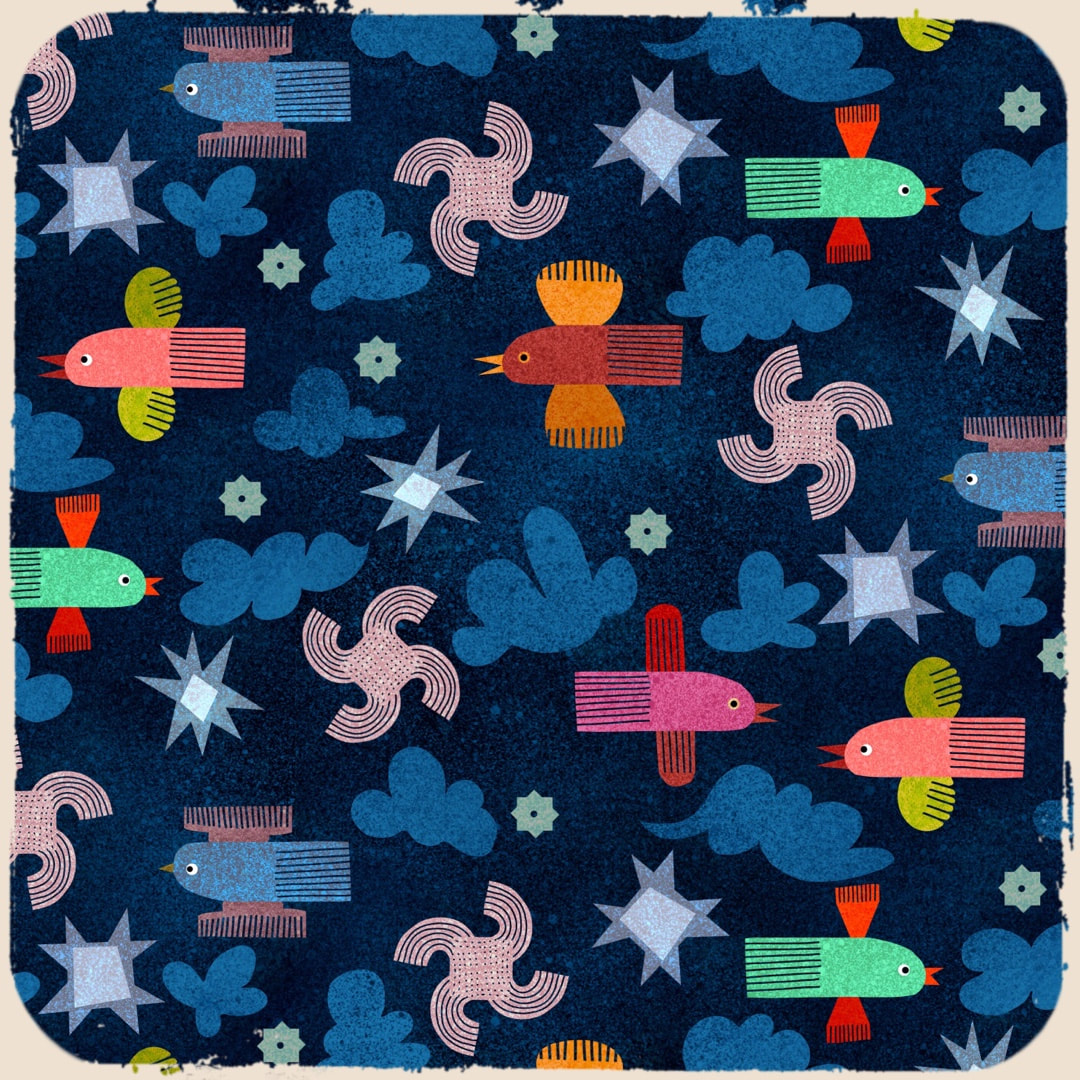 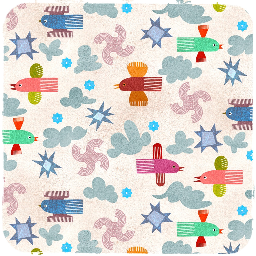 Thanks for visiting, see you next week
 What story is he telling? Just look at the expressions on his audience's faces!
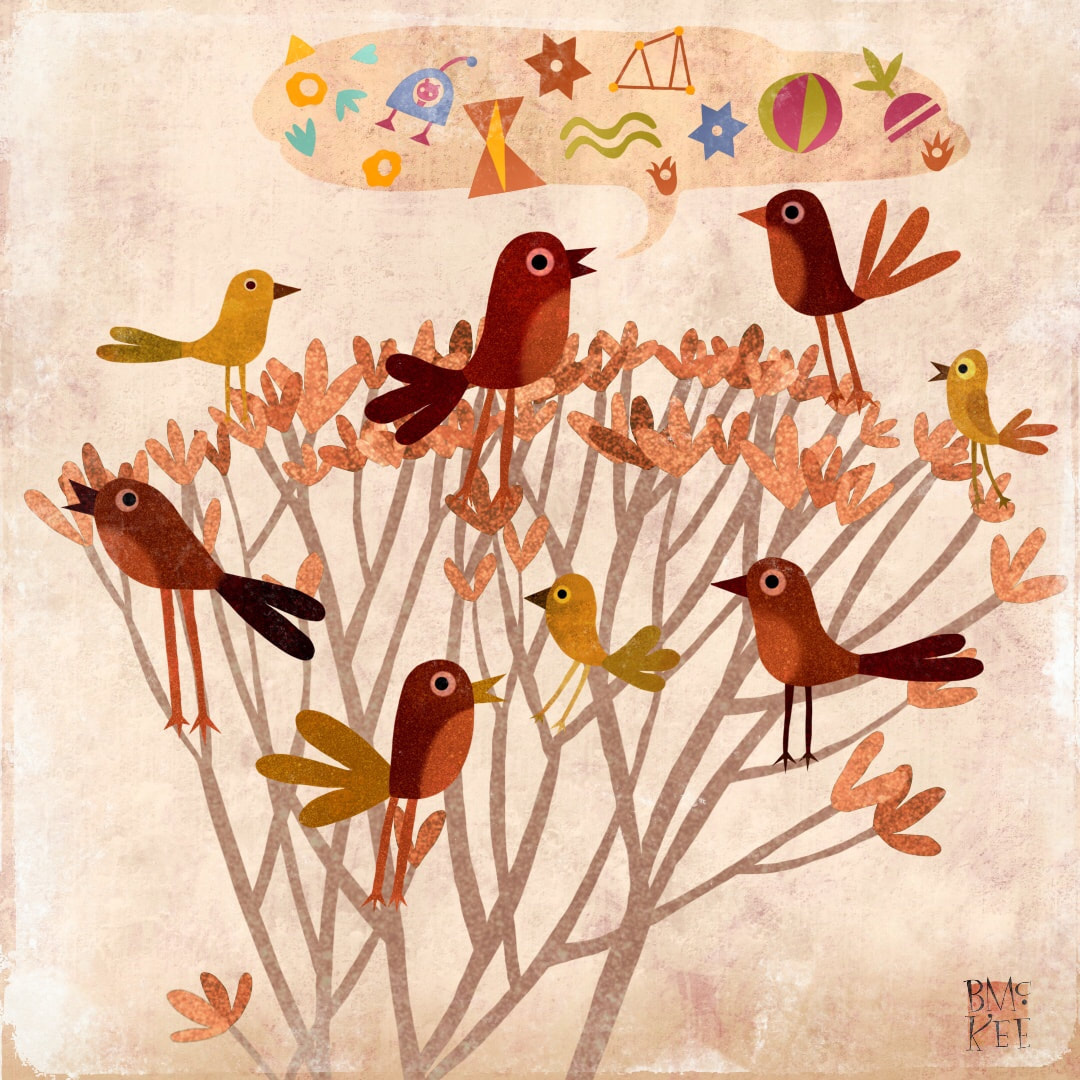
 Another example of how my interests are shared between my drawing practice and my illustration: unreadable asemic text has been a longstanding theme in my Heather Eliza drawings, and now, similarly, it has popped up in this playful illustration in the form of symbols representing what these birds are gossiping about! Ice, stars, water, trees, fluffy stuff, navigation, eggs, landmarks and - well, eeeee says the hen. All the stuff that birds need to share.
 We had such a fun, busy weekend last week that I didn't get around to blogging. This is a catchup, and you can see here what it was all about. Here are some previous works I remade during the week in new textures and new colours. Below, inspired by the Voynich manuscript, was my favourite because its rich, velvety colours and the tiny lines make it look like an embroidery. 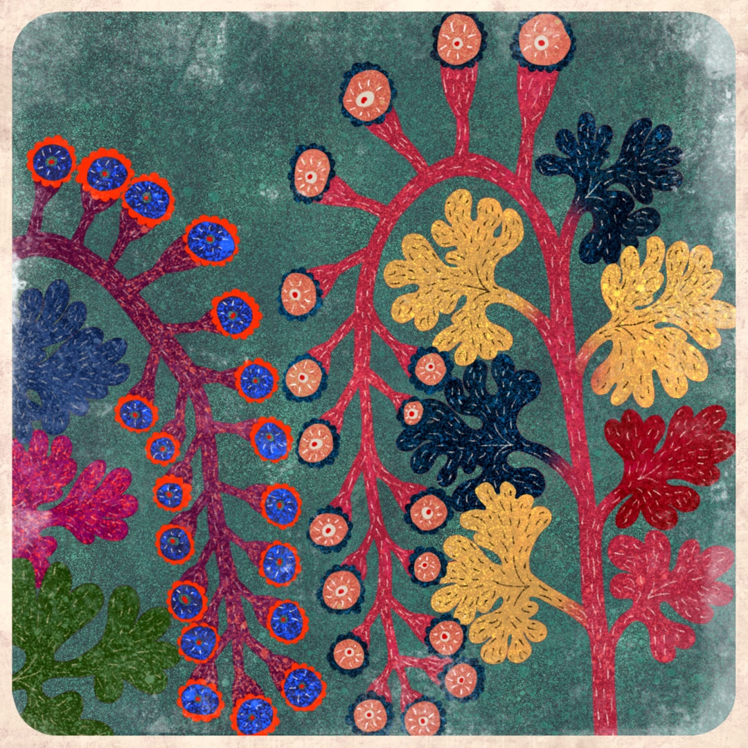 In the same week I also got interested in honing in on details and redrawing each one, an interesting exercise in composition and detail. I am compiling several Instagram posts to use when I get back to work on my book of ditties illustrations, so I don't have to keep interrupting my work flow - and it is so relaxing to be able to play like this and learn at the same time.   Still running along with Voynich inspired flowers this week, I set up 6 small canvasses in Procreate and worked through them quite quickly. I like to work this way, as it stops overthinking, keeps the work fresh, and is great for generating new ideas. I didn't expect to like the works as much as I do, intending them at first to be just small digital collage sketches so I didn't pay any attention to how I set up the canvasses at the beginning. I discovered subsequently that they are all 72dpi, too low a resolution to make prints - I had just quickly copied a master I use for Instagram post, whereas I normally work at 300dpi. I had envisaged the six pictured above to be no larger than 15cm a piece if they were prints.  The physical dimensions provided in Procreate are 38x38cm at 72dpi (if the resolution had been 300dpi, they would only measure 9cm). They may print absolutely fine at 15cm, being less than half the size of their physical dimensions. I tried the pot, bottom right of the 6 images, with the tiny zig-zags running downward (a detail most likely to show up poor print quality) on our home office printer, and from what I could tell it seemed to be fine. However, our printer is not professional quality. I won't know for sure until I take them along to a proper printer's and see what happens.
 Monday: I performed my yearly ritual of drawing up charts of sunrise and sunset times to see just how much more daylight we have since the winter solstice. I calculated 1 hour and 3 minutes, but by the time I write this journal entry it will be even more, as we are steadily gaining 4 minutes and counting every day. Tuesday: the first day of February is here! It's a great month, as the sun gets brighter and higher in the sky. There are shoots coming up all over the garden, and I dream of all the lovely flowers we will have. Wednesday was Candlemas, a day I really like; the thought of blessing candles is wonderfully Gormenghast - I can visualise some strange ancient ceremony of the Groan family being conducted in the castle. The best thing, though, is arranging garden snowdrops in a posy vase and lighting lots of candles, celebrating the lighter days and higher angle of the sun. (I took some photos of our snowdrops and posted them on my HEW blog). Thursday and Friday were about getting organised. My work room is cluttered with some Christmas decorations which were taken down on twelfth night. While most went back into the loft, others required packaging materials, replacement parts, and a bit of mending before they join the others the loft, so a couple of Amazon orders were required. I feel the need to get my room back! Saturday saw the completion of the second stage of the cover artwork for the children's book I have been illustrating, also this week; next week will be the third stage, and maybe the final. For fun in the evenings I often play about with my pareidolia creatures, making up little visual stories as I introduce them to one another. I made the one pictured above this week, and this one below a couple of weeks ago.  Thanks for visiting, see you next week!
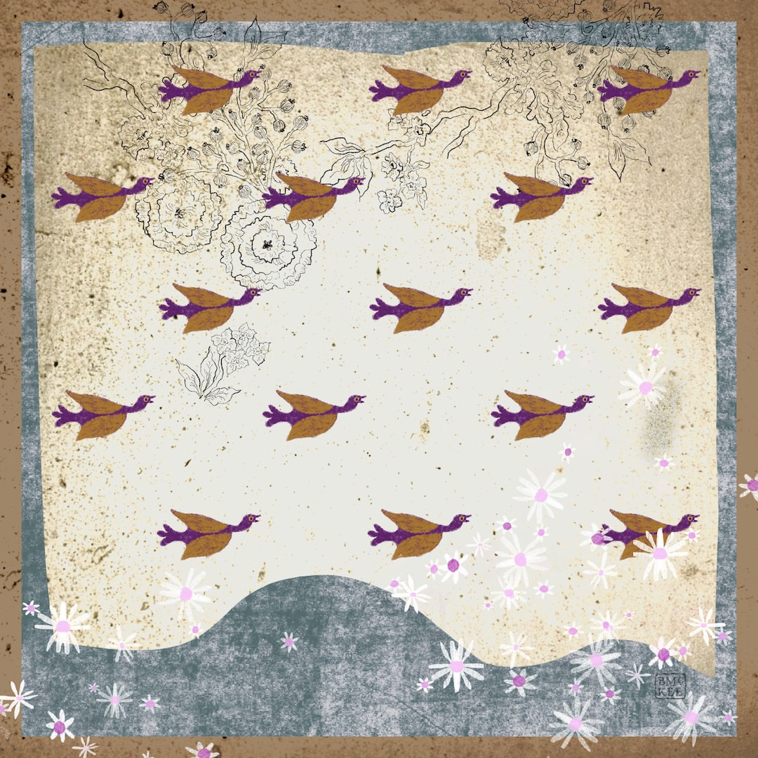 Synchronised flying! I became very interested in this collage when the birds suddenly became a pattern in the landscape, it's a novel combination. I'm sure it's got something to do with living beneath the flight-path of geese crossing the sky to and from a local nature reserve. They form huge skeins and the air is full of their chatter and gabble as they pass over, a beautiful thing indeed. The geese here are one of my pareidolia finds in damp patches on paths on the park.
Thanks for visiting, see you next week! |

~~~~~~~~~~~~~~~~~~~~~~
Welcome to my illustration and patterns blog.
I illustrate under the pen-name of Binky McKee, McKee being my mother's maiden name. Binky was the name of every single cat my great-grandmother kept - allegedly about 40 of them during her 94 years of life. I changed the website address a few months ago, so some older links on previous posts are broken. If you click one of those and it takes you to a strange page, simply replace the .co.uk after the binkymckee. with weebly.com and it will work again. I hope you enjoy your visit! ~~~~~~~~~~~~~~~~~~~~~~
~~~~~~~~~~~~~~~~~~~~~~
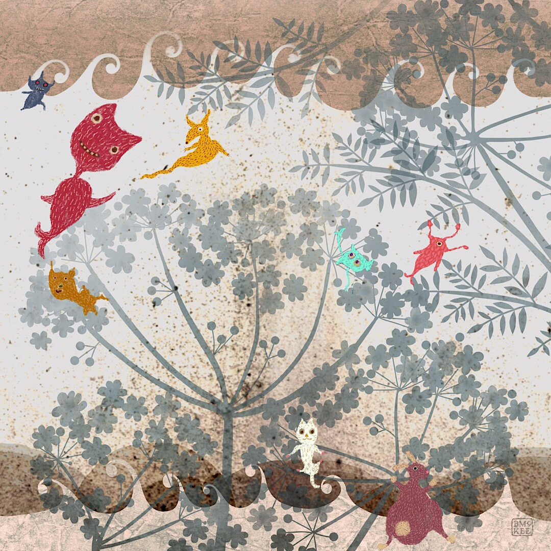
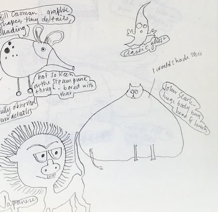
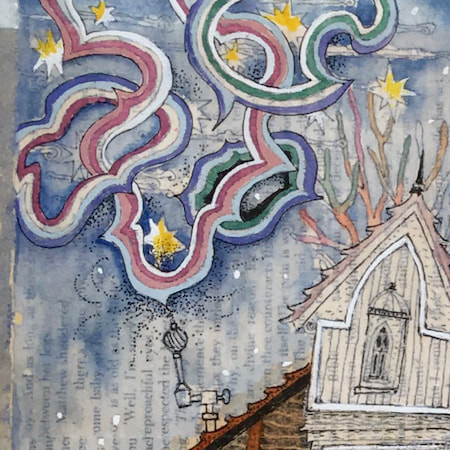
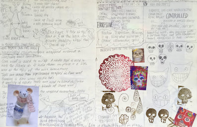
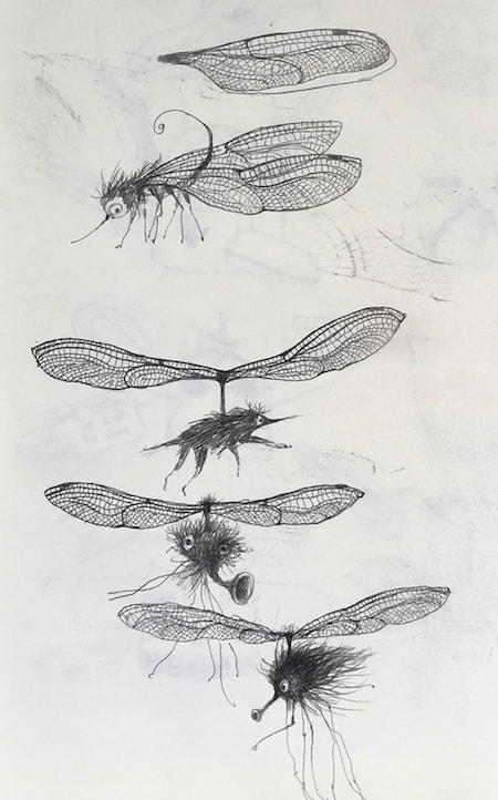
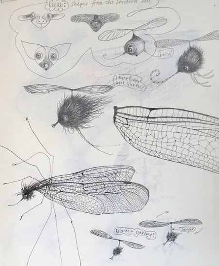
I keep lots of scrapbooks and sketchbooks where I develop ideas and design little creatures. Here's a peek inside one ...

~~~~~~~~~~~~~~~~~~~~~~
~~~~~~~~~~~~~~~~~~~~~~
As you may know, I am also known as Heather Eliza Walker.
Click the image if you would like to find out more and visit my other website. ~~~~~~~~~~~~~~~~~~~~~~ ~~~~~~~~~~~~~~~~~~~~~
~~~~~~~~~~~~~~~~~~~~
April 2024
~~~~~~~~~~~~~~~~~~~~~~
~~~~~~~~~~~~~~~~~~
All
~~~~~~~~~~~~~~~~~~~~~~
~~~~~~~~~~~~~~~~~~~~~~
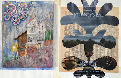
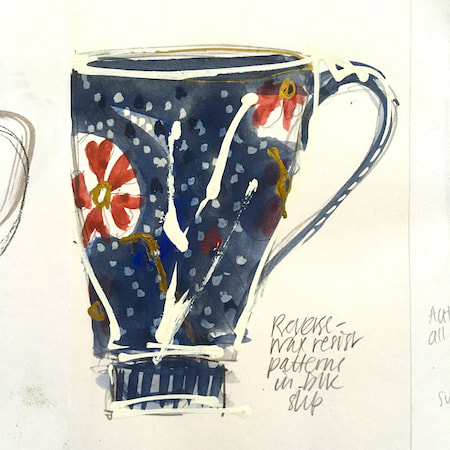
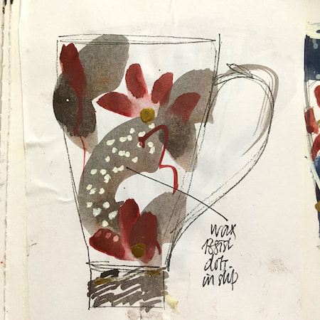
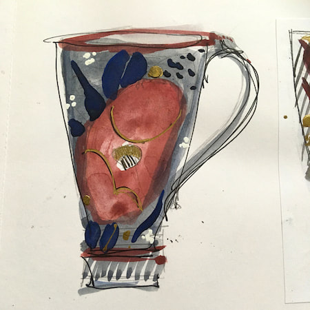
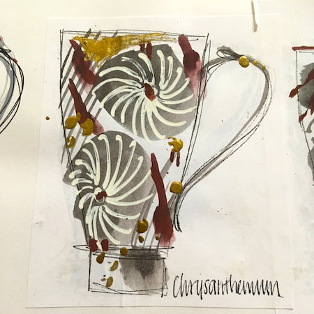
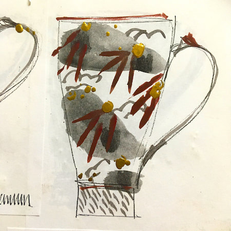
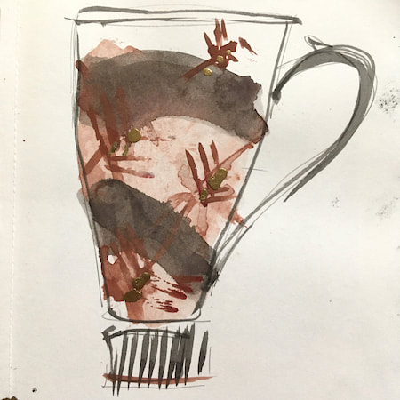
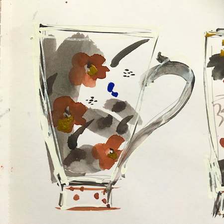
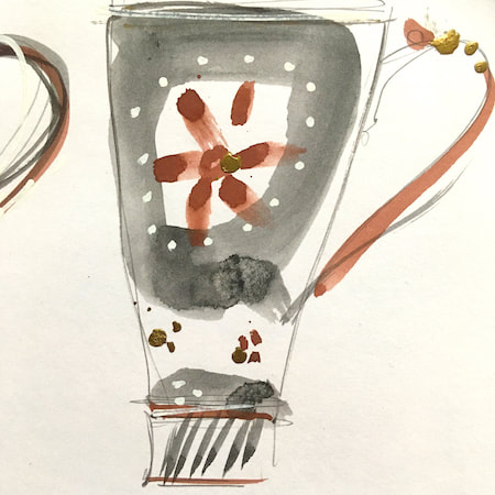
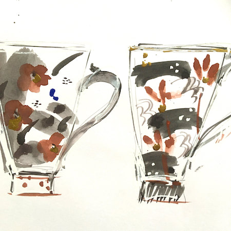
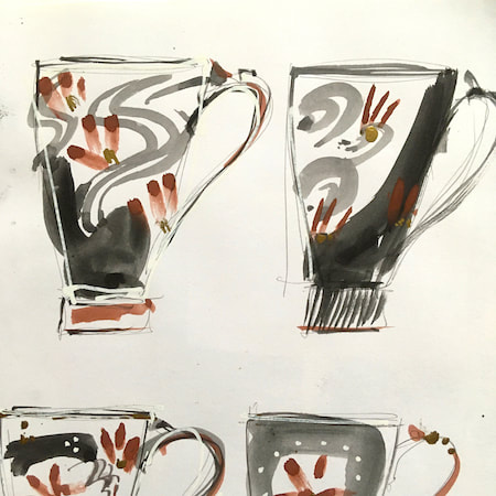
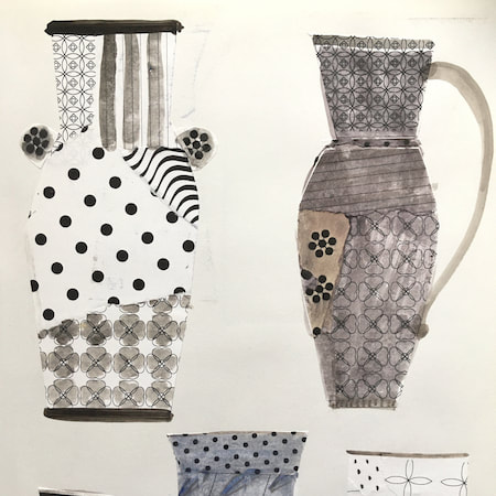
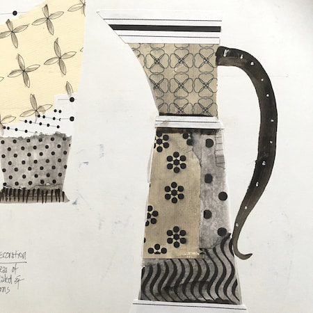
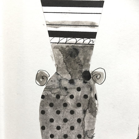
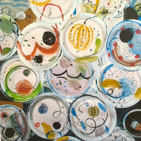
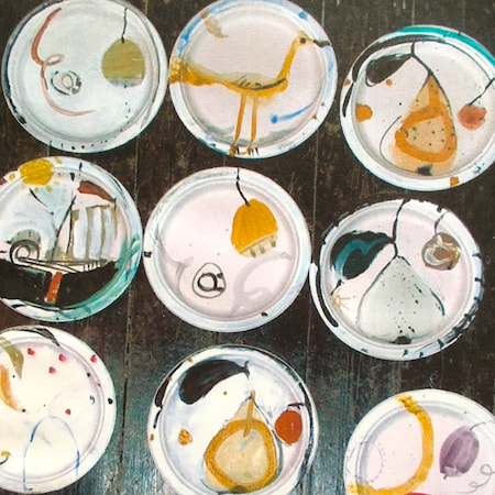
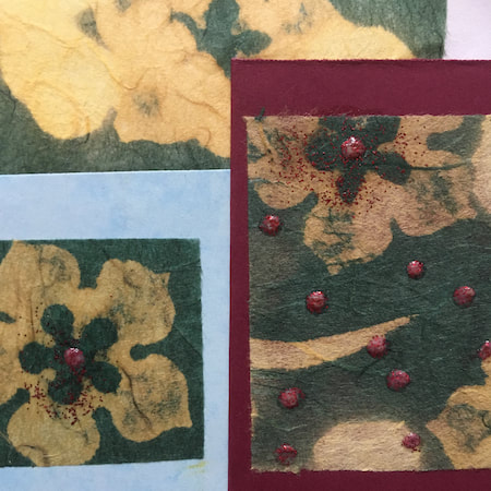
This time, take a peek into my ceramic design sketchbook. I actually made some of the mugs, but I kind of prefer the drawings! The plate designs are painted on paper plates, a most liberating process.
~~~~~~~~~~~~~~~~~~~~~~
~~~~~~~~~~~~~~~~~~~~~~
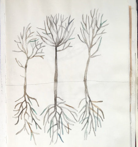
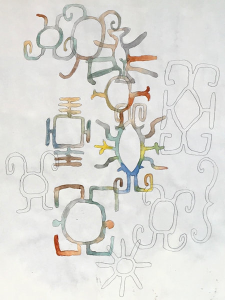
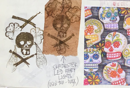
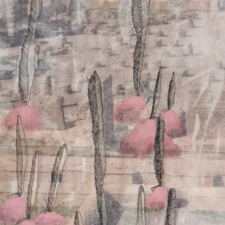
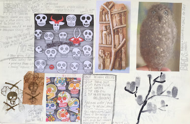
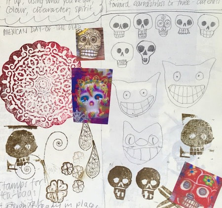
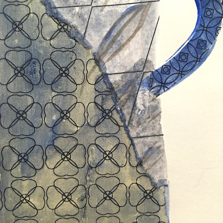
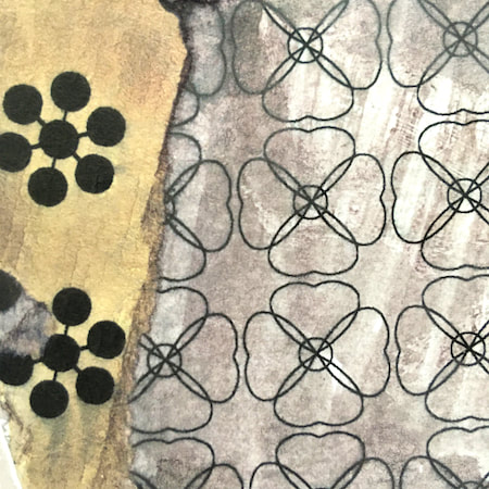
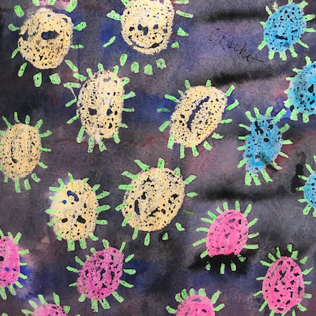
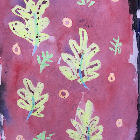
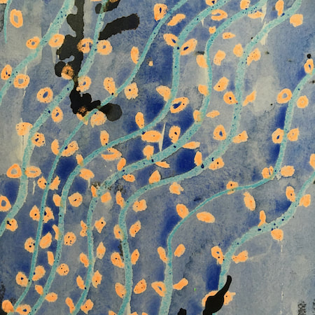
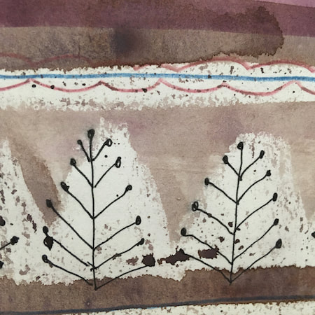
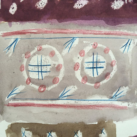
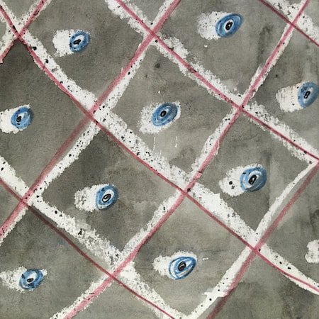
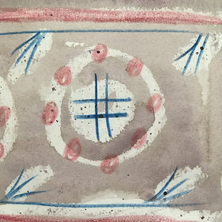
These watercolours are from my pattern sketchbook. I used coloured wax crayons to resist the washes of watercolour, also home-made rubber stamps dipped in bleach then printed on crêpe paper - the bleach takes out the paper dyes.
~~~~~~~~~~~~~~~~~~~~~~
~~~~~~~~~~~~~~~~~~~~~~
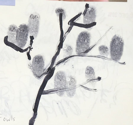
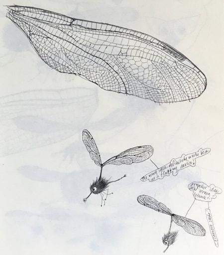
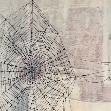
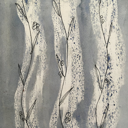
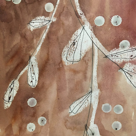
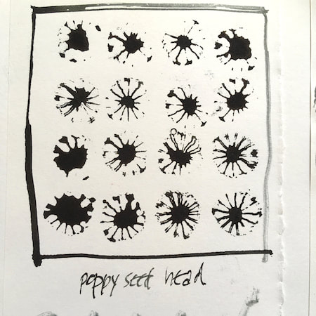
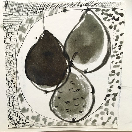
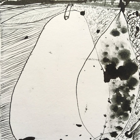
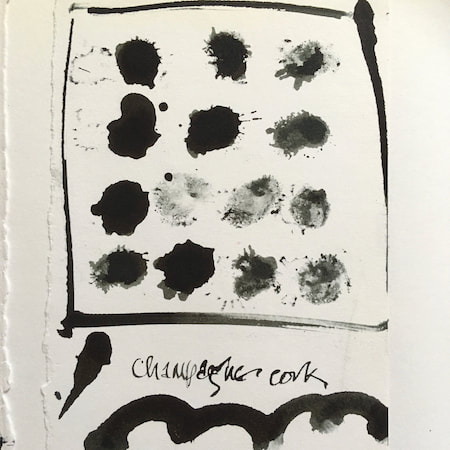
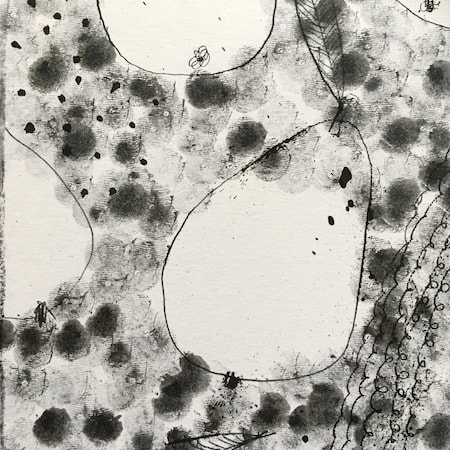
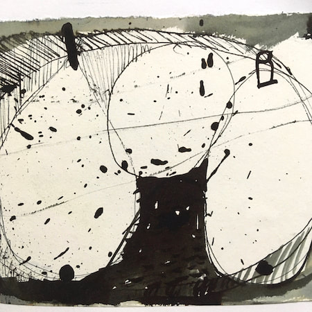
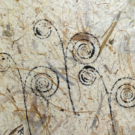
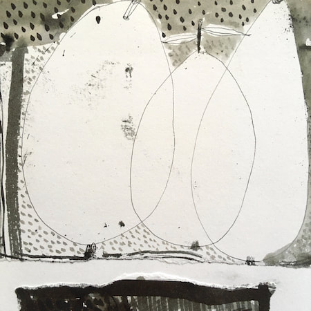
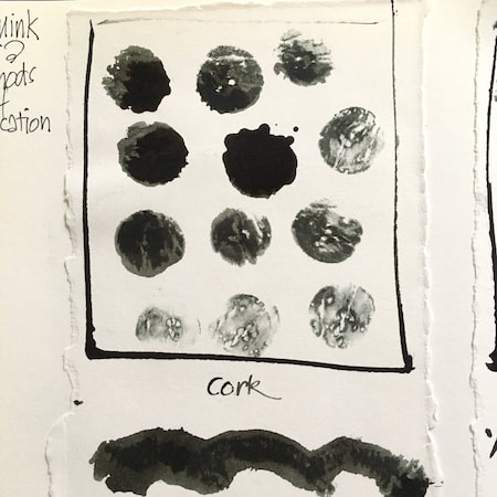
A sketchbook I used for mark-making with unusual objects - corks, seed-heads, feathers, home-made rubber stamps, my fingers and lots of flicky things ...
|
 RSS Feed
