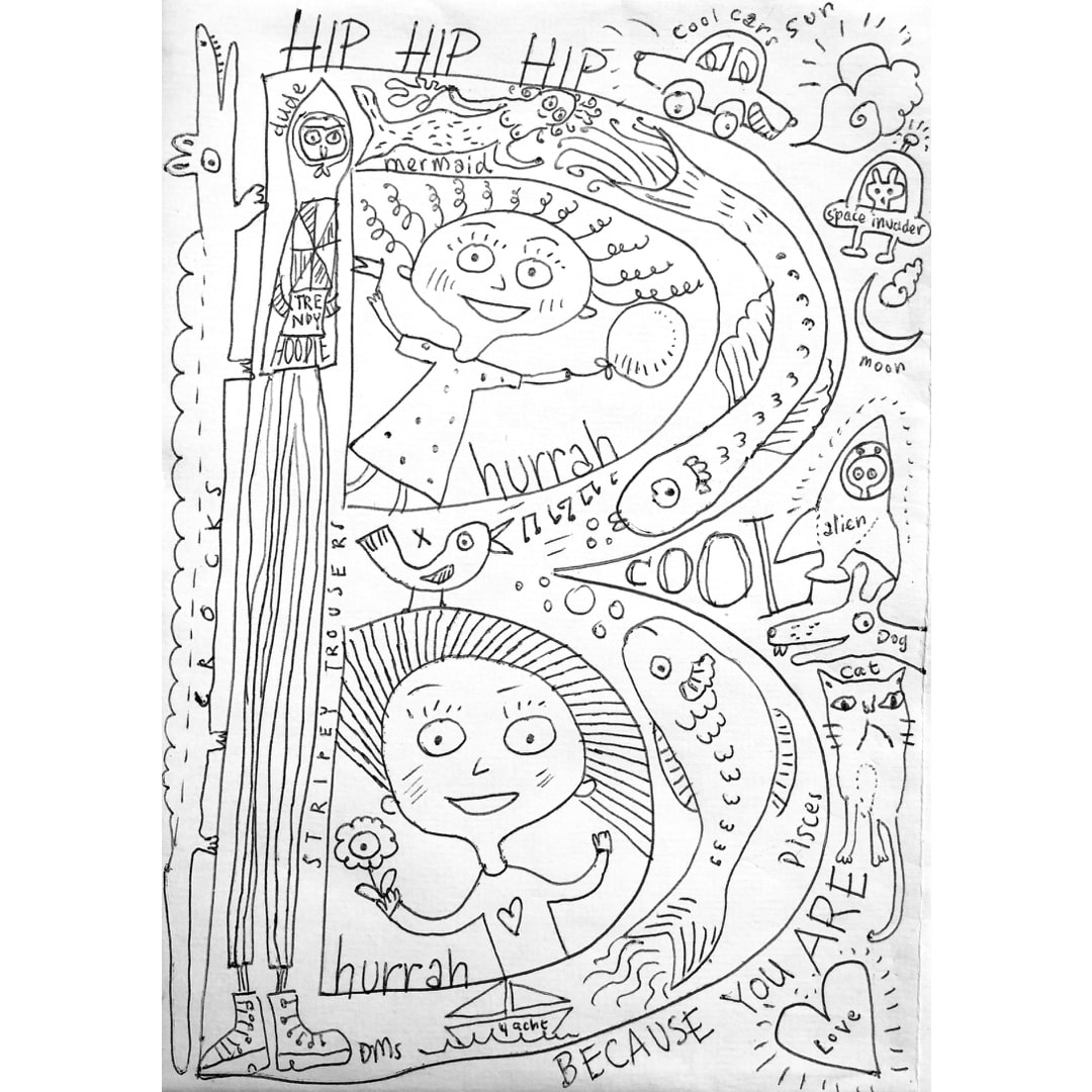
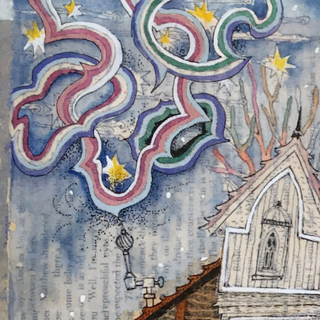
 I had so much fun drawing on the envelope and inside B's birthday card it made me think I should do more of this kind of drawing. I just sat and let it happen without too much thought, my mind simply spilling onto the paper. The invention was just like being a kid again, and B loved it. The card itself was one of the ones I made back in December, which I set aside for B at the time - there's always one in a batch which turns out a bit special. 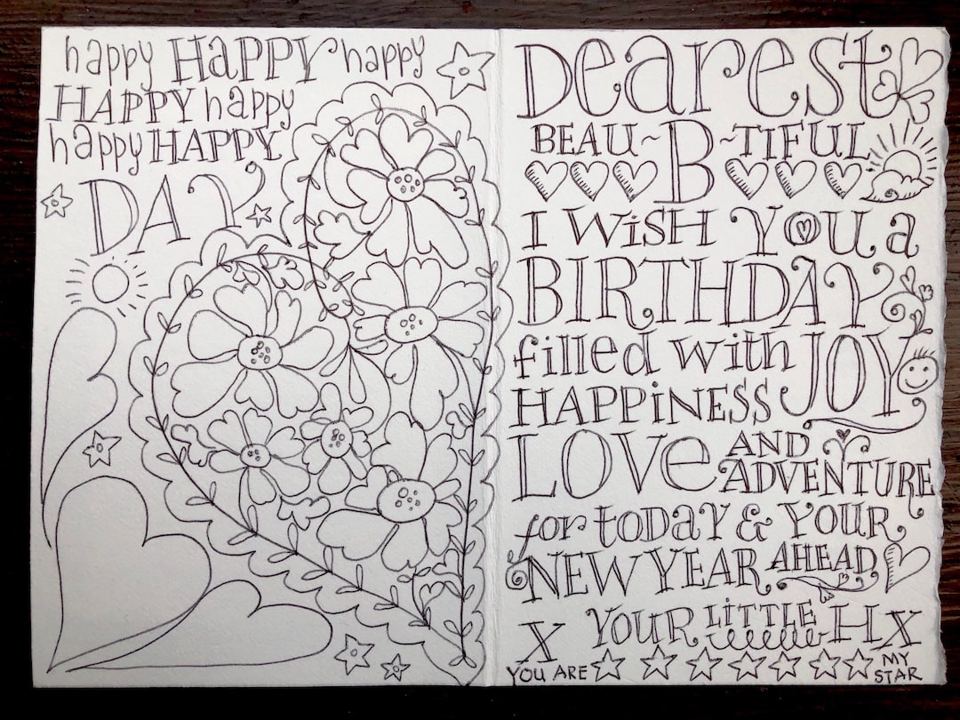 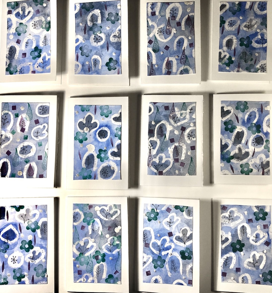 I started making birthday cards back in early July, but only got one done - so now all the December and January birthdays are coming up fast, I had to get on with serious card-making. Luckily I had cut and folded all the card backings, so just the images to make up and mount to do now. 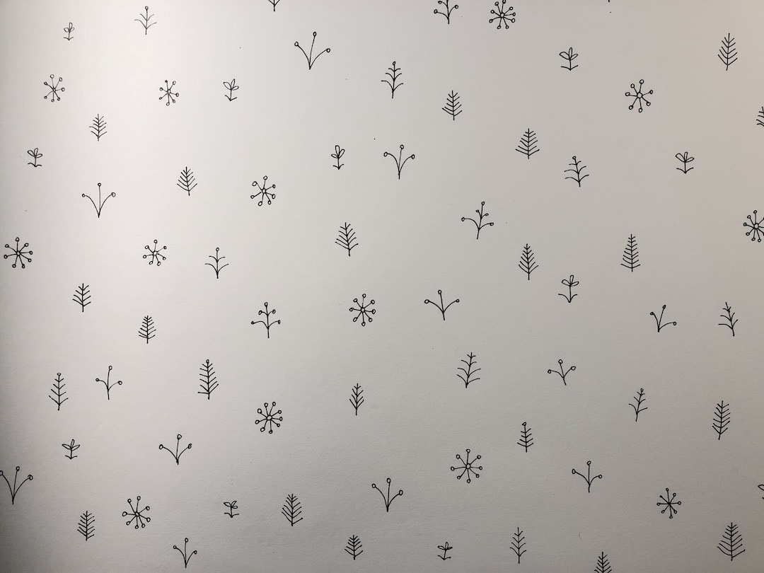 I started out without the faintest idea of what I was going to do, but after a few experiments and fails this is how they started: a sheet of sprigs. Some wax resist drawn onto them with a candle stump, watercolour and a selection of rubber stamps later and hey presto - enough cards to last until next summer. 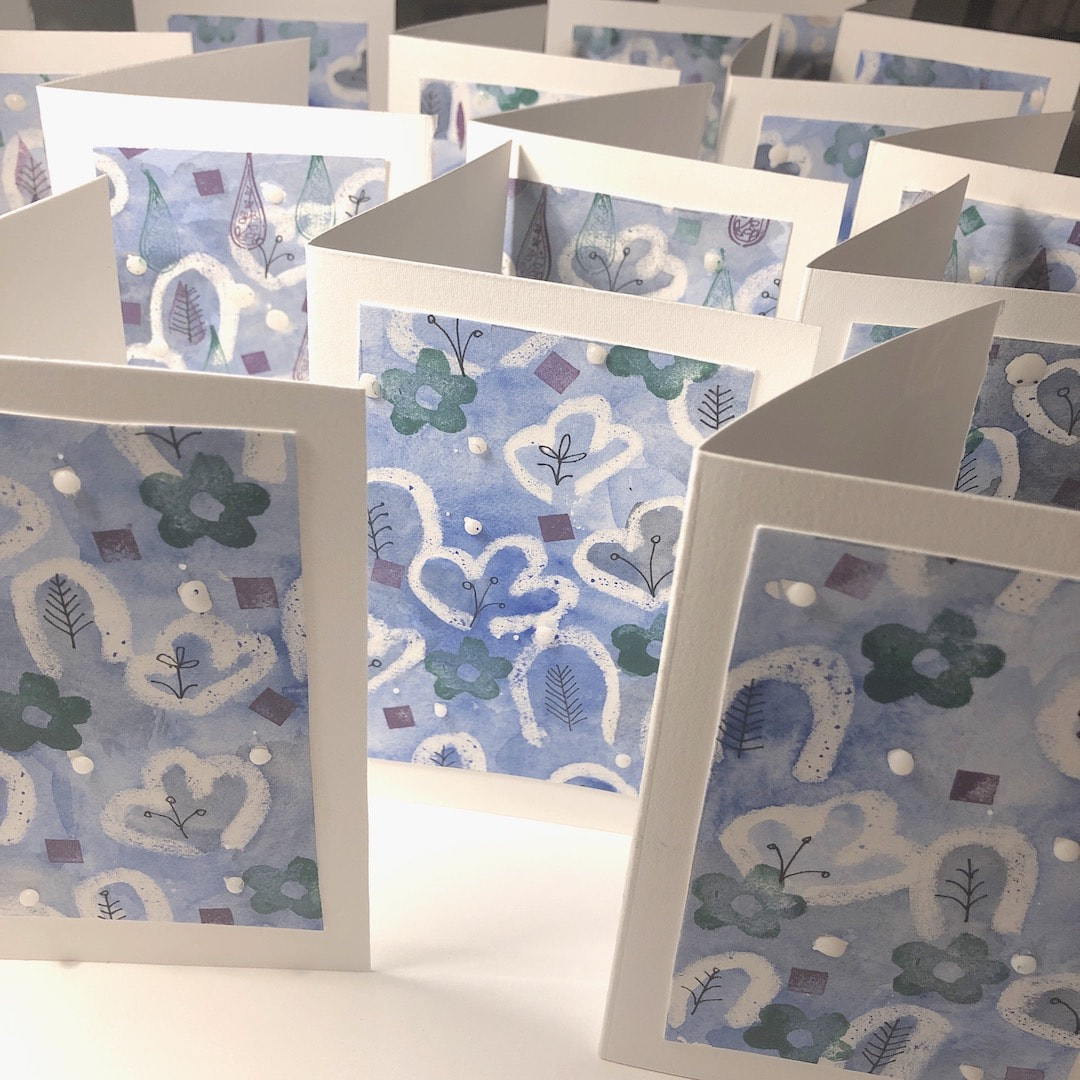 Of course, there are families and couples and I don't want to send the same card out to these folks, so there are companion cards in a different style which I made up at the same time - see those on my Heather Eliza blog.
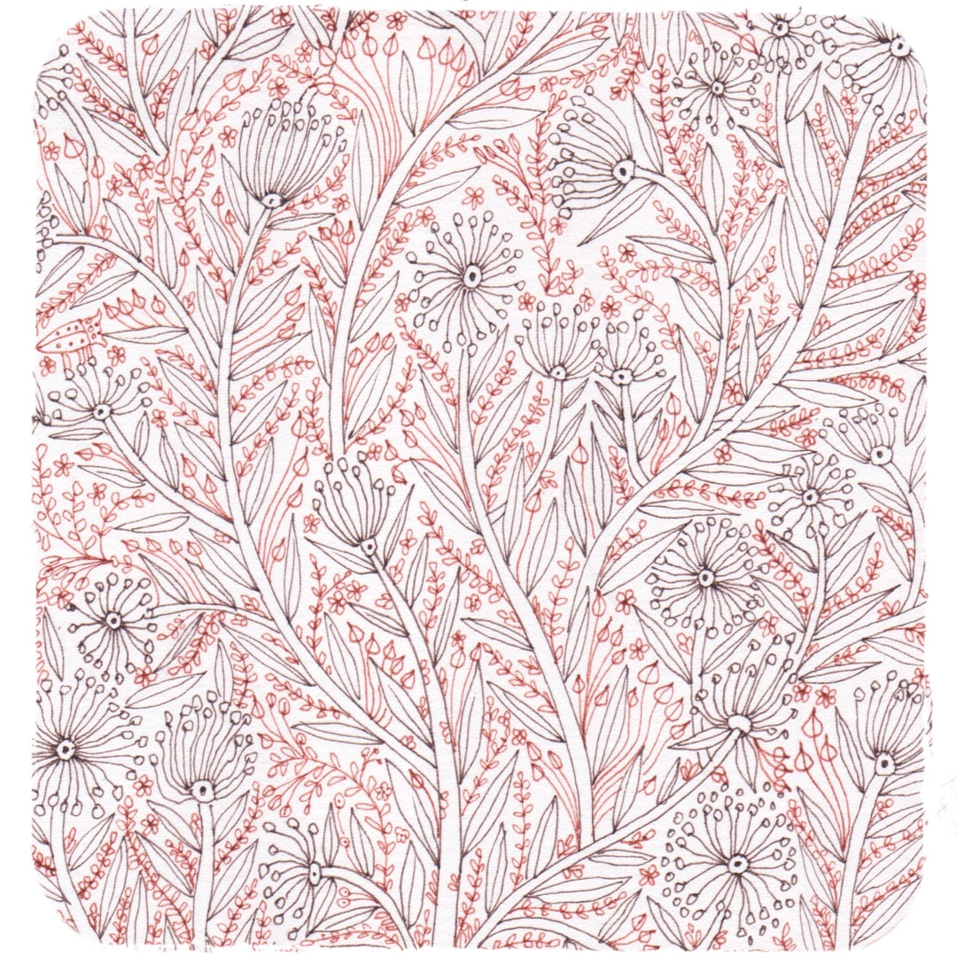 I made this drawing in coloured inks in March 2019, with pattern-making in mind: I blogged about its early stages here. The drawing is a little chaotic in this state and I didn't know how to go about using it at the time, but I thought I made a start on basing a design on it a couple of weeks ago. 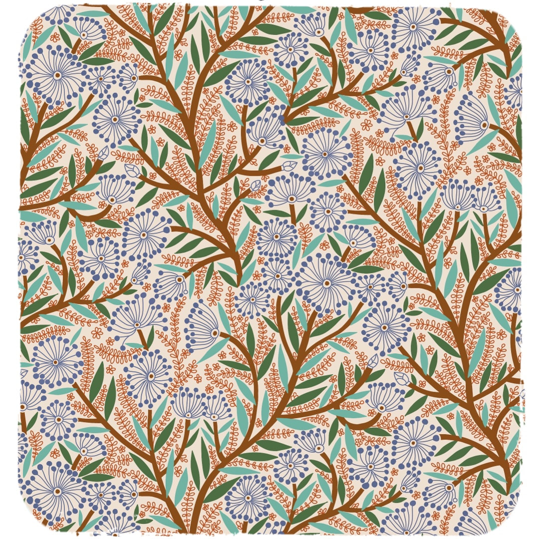 This is the start: the colour scheme was just for clarity, not intended as a final colourway. The half drop was too shallow for such a busy design, the stems stumpy, and I wasn't keen on the lean at this stage. 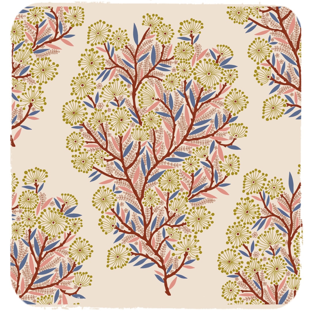 I picked out which was to form the main tree-like motif and redrew the stems to make them more slender and a bit knobbly. I also set it more upright to get rid of the lean, and made improvements to the frondy bits sprouting from the stems. Here is the first stage of the new repeat, quite a pretty motif on its own, but I wanted it to cover the whole surface, so at this stage work had to be done to make it into a continuous flow. 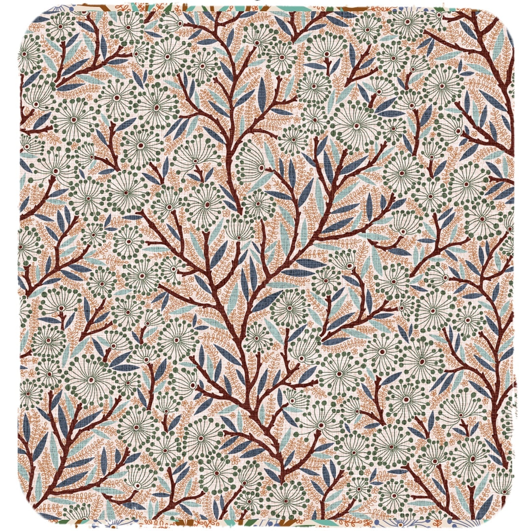 This is how the pattern looks now after additional elements were inserted and interwoven with the main motif. I tried it out with a repeating linen texture I have been working on, and it looks very nice. It makes me think of willows with catkins gently swaying in the breeze beside a big old river. However, the story of this pattern doesn't stop here ... To be continued ...
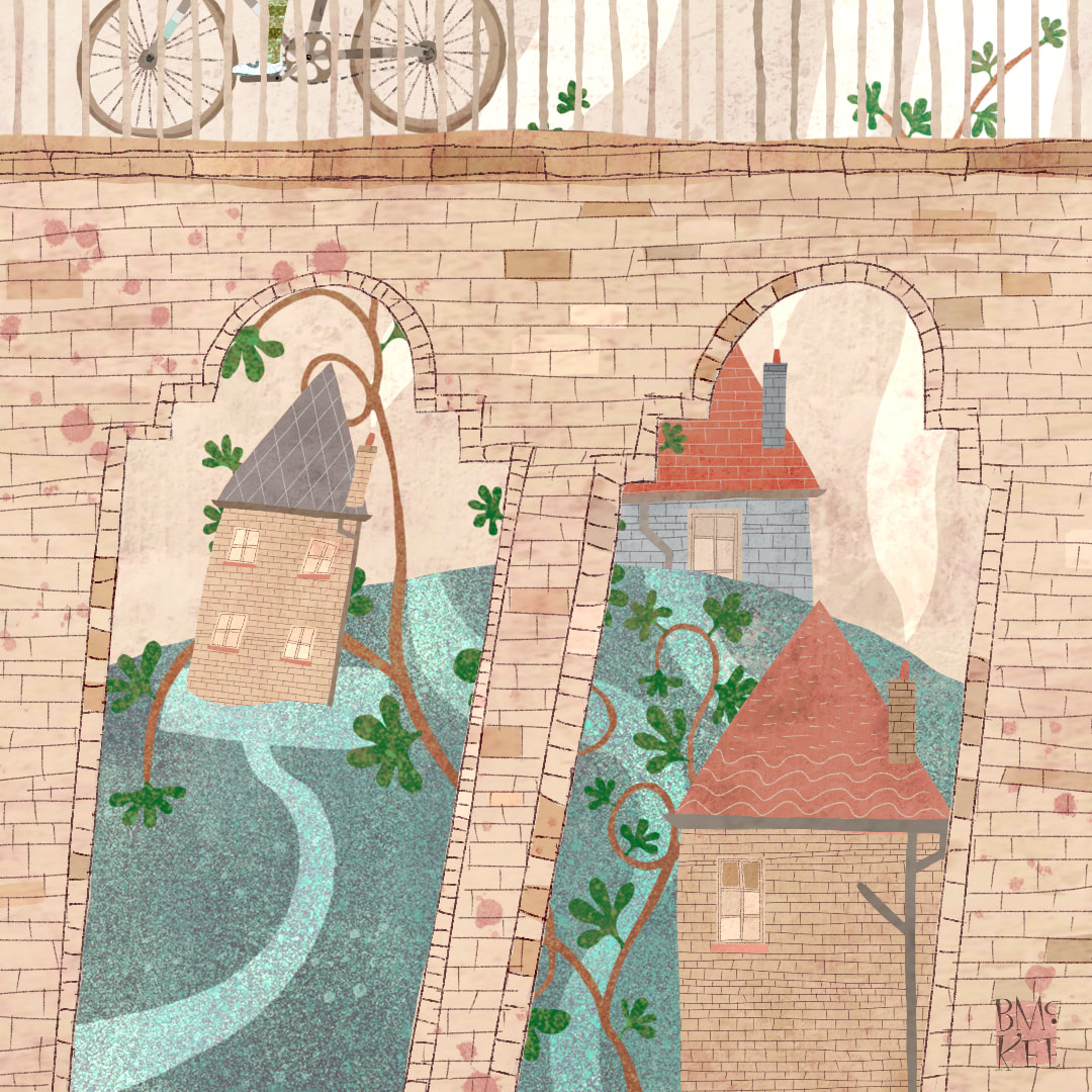 This town. Viewed through a disused railway bridge, I particularly enjoyed the cyclist above the houses entwined with vines - there is such a scene close by to where I live.
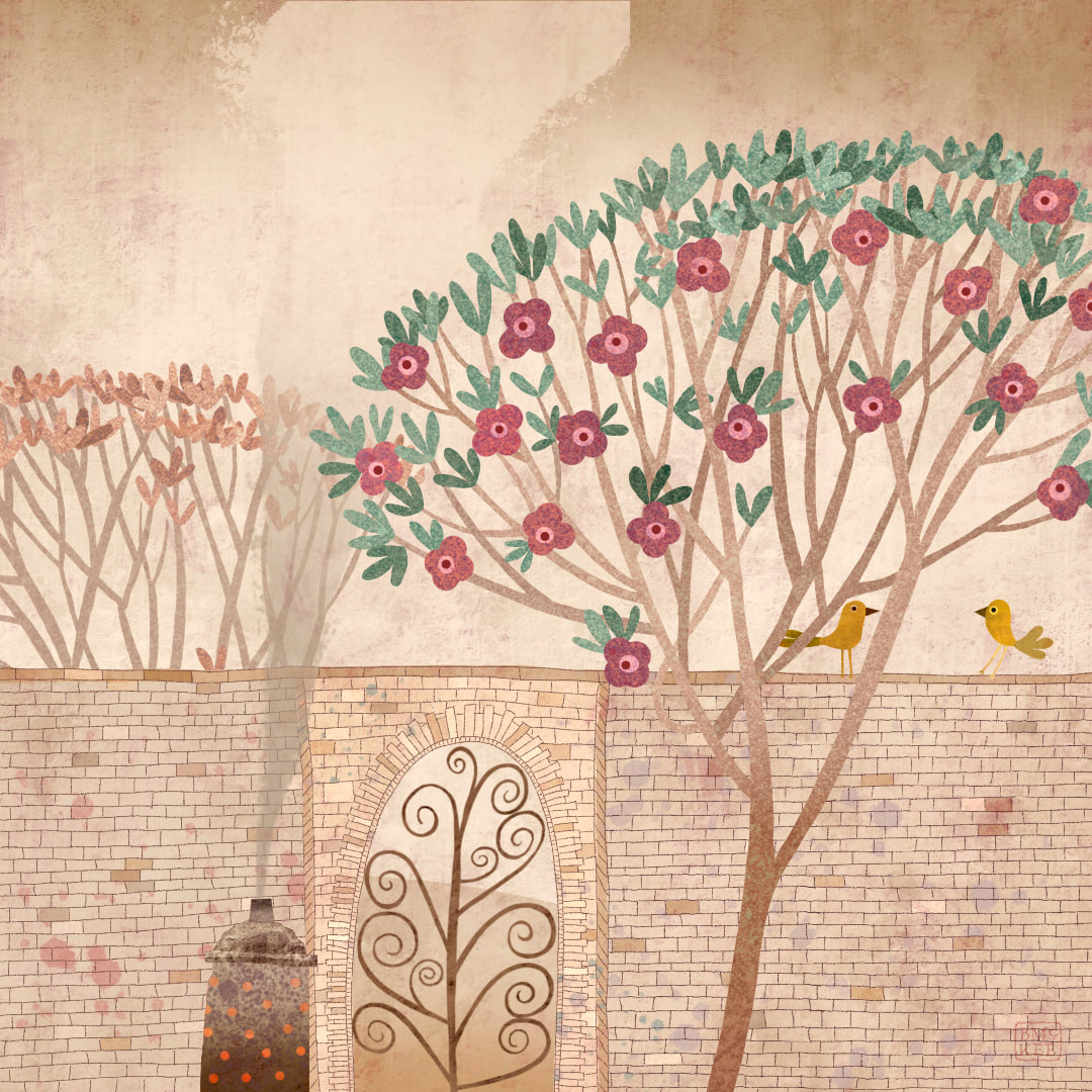 Autumn is arriving with all its fragrances: piles of fallen leaves and bonfires. I celebrate the calm and quiet of the new season in this work depicting a walled garden and a fancy gate.
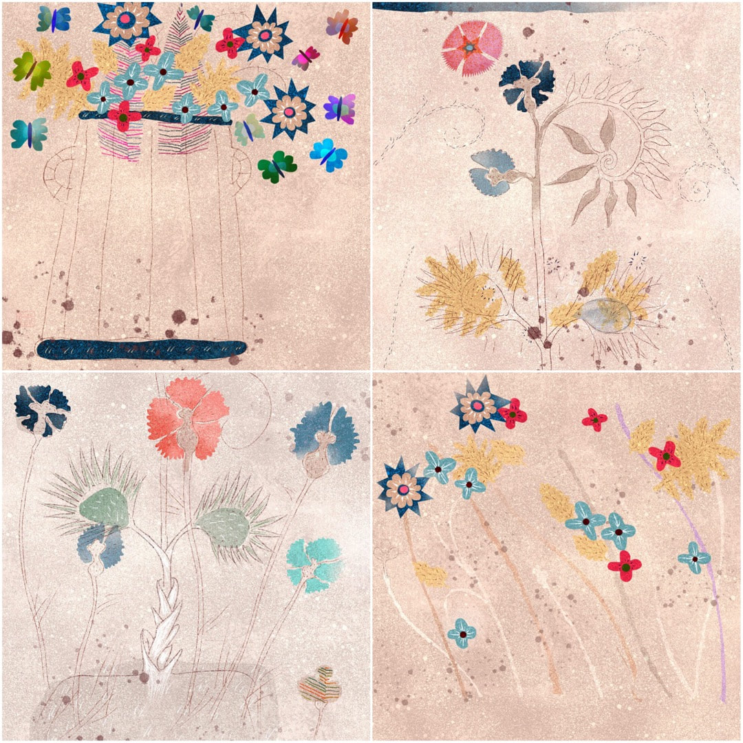 An accidental inspiration happened this week when I began switching off some visible layers on a little still life of a pot of flowers I made a couple of weeks ago. The result is pictured above left; much as I loved the zigzags which decorate the original, I was interested in the open drawing and the distribution of tones, colours and shapes accompanying the line-work. I began to experiment with opening up spaces on some Voynich based sketches. 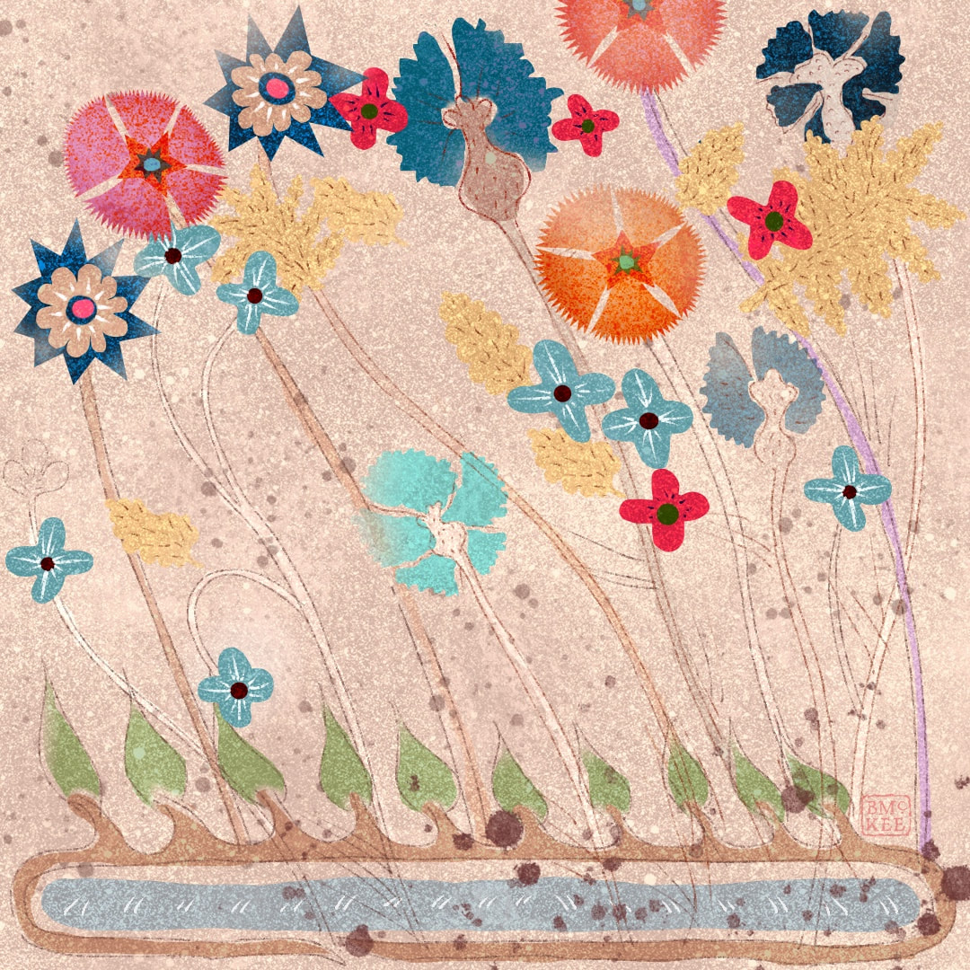 This led me onto drawing flowers with lots of movement, as though blowing around in the wind. I don't know where the stylised pond at the base of the above image came from, it was just a sort of vision, but it does seem to contain the Voynich spirit ... 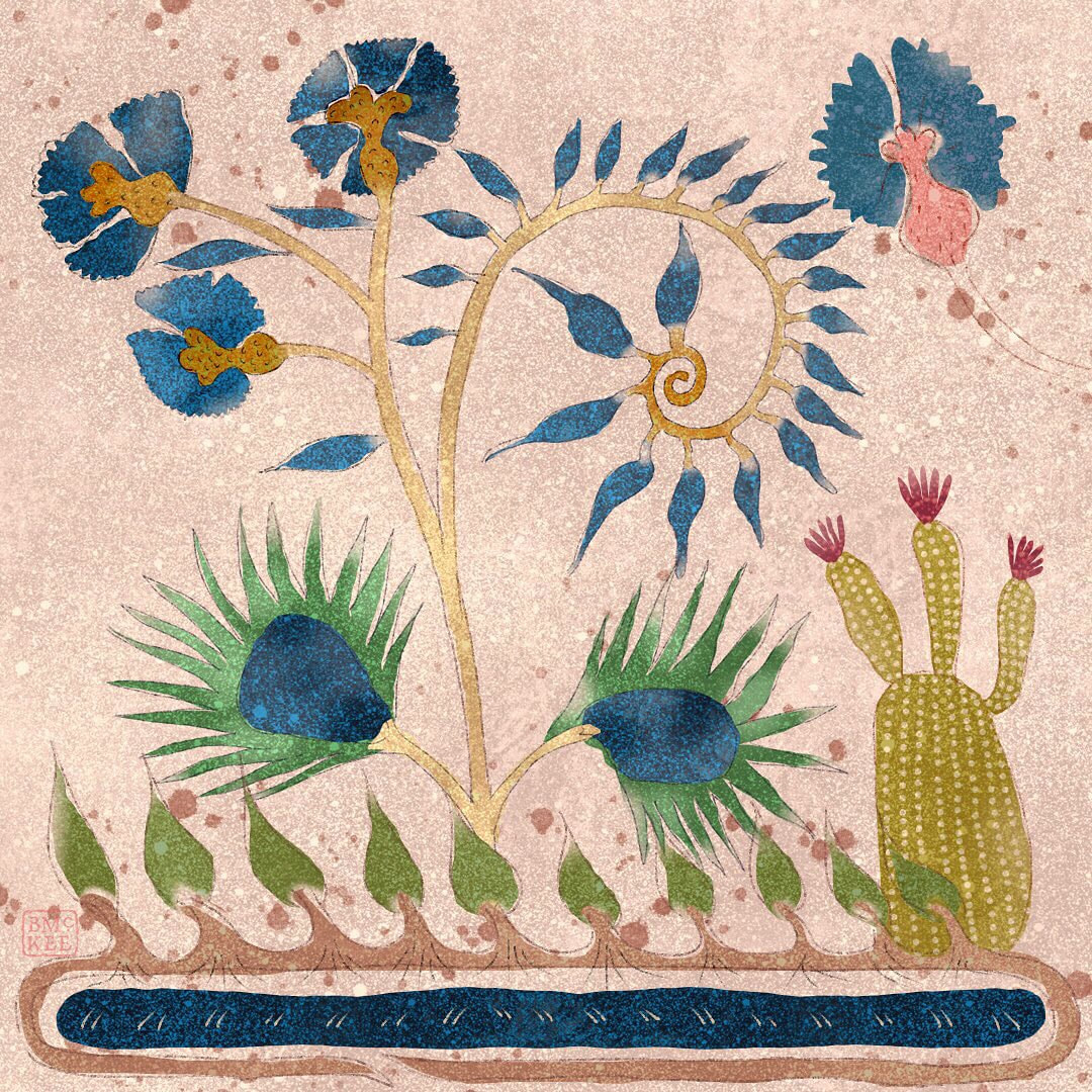 ... and then I wondered how a Voynich inspired drawing would look with my favourite drawing of a cactus, both also bending in the wind. Why not? I am loving my new texture I made for these and the way I am playing with transparency. I definitely see these works in Procreate as possible sketches for watercolour paintings. 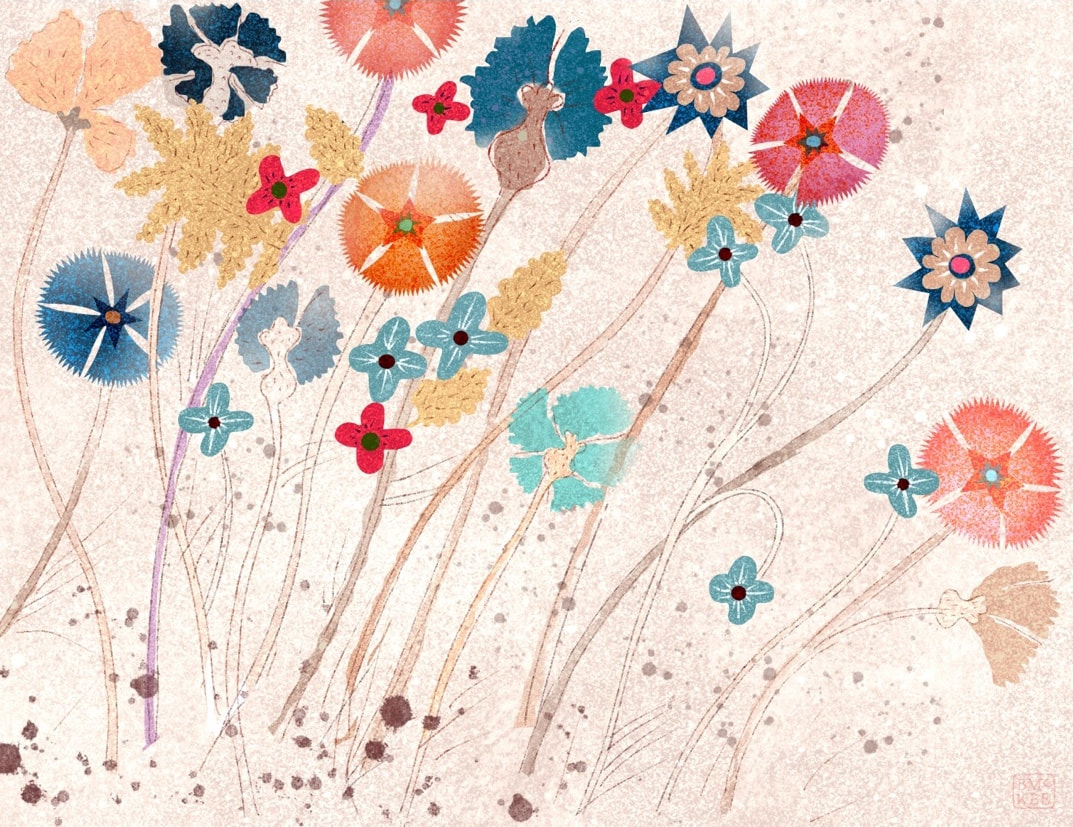 Thanks for visiting, see you next week
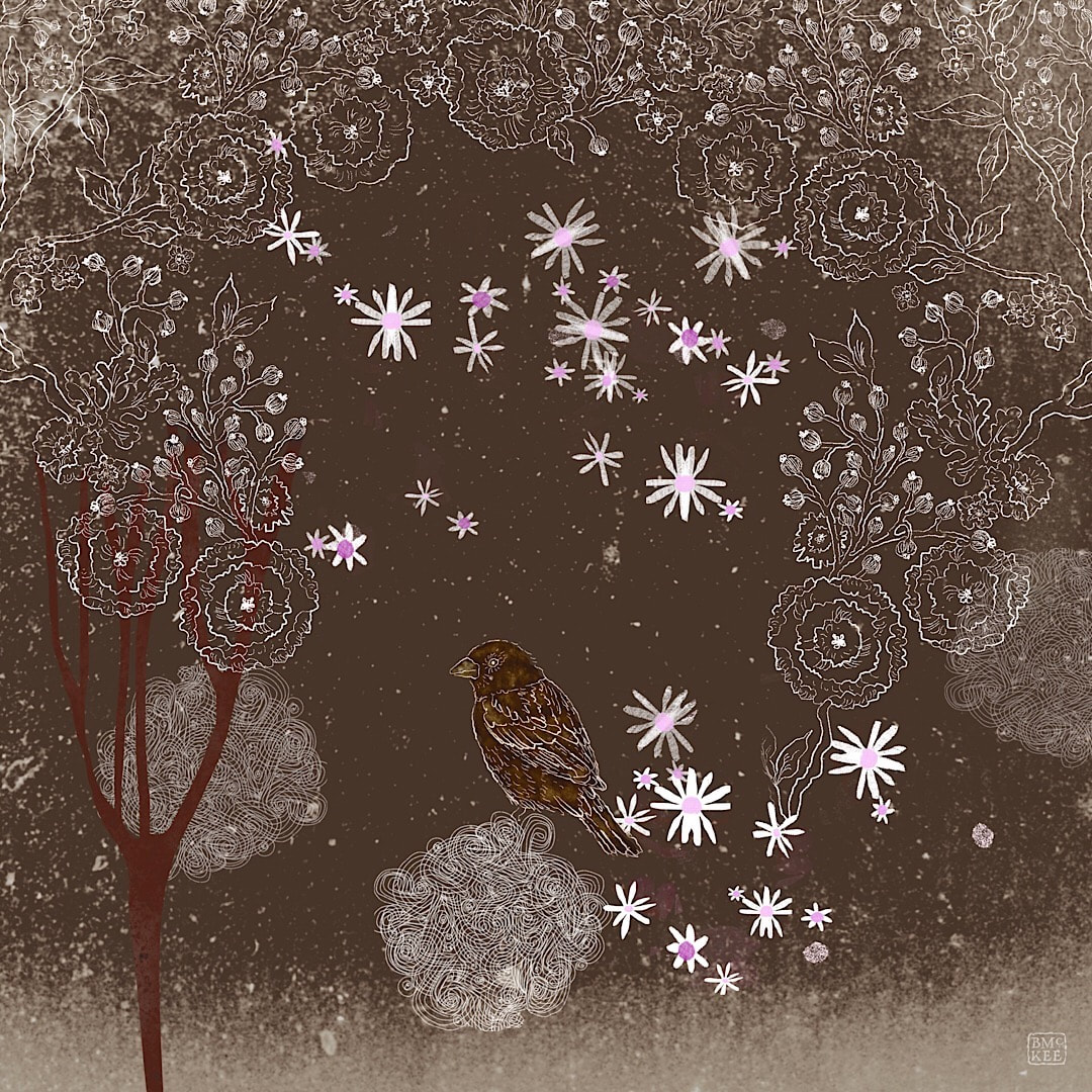 Mixing that shaky, nervous line with other textures I made a sleeping Robin dreaming of spring, still on my favourite grainy background.
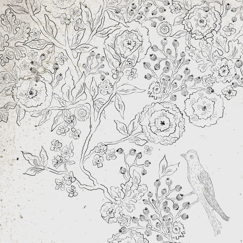 I have become very interested in using a traditional drawing style to make sketches of my patterns this week, and looking for birds and other floral and blossoming motifs. A nervous line with a variety of weight over a favourite texture (ink bleed in Procreate on what I think must have been a photo of a grainy porch window at Wester Lix) is doing it for me right now. I'm already thinking Valentine's Day and spring. 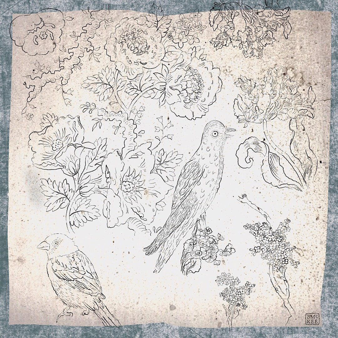 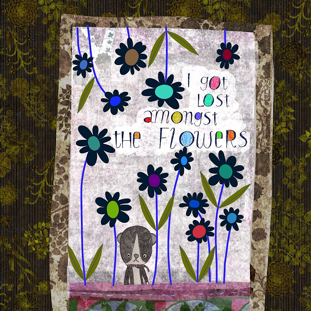 The weather has been so dark and rainy this week the light was too poor to get much drawing done, so I spent more time than usual working on my iPad. The flat and even qualities of my recent pattern-making work is inspiring and I played some more with putting flat elements over grungy textures, and this is what happened. 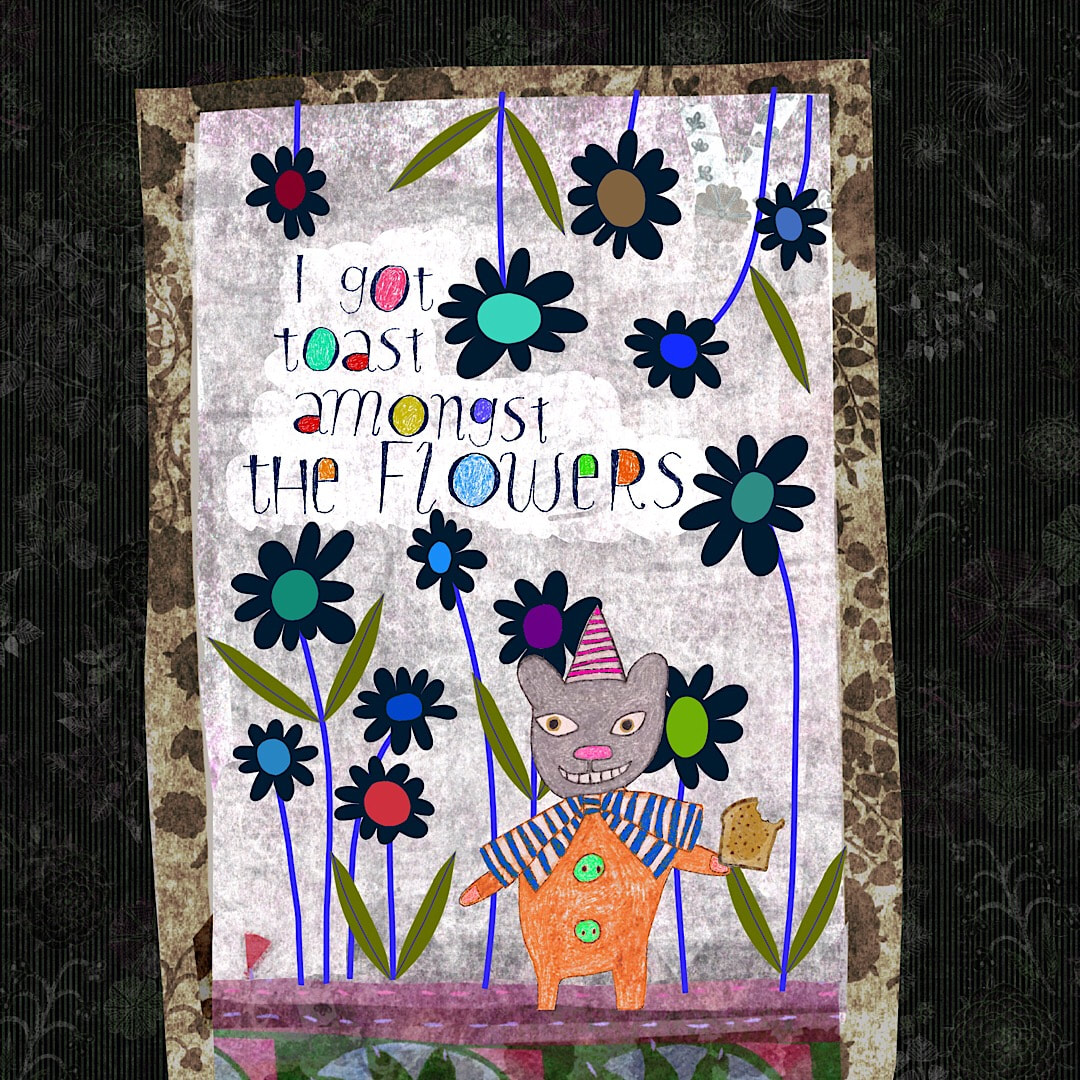 For a long time I have wanted to develop some little characters from a pencil drawing of a group of toys and cats in one of my sketchbooks. I thought I had lost it, but I was delighted when I found it safe and well back in April, and thought to use these little bears to inhabit the flowers and talk. The way I lettered the word 'lost' at first looked a bit like 'toast' which I thought was funny, so in no time I had this pair - from wistful to a fistful! 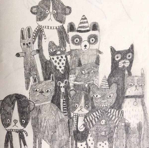 What I enjoyed working with the bears was finding the best way to keep the feel of the original pencil drawing. After a few false starts this turned out to be to separate each creature in Procreate and draw directly onto it. Some of the original drawing on paper still shows through, which provides a lovely ground of texture and varying tone. This way I was able to firm up and clarify ideas in the original drawing while keeping the innocence of pencil marks. I am looking forward to see how it looks when I eventually remake the original drawing in colour.
I also finished the outline work for the 'collaboration' with my younger self this week, tidying up and adding new elements. There are no spaces left there now, and the pattern fits nicely - more on that later when I start adding colour. Thanks for visiting, see you soon! 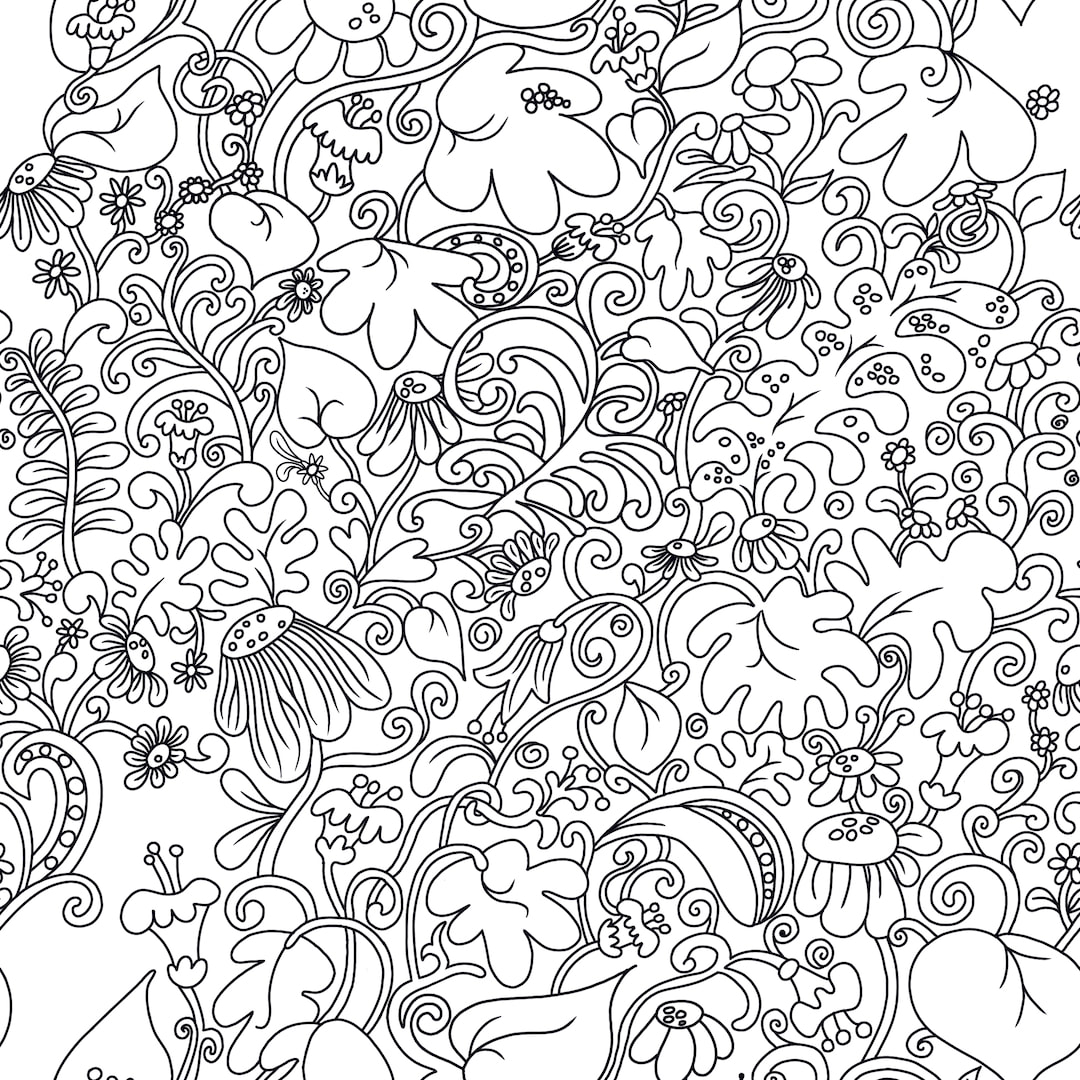 Continuing the clean theme, I began a 'collaboration' with my younger self. A few years ago I was delighted to find an old design I had made in school. It must have been 1972-3 because at the bottom of the sheet there is a small pencil note: "Heather Walker 2 G 2"; I would have been 12 or 13 if that means form 2 at school, although I seem to recall being a little older when the design was made into a batik cushion cover. 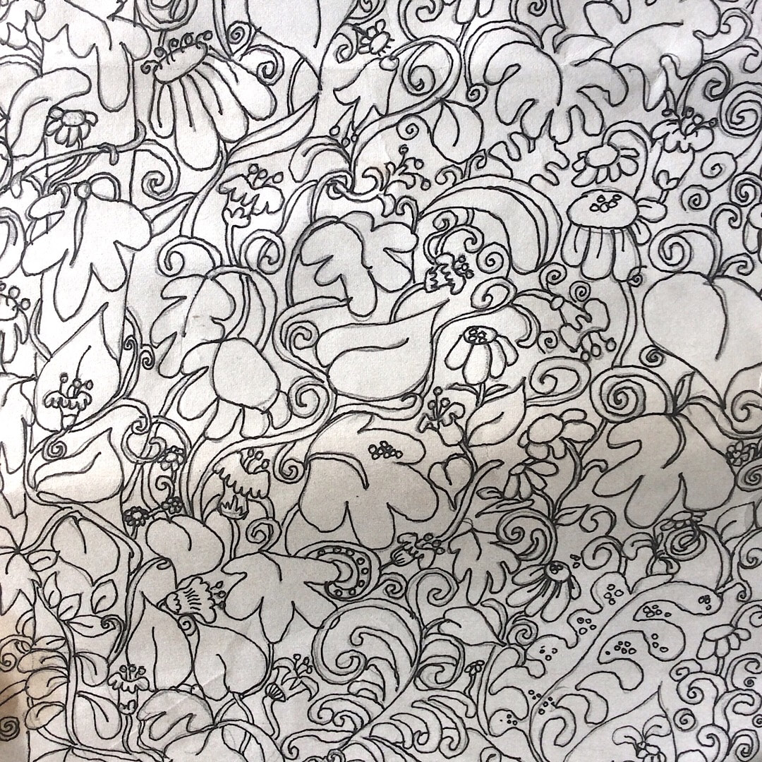 Here is a detail of the original drawing from all those years ago. I have wanted to work with it for some time, and started copying it in the Yay Flowers cut-out collage style earlier this year, but it didn't work. It didn't want to be drawn like that and looked dated in the wrong kind of way, somehow lacking a fondness for the nostalgia of the 70s which surprised me, because I thought Yay Flowers looked quite 70s. I like the glow and all the textures of Yay Flowers, but perhaps I was already moving away from that grungy texture I was using last year and that's why it didn't work. I had a feeling it could just look dirty in print even back then. As soon as I began tracing in Procreate with a smooth, clear outline all the fun came back. 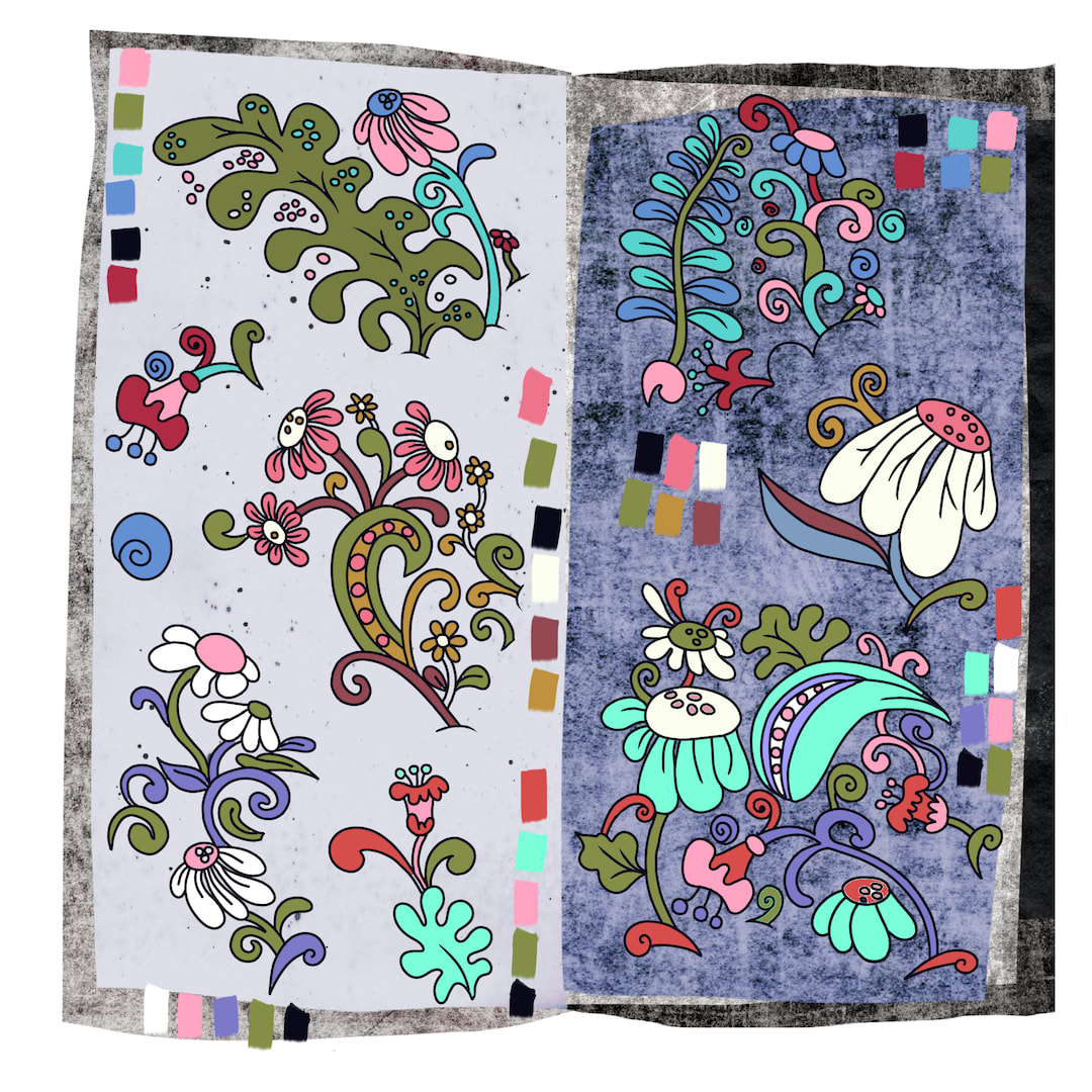 I had fun separating a few of the main motifs and experimenting with flat colour; now it looks 70s in the right way, with a clean and contemporary feel. I do like the juxtaposition of the flat line and colour work against grungy textures, but I know it wouldn't print well on Spoonflower so the final pattern will have a flat background. The thing to bear in mind is that fabric has its own texture and there's little need to add more, and when I am designing for a pattern I have to stop thinking like a painter and not make 'drawings of textiles', something I have done lots of times because of my interest in them - see September 2020, a month when that's almost all I did.
Thanks for visiting, see you next week! 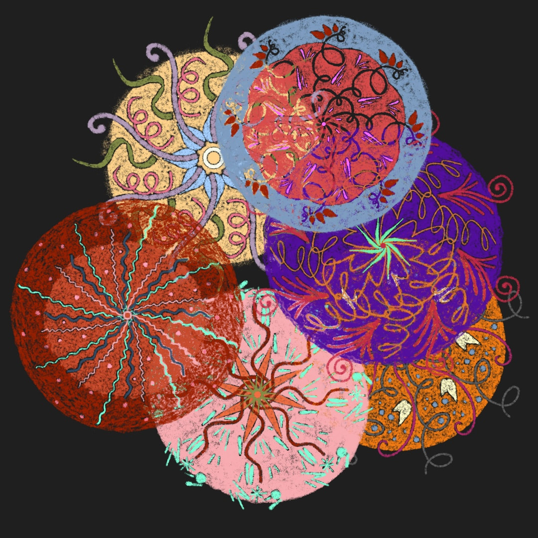 I selected 6 of the sea-urchins I made last week to work in exactly the same way as I draw the pareidolia images, tracing over the image onto layers above using Procreate's HB6 sketch brush. It was one of those overnight "what if ..." thoughts and I wasn't at all sure how it would look. The idea was to make them more consistent with the pareidolia series drawings. From the first experiment I could see I liked it a lot, the texture and scumbly marks and saturated colours looked good. I like the semi-transparent quality, whichever background I use changes their appearance; but at the moment my favourite is anything dark enough to enhance the chalk-board effect. I am currently working on a pattern which combines little creatures with these roundels. 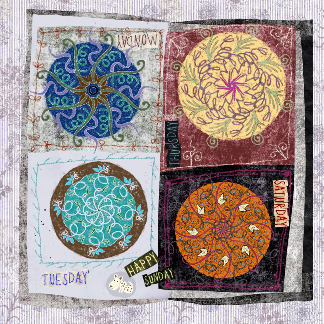 Today's Instagram post ^
Thanks for visiting, see you next week!  A run of beautiful warm sunshine this week proved a big distraction - I didn't want to be indoors at all. We had a couple of barbecues, one evening we ate our evening meal as a picnic on the grass. The next evening we lit the barbecue again, but while we were cooking our marinated spatchcock chicken which I had prepared earlier in the day, the cold came back in and we retreated indoors to eat. I did get my sketchbook and paints outdoors, though, and the pop-up tent went up as my 'outdoor studio' - which I am pleased to report I am getting quite proficient at folding up and putting away now. Last year there were a couple of hysterically hilarious antics, not aided by wine and B cracking jokes at my attempts. I bought the tent in 2016 and have used it every summer since, so 5 years practice is finally paying off!  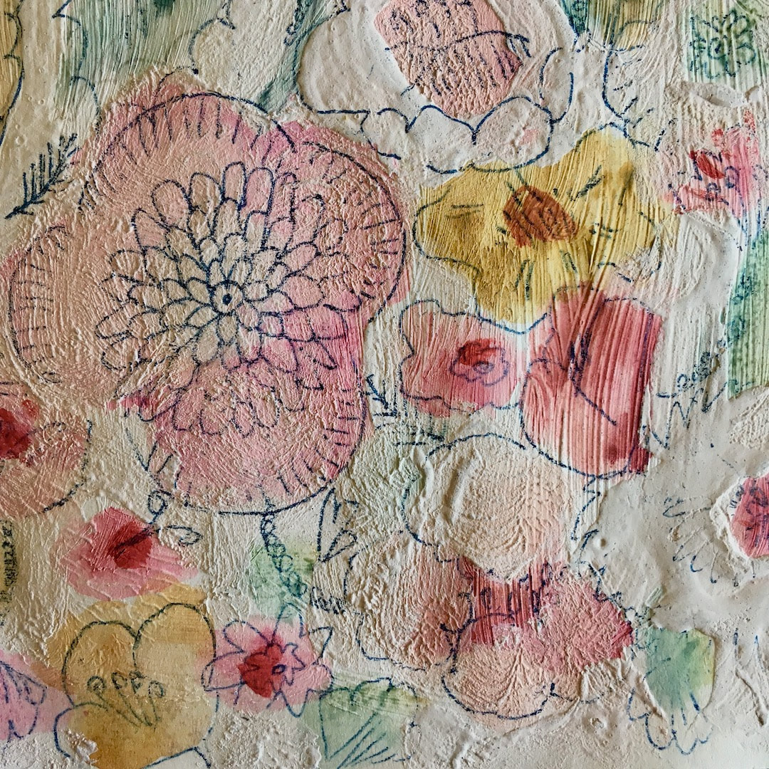 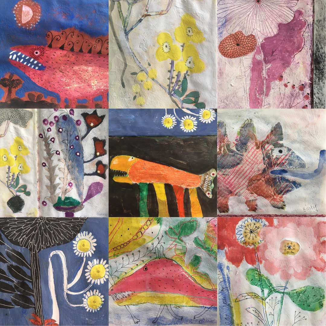 This week, some of my monsters developed two heads! - inspired by insects which often display a big scary face on their body or wings which isn't actually their face. At long last I worked out how to make Reels on Instagram with the image top left, above, and set it to "What's that coming over the hill" by The Automatic - great fun. Still working in my sketchbook, I developed the floral theme a little further with my adoration of ikebana. I love the gravity-defying weirdness where truth is indeed stranger than fiction as they spring from preposterously tiny vases or shallow bowls apparently supported by nothing but moss. I am also preparing some textured Fabriano Rosaspina, a heavy card-like printing paper, for stand-alone works. I'm getting texture by adding whiting to my primer and using lots of scumbling. Yesterday I had some weekend fun making small yellow flowers from one of the paintings into a repeat pattern, which I am calling Pansy Riot. Can't wait to see it on some products. 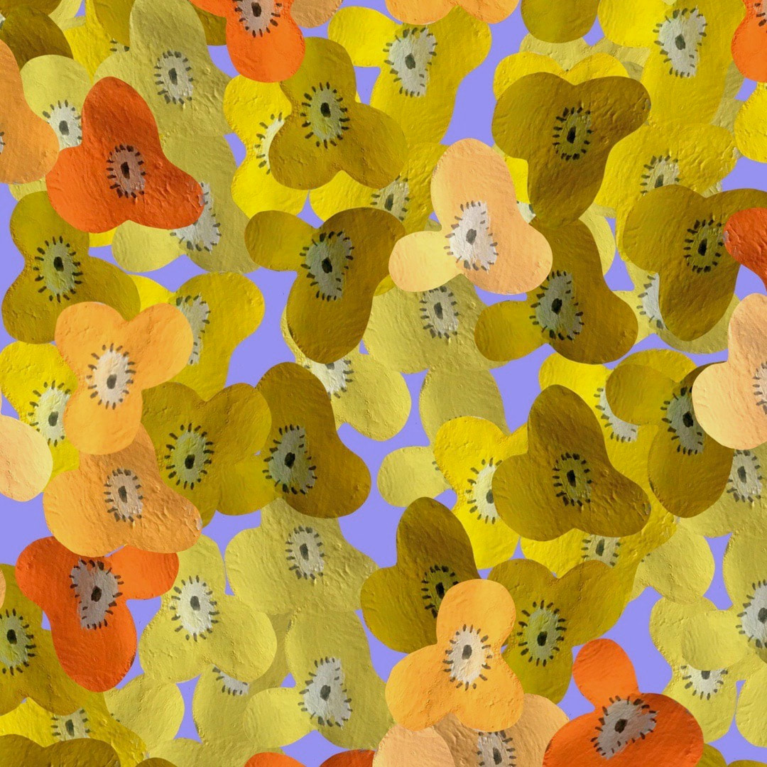 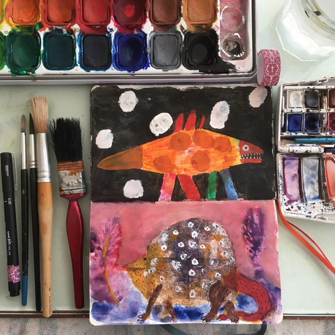 Oh, the joy! Real paper, real paints, real everything again. Overnight this week it suddenly became spring, and there was warmth in the sun meaning I could get back into my work room. It's freezing in there and dark over the winter, but this week I opened it all up again and the absolute joy of natural work spilled out all over! So exciting - I have wanted to paint monsters for ages, so I started work immediately with a wild prolific madness. I am so genuinely happy! 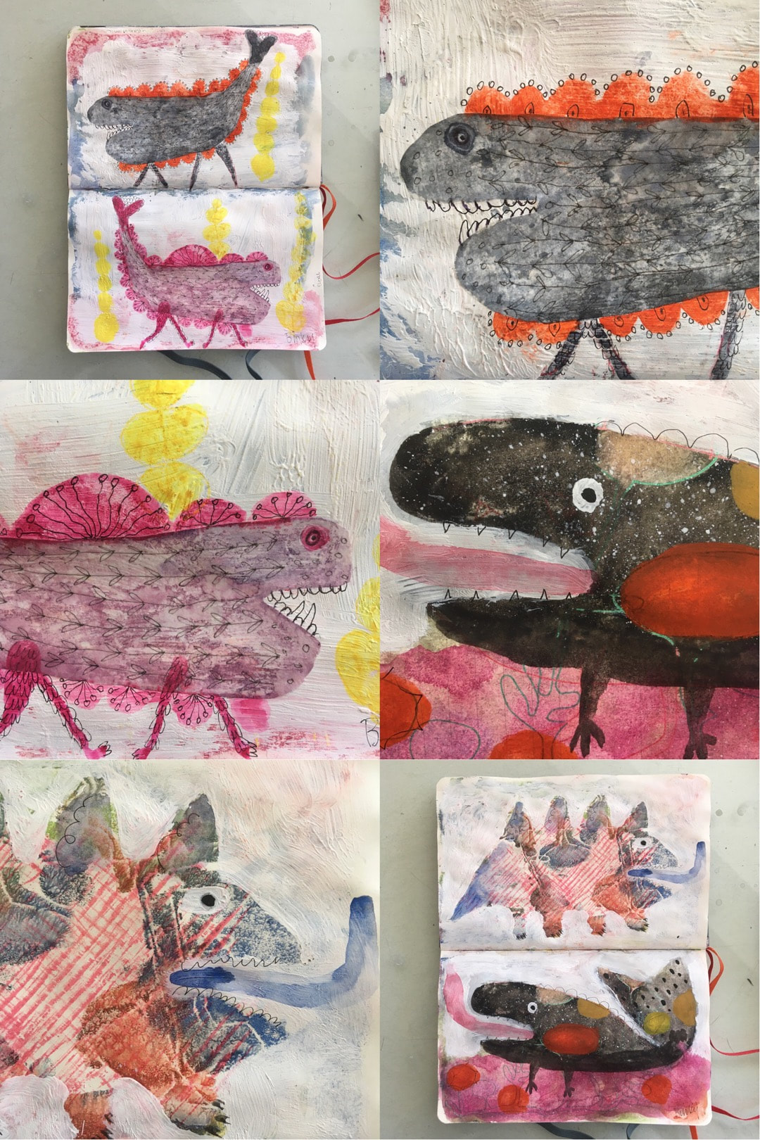 Don't get me wrong, I thank the Lord (and B!) for my iPad Air which has enabled me to keep producing through the most difficult of times, not just cold weather but during my parents' decline in health, the subsequent house move, and selling our former house during the horribly difficult times of the Covid plague. Periods when I didn't have a room at all, just shuttling back and forth in a car or a removal van and providing for wonderfully supportive friends who pitched in to help. Recently I have derived immense satisfaction from finding a way to make perfect patterns with basic technology digitally 'by hand' that's not actually carving woodblocks, and I've come a long way without Adobe products or automated patternmakers.
Being a trained painter, though, nothing beats the mess and randomness of the studio and I am so, so happy to be back. The freedom! I should also mention B and I had our first dose of Oxford AstraZeneca exactly one week ago today. It was an extremely well-organised event, really quite an exciting and pleasant experience with wonderful and competent NHS staff and heating in every booth. No side effects or symptoms to report, we should have some level of protection by next week.  A mid-week bonus post - I finished a much softer rose brocade I have been working on at the same time as the watercolour texture patterns. The daffodils are out and spring is definitely on its way, so I used lots of daffodilly yellow against silvery grey to celebrate, and made these two shy little drawings. I particularly enjoyed the Roses marmalade jar drawing. 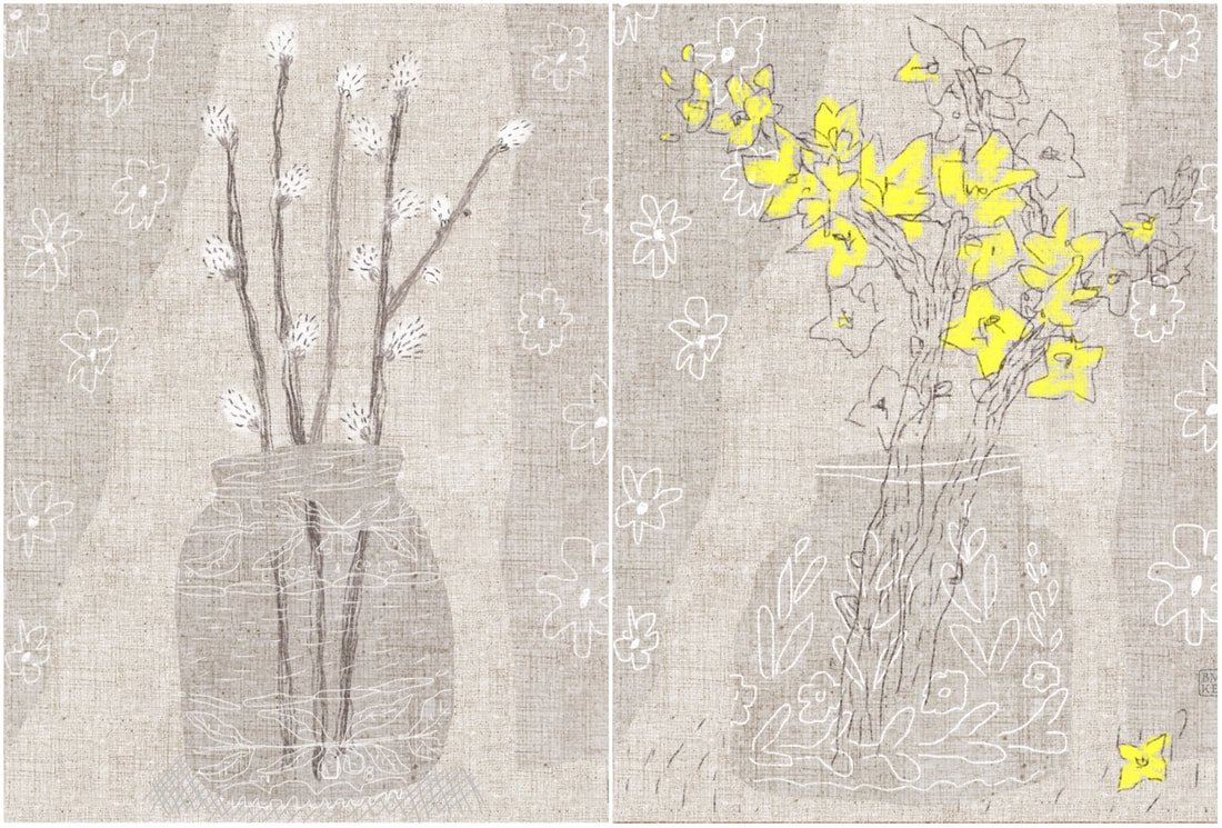 |

~~~~~~~~~~~~~~~~~~~~~~
Welcome to my illustration and patterns blog.
I illustrate under the pen-name of Binky McKee, McKee being my mother's maiden name. Binky was the name of every single cat my great-grandmother kept - allegedly about 40 of them during her 94 years of life. I changed the website address a few months ago, so some older links on previous posts are broken. If you click one of those and it takes you to a strange page, simply replace the .co.uk after the binkymckee. with weebly.com and it will work again. I hope you enjoy your visit! ~~~~~~~~~~~~~~~~~~~~~~
~~~~~~~~~~~~~~~~~~~~~~
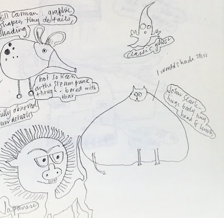
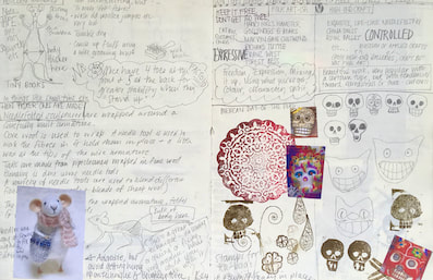
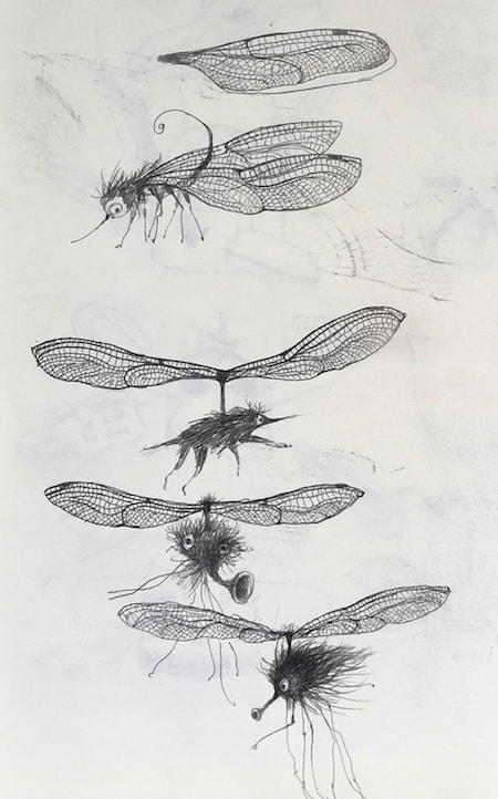
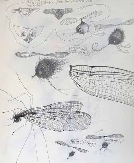
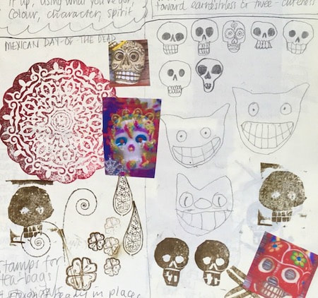
I keep lots of scrapbooks and sketchbooks where I develop ideas and design little creatures. Here's a peek inside one ...

~~~~~~~~~~~~~~~~~~~~~~
~~~~~~~~~~~~~~~~~~~~~~
As you may know, I am also known as Heather Eliza Walker.
Click the image if you would like to find out more and visit my other website. ~~~~~~~~~~~~~~~~~~~~~~ ~~~~~~~~~~~~~~~~~~~~~
~~~~~~~~~~~~~~~~~~~~
April 2024
~~~~~~~~~~~~~~~~~~~~~~
~~~~~~~~~~~~~~~~~~
All
~~~~~~~~~~~~~~~~~~~~~~
~~~~~~~~~~~~~~~~~~~~~~
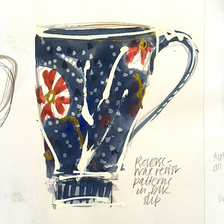
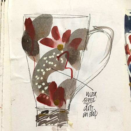
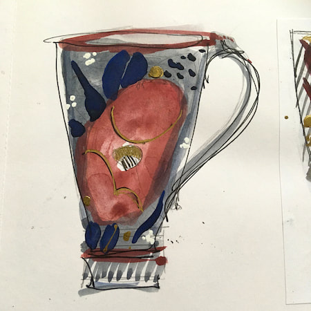
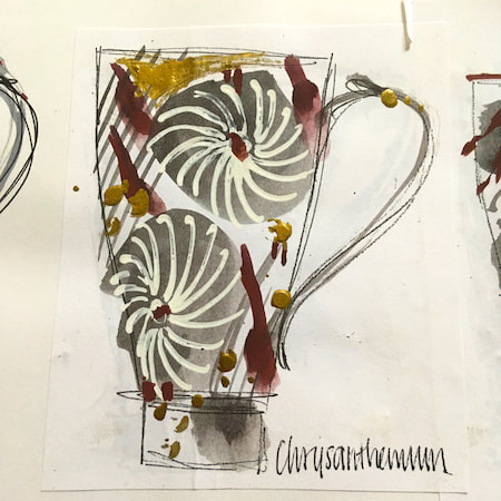
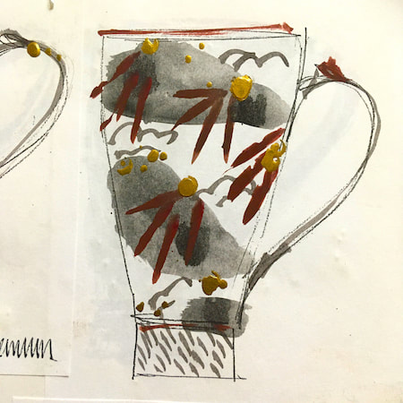
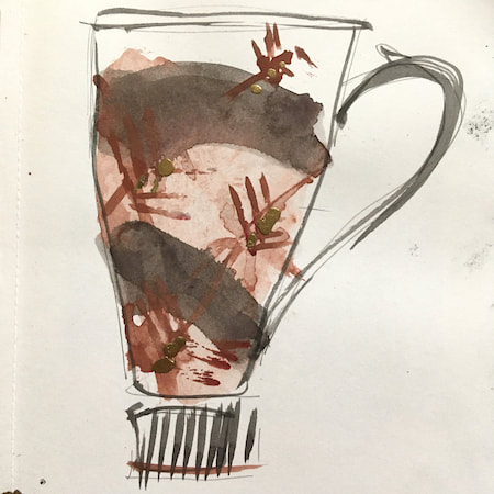
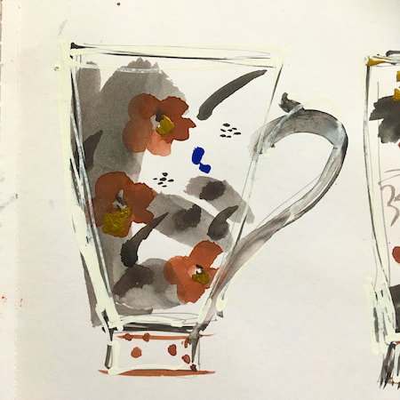
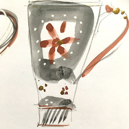
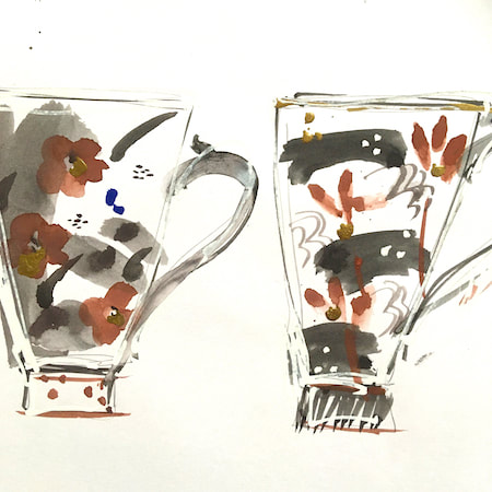
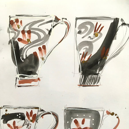
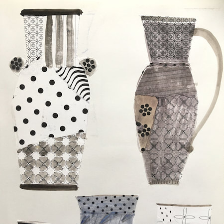
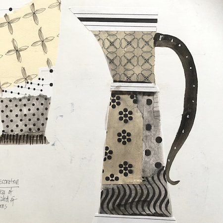
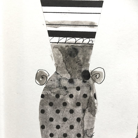
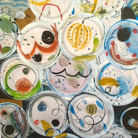
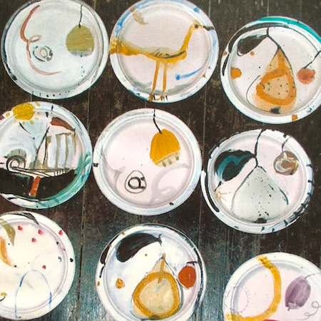
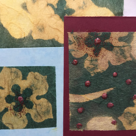
This time, take a peek into my ceramic design sketchbook. I actually made some of the mugs, but I kind of prefer the drawings! The plate designs are painted on paper plates, a most liberating process.
~~~~~~~~~~~~~~~~~~~~~~
~~~~~~~~~~~~~~~~~~~~~~
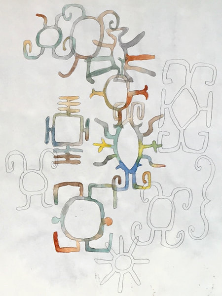
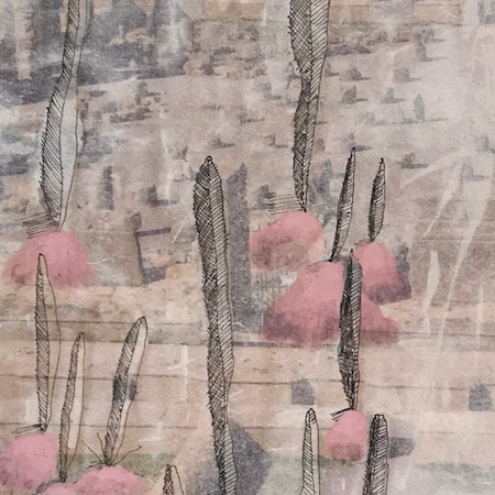
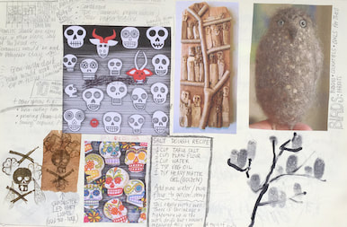
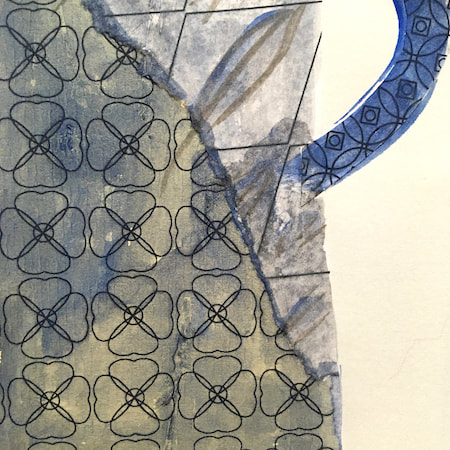
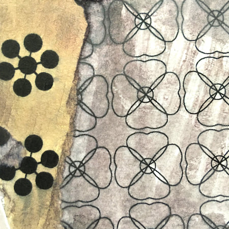
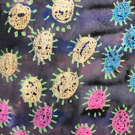
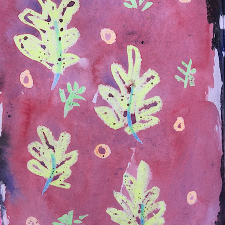
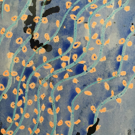
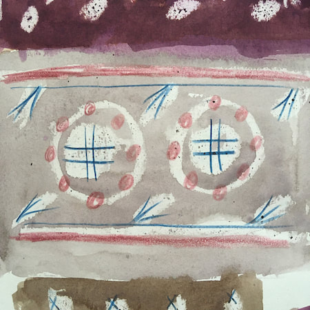
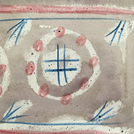
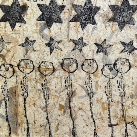
These watercolours are from my pattern sketchbook. I used coloured wax crayons to resist the washes of watercolour, also home-made rubber stamps dipped in bleach then printed on crêpe paper - the bleach takes out the paper dyes.
~~~~~~~~~~~~~~~~~~~~~~
~~~~~~~~~~~~~~~~~~~~~~
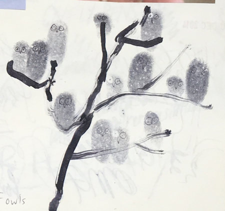
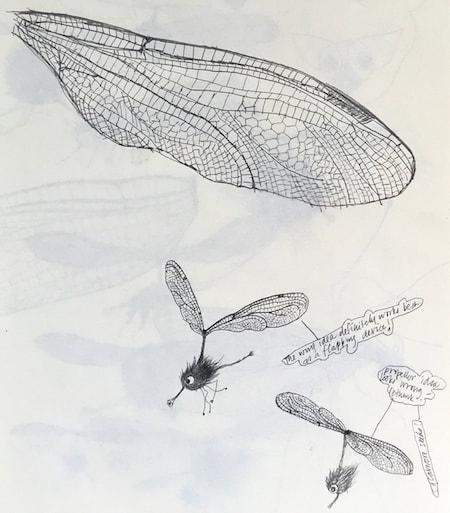
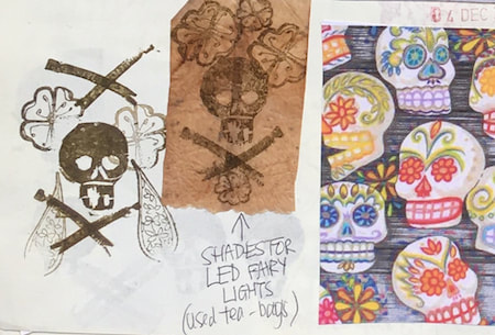
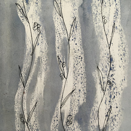
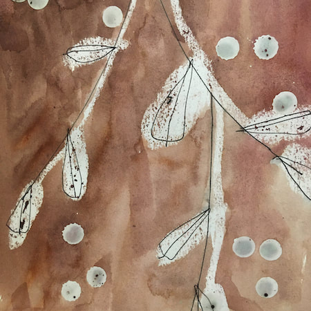
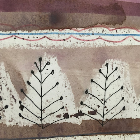
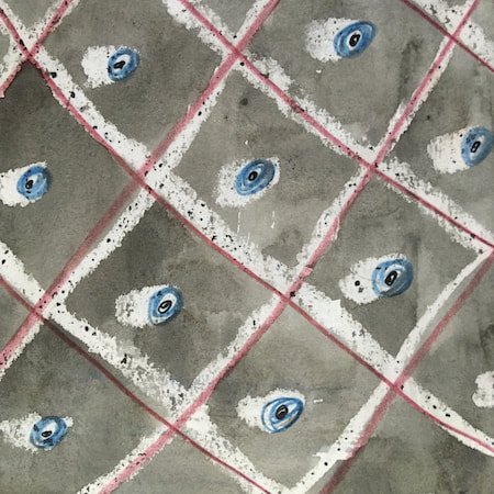
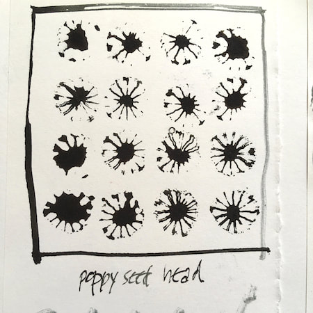
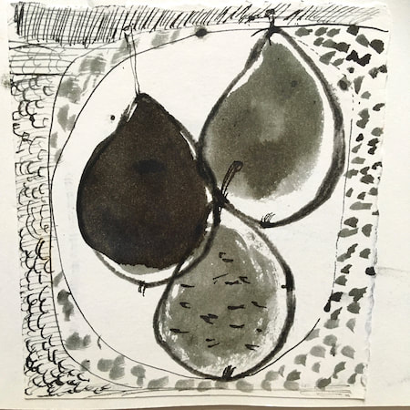
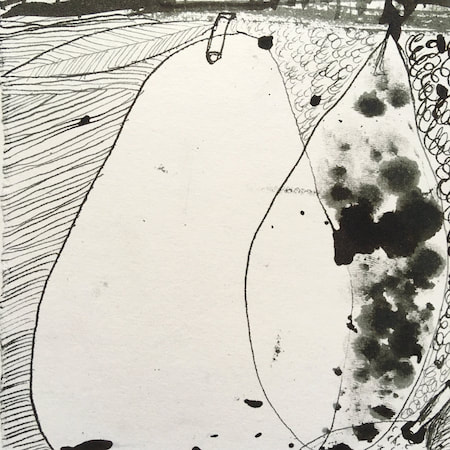
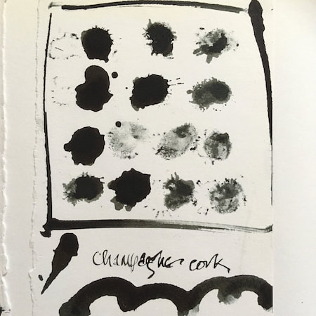
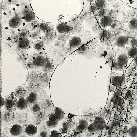
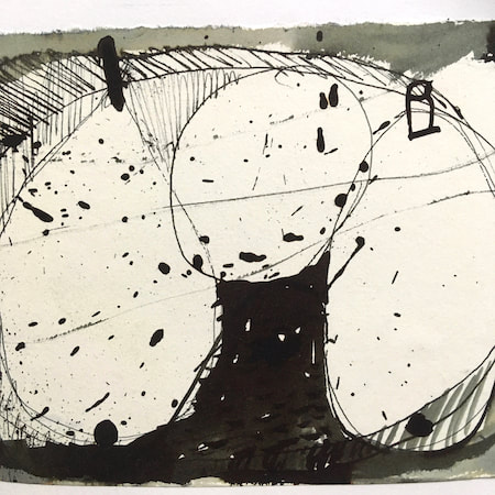
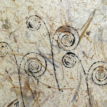
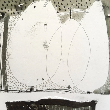
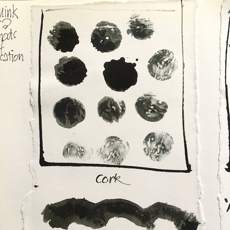
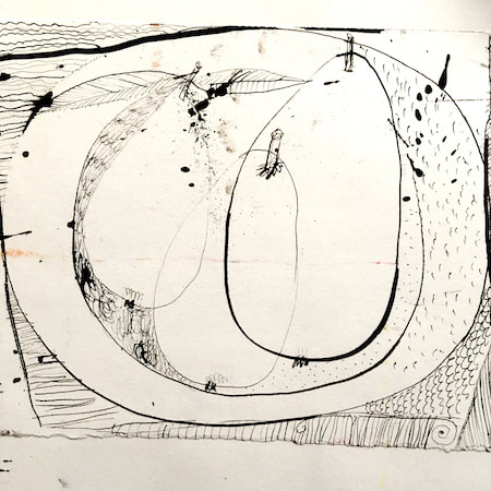
A sketchbook I used for mark-making with unusual objects - corks, seed-heads, feathers, home-made rubber stamps, my fingers and lots of flicky things ...
|
 RSS Feed
