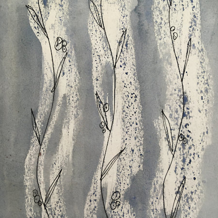
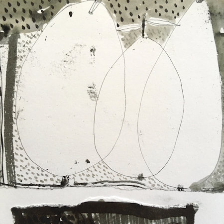
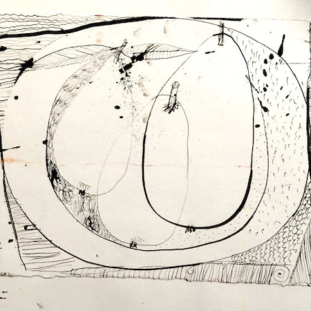
 An accidental inspiration happened this week when I began switching off some visible layers on a little still life of a pot of flowers I made a couple of weeks ago. The result is pictured above left; much as I loved the zigzags which decorate the original, I was interested in the open drawing and the distribution of tones, colours and shapes accompanying the line-work. I began to experiment with opening up spaces on some Voynich based sketches. 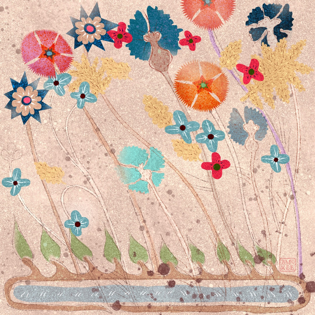 This led me onto drawing flowers with lots of movement, as though blowing around in the wind. I don't know where the stylised pond at the base of the above image came from, it was just a sort of vision, but it does seem to contain the Voynich spirit ... 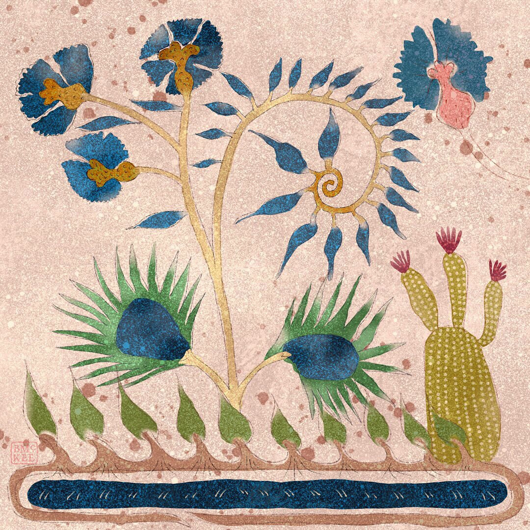 ... and then I wondered how a Voynich inspired drawing would look with my favourite drawing of a cactus, both also bending in the wind. Why not? I am loving my new texture I made for these and the way I am playing with transparency. I definitely see these works in Procreate as possible sketches for watercolour paintings. 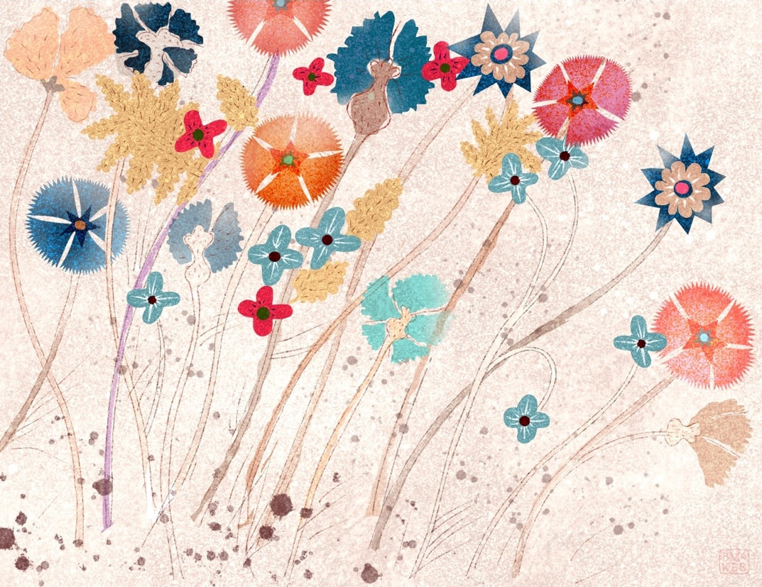 Thanks for visiting, see you next week
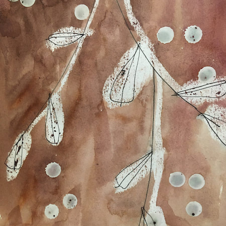
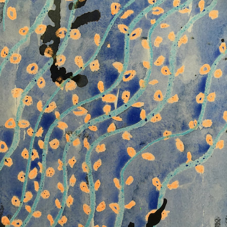
 More Voynich manuscript influenced flowers this week, experimenting with line and a softer texture in Procreate. 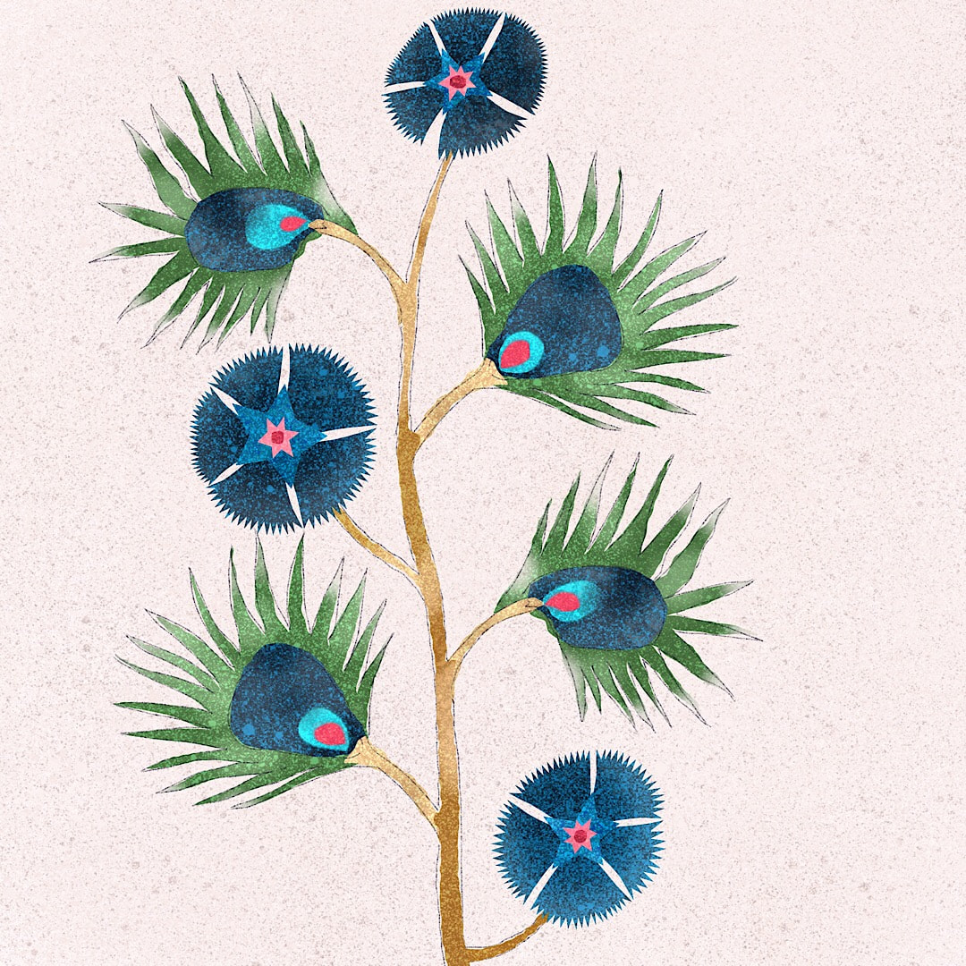 These spiky leaves reminded me of peacock feathers, so I brought in the jewel colours. I am getting the urge to work with these new Procreate sketches in watercolour, splotchy inks and maybe collage - let's see what next week brings. 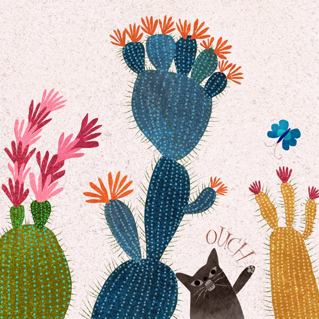 And this was yesterday's Caturday post on Instagram, distracted by a butterfly and not looking where he's going in a cactus garden. I particularly enjoyed the expressive cacti with all the little dots.
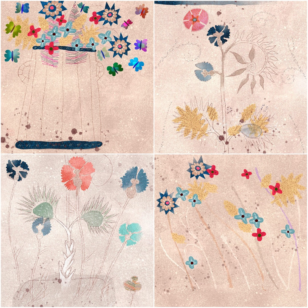
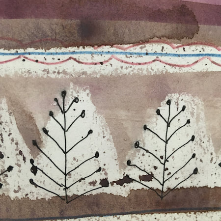
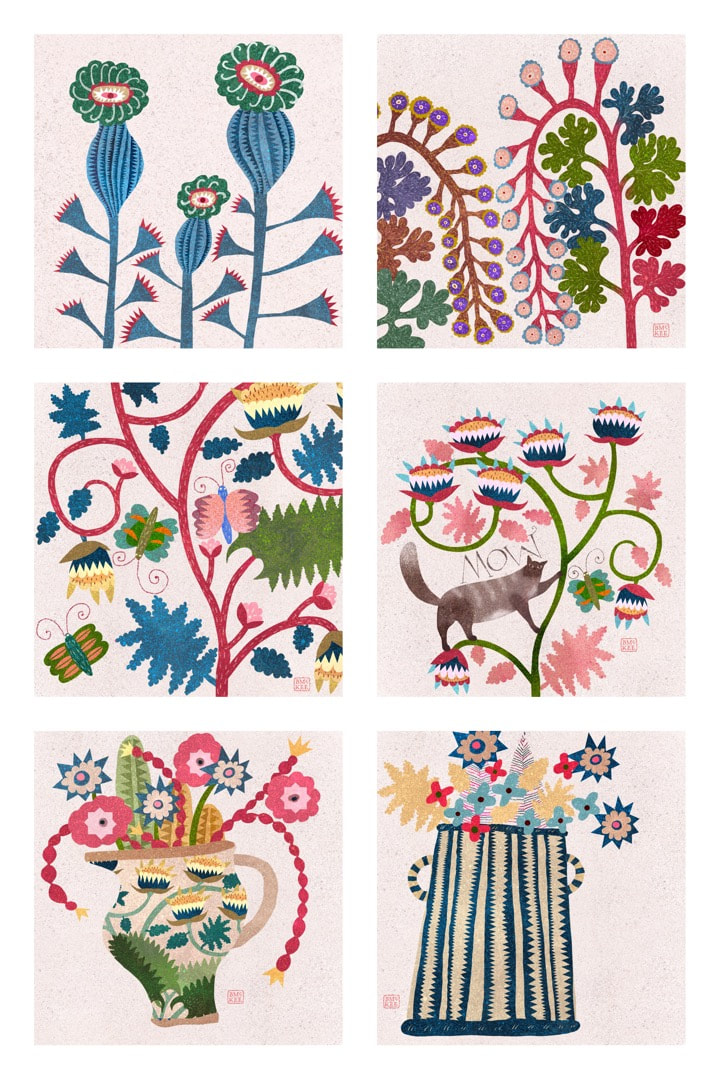 Still running along with Voynich inspired flowers this week, I set up 6 small canvasses in Procreate and worked through them quite quickly. I like to work this way, as it stops overthinking, keeps the work fresh, and is great for generating new ideas. I didn't expect to like the works as much as I do, intending them at first to be just small digital collage sketches so I didn't pay any attention to how I set up the canvasses at the beginning. I discovered subsequently that they are all 72dpi, too low a resolution to make prints - I had just quickly copied a master I use for Instagram post, whereas I normally work at 300dpi. I had envisaged the six pictured above to be no larger than 15cm a piece if they were prints. 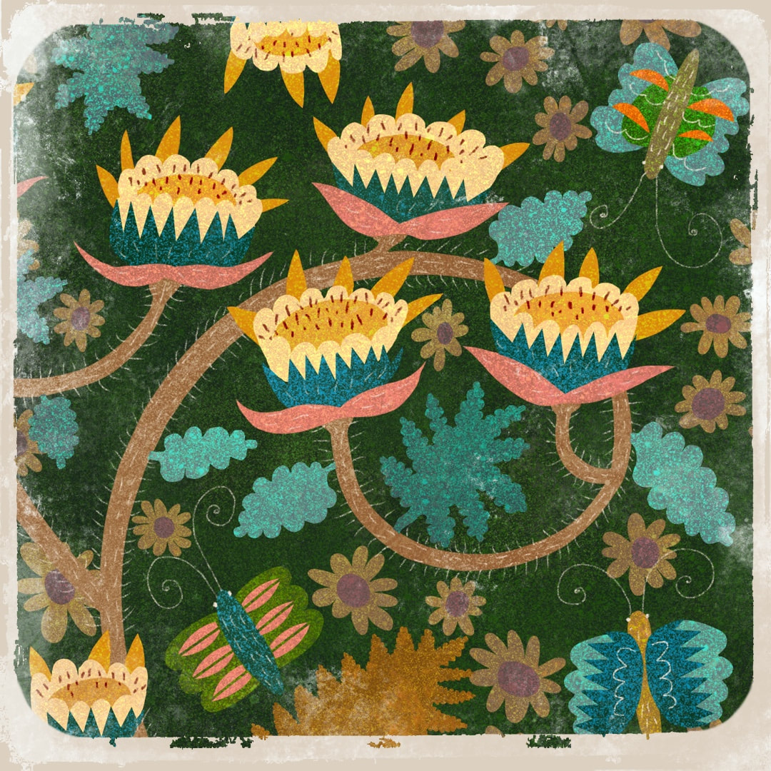 The physical dimensions provided in Procreate are 38x38cm at 72dpi (if the resolution had been 300dpi, they would only measure 9cm). They may print absolutely fine at 15cm, being less than half the size of their physical dimensions. I tried the pot, bottom right of the 6 images, with the tiny zig-zags running downward (a detail most likely to show up poor print quality) on our home office printer, and from what I could tell it seemed to be fine. However, our printer is not professional quality. I won't know for sure until I take them along to a proper printer's and see what happens.
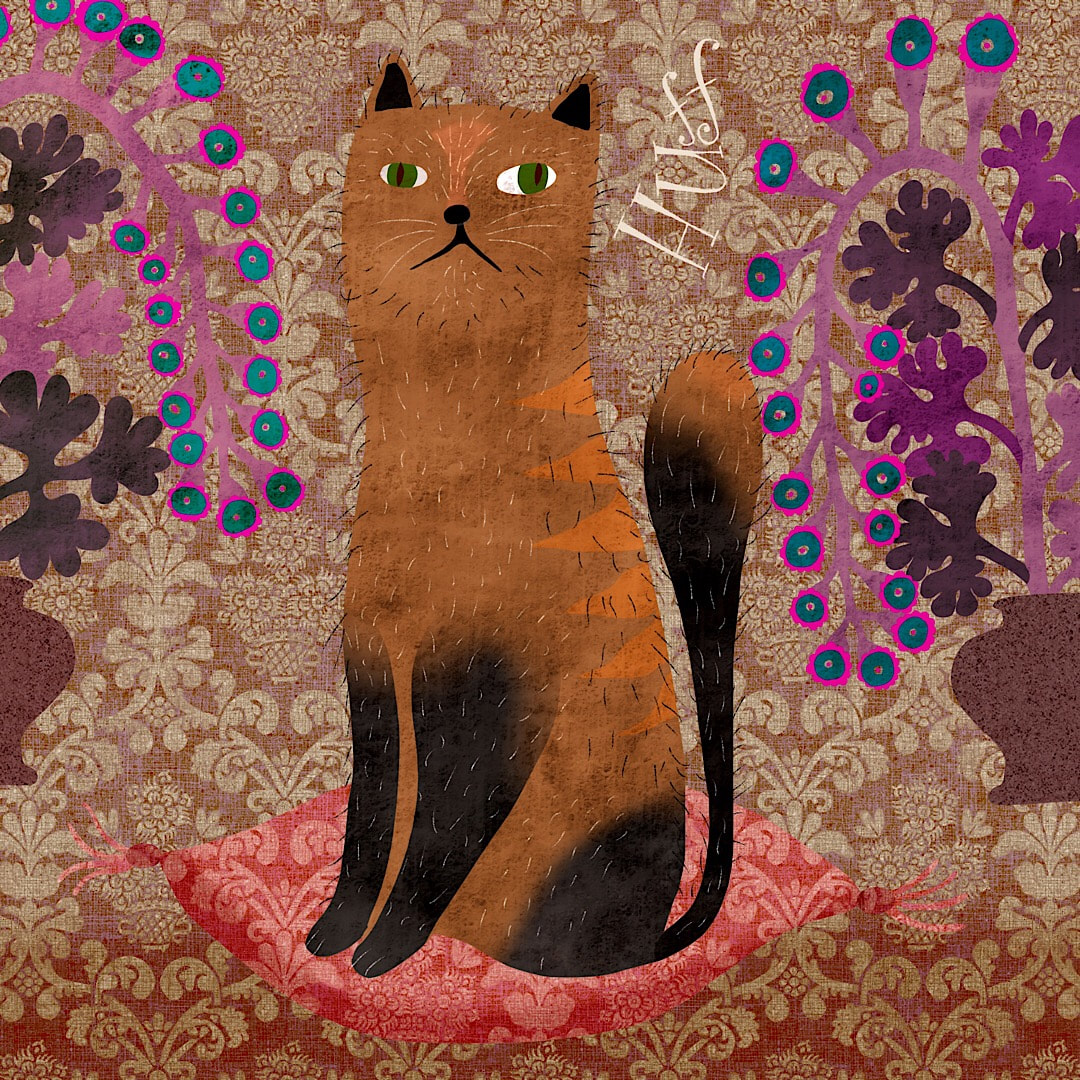 Cat in a huff - I am looking after Minnie the cat this weekend, and she is often spectacularly huffy, so funny. I also worked on a composition of coloured dots which I later made into a pattern. 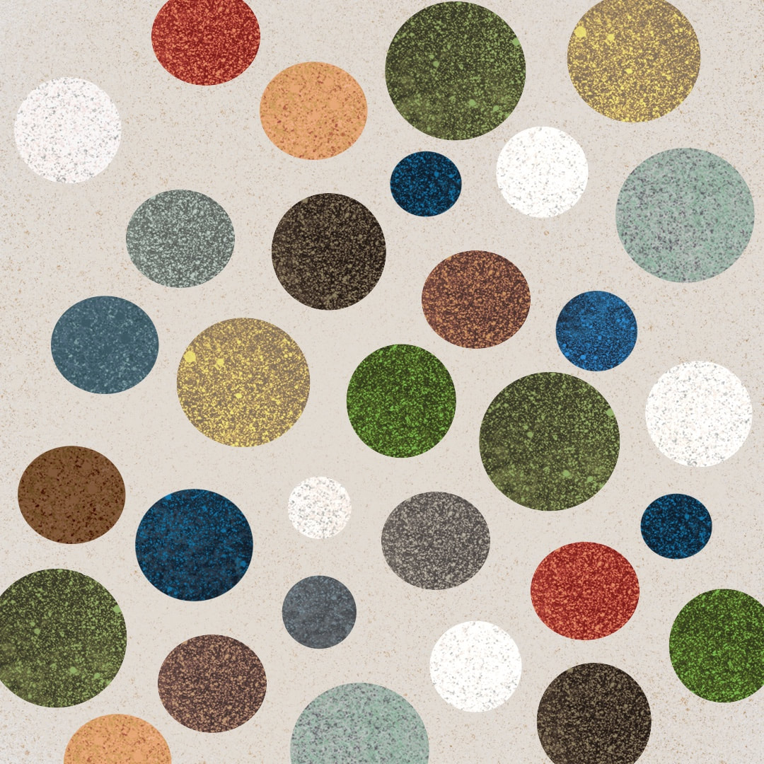 I backdated this post because I took the day off for my birthday!
Thanks for visiting, see you next week! 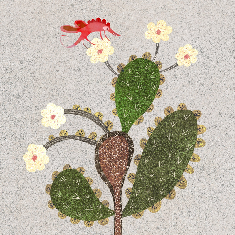 I had a refresh of colours, textures and subject matter this week. These flowering cactus collages (made inProcreate) had been hanging around in my workspace for a while but something wasn't gelling; however, a new approach to completely brought them to life. I wasted an awful lot of time trying unsuccessfully to get them to work (I liked the shapes and idea) until this refurbishment in new speckled textures and drawing captured exactly the right mood. 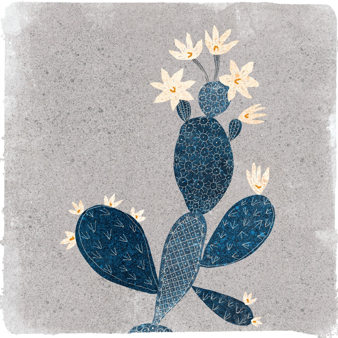 When I'm not designing patterns, I don't have to worry about making everything as clear as a cartoon. Close tones and subtlety are open to me, and these two cactus pieces were my favourites of the week's work. I particularly like the Japanese woodcut look of the blue one here - it's cool, flat and graphic yet soft, with its little pattern details derived from the spikes of a cactus. 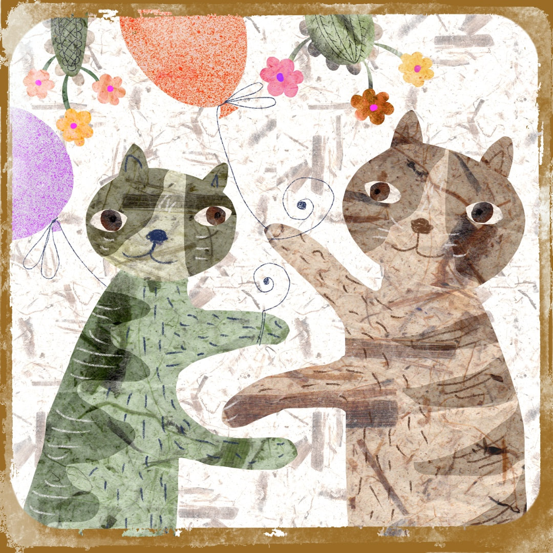 These charming partying cats were created especially for Caturday on the May bank holiday weekend!
Thanks for visiting, see you soon! |

~~~~~~~~~~~~~~~~~~~~~~
Welcome to my illustration and patterns blog.
I illustrate under the pen-name of Binky McKee, McKee being my mother's maiden name. Binky was the name of every single cat my great-grandmother kept - allegedly about 40 of them during her 94 years of life. I changed the website address a few months ago, so some older links on previous posts are broken. If you click one of those and it takes you to a strange page, simply replace the .co.uk after the binkymckee. with weebly.com and it will work again. I hope you enjoy your visit! ~~~~~~~~~~~~~~~~~~~~~~
~~~~~~~~~~~~~~~~~~~~~~
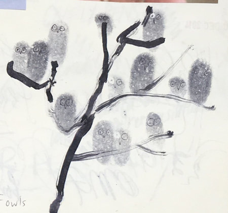
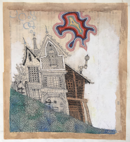
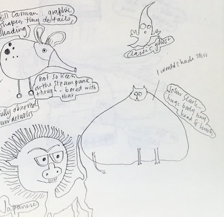
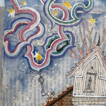
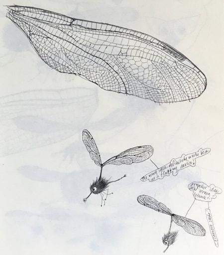
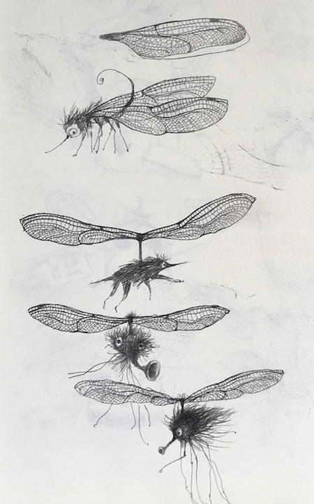
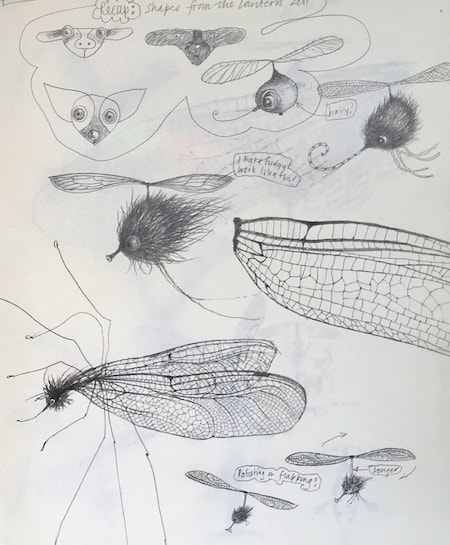
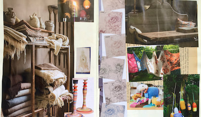
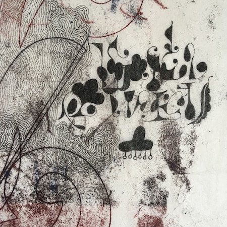
I keep lots of scrapbooks and sketchbooks where I develop ideas and design little creatures. Here's a peek inside one ...

~~~~~~~~~~~~~~~~~~~~~~
~~~~~~~~~~~~~~~~~~~~~~
As you may know, I am also known as Heather Eliza Walker.
Click the image if you would like to find out more and visit my other website. ~~~~~~~~~~~~~~~~~~~~~~ ~~~~~~~~~~~~~~~~~~~~~
~~~~~~~~~~~~~~~~~~~~
April 2024
~~~~~~~~~~~~~~~~~~~~~~
~~~~~~~~~~~~~~~~~~
All
~~~~~~~~~~~~~~~~~~~~~~
~~~~~~~~~~~~~~~~~~~~~~
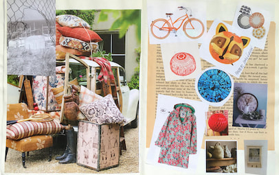
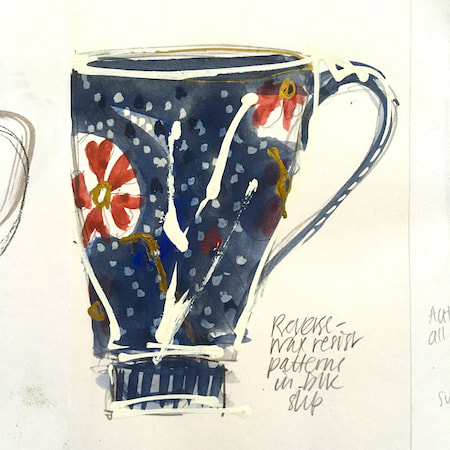
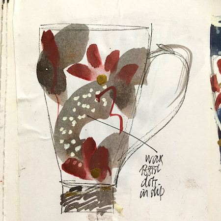
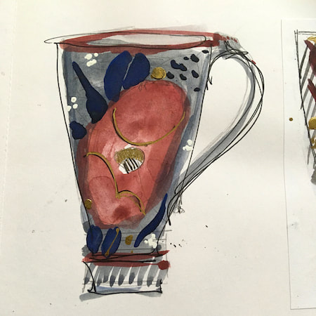
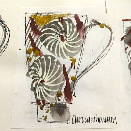
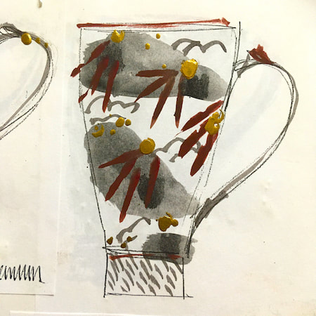
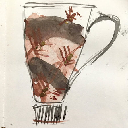
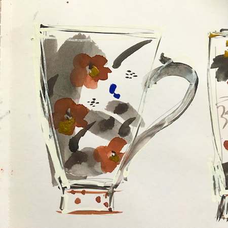
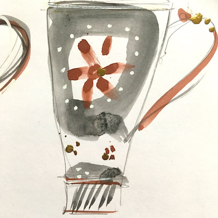
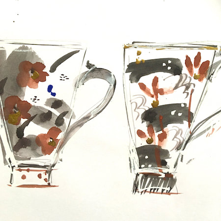
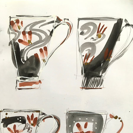
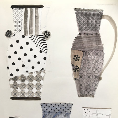
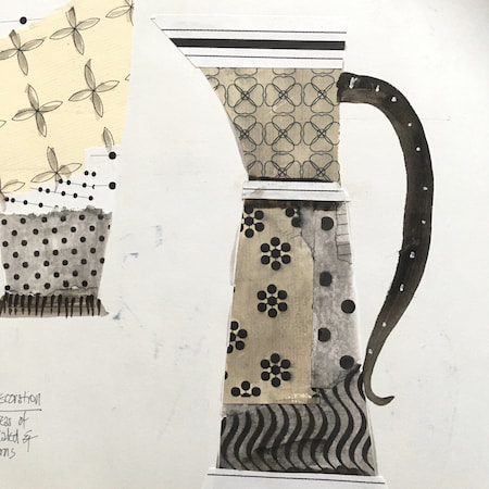
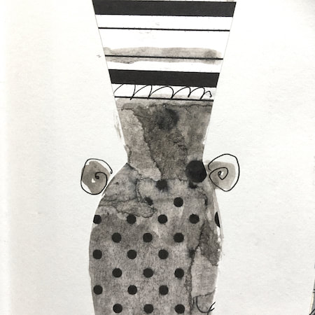
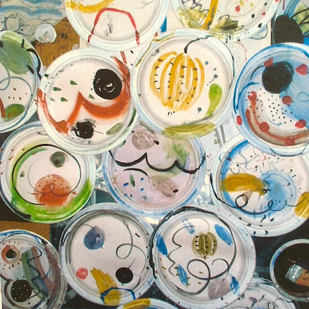
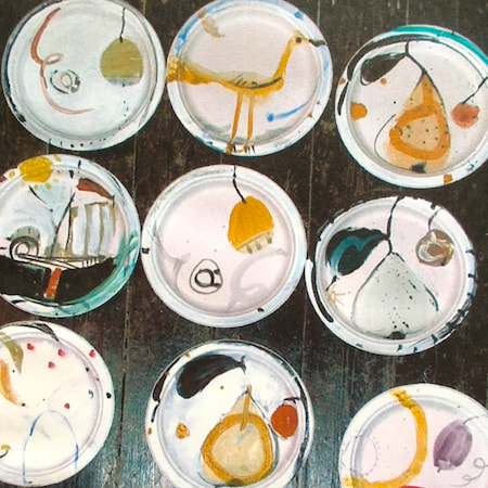
This time, take a peek into my ceramic design sketchbook. I actually made some of the mugs, but I kind of prefer the drawings! The plate designs are painted on paper plates, a most liberating process.
~~~~~~~~~~~~~~~~~~~~~~
~~~~~~~~~~~~~~~~~~~~~~
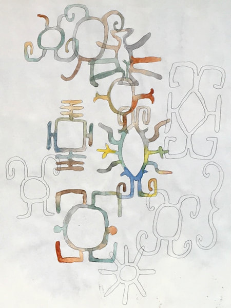
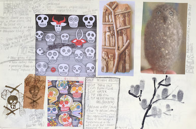
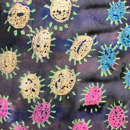
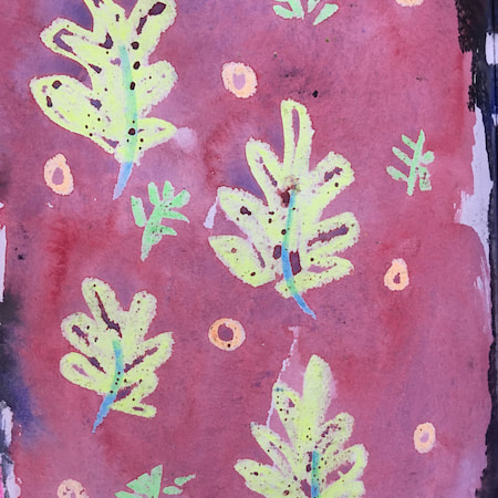
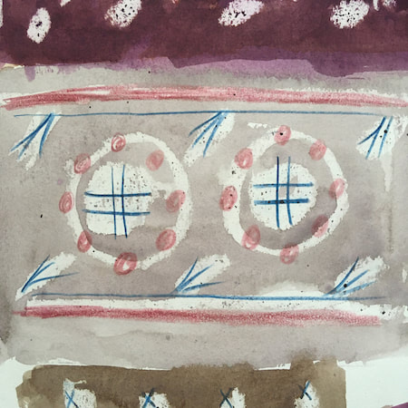
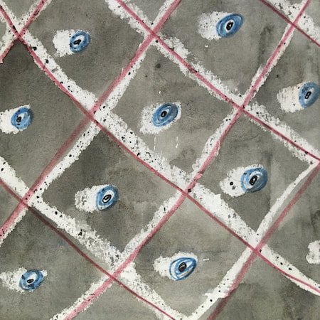
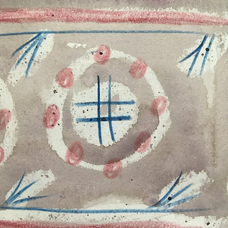
These watercolours are from my pattern sketchbook. I used coloured wax crayons to resist the washes of watercolour, also home-made rubber stamps dipped in bleach then printed on crêpe paper - the bleach takes out the paper dyes.
~~~~~~~~~~~~~~~~~~~~~~
~~~~~~~~~~~~~~~~~~~~~~
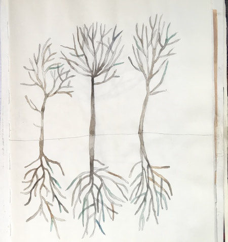
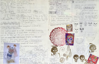
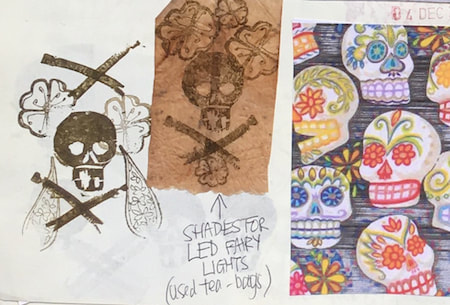
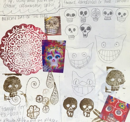
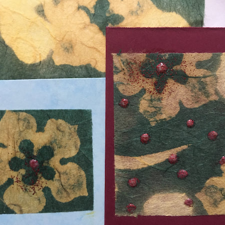
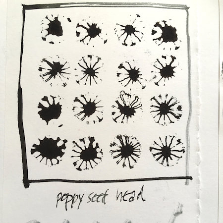
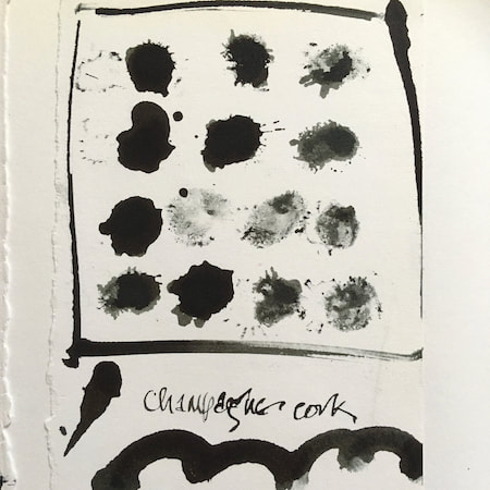
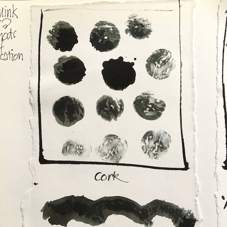
A sketchbook I used for mark-making with unusual objects - corks, seed-heads, feathers, home-made rubber stamps, my fingers and lots of flicky things ...
|
 RSS Feed
