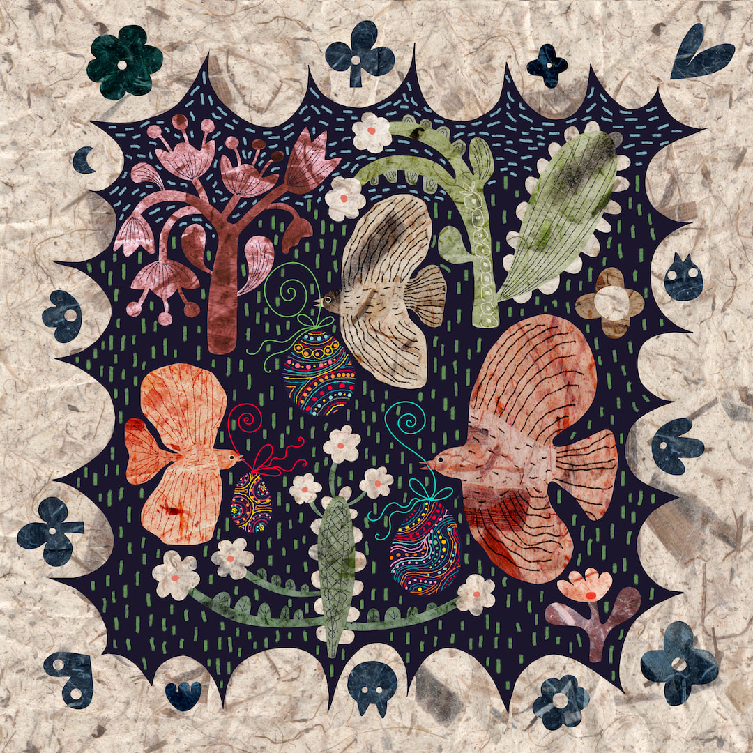
 I liked the folksy Caturday collage so much I rejigged it, together with the Easter egg birds collage, into a square with a folksy border. 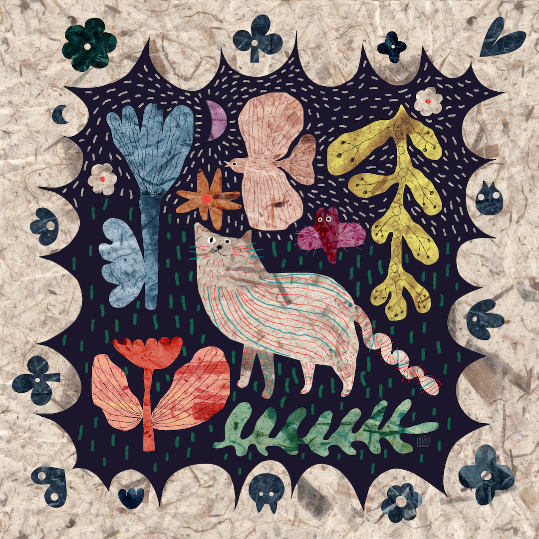 I especially had throw pillows in mind, but both designs look super on the products I selected! I still get a big thrill from seeing my work on Redbubble's products. 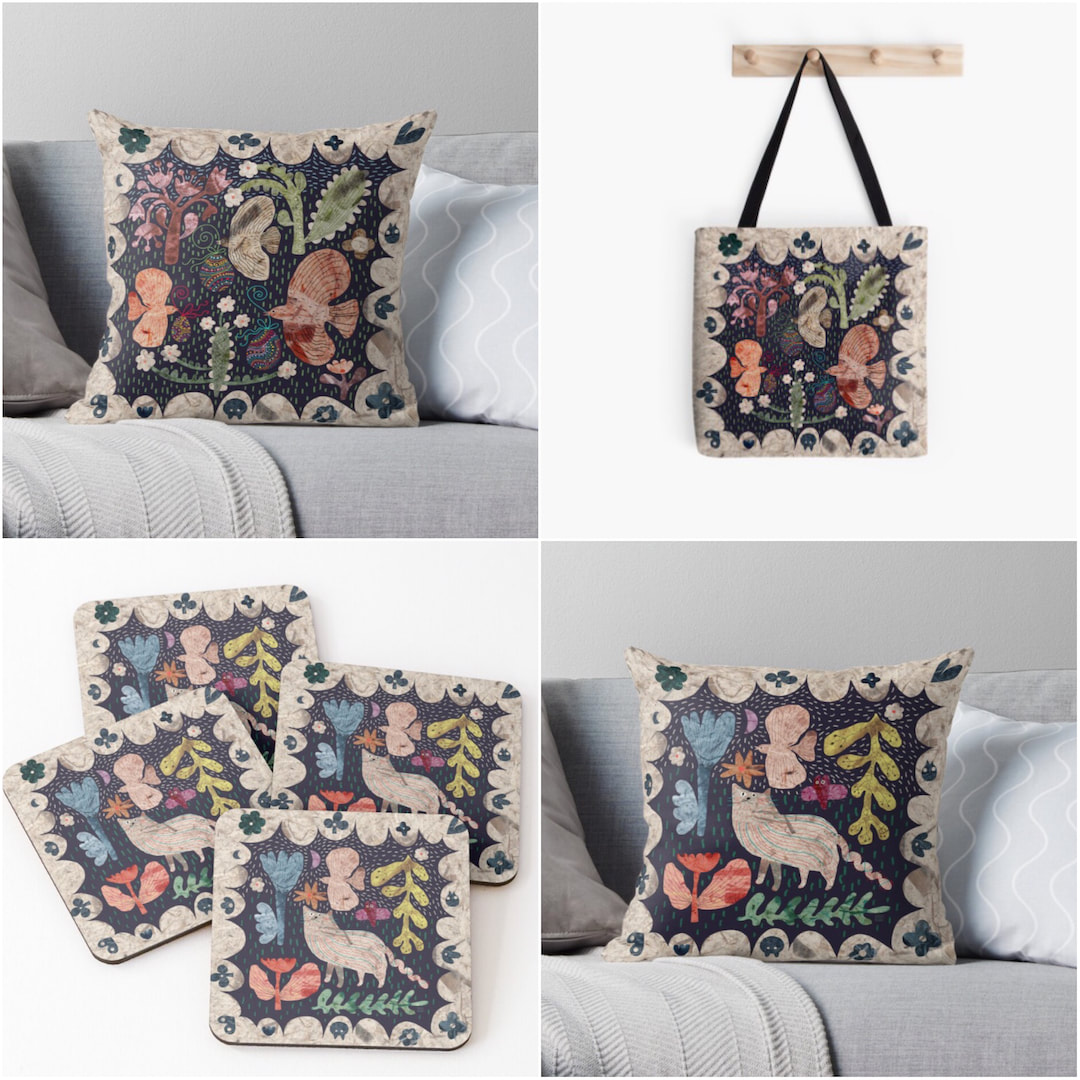 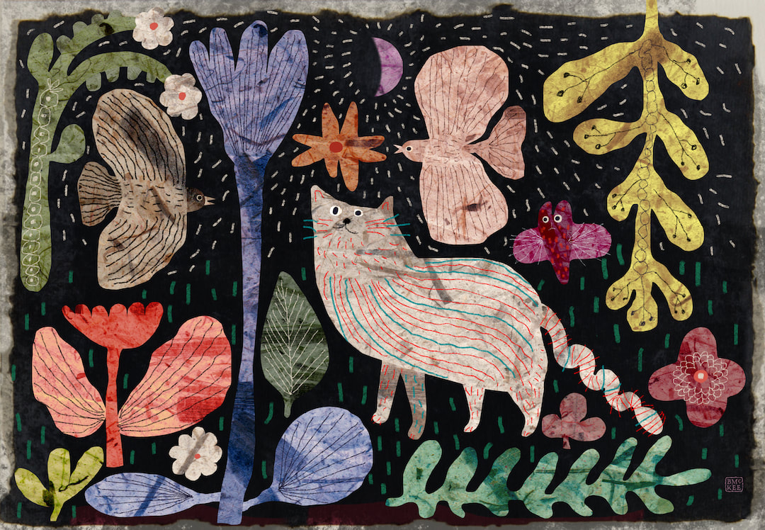 I called this "A twist in the tail" (sorry!) - it is another Instagram post for Caturday which began as a square format but I reckoned it would make lovely art prints and cards, so here is a landscape version and how it looks as a framed print. I was so pleased with this I went on to redesign the Easter eggs birds in a similar fashion to make a matching pair. This is currently work in progress in my spare time as I push on with the children's book, which is going extremely well and I am sure it will not be long until I can begin sharing some of the work. 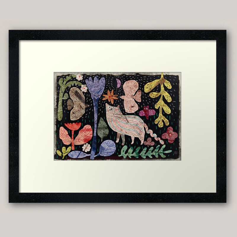 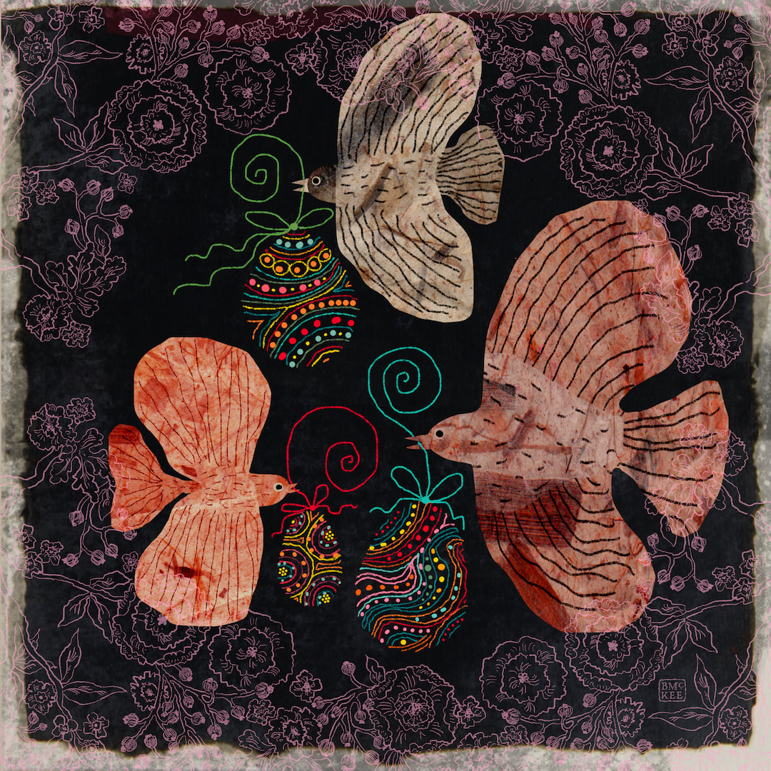 I have been cutting out a lot of bird shapes in mulberry paper in Procreate recently, so I quickly collaged this together for an Easter post. - birds bringing Easter eggs. A very Happy Easter to you! Such a lovely time of the year, the days are getting longer and the sun is out and blossoms and buds are happening.
Thanks for visiting, see you soon! 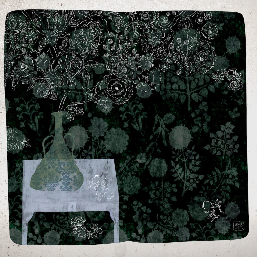 'Perfume.' I thought these ghostly flowers were expressive of the fragrance of real flowers in a vase. It has been quite a busy week, in spite of the two bank holidays on Monday and Tuesday. I took down the Christmas decorations on Wednesday, which took all day; Thursday and Friday saw two social engagements, the first we have had for such a long time it was overwhelming! Having to take lateral flow tests and observe social bubbles adds quite a lot to a day with an event. I have been a couch potato ever since; this afternoon I am lounging on the sofa, laptop on knees, dressed stylishly in a fleece Minnie Mouse onesie and a dressing gown decorated with koala bears with ears on its hood, with a hot water bottle and a snuggly blanket to add luxury. I haven't made any new work since before the Christmas period, so today I'm posting the collage above which I made on the 19th December.
Thanks for visiting, see you next week!  I have become very interested in using a traditional drawing style to make sketches of my patterns this week, and looking for birds and other floral and blossoming motifs. A nervous line with a variety of weight over a favourite texture (ink bleed in Procreate on what I think must have been a photo of a grainy porch window at Wester Lix) is doing it for me right now. I'm already thinking Valentine's Day and spring. 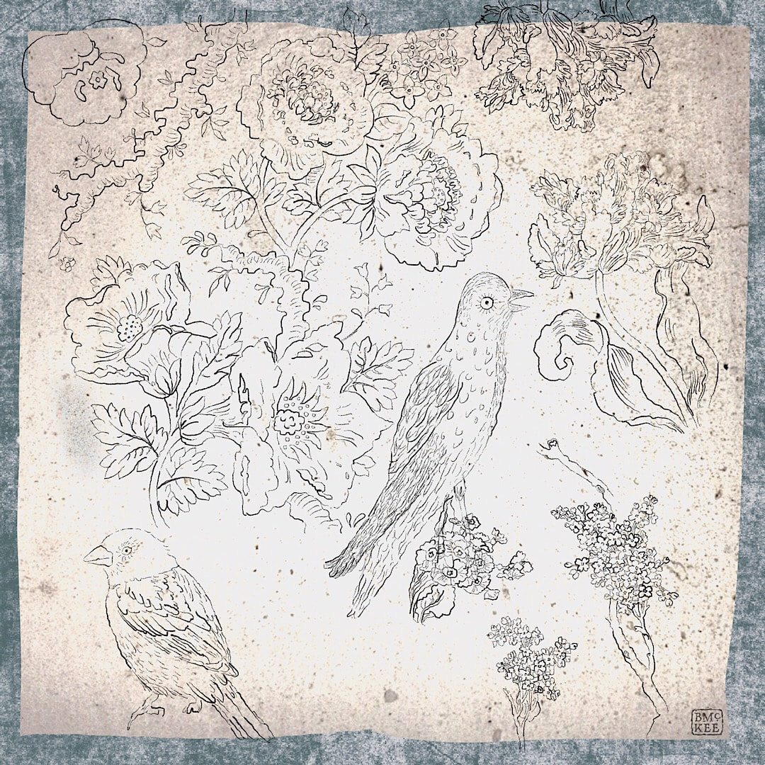  Continuing the clean theme, I began a 'collaboration' with my younger self. A few years ago I was delighted to find an old design I had made in school. It must have been 1972-3 because at the bottom of the sheet there is a small pencil note: "Heather Walker 2 G 2"; I would have been 12 or 13 if that means form 2 at school, although I seem to recall being a little older when the design was made into a batik cushion cover.  Here is a detail of the original drawing from all those years ago. I have wanted to work with it for some time, and started copying it in the Yay Flowers cut-out collage style earlier this year, but it didn't work. It didn't want to be drawn like that and looked dated in the wrong kind of way, somehow lacking a fondness for the nostalgia of the 70s which surprised me, because I thought Yay Flowers looked quite 70s. I like the glow and all the textures of Yay Flowers, but perhaps I was already moving away from that grungy texture I was using last year and that's why it didn't work. I had a feeling it could just look dirty in print even back then. As soon as I began tracing in Procreate with a smooth, clear outline all the fun came back. 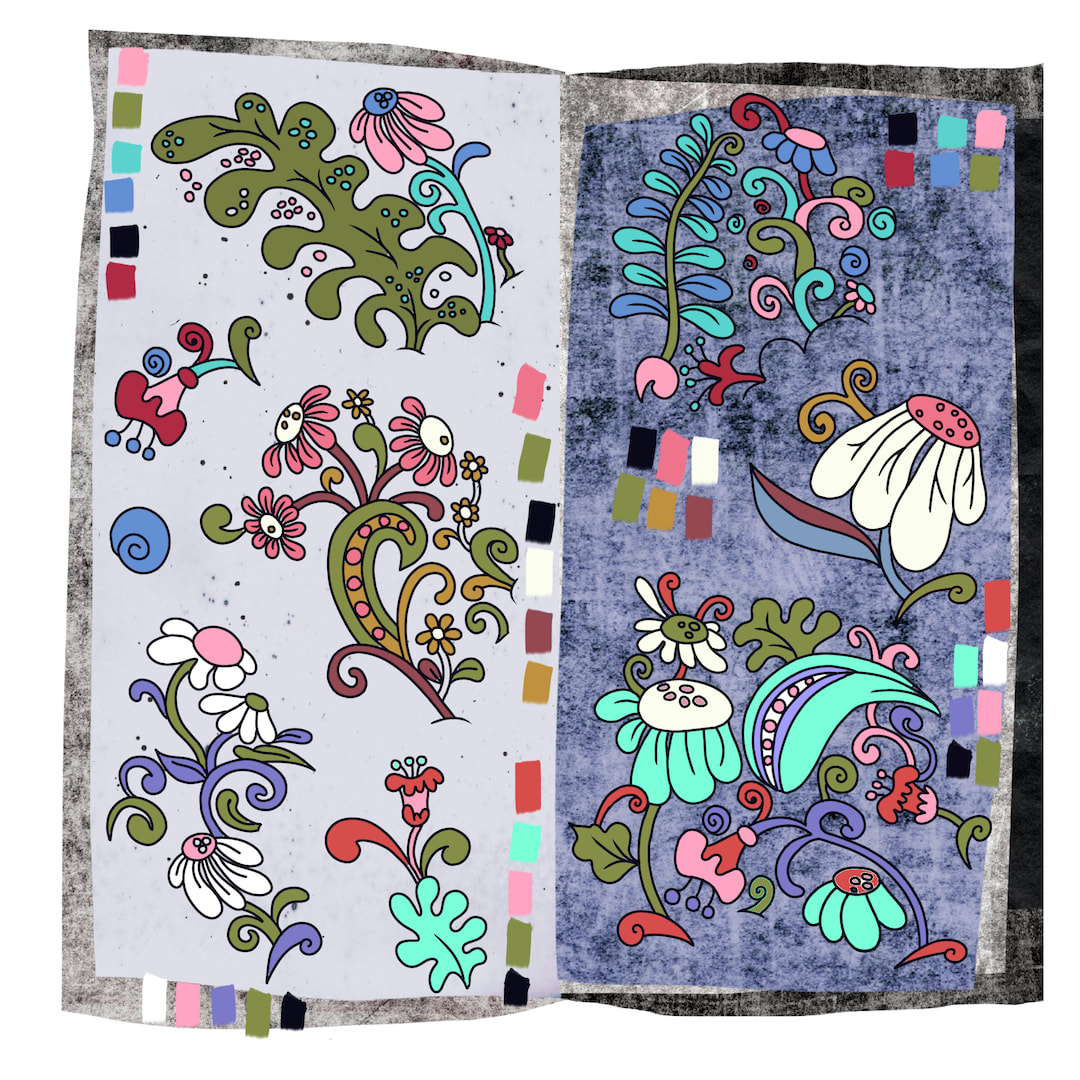 I had fun separating a few of the main motifs and experimenting with flat colour; now it looks 70s in the right way, with a clean and contemporary feel. I do like the juxtaposition of the flat line and colour work against grungy textures, but I know it wouldn't print well on Spoonflower so the final pattern will have a flat background. The thing to bear in mind is that fabric has its own texture and there's little need to add more, and when I am designing for a pattern I have to stop thinking like a painter and not make 'drawings of textiles', something I have done lots of times because of my interest in them - see September 2020, a month when that's almost all I did.
Thanks for visiting, see you next week! 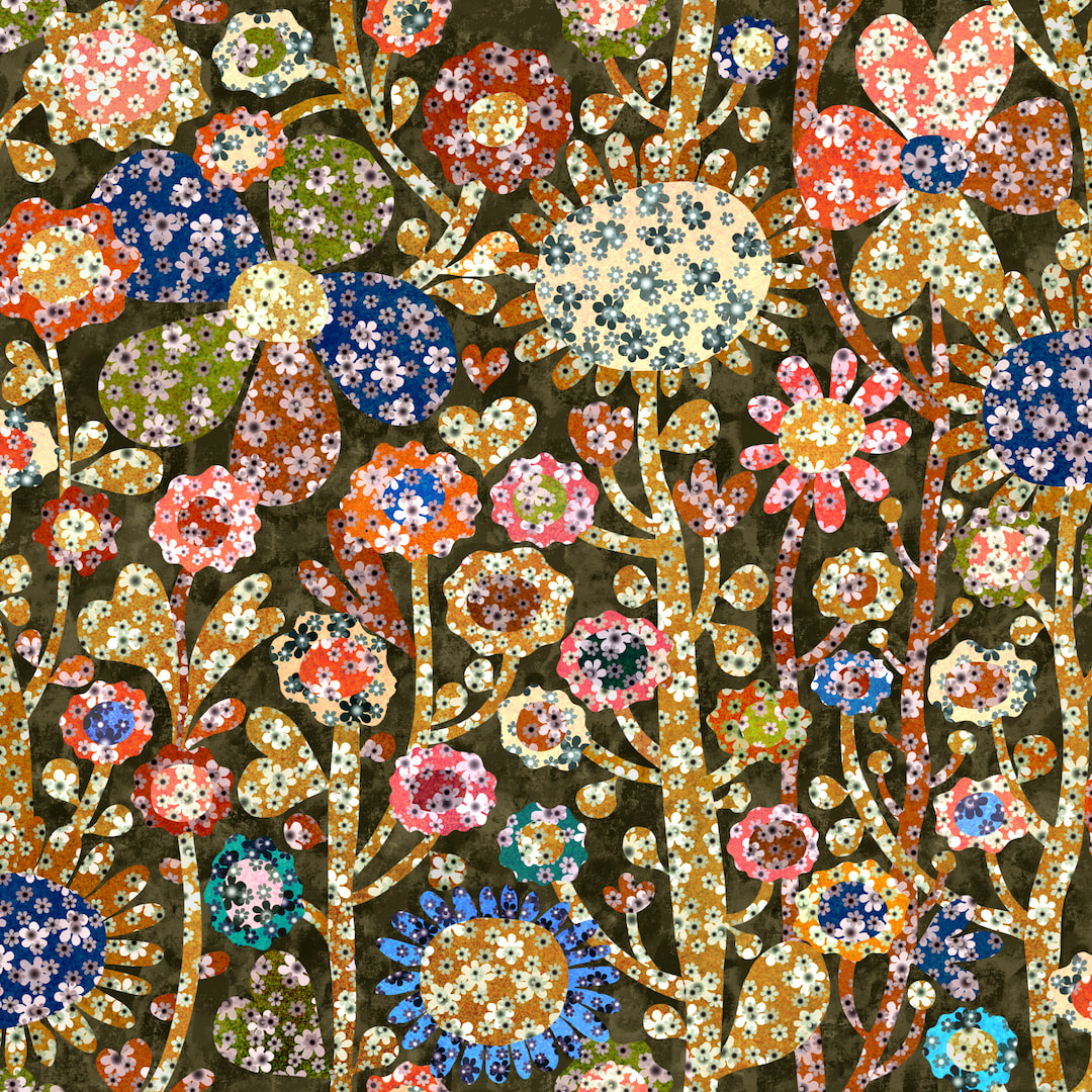 This one has kept me busy all week with enough going on in it to satisfy even my horror vacui. Flowers do make themselves from flowers, don't they? Above is a composition ahead of putting it into repeat, I rather liked the tall yellow stalk branching out into bunches of flower heads (just right of centre) but it didn't look good in a pattern, rather irritating actually, so I modified it to better suit the flow of a pattern in half-drop. Below is the result. I am loving the exuberant jollity and personalities of the flowers. 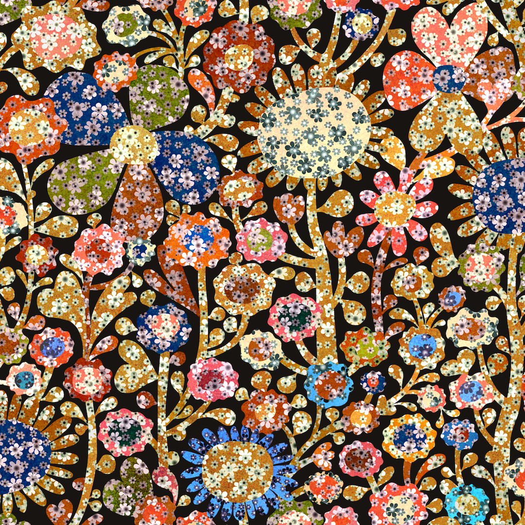 Thanks for visiting, see you next week!
 Instead of just uploading patterns to my Redbubble store, I have been turning my attention to wall art. Below is a rework of one of last year's pieces, and I was so encouraged by how charming it looks framed in my shop I went on to make the new composition above. 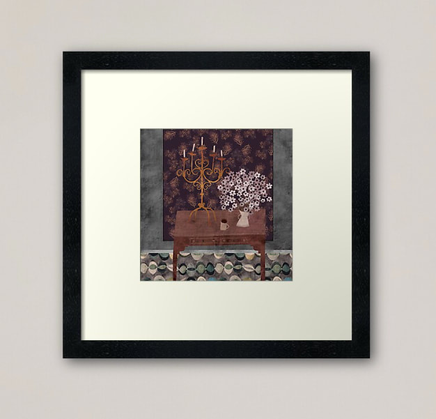 The variety of work and different dimensions certainly makes my Explore Designs page more exciting, taking it away from the strict grid into a naturally staggered flow which is easier on the eye. I have also begun to mix up the designs; I had been uploading patterns in different colourways one after the other so they were grouped together, but I think that looks a bit boring so now I am alternating patterns to work the colours. I discovered that's actually a fresher and enjoyable way to work anyway. 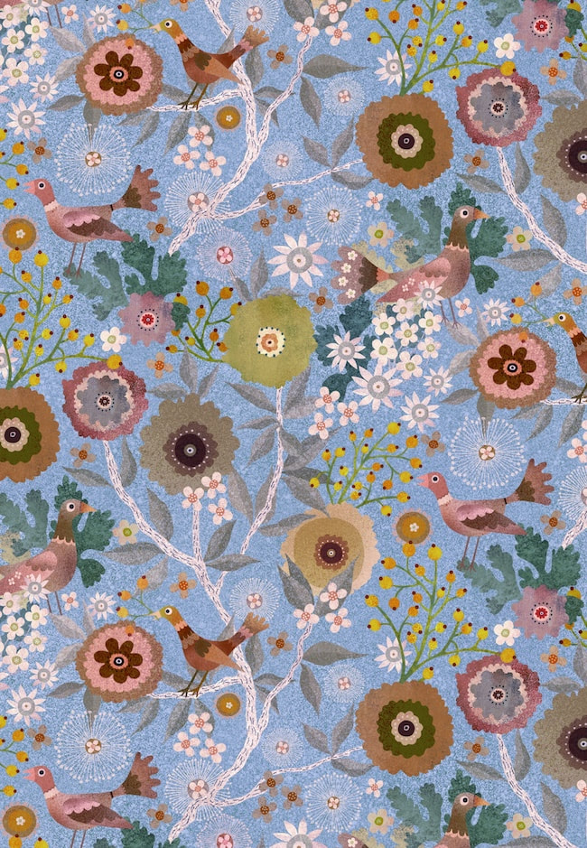 Here's a version from this week, a blue colourway of the birds and berries pattern I have been working on lately, but I also got out the vintage tie daisies pattern plus a few others to put into new colourways. Mixing it all up seems to be really improving the look of my page.
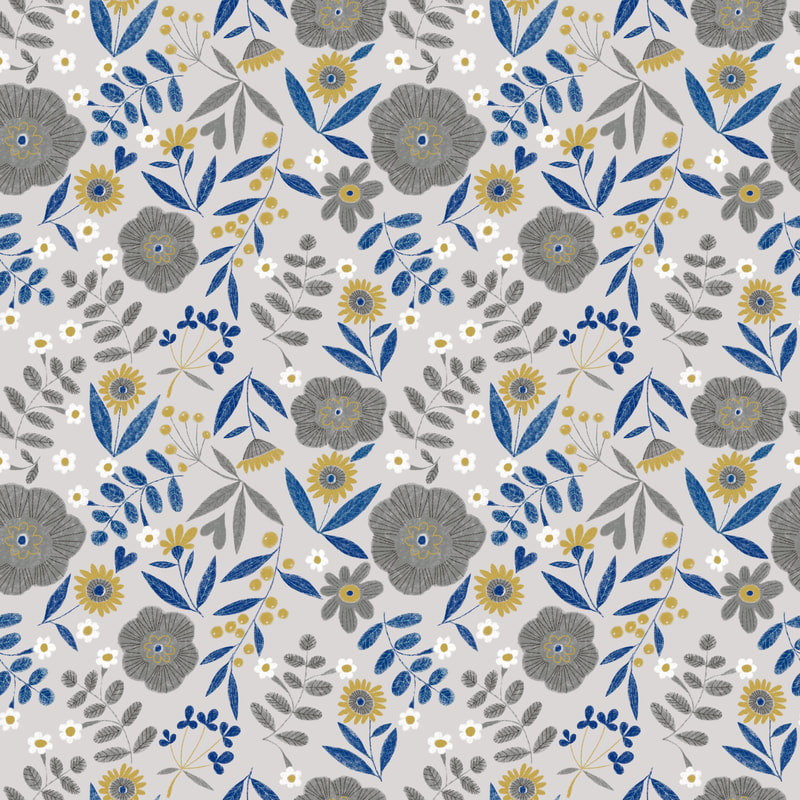
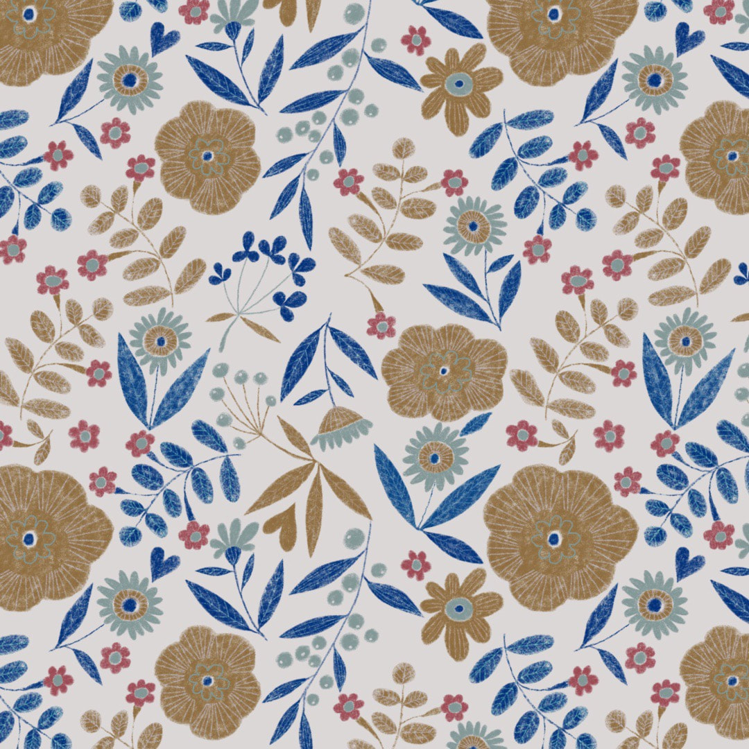
Thanks for visiting, see you next week! 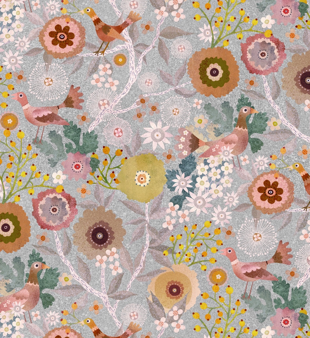 Last week's success reworking Yay Flowers! from 2020 inspired me to rework the Birds and Berries garden pattern I also made last year, but never used. I gave it a quick try on Redbubble at the time, but had concerns about it so I never launched it. Back then I was working by bouncing designs back and forth between iPad and Photoshop and it raised a few issues, such a line of just one pixel going missing etc - a minuscule difference, but enough to fault a good pattern, and although I tested the repeat thoroughly and it seemed fine in the end, I just didn't trust it. I lost Photoshop when my very, very old MacBook finally died, but already had Procreate on iPad and was using that more and more. I won't subscribe to Adobe any more (don't approve, and can't afford it anyway) so nowadays no more Photoshop and I am working exclusively on my iPad Air. No, I don't have the wondrous Procreate 5 because it's only available for iPad Pro (which I also can't afford) but over the last few months I have worked out an idiosyncratic but completely practical way of making good patterns 'by hand', which I really enjoy; I can work in comfort at massively enlarged pixel scale for total accuracy. It's a kind of hybrid of the physical paper method and modern (well, sort of in my case) technology, and it certainly satisfies my inner jigsaw puzzler! So, this week I had the confidence to get out my favourite pattern and rework it. I could only get it to work last year in merged form, solid state with background, so colour variations didn't really work. I rebuilt the pattern tile from scratch with elements I had filed away, and hey presto - colour separations! I love this silvery version (above), the original colourway is shown below. And yes, the pattern is going back onto my Redbubble store to play in all its colourways. 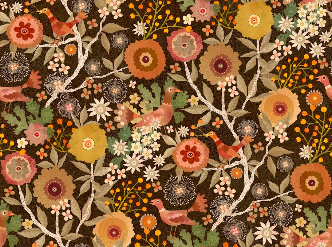 Thanks for visiting, see you next week!
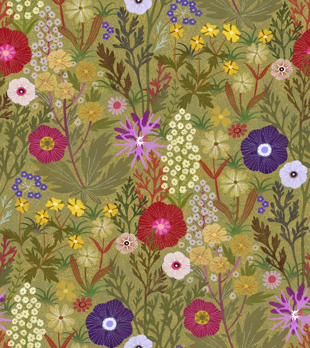
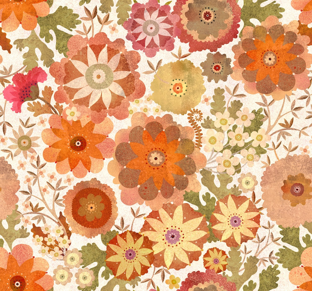 In May last year I made the above pattern which I called Yay Flowers! I only every produced it in one colourway as I was going through a process at the time of making patterns as a whole entity, with everything merged together. I made a new speckled repeating background for the original pattern, pictured above. When I was drafting the idea for the pattern last year, I had produced an initial little composition which I liked a lot, but couldn't figure out how to use it at the time. I thought I would give it a go while I had the various artwork pieces out. I keep the elements of patterns I really like so I can use them again, so I fetched the flower workings, rearranged them, created new stems, leaves, and a couple of new flowers, and colour separated at the same time. Below is a lovely, sombre version of the new pattern in velvety browns. 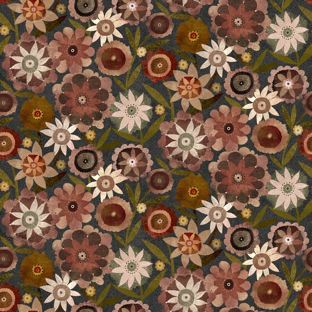 It has been a week of colourways, I also worked a few for last week's British Meadows pattern . I particularly liked this soft blue and lilac version, quite dreamy. 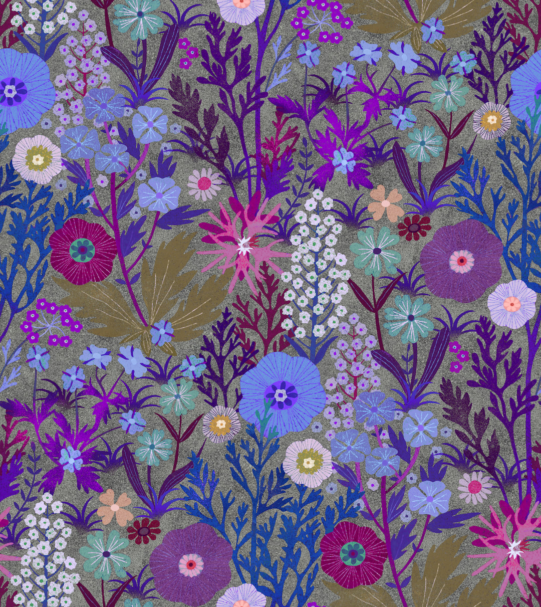 Thanks for visiting, see you next week!
 This is a new pattern I have been working on this week, using the risograph textures I made earlier. I'll add more about it here later, but I'm off to watch the football and have some dinner now!
Thanks for visiting, see you next week  I worked two more colourways of my latest pattern during the week. I like to limit the number of colours for such patterns to no more than five, plus a background colour. It partly comes from my training as a graphic artists in the print industry in the early-mid '90s, working with colour separations to produce one printing plate for each colour for the offset litho process. I enjoyed seeing how an image was composed by unravelling the colours. 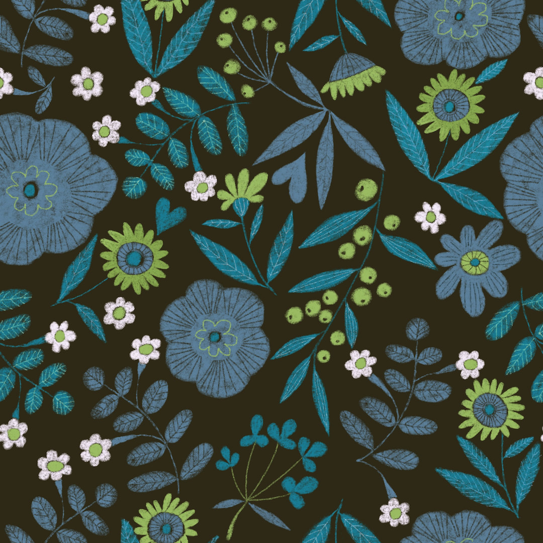 Below is a photo of a little Christmas card I had made at the printers back then, the colour separations can be seen clearly because something I loved to do was emphasise the hand-made quality by making the separations miss here and there. The negative spaces are activated and appear white because of the surrounding colours, although it is printed on a buff coloured laid paper. Interestingly, I bought a new duvet cover from George at Asda recently where the designer had done exactly the same thing in making the separations 'miss', which adds a considerable amount of charm to the pattern. 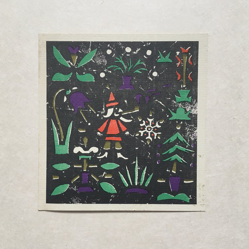 More recently, when I was working on the daisy pattern based on a 1970s neck-tie, I was surprised to find only five separations plus the background, in spite of looking like a riot of colour. Naturally, working in Procreate or any application which uses layers, I keep one layer per colour and limiting the colours means putting a design into repeat is very much faster; if I can stick to four like this new pattern it makes life a lot easier. I find fewer colours make a more cohesive pattern and I enjoy the challenge of working within limitations, which is just as well with my comparatively archaic methods. My Redbubble shop has become a wonderful playground where I can see my patterns on a variety of products - I randomly present a framed art print and a pair of socks today! 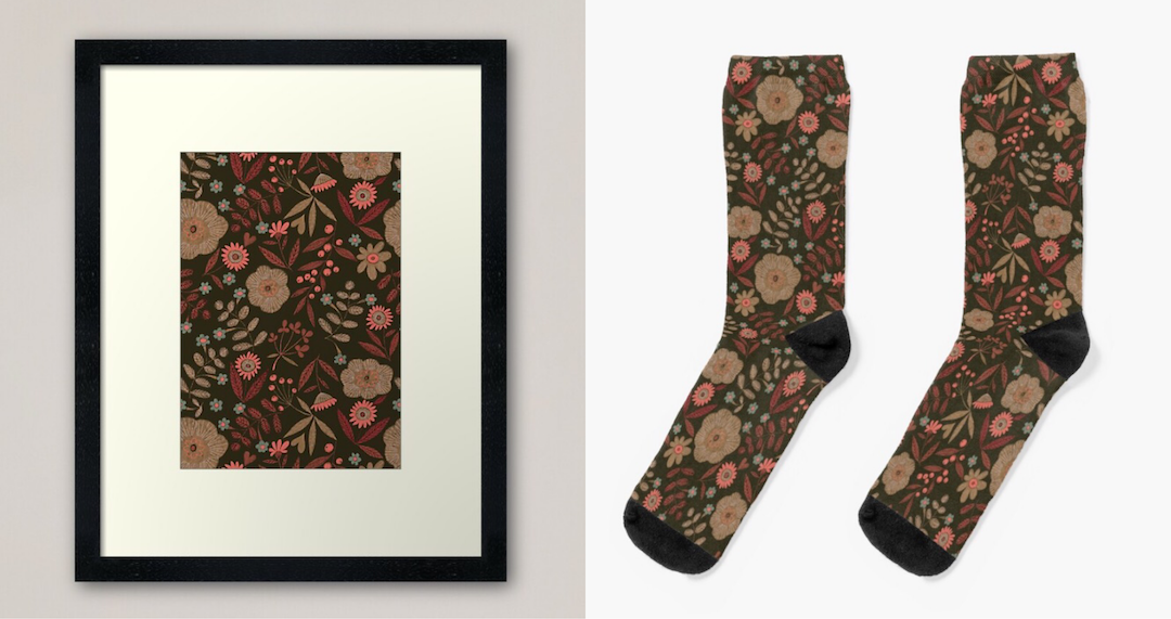 Thanks for visiting, see you next week!
  Above, a new pattern in its first two colourways, and below, different colourways of last week's pattern inspired by a vintage tie. I have been thinking about why I love pattern-making so much, my interest is increasing rapidly with time. I don't really know, to be honest; I think it may relate to solving jigsaw puzzles, or crosswords, but it's worth noting the process: while the purpose and end results are quite different, the mental process is almost the same as in my drawings. In fact, pattern-making feeds into and assists the drawings. When you design patterns it is necessary to think about the motifs and the surrounding space - it's the only way I can express it, but you quickly learn how to avoid the irritating forms, line-ups or gaps which when put into repeat disrupt a pattern, so the up and down and left and right become vital to a successful composition. I can spot a no-no from a mile off these days! I suppose the devil is in the detail. I'm using this knowledge gained from applied art in my drawings and it makes me glad that I diverted into the two disciplines. 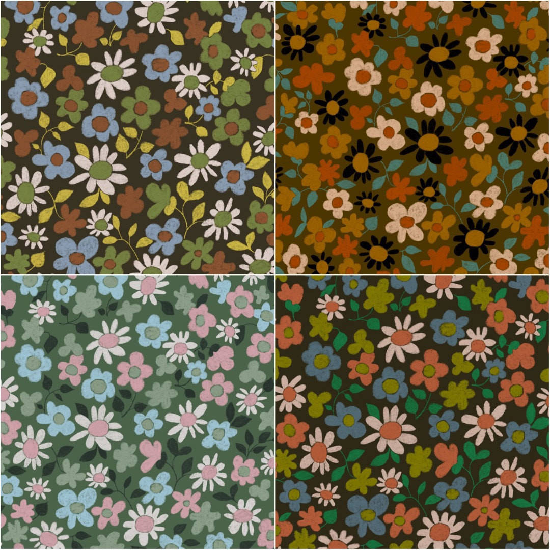 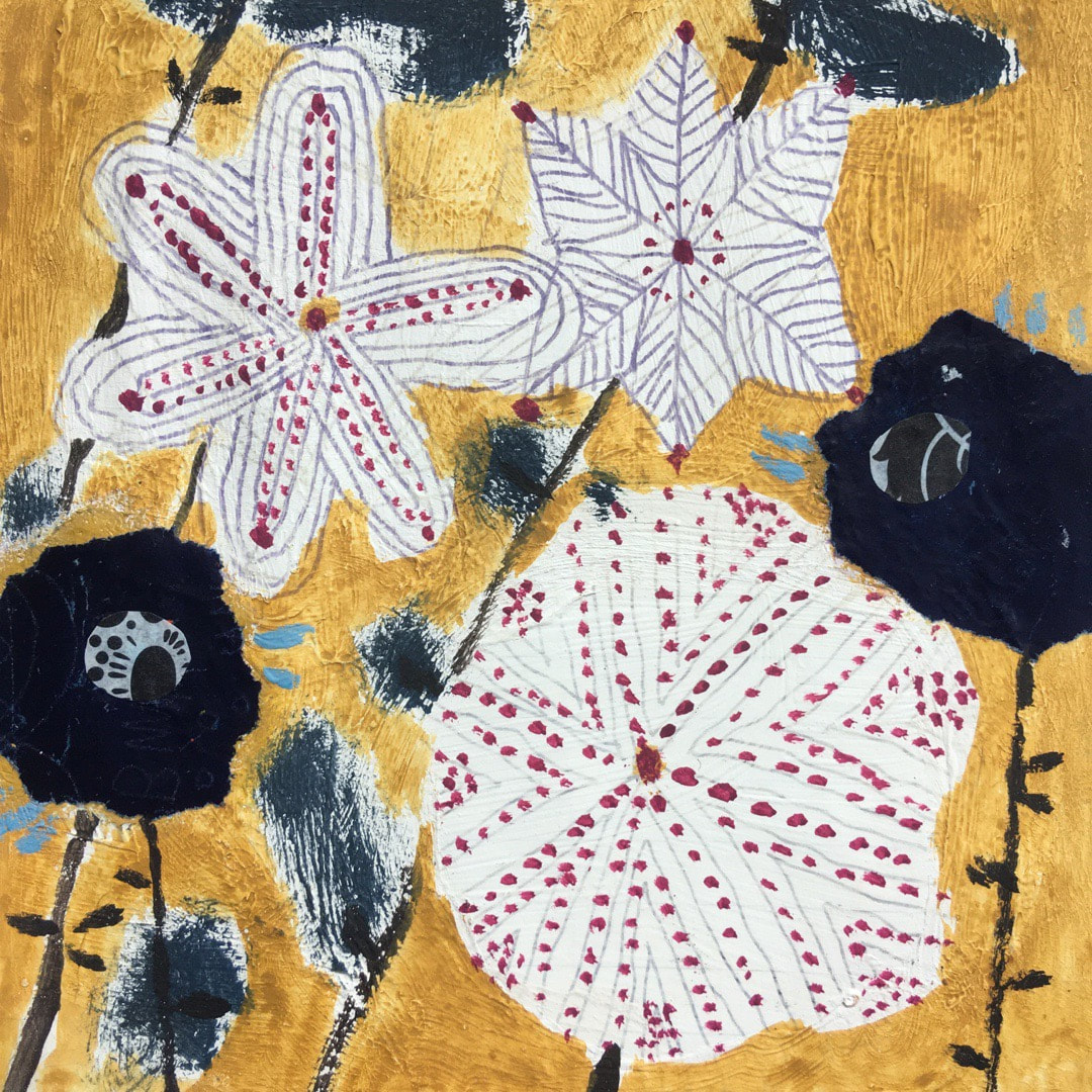 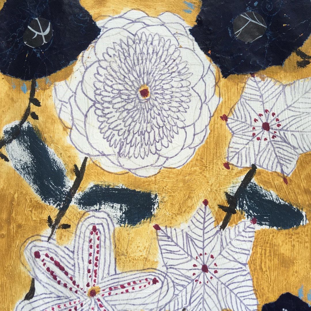 Some sunshine yellow to welcome in the merry month of May! I do wish we could have a bit more actual sunshine, it has been bitterly cold here in Fife this week, with very cold nights and some frost in the early morning. Flowers, very sensibly, are refusing to bloom in the real world but are still going strong in my work. 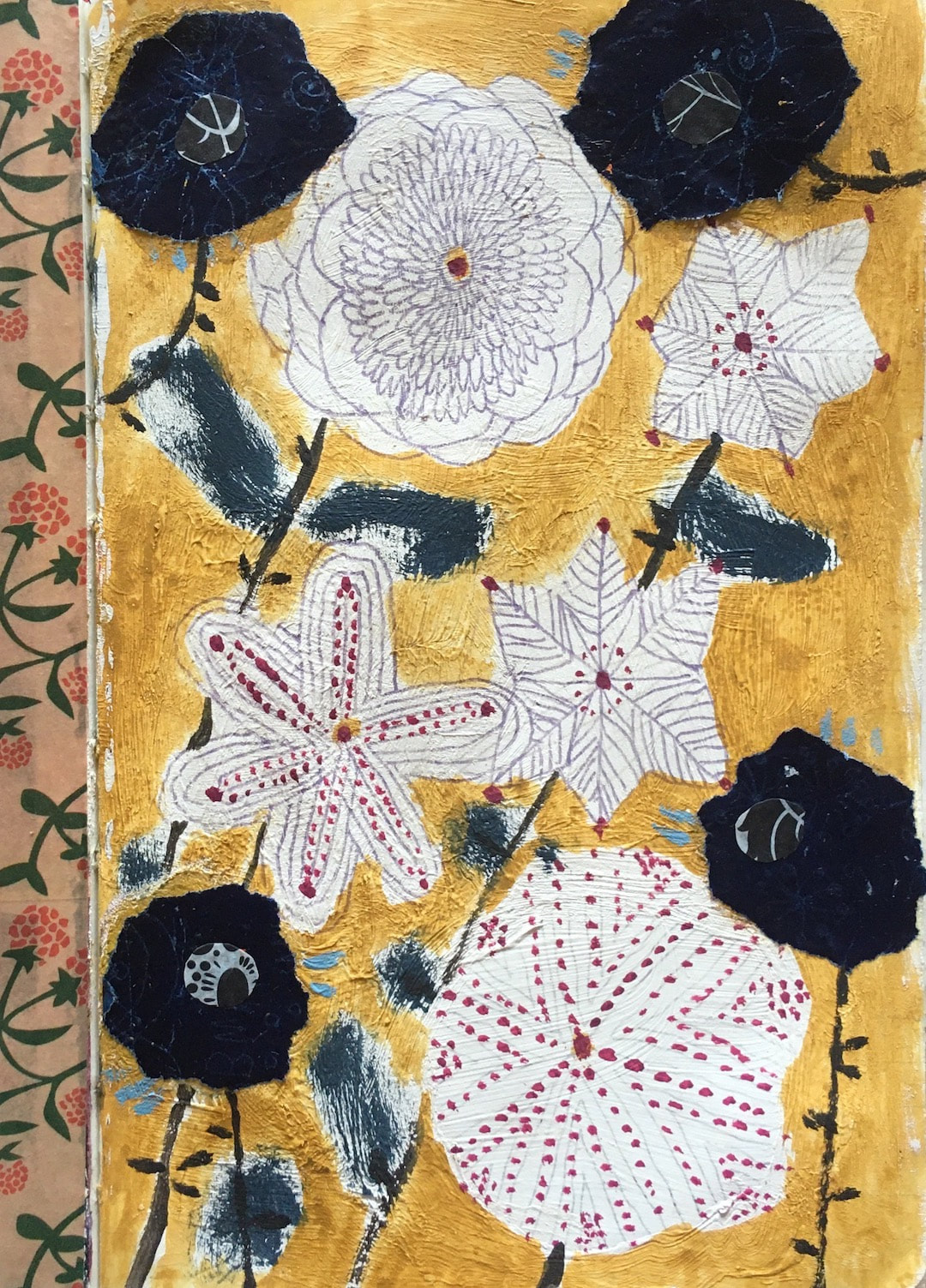 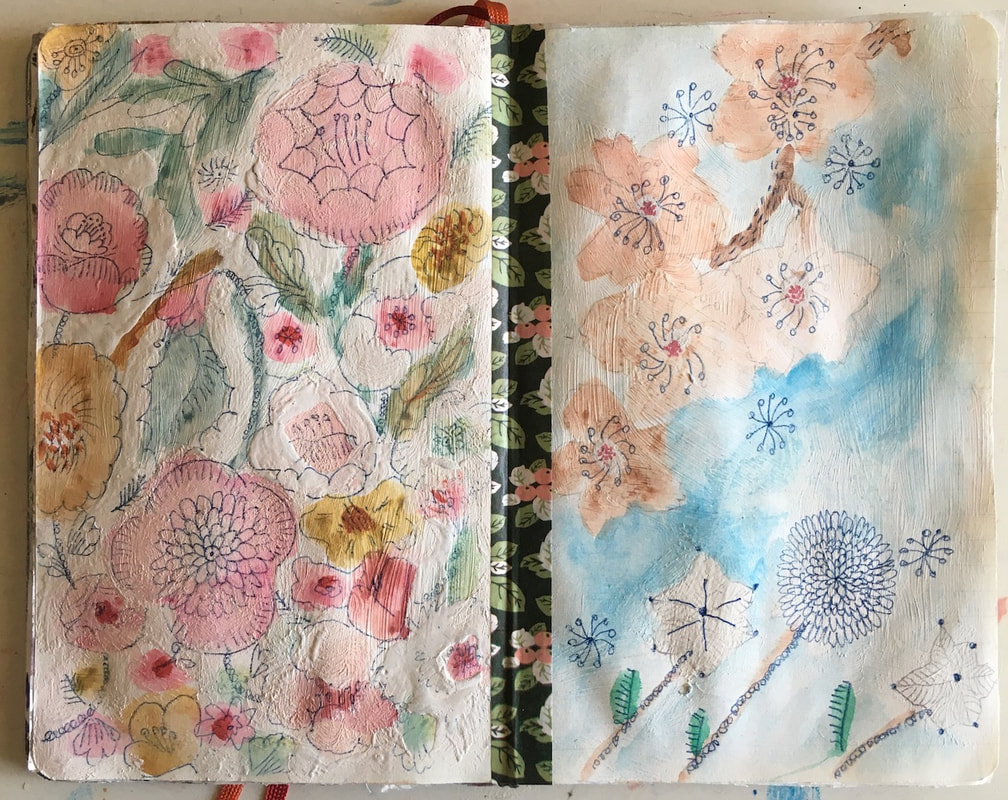 A run of beautiful warm sunshine this week proved a big distraction - I didn't want to be indoors at all. We had a couple of barbecues, one evening we ate our evening meal as a picnic on the grass. The next evening we lit the barbecue again, but while we were cooking our marinated spatchcock chicken which I had prepared earlier in the day, the cold came back in and we retreated indoors to eat. I did get my sketchbook and paints outdoors, though, and the pop-up tent went up as my 'outdoor studio' - which I am pleased to report I am getting quite proficient at folding up and putting away now. Last year there were a couple of hysterically hilarious antics, not aided by wine and B cracking jokes at my attempts. I bought the tent in 2016 and have used it every summer since, so 5 years practice is finally paying off!   |

~~~~~~~~~~~~~~~~~~~~~~
Welcome to my illustration and patterns blog.
I illustrate under the pen-name of Binky McKee, McKee being my mother's maiden name. Binky was the name of every single cat my great-grandmother kept - allegedly about 40 of them during her 94 years of life. I changed the website address a few months ago, so some older links on previous posts are broken. If you click one of those and it takes you to a strange page, simply replace the .co.uk after the binkymckee. with weebly.com and it will work again. I hope you enjoy your visit! ~~~~~~~~~~~~~~~~~~~~~~
~~~~~~~~~~~~~~~~~~~~~~
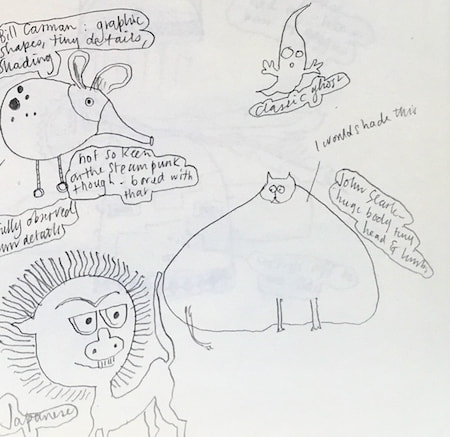
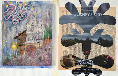
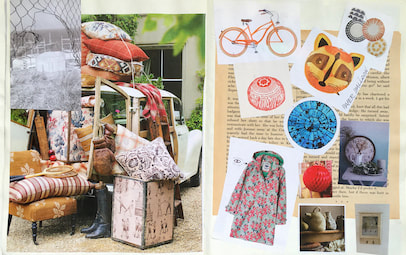
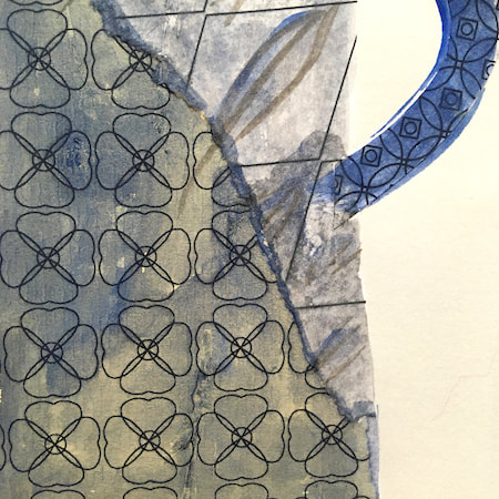
I keep lots of scrapbooks and sketchbooks where I develop ideas and design little creatures. Here's a peek inside one ...

~~~~~~~~~~~~~~~~~~~~~~
~~~~~~~~~~~~~~~~~~~~~~
As you may know, I am also known as Heather Eliza Walker.
Click the image if you would like to find out more and visit my other website. ~~~~~~~~~~~~~~~~~~~~~~ ~~~~~~~~~~~~~~~~~~~~~
~~~~~~~~~~~~~~~~~~~~
April 2024
~~~~~~~~~~~~~~~~~~~~~~
~~~~~~~~~~~~~~~~~~
All
~~~~~~~~~~~~~~~~~~~~~~
~~~~~~~~~~~~~~~~~~~~~~
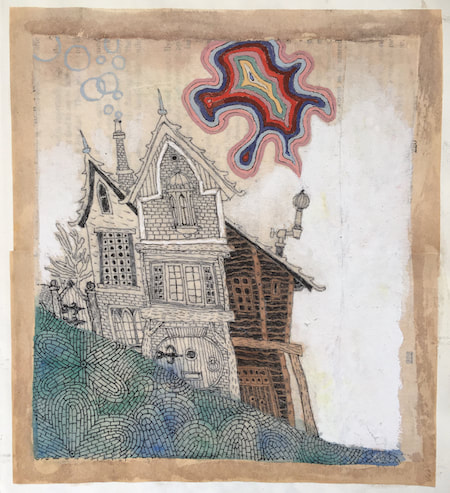
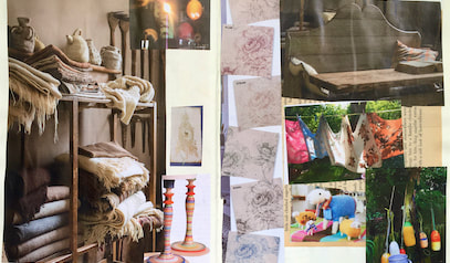
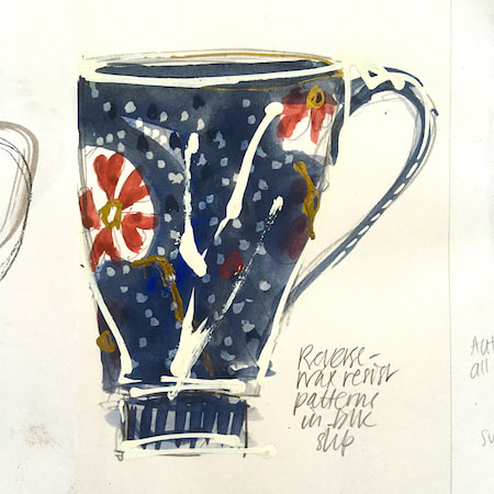
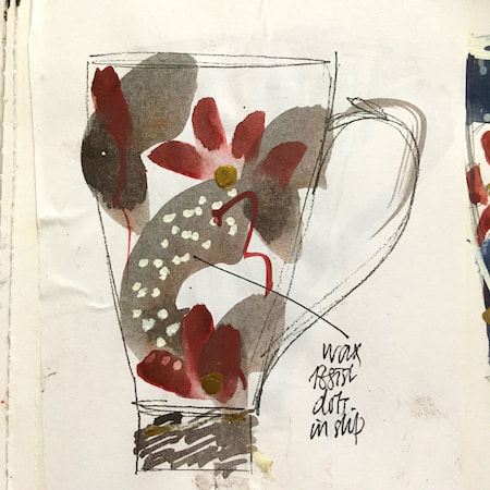
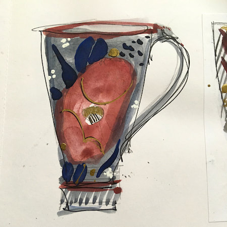
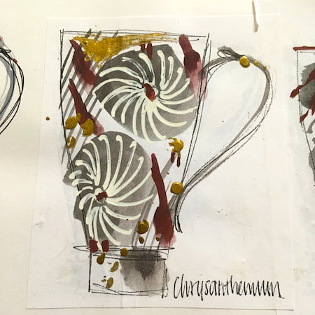
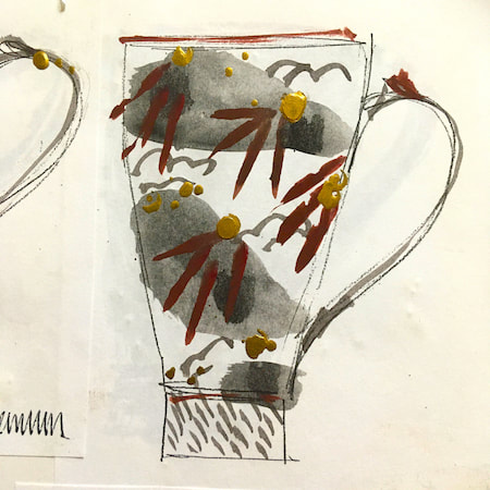
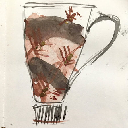
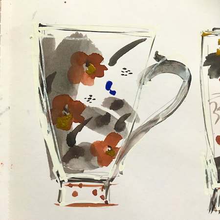
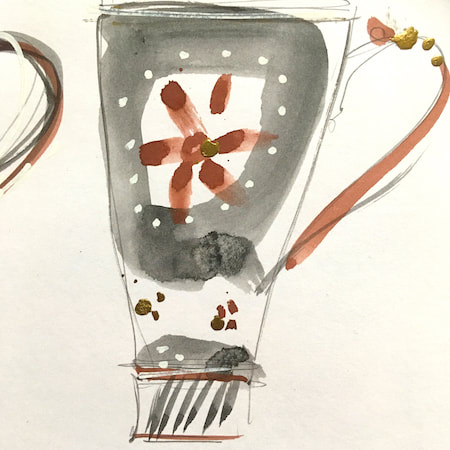
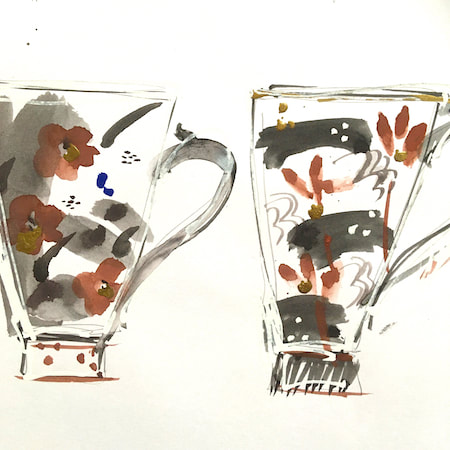
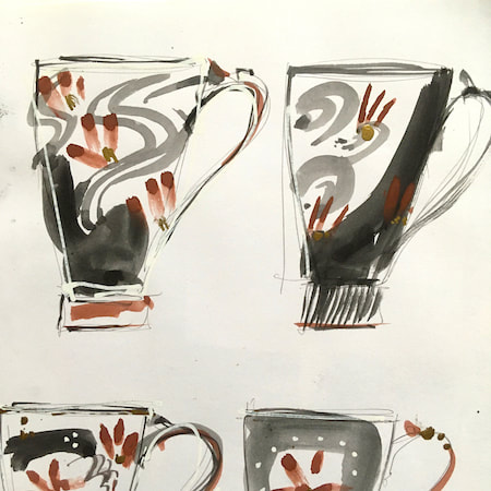
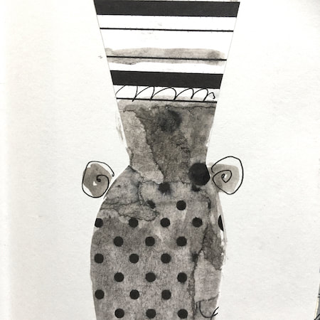
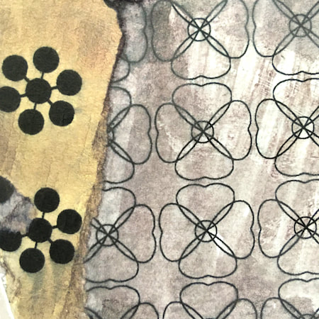
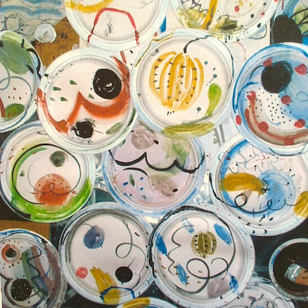
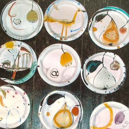
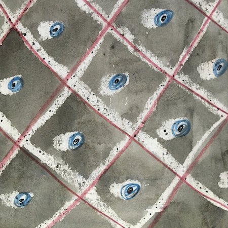
This time, take a peek into my ceramic design sketchbook. I actually made some of the mugs, but I kind of prefer the drawings! The plate designs are painted on paper plates, a most liberating process.
~~~~~~~~~~~~~~~~~~~~~~
~~~~~~~~~~~~~~~~~~~~~~
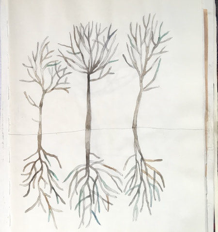
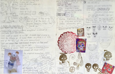
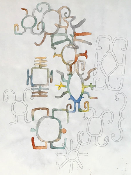
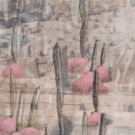
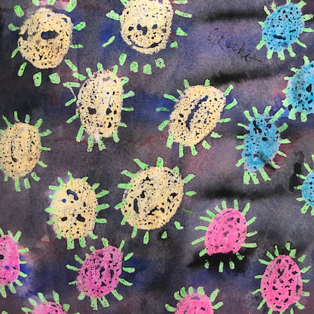
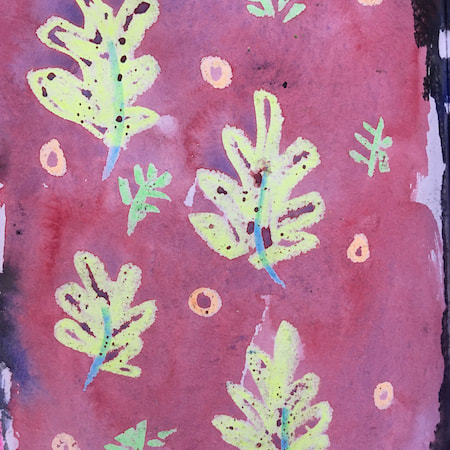
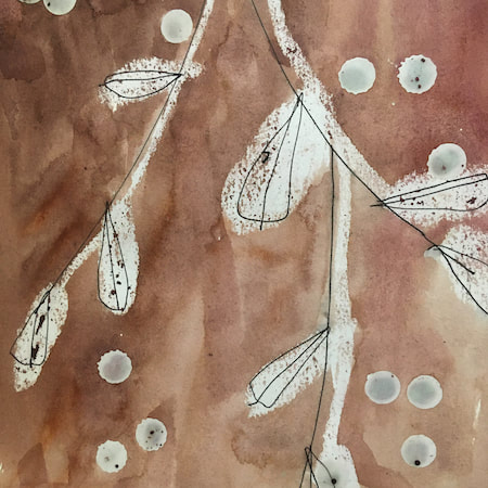
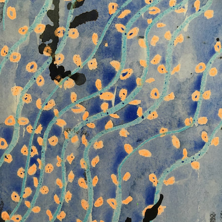
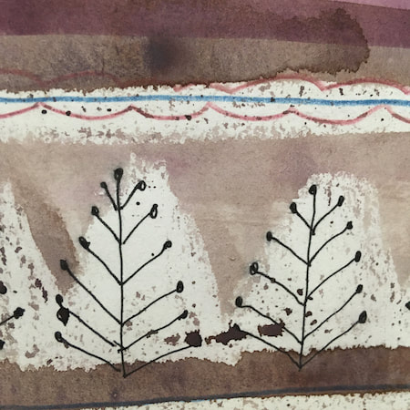
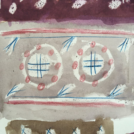
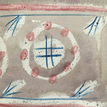
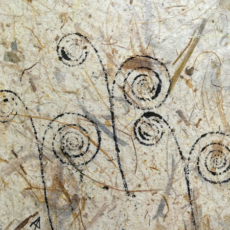
These watercolours are from my pattern sketchbook. I used coloured wax crayons to resist the washes of watercolour, also home-made rubber stamps dipped in bleach then printed on crêpe paper - the bleach takes out the paper dyes.
~~~~~~~~~~~~~~~~~~~~~~
~~~~~~~~~~~~~~~~~~~~~~
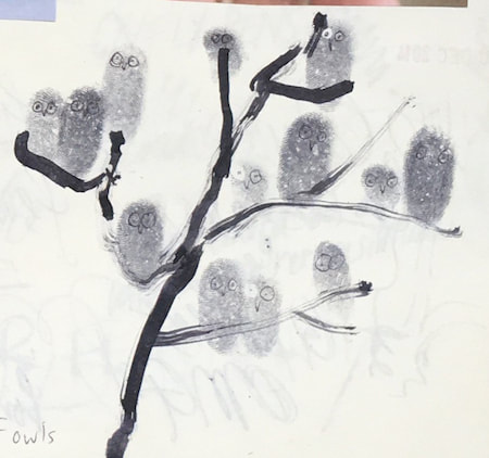
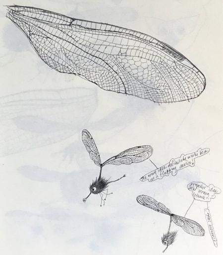
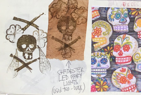
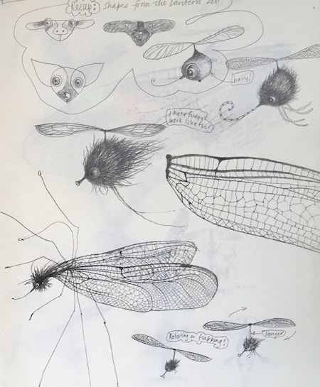
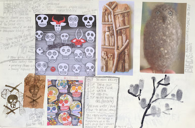
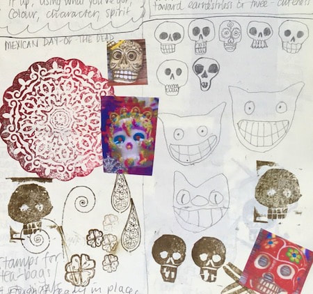
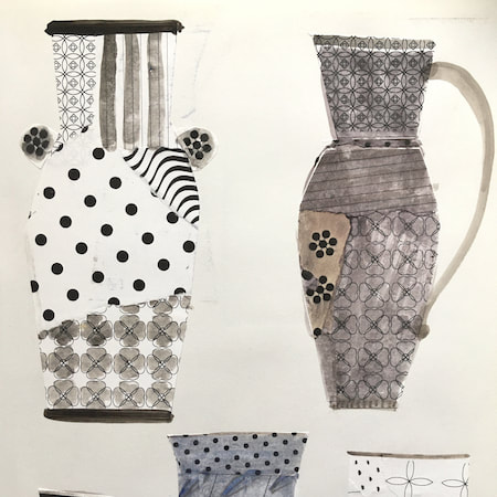
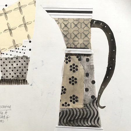
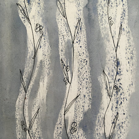
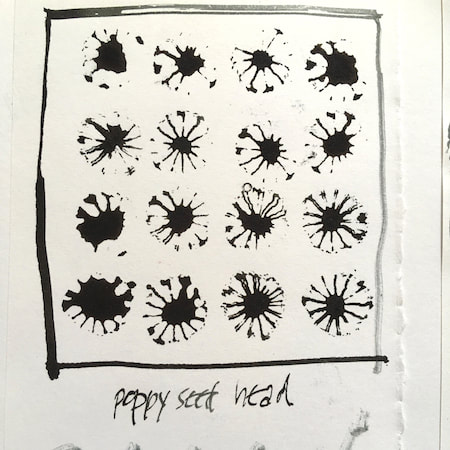
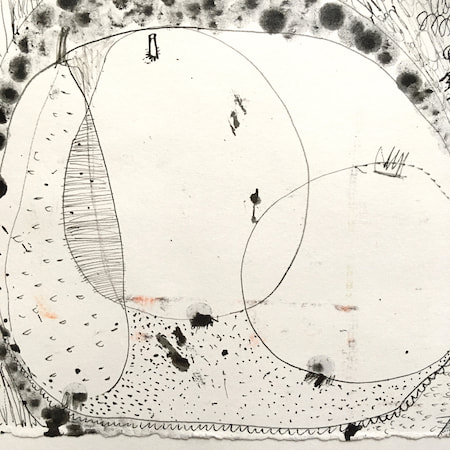
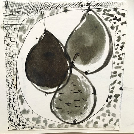
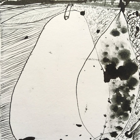
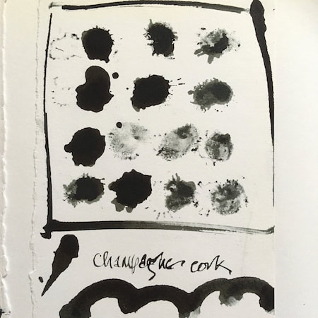
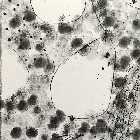
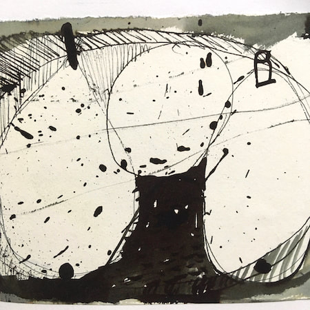
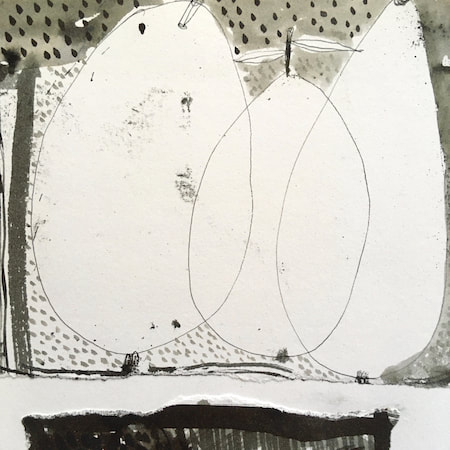
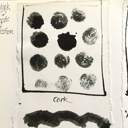
A sketchbook I used for mark-making with unusual objects - corks, seed-heads, feathers, home-made rubber stamps, my fingers and lots of flicky things ...
|
 RSS Feed
