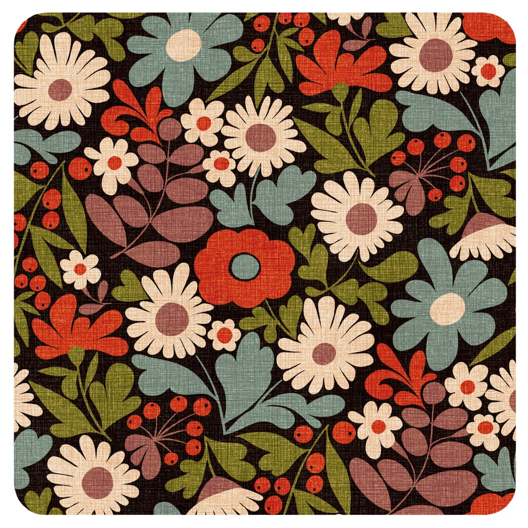
 During the week I got out my Crazy Daisies pattern again to make an autumnal colour version in a speckled texture. I made a slight change to the colour separations at the same time, moving the eye of the red flower in the centre onto a different layer (blue-grey as seen here). 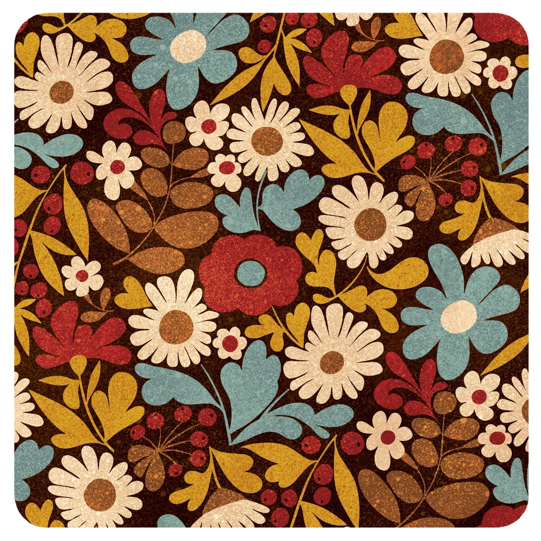 In the process, I copied each colour layer into a fresh document and spotted a missing leaf. I guess while I was designing it I must have added a leaf and forgot to put it into the repeat (no automated technology here!) I'm just amazed I didn't notice it before now. I think it pays to put work to one side for a while before examining every angle of the repeat, sometimes I'm too excited with a new design to notice flaws at the time. All versions of Crazy Daisies have now been amended. 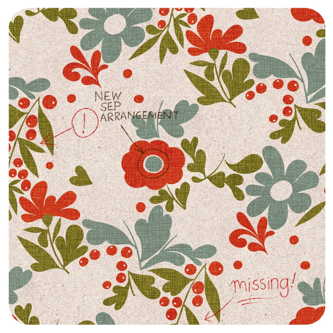  Happy with this one! Quite a few permutations on since I began with the first willow pattern, we now have the expanded blossoms together with cute rounded leaves and some spiky christmas-cactus-like shoots, shown here in two colourways. Above shows a new, smoother linen texture in Peru-inspired colours; I tweaked the colours in the version below for a pastel colourway. 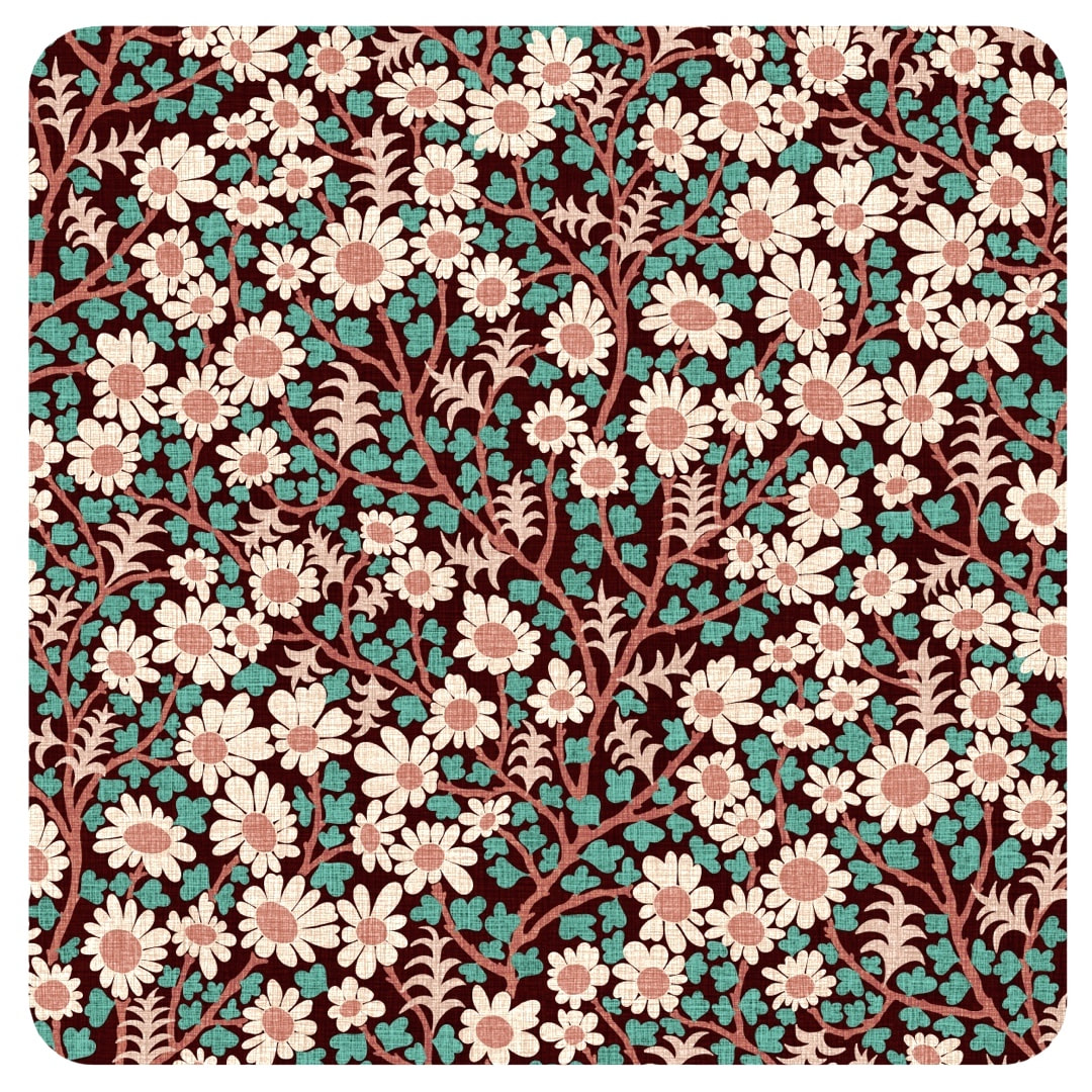 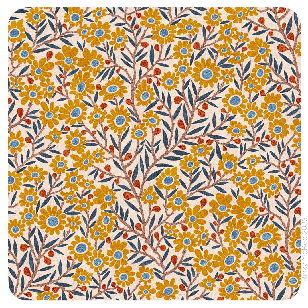 I settled on the version which uses all the flower centres in the same colour for these two colourways, liking the inky effect speckle texture I made for the catkins pattern a couple of weeks ago so much that I added new colours to the palette. All based on earthy ink pigments, here are ochre and sienna beside the original indigo and blue. 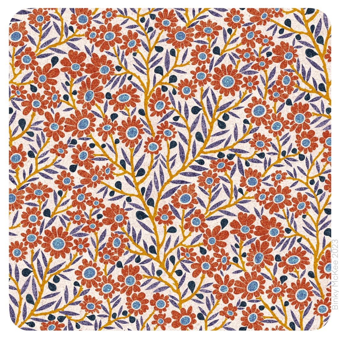 I think the speckle texture suits these patterns, it's not ideal for everything but sits well on smaller elements like these; I imagine them printed on soft cotton.
 My tree now started sprouting in a different direction with blossom flowers and tiny fruits! In a similar way to Crazy Daisies, I extended blossom petals to fit the space around them. I made two versions with different colour separation arrangements. I can't decide which one I like the best, but I feel the version pictured above is easier on the eye, being more organised with the flower eyes all red and the leaves all green. 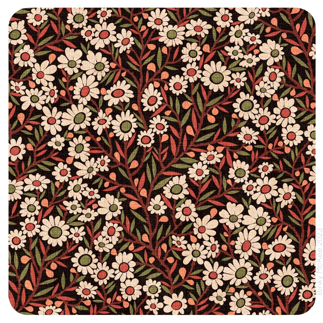 This version split the colour separations so the leaves and eyes of the flowers are together on the same colour, so there are green and red eyes and green and red leaves in a jolly arrangement. You have to imagine the effect flowing across fabric as it moves, say on a dress or curtain material - I really am undecided, perhaps I'll use both for different palettes in the end.
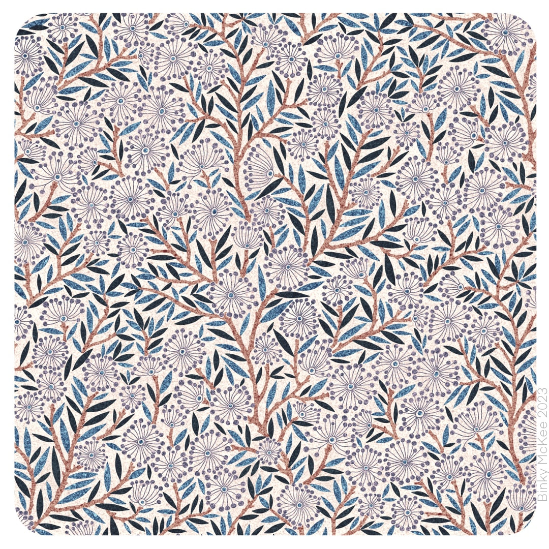 Now that I had my new Catkins pattern, I was excited to experiment with different colourways and textures. Above shows a speckle texture in indigo and sepia, suggestive of ink drawings or woodcut prints. The four colourways below have been given a linen texture, and they show how the simplest of tweaks to colours and backgrounds radically affect a pattern to the extent it almost looks like a completely different design, even the scale of elements appears to change. This is why experiments like these are so exciting. 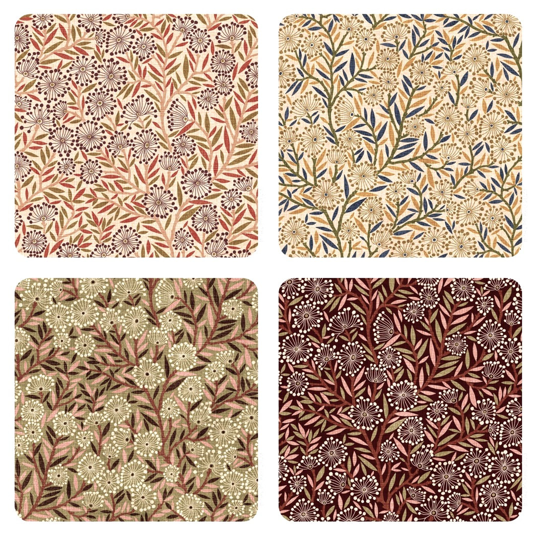 Having omitted all the little sprigs between the branches of the tree (which suggested willows waving in a riverside breeze) from this pattern, I was happier that the design would print better. My concern was that the spriggy lines were so fine they would run into each other and look a bit mushy with random solid fills. One of the reasons I overlay textures is to get a feel for how a design might print on textiles, in this case I think it was helpful in avoiding pitfalls.
From this point, a different inspiration came along ... To be continued 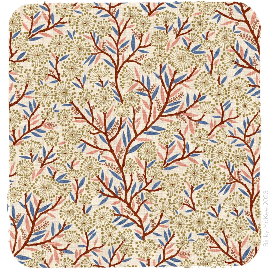 Once I was happy with the pattern and repeat, I began to wonder if my design was a little too crowded. I couldn't help noticing when I was working in layers the pattern looked good with more space surrounding the main elements when the layer with the frond outline details was toggled off; it was fighting for dominance with the bobbly catkins design. I simplified the fronds layer, as shown above. It was now in balance and more relaxed. 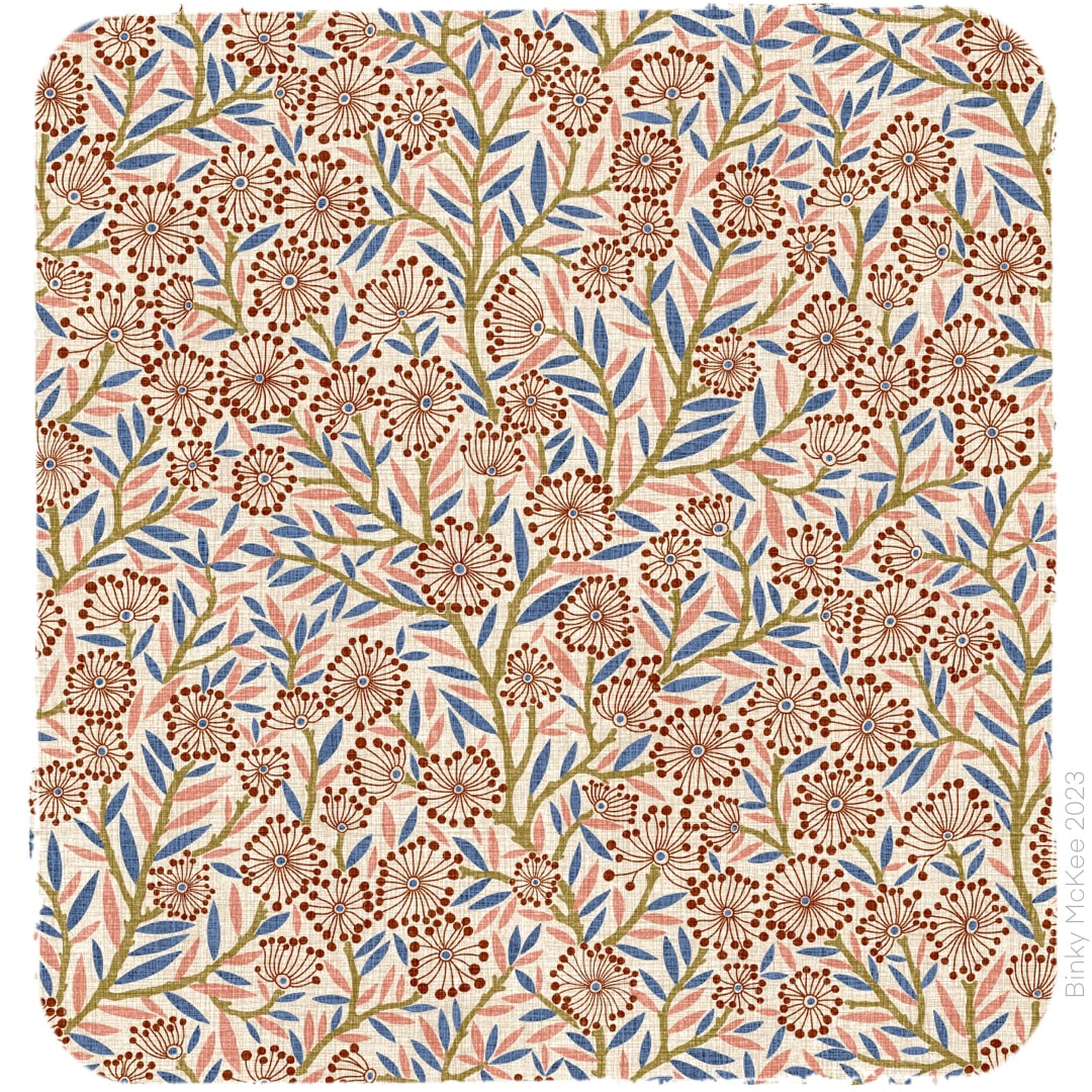 Then I wondered about removing the fronds altogether, and redesigned the leaf layers, shown above in pink and blue. Very nice! - but then I realised I had created a completely new pattern. so, where to go from here?
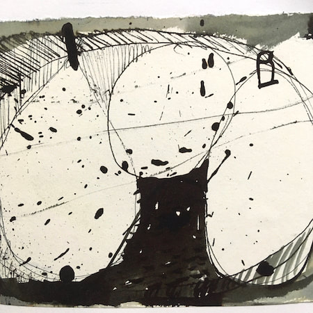
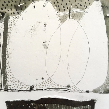
To be continued ... 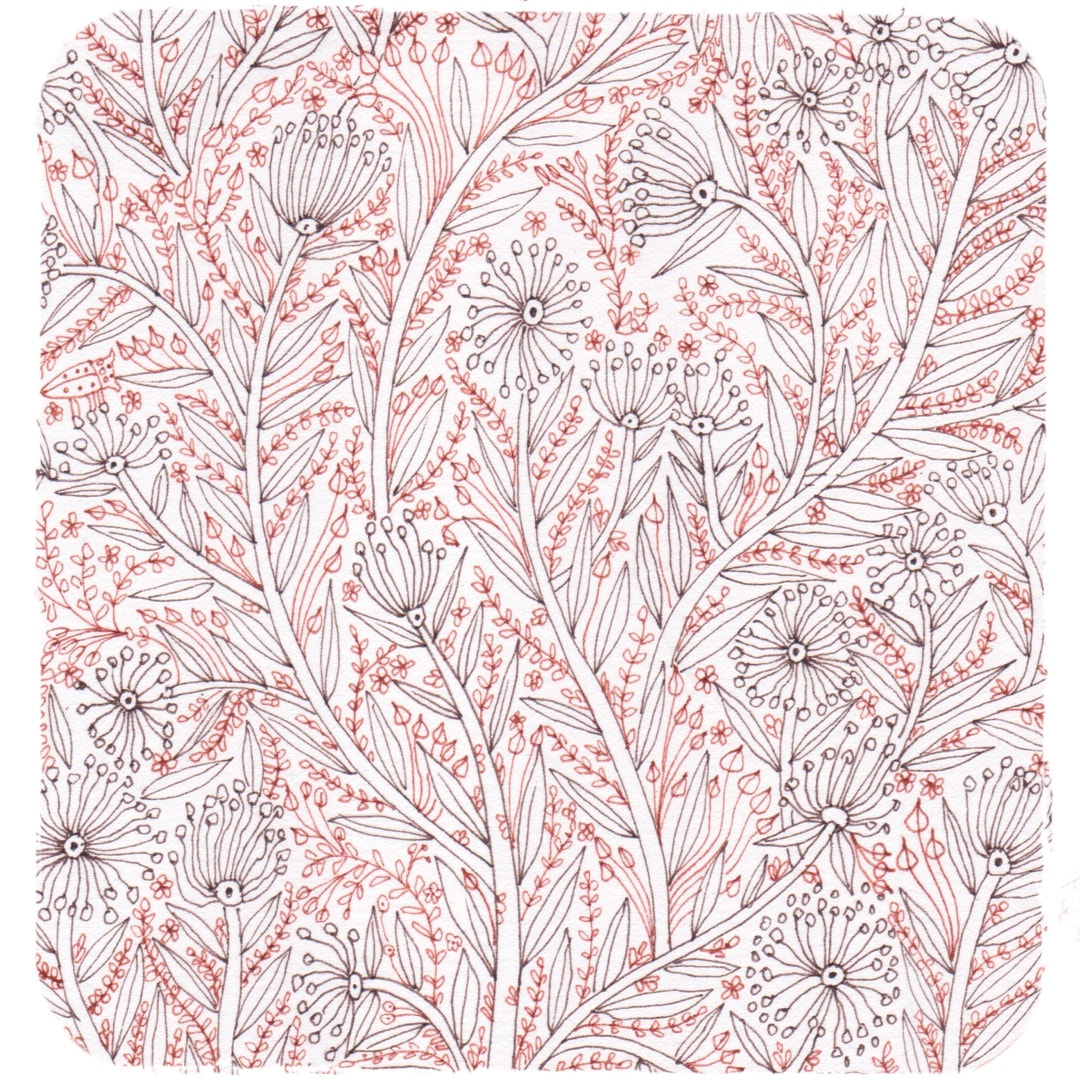 I made this drawing in coloured inks in March 2019, with pattern-making in mind: I blogged about its early stages here. The drawing is a little chaotic in this state and I didn't know how to go about using it at the time, but I thought I made a start on basing a design on it a couple of weeks ago. 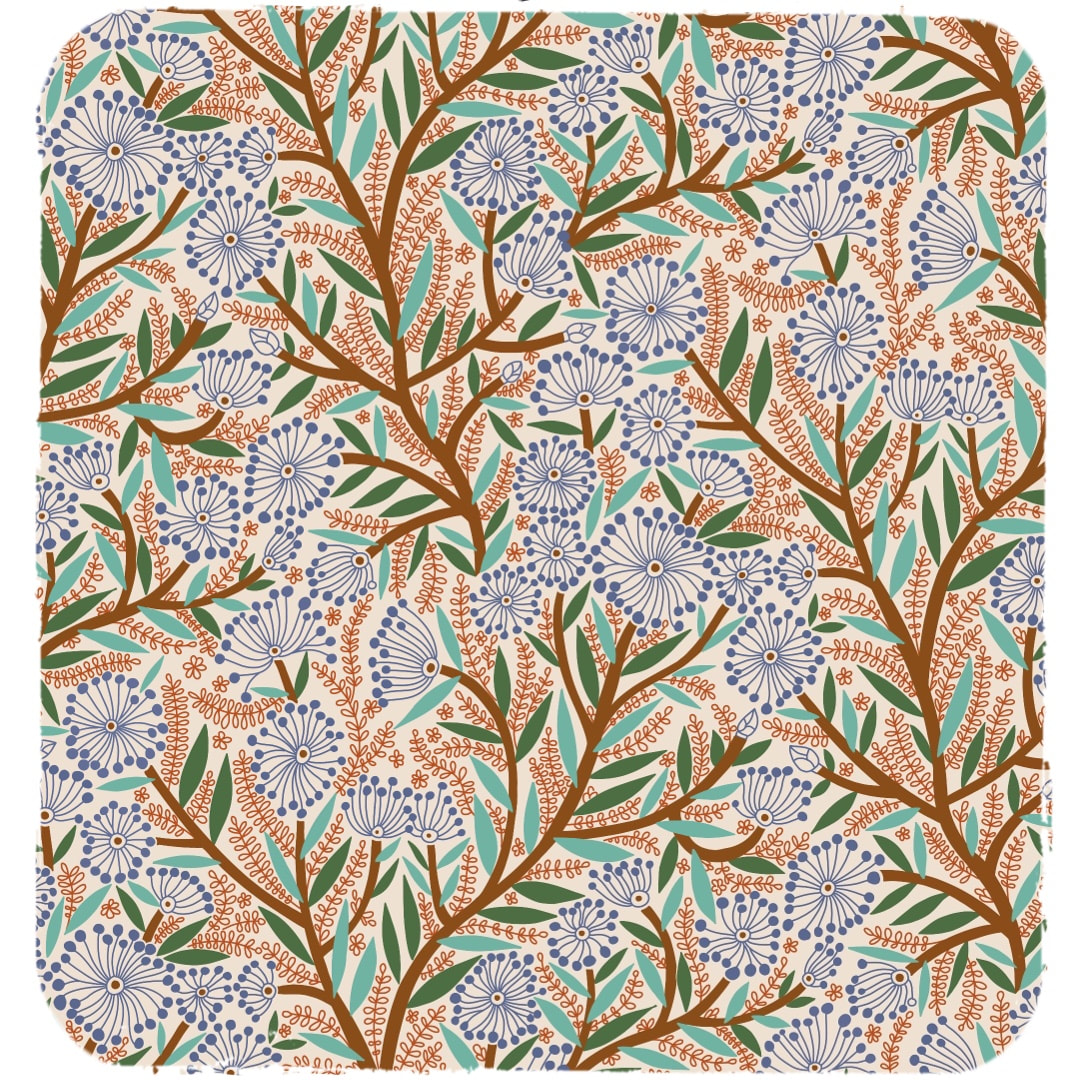 This is the start: the colour scheme was just for clarity, not intended as a final colourway. The half drop was too shallow for such a busy design, the stems stumpy, and I wasn't keen on the lean at this stage. 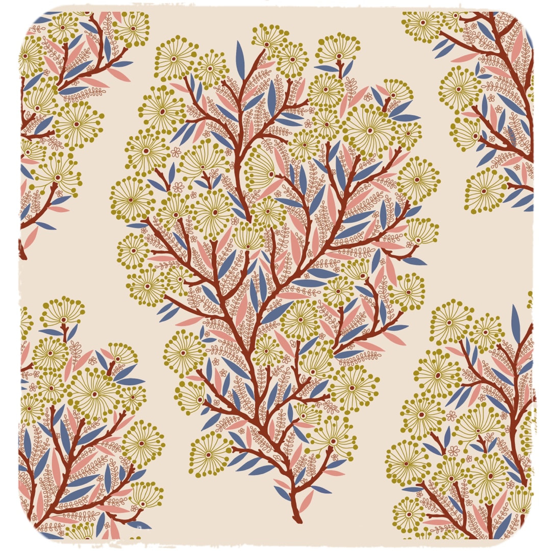 I picked out which was to form the main tree-like motif and redrew the stems to make them more slender and a bit knobbly. I also set it more upright to get rid of the lean, and made improvements to the frondy bits sprouting from the stems. Here is the first stage of the new repeat, quite a pretty motif on its own, but I wanted it to cover the whole surface, so at this stage work had to be done to make it into a continuous flow. 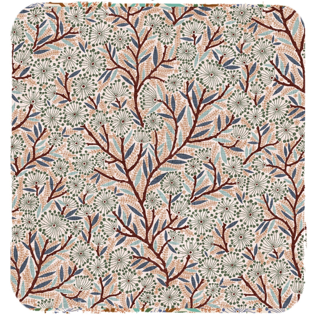 This is how the pattern looks now after additional elements were inserted and interwoven with the main motif. I tried it out with a repeating linen texture I have been working on, and it looks very nice. It makes me think of willows with catkins gently swaying in the breeze beside a big old river. However, the story of this pattern doesn't stop here ... To be continued ...
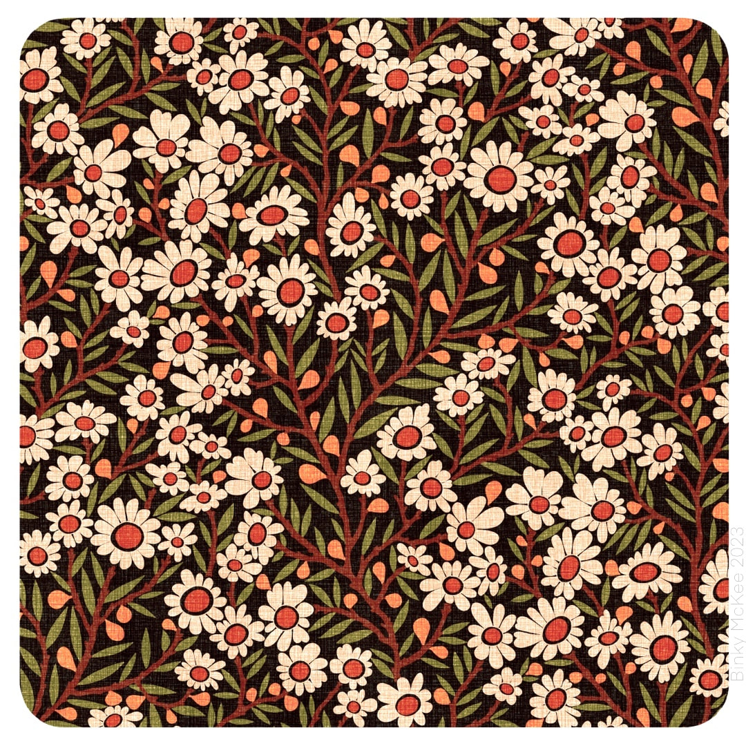
 Another day, another colourway and a new texture. I particularly like indigo and stone colours together, so I made a version of Crazy Daisies in just those two colours; plus a new loose-weave kind of hessian texture drawn up recently.
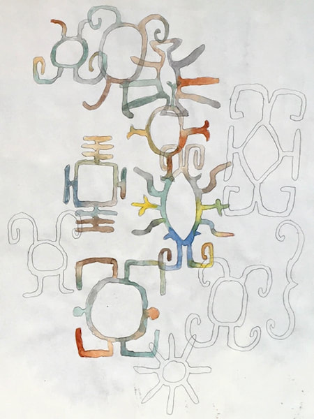
(PS I did something completely different with this texture over at Heather Eliza's blog!) 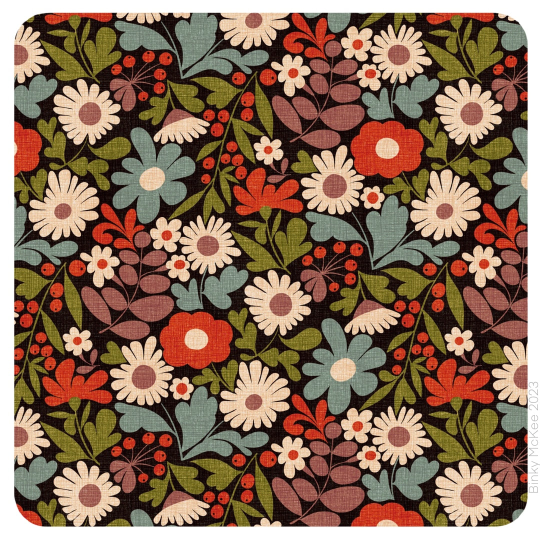 The wildflower garden pattern I have been posting recently literally grew! I suddenly had the idea to expand the daisies to fit the spaces which surrounded them, then other elements expanded likewise, and this is the result. It is now one of my personal favourites, it just feels very 'me'. (My vintage tie daisy pattern is a close second, possibly even first equal). I also made 2 new palettes recently: one was based on the colours from a lovely old velvet scarf I have, the other, pictured below, from a vibrant Peruvian hand-knitted cardigan I bought in A Mano in Camden, London, in the 1990s and still wear a lot - often with the velvet scarf for a marvellous colour display. By the way, these two are in the new clean linen texture I have been working on. 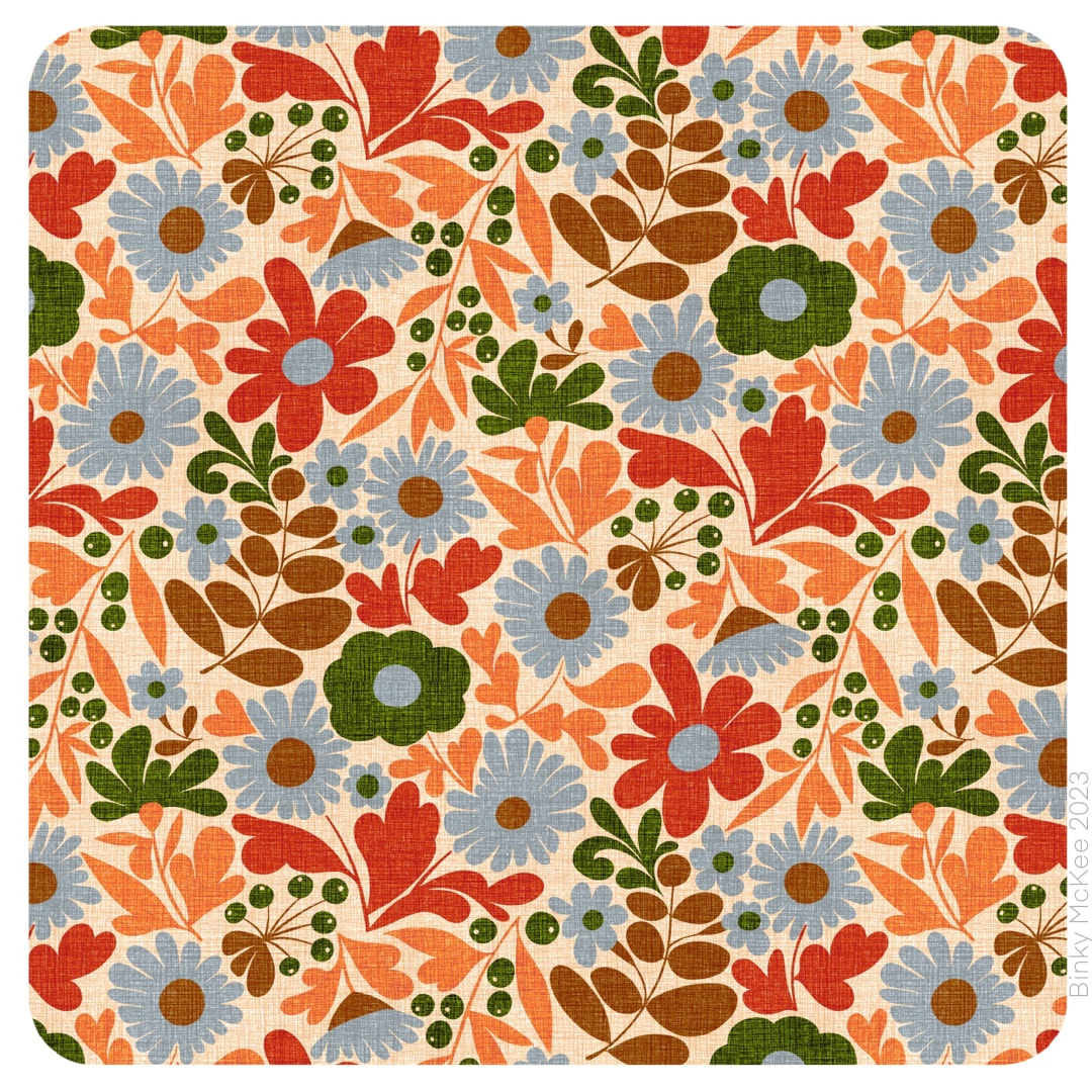 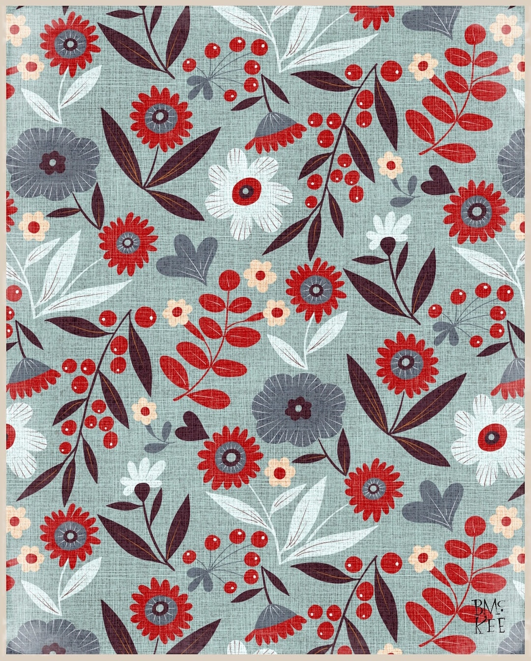 I spent some time making a new linen texture for my pattern blogs; this one is a tighter weave and cleaner, without the blobs which added bags of character (but could be seen as stains). To the left below is the characterful one with the new one on the right as a comparison. I know it's not the best comparison using different colourways, but hey-ho. 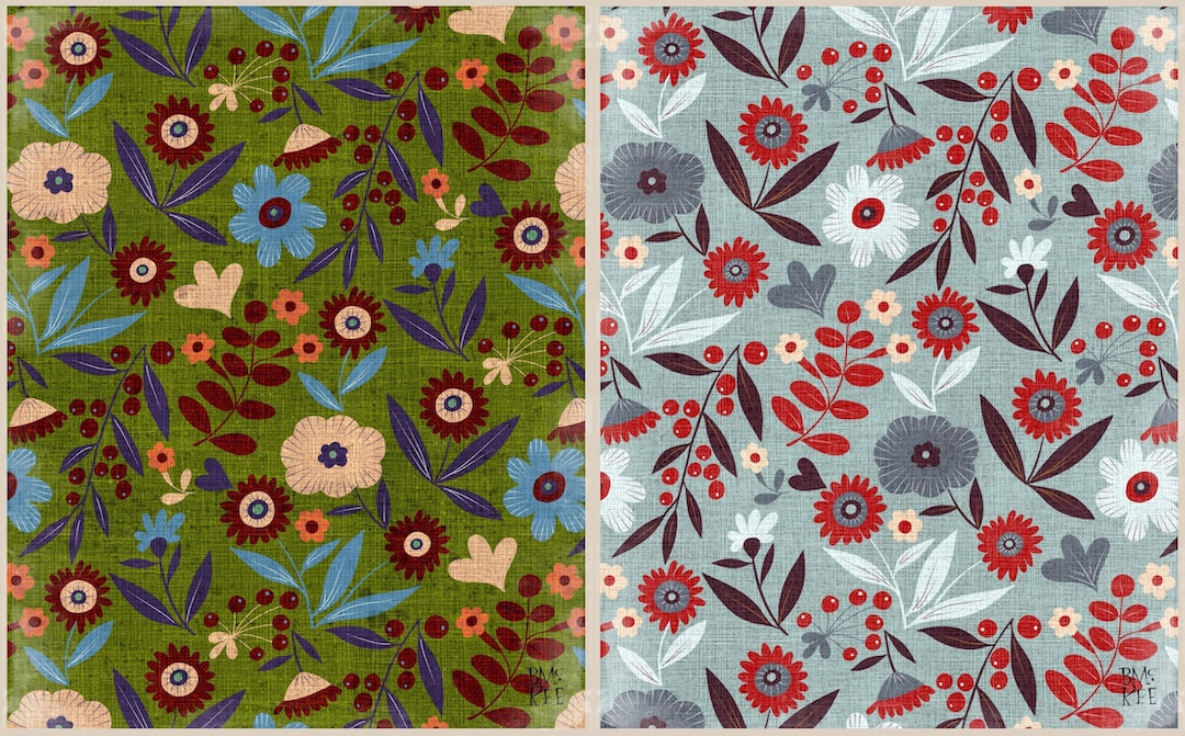 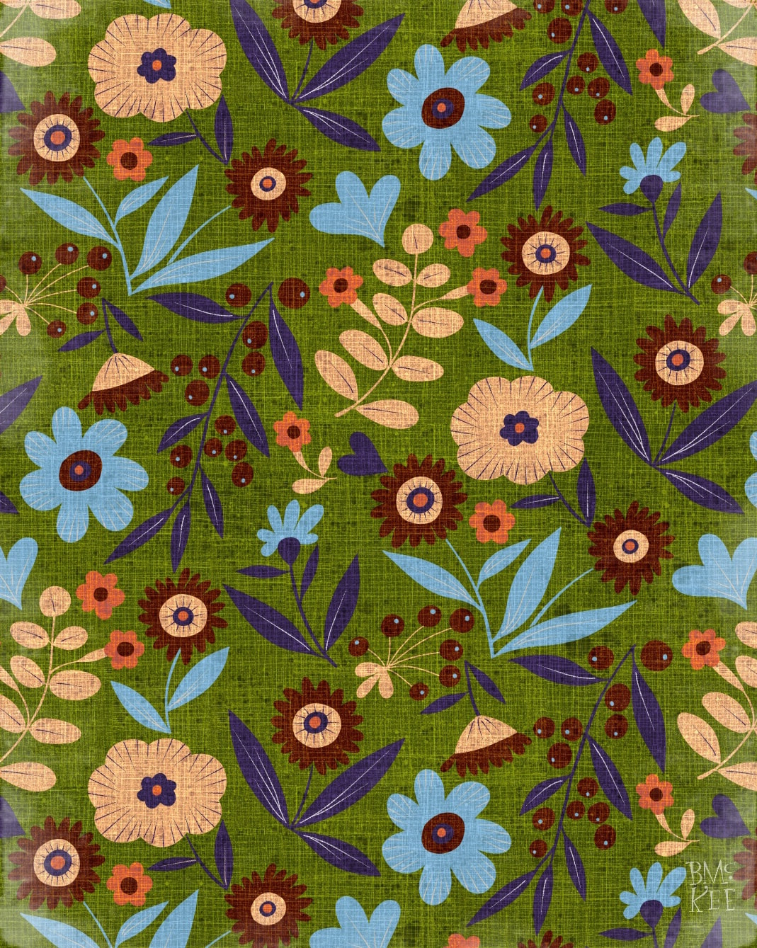 Following a recent jaunt into abstracts and geometric patterns, it's back to florals again with a rework of one I made in May 2021. It's one of my favourites, but I hadn't made it into a half-drop back then, just a block print, which I thought was a shame because it deserved a better flow; so while I was still on holiday I revived and refreshed the original. Now it is flowing and has bigger, brighter (and fewer) colours than before. I also revived a linen texture I made ages ago to provide texture just for blog and IG posts - it looks charming! Wouldn't it be great if it looked like that actually printed on a linen weave? 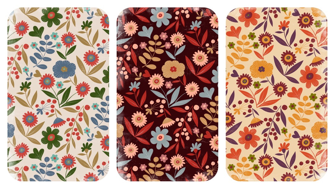 Here are a few more colour experiments. And, as often happens, while I was working on this one, some new developments came into my head which I will post here next week! 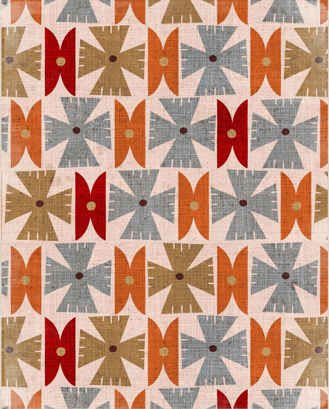 I haven't yet mentioned a revisit to the abstract shapes I started back in January to kickstart the new year after the Christmas holidays. I had developed ideas for patterns, which I never got around to putting into repeat, so this is what I was working on before I took my holiday from work. This one is my favourite, in 6 colours. I like to limit colour palettes from time to time, harking back to the old days of colour separations and single colour print runs. As a matter of fact, because my iPad technology is somewhat outmoded (it's nearly 10 years old), this is still the way I work, using the layers in Procreate 4.3.8 for colour separations.
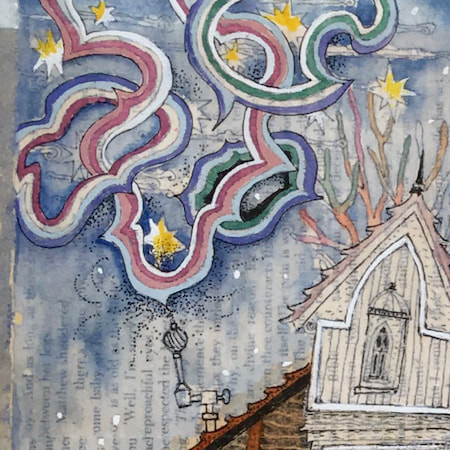
Thanks for visiting, see you next week! 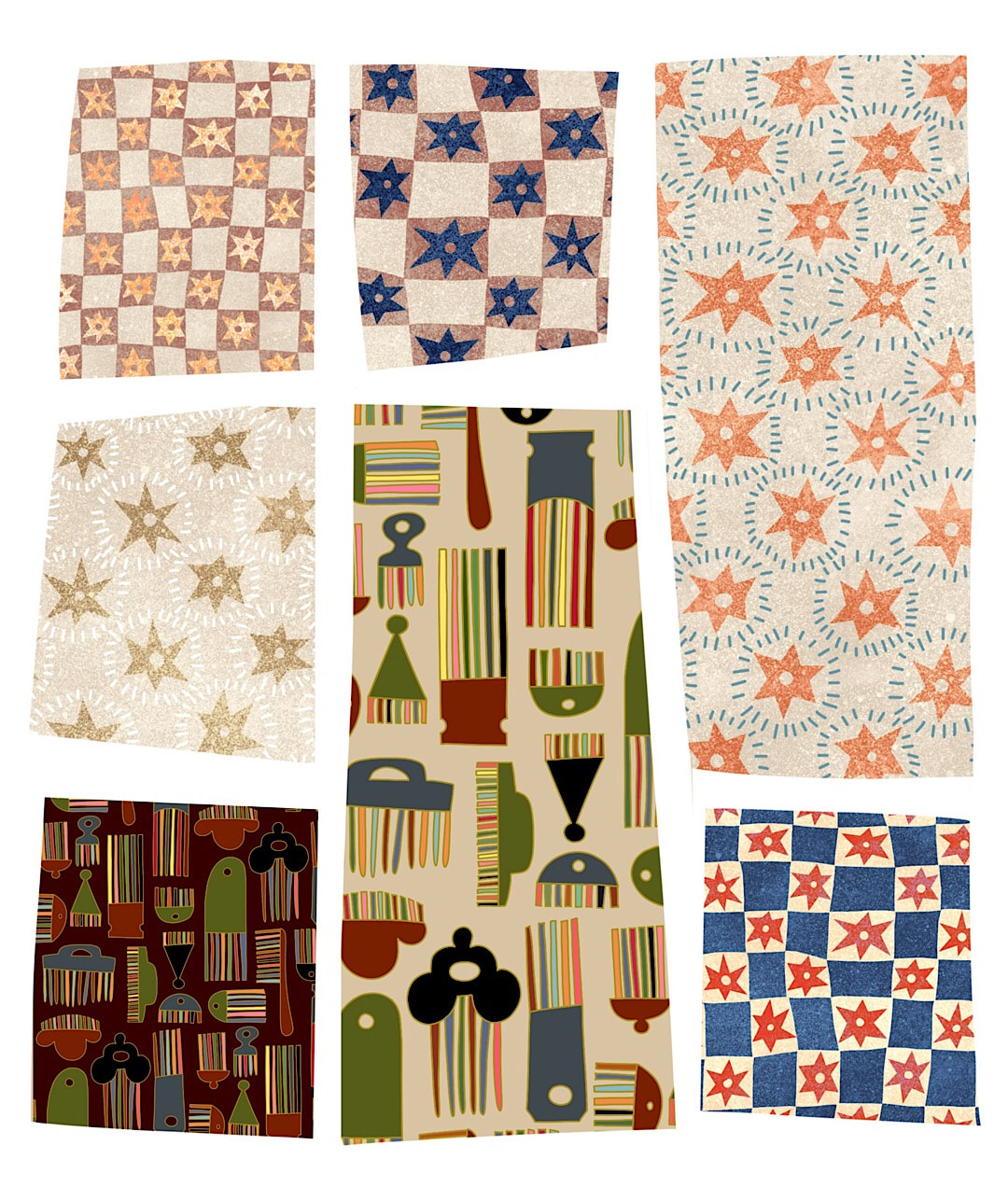 A composition for Instagram. I'm always trying to find ways to post images of my patterns without turning my page into something resembling a sample book, fine in its own context but not very interesting IG content. I liked this crazy paving kind of composition. 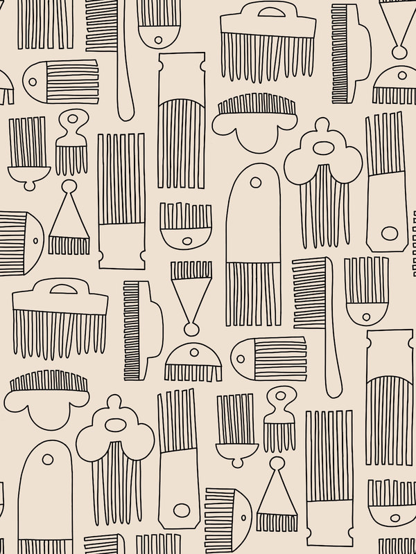 I have been spending some relaxing hours in the afternoons while taking my holiday (very much a staycation at home) working a combs pattern I have been developing. The drop was too shallow so I basically started all over again, tightening the composition, and replacing some of the combs with new ones. I think the outline tile works very well on its own now. It would be great to produce a colouring book of outline patterns, I would be quite excited to sit colouring them in for relaxation. 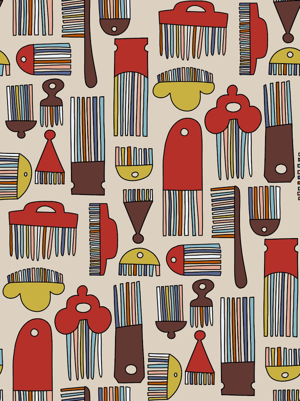 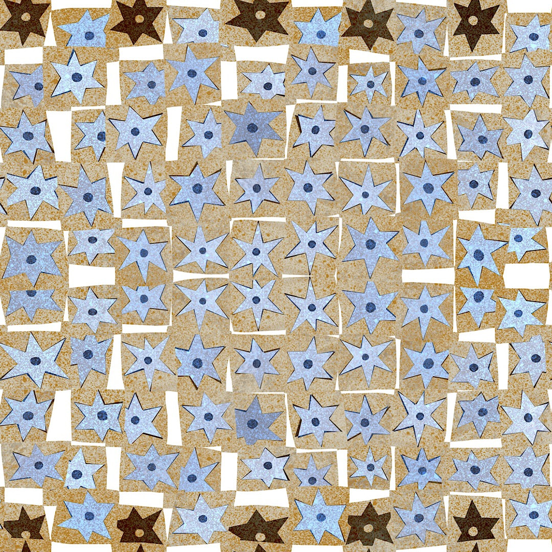 Hurrah! I have been given a holiday from work. I put in for one and a half days next week to get some things done around the house, but was told by my manager that I had too many hours of holiday remaining and had to use up more. I ended up with nearly two weeks, beginning last Wednesday! So I'm celebrating some of the joyful chaos here which happens 'behind the scenes' during designing patterns: above, what it looks like mid-flip while designing a repeat, and below is the colourful mess when a clipping mask is unclipped - or unhinged, rather! I love the child-like fat lines and the graffiti feel, it would make a great painting. 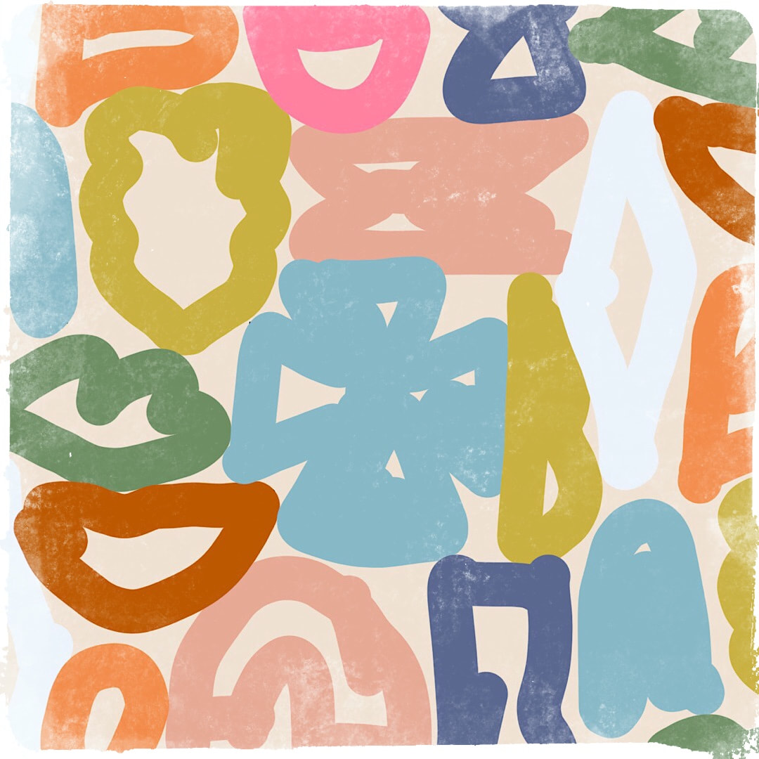 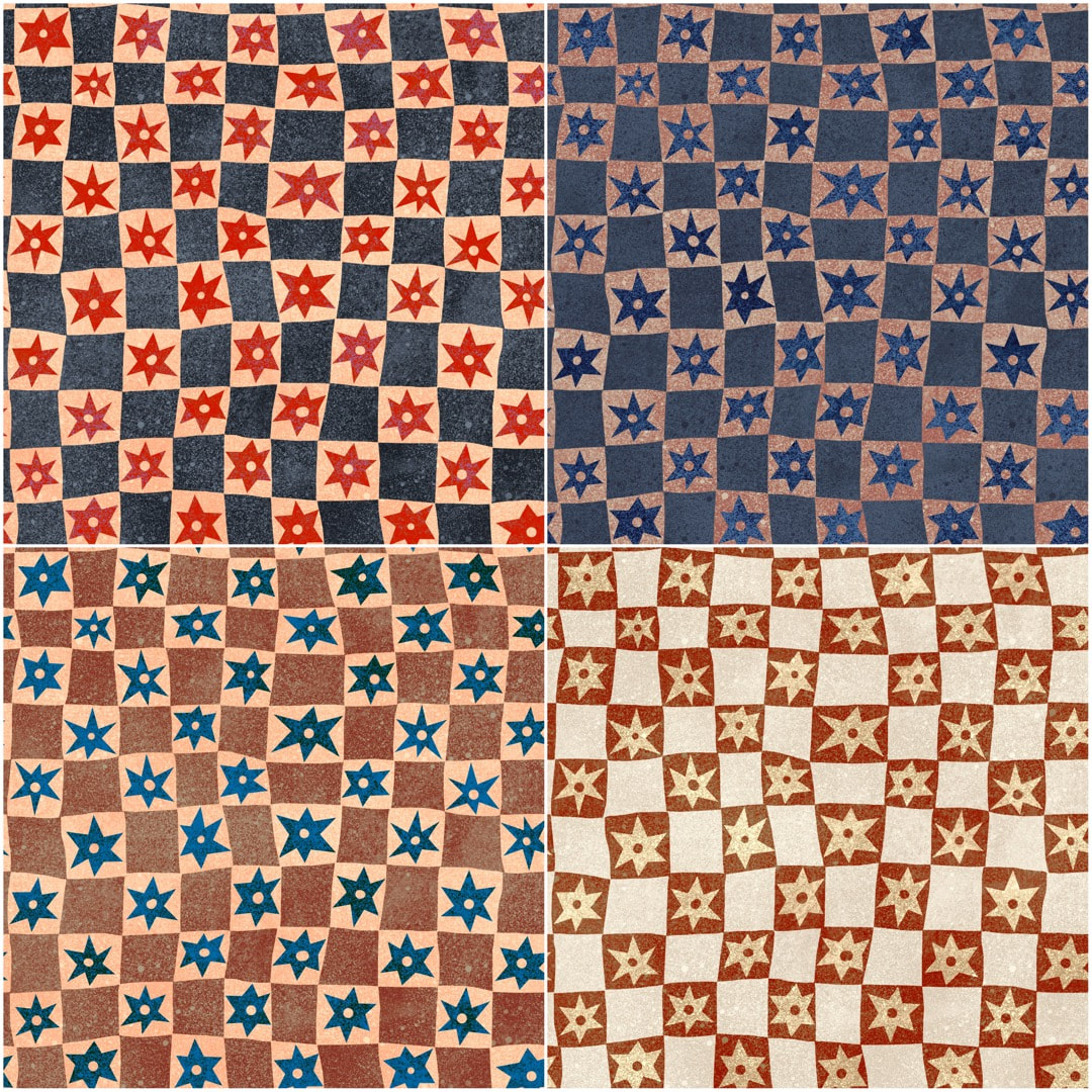 I got a nice surprise during the week when I stumbled across a forgotten stars chequerboard pattern I had made especially for my Glorious Marrow ditty. I had forgotten it was all in repeat and ready to go, and had some fun playing around with different colourways. 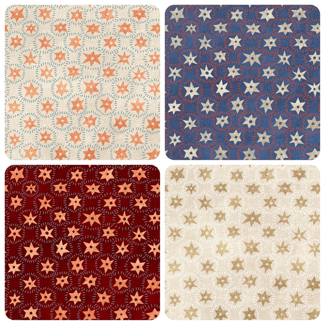 I was especially delighted when I discovered something else to do with the stars - making them twinkly. My love for textiles makes me think they would make a beautiful embroidery, the radiating lines suggest stitches. Wouldn't the sparkle stand out if it was sewn in gold thread? 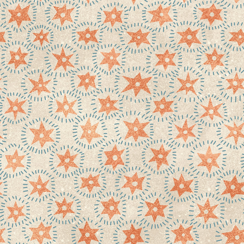 Just imagine, little stars sparkling with radiating gold catching the light.
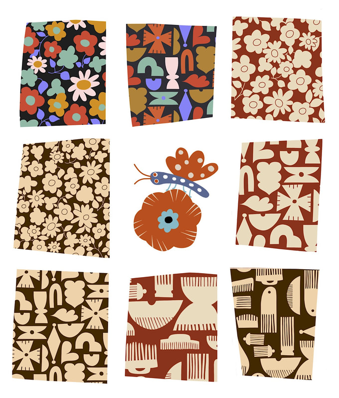 Different patterns in matching colours: here is a mix of vintage daisy, the pattern I'm just calling 'shapes' until I think of a better name, and a combs pattern I've been working on this week - plus a very cute moth on a flower. 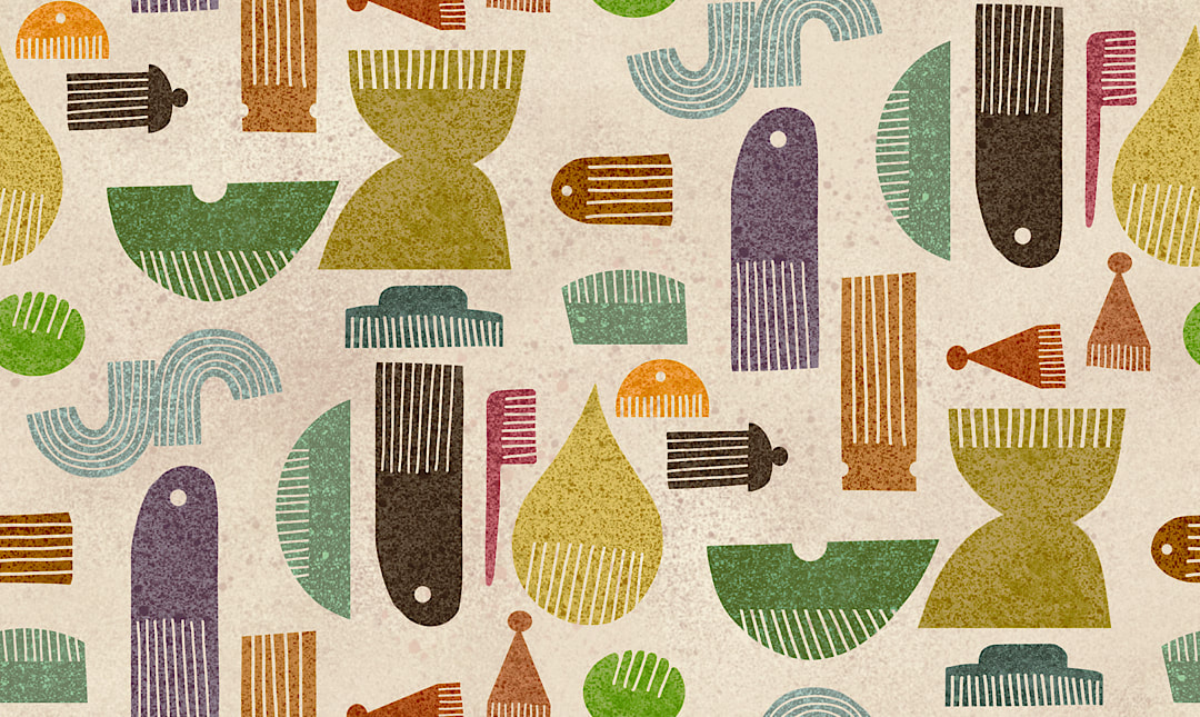 |

~~~~~~~~~~~~~~~~~~~~~~
Welcome to my illustration and patterns blog.
I illustrate under the pen-name of Binky McKee, McKee being my mother's maiden name. Binky was the name of every single cat my great-grandmother kept - allegedly about 40 of them during her 94 years of life. I changed the website address a few months ago, so some older links on previous posts are broken. If you click one of those and it takes you to a strange page, simply replace the .co.uk after the binkymckee. with weebly.com and it will work again. I hope you enjoy your visit! ~~~~~~~~~~~~~~~~~~~~~~
~~~~~~~~~~~~~~~~~~~~~~
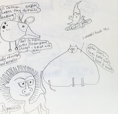
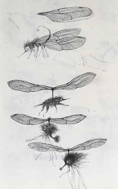
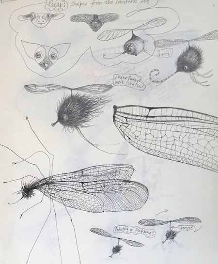
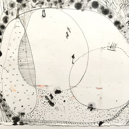
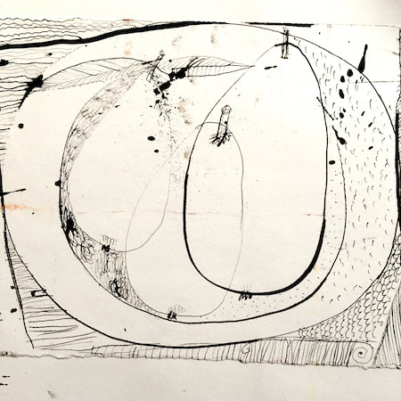
I keep lots of scrapbooks and sketchbooks where I develop ideas and design little creatures. Here's a peek inside one ...

~~~~~~~~~~~~~~~~~~~~~~
~~~~~~~~~~~~~~~~~~~~~~
As you may know, I am also known as Heather Eliza Walker.
Click the image if you would like to find out more and visit my other website. ~~~~~~~~~~~~~~~~~~~~~~ ~~~~~~~~~~~~~~~~~~~~~
~~~~~~~~~~~~~~~~~~~~
April 2024
~~~~~~~~~~~~~~~~~~~~~~
~~~~~~~~~~~~~~~~~~
All
~~~~~~~~~~~~~~~~~~~~~~
~~~~~~~~~~~~~~~~~~~~~~
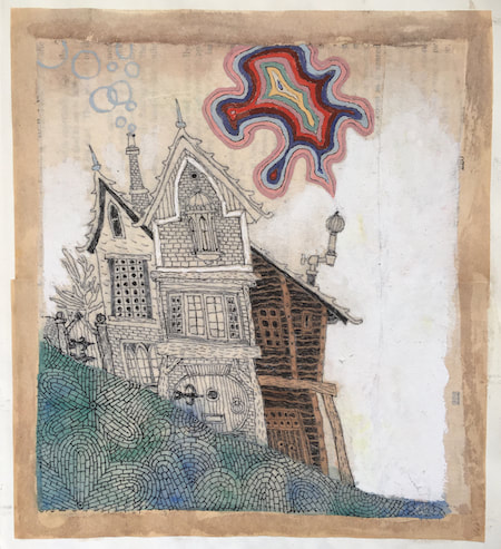
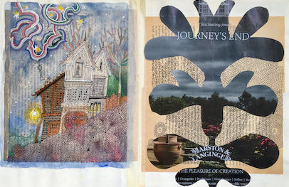
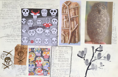
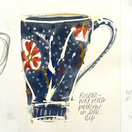
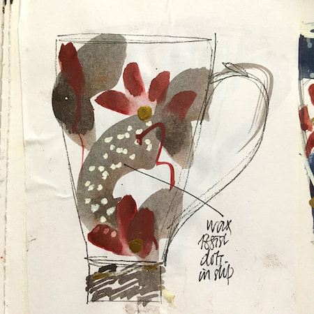
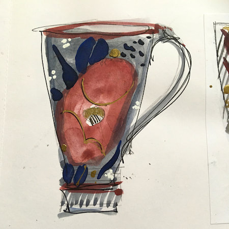
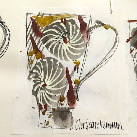
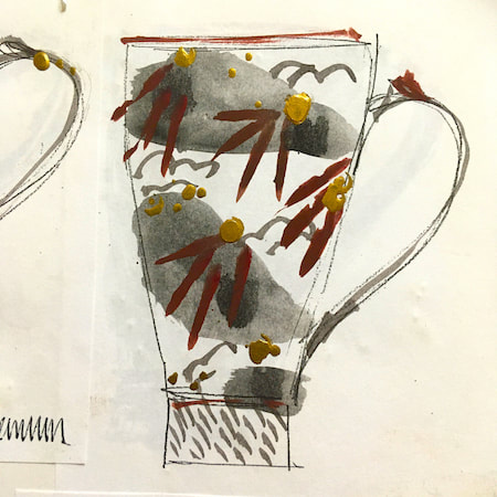
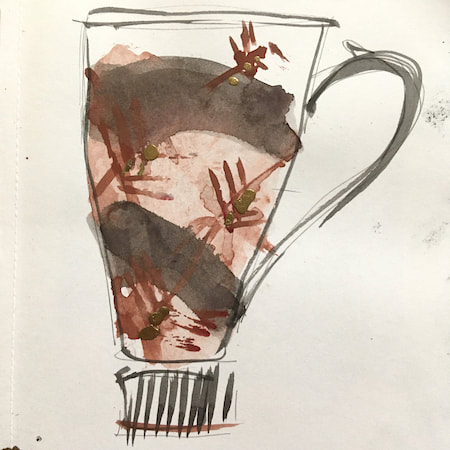
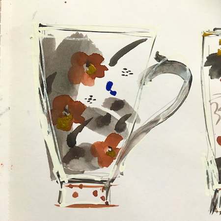
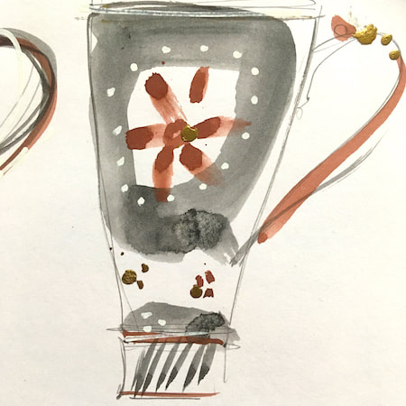
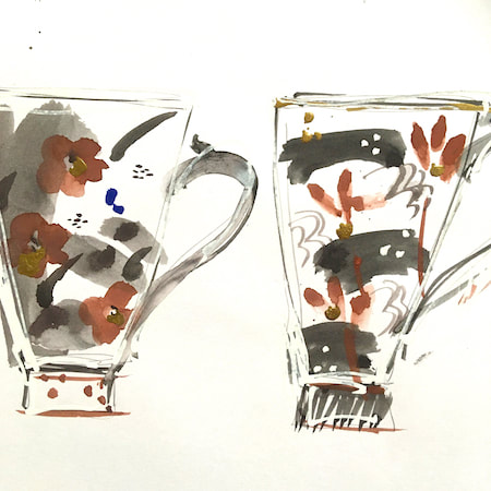
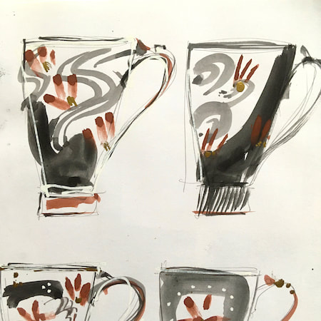
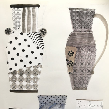
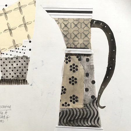
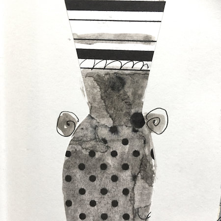
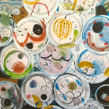
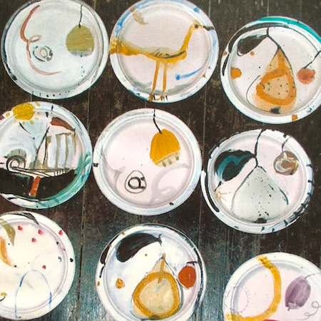
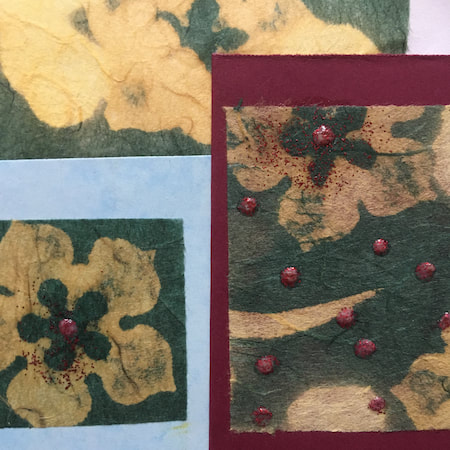
This time, take a peek into my ceramic design sketchbook. I actually made some of the mugs, but I kind of prefer the drawings! The plate designs are painted on paper plates, a most liberating process.
~~~~~~~~~~~~~~~~~~~~~~
~~~~~~~~~~~~~~~~~~~~~~
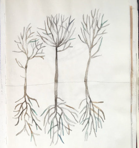
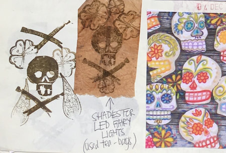
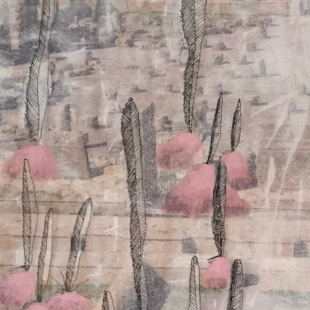
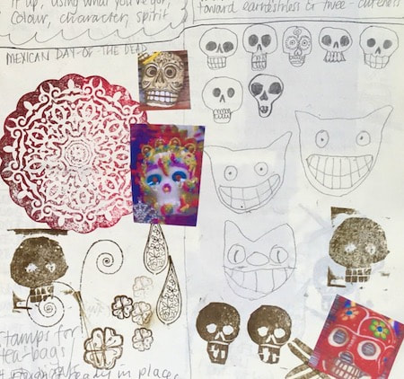
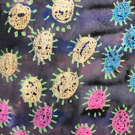
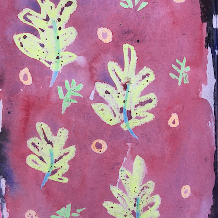
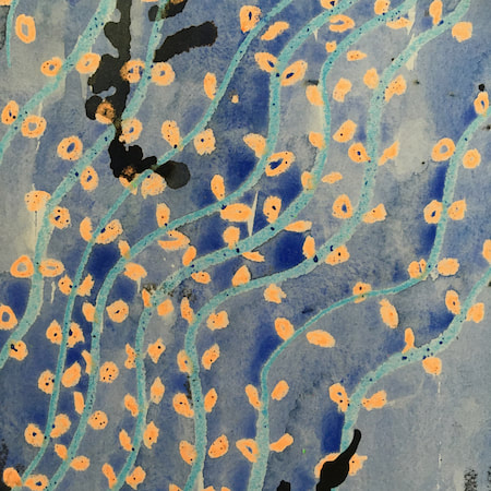
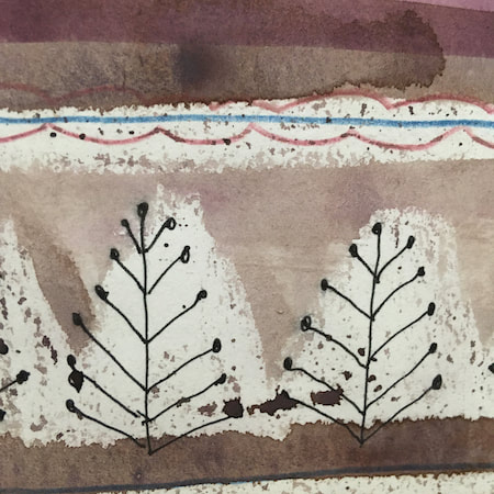
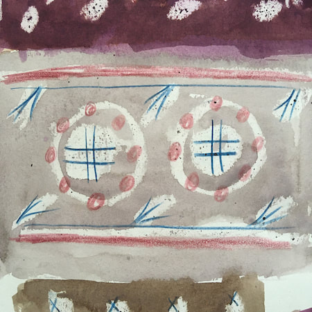
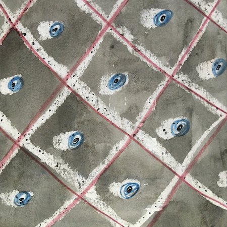
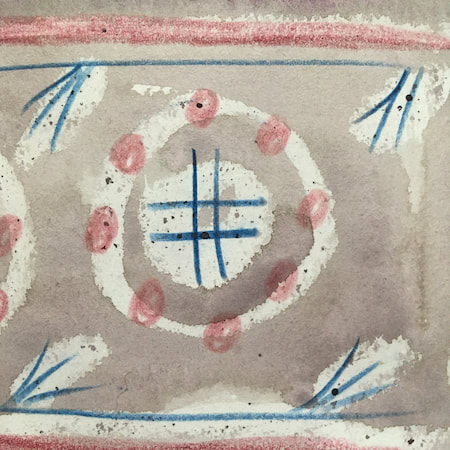
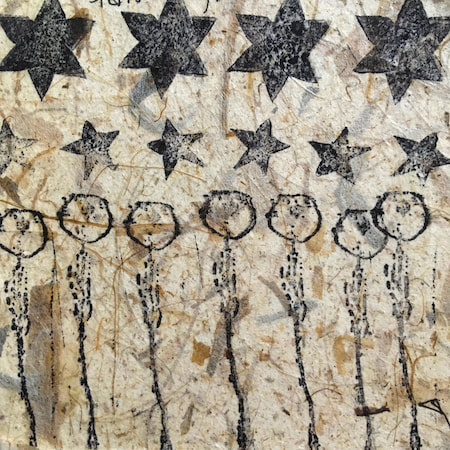
These watercolours are from my pattern sketchbook. I used coloured wax crayons to resist the washes of watercolour, also home-made rubber stamps dipped in bleach then printed on crêpe paper - the bleach takes out the paper dyes.
~~~~~~~~~~~~~~~~~~~~~~
~~~~~~~~~~~~~~~~~~~~~~
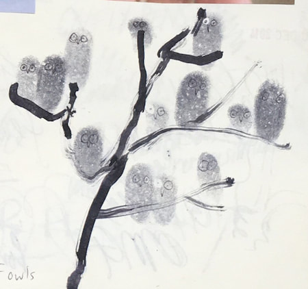
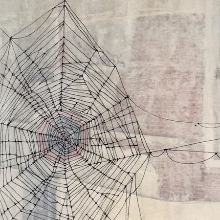
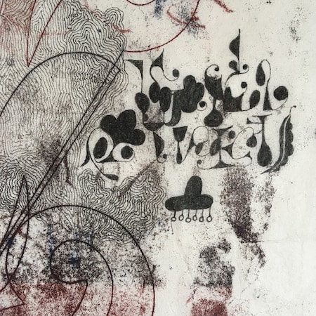
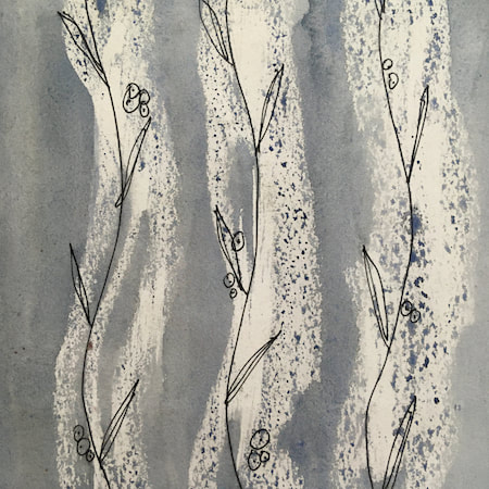
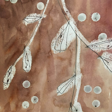
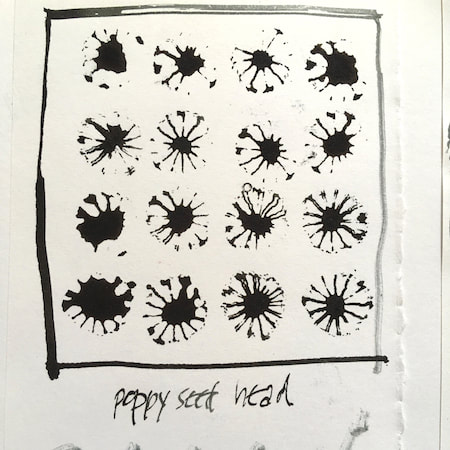
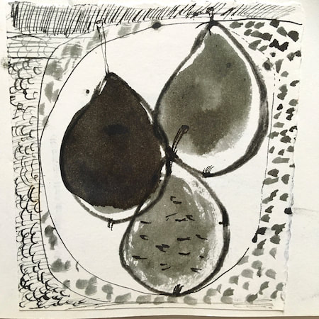
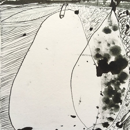
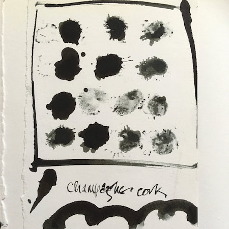
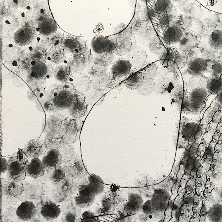
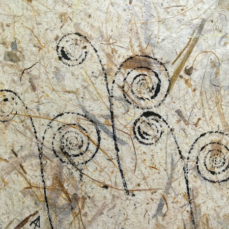
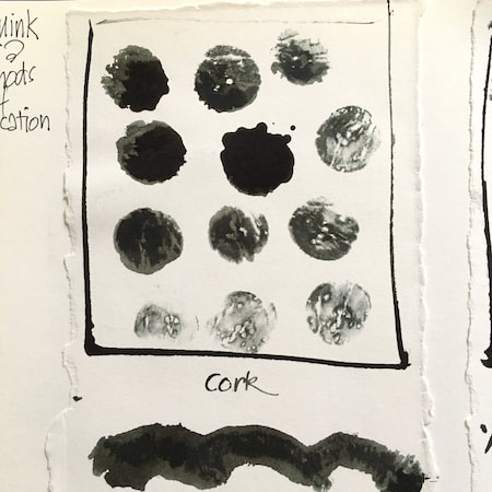
A sketchbook I used for mark-making with unusual objects - corks, seed-heads, feathers, home-made rubber stamps, my fingers and lots of flicky things ...
|
 RSS Feed
